• >>>NEW Colour 2.0 Workshop<<<
  • Technique
    • Latest Techniques
    • FREE TIPS
    • Quick Tips
    • Video
    • Site Search
    • Blog
    • Archives
  • Mentoring
  • >Online Workshops<
  • Workshops
  • Studio Lighting Books
  • Contact
    • Newsletter
    • Contact
    • Statement
Jake Hicks Photography
  • >>>NEW Colour 2.0 Workshop<<<
  • Technique
    • Latest Techniques
    • FREE TIPS
    • Quick Tips
    • Video
    • Site Search
    • Blog
    • Archives
  • Mentoring
  • >Online Workshops<
  • Workshops
  • Studio Lighting Books
  • Contact
    • Newsletter
    • Contact
    • Statement

Stay Inspired - Inspirational work from 10 Photographers and Artists 001

Stay Inspired thumb 001.jpg

"Stay Inspired" is a weekly post where I share the work of an inspirational photographer or artist every Thursday on my Facebook Page. I've been doing this every week since 2013 so there is now a vast number of outstanding creatives from all genres and disciplines that we've looked at over the years and it would be a shame to not try and collate them all in one place for not only myself but for you as well.

These new posts will look at a collection of 10 artists each and they should prove to be an excellent resource for not only inspiration but motivation as well. With each artist shared, I will include a short overview of their work including things to consider and look at whilst on their portfolio. Please bear in mind that these will be very subjective opinions and mine alone so please take from them what you will. I believe a more personal point of view of another artists work may be of more value to you over simply stating their name and age for example but this does mean you may not always agree with me and I would encourage that. Art is subjective and I like music, the best art does not appeal to everybody.

Inspirational Work from 10 Photographers and Artists 001

Stay Inspired Facebook Thumbnail TempBenjamin Kanarek.jpg

I'll start this off by sharing the site of Benjamin Kanarek. By all means check out some of his recent work for Vogue and Harper's Bazaar but the link that I'm providing here actually takes you to his archives. In here you will find some of his incredibly vibrant colour works he was producing in the 80's and 90's. Check out some of the projects like, 'L'OFFICIEL Paris', 'VOTRE BEAUTE' and 'VOGUE Italia' to see what I mean. For those of us who were shooting film, phrases like 'cross-processing' and 'pushed and pulled exposures' rouse mixed emotions, as much fear of pushing the technique too far as there was excitement of how it might turn out. It certainly appears that Mr Kanarek had mastered some of these lost arts enough to gamble on them for the front cover of Vogue.

I absolutely love this work, go check it out.

Benjamin Kanarek

 
Stay Inspired Facebook Thumbnail Christian GirottoTemp.jpg

Next up we just have some insanely good artistic skills from Christian Girotto. I'm tempted to think this guy is using a different version of Photoshop than me; that's my excuse and I'm sticking to it!

Check out the albums 'Vanessa Cruz' along with 'In the Edge' and start making your excuses.

Pay close attention to how significant a creative style can be with post-pro alone. A personal style is not unique to the photography and investing time in a personalised post production look can be just as important.

Christian Girotto

 
Stay Inspired Facebook Thumbnail TempNicoline Patricia Malina.jpg

Nicoline Patricia Malina is an Indonesian photographer that seems just as happy shooting the vivid Asian colours of Hello Kitty and friends as she does shooting Europe's cinematic black and whites. Another photographer that is seemingly unburdened by her own style. Check her out.

Nicoline Patricia Malina

 
Stay Inspired Facebook Thumbnail TempBruno Dayan.jpg

This guys work is phenomenal. I've been a huge fan of his style and aesthetic for more than a decade now and I would put Dayan's work up there as one of my core inspirations when I was starting out with synthesised colour in my imagery all those years ago. I absolutely adore his use of soft colours and storytelling with subjects and environments and although I'm not personally a huge fan of the 'dead-doll' posing aesthetic that permeates so much of his work, I think it works incredibly well within his environments and lighting. Stop reading this nonsense and get over there!

Bruno Dayan

 
Stay Inspired Facebook Thumbnail TempDamon Loble.jpg

L.A based Damon Loble has a very distinct style and although the content of his images may not be to everybody's liking, his method certainly holds some weight in my mind. For the photographic reverse-engineers among us, it's worth bearing in mind that these images are current, have very little post and shot with his Hasselblad digital back. I find it hard to believe that the timeless feel to his images are all generated 'in-camera' with that digital Hasselblad but none the less exceptional work. Take from that extra info on the capture device for what it is, but I do find it interesting given the look and style of his work. Regardless of the process though, the bottom line is that this work is fantastic.

-Be warned this site loads everything at once and is VERY SLOW TO LOAD!- Be patient.

Damon Loble

 
Stay Inspired Facebook Thumbnail TempLucas Passmore.jpg

LA based photographer Lucas Passmore appears to have a phenomenal knack of getting some stunning poses from his models and I love the connection he seems to get from them through the lens. Here is a link to his site which although shows some great 'commercial' shots I personally find the real magic is shown on his blog http://lucaspassmore.tumblr.com/archive

Here there are row after row of great shots highlighting his best work with some great lighting and gorgeous colour grading. Go and say hi!

Lucas Passmore

 
Stay Inspired Facebook Thumbnail TempMartin Schoeller.jpg

I wanted to show you NY based photographer Martin Schoeller and his famous series called 'Close up'. Martin has photographed the biggest of the big names in this series but what draws me into the shots is his photography techniques. No posing no fancy styling just bold crops and impeccable lighting. What's also worth noting is the shaping and structure these portraits have by the actual absence of light around the edges. I love it. The link here takes you straight to the project but while you're there check his 'Twins' series shot in the same style, very freaky though.

Martin Schoeller

 
Stay Inspired Facebook Thumbnail TempSølve Sundsbø.jpg

Norwegian born but currently London UK based, Sølve Sundsbø has a fantastically clean style and has shot for all the major campaigns including Chanel, Cartier, Dolce & Gabbana, plus the the Alexander McQueen retrospective in New York.

I'd be surprised if you hadn't perviously seen at least one of his images before and considering his breadth of skill base, he's not afraid to push all manner of techniques like shutter drags, gels and even underwater shoots. Head on over and check out his work.

I'd be interested to hear what you guys think of his work though.

Sølve Sundsbø

 
Stay Inspired Facebook Thumbnail TempGlenn Norwood.jpg

Not only a great guy but also phenomenal photographer so I'd just like to highlight one of my followers amazing work on here. I've been a big fan of Glenn Norwood's photography for a while, especially his fantastic use of colour and the guy has won one more prestigious photographic awards in his career than I can count and definitely knows what he's talking about. There's little I can say that will do his work justice so just head over and check it out.

His site is under construction at the moment so check out his Instagram in the meantime.

Glenn Norwood

 
Stay Inspired Facebook Thumbnail TempSantiago & Mauricio.jpg

Some fascinating inspiration with these sibling photographers as we look at the more unique style of Santiago & Mauricio. Santiago & Mauricio are two brothers from Mexico city currently working out of New York and they seem to specialise in the blending of stills and motion with every campaign they produce. Their site includes a lot of video over stills and their style certainly has more of a rougher edge over the more mainstream fashion looks we might be more accustomed with.

I wouldn't say they were anti 'normal' but their look and character portrayal certainly explores the more irregular body shape and gender stereotypes. They allow their characters to do most of the work in their shots and a strong connection with camera to subject and a photographic technique that takes second place behind the model makes for some powerful imagery.

Very refreshing work and although not my personal preference and I have a lot of admiration for what they're achieving with their subject here. I'd love to hear what you think though.

Santiago & Mauricio


Closing Comments

As with all of my posts, I always welcome your comments and thoughts on the artists I've shared here and although all of the photographers and creatives I've mentioned come from my own personal tastes and appreciations, I still feel they are all incredibly varied which ultimately means there will be at least one persons work here that you'll love.

Sure, we've really only looked at 'people' photographers here including, portraits, fashion and editorial shooters with none of the other photographic genres being covered but it's still incredible to me as to just how varied this single discipline can be.

I think one of the core things I want you to take away from this series is how another person interprets their subject into a photograph. Sure you can simply reverse engineer the lighting or copy a pose of an image but I hope you take away a lot more than simply the mechanics of a photograph.

Look at their style and see how that is impacting their work for the better. Look for similarities in pose, expression, subject, lighting, theme and colour. All of these things play a role in any image and by appreciating that in others work we can be better equipped to express it into our own images.


If you liked this article and would want to be shown more posts like this in the future, please feel free to sign up to my monthly newsletter. I publish one of these articles every week and every month I collect them all up and send them directly to your inbox in case you've missed one. Signing up now also get's you a free 10 page pdf of studio lighting tips and techniques. Jake Hicks Photography - Newsletter 


:WARNING: Free advertising space being liberally used by myself below!


If you liked this article and would be interested in more posts like this in the future, please feel free to sign up to my monthly newsletter. I publish one of these articles every week and each month I collect them all up and send them directly to your inbox just in case you missed one. Signing up now also get's you my free 10 page pdf on Studio Lighting Tips and Techniques. Jake Hicks Photography - Newsletter 

gel trio newsletter.jpg

If you're interested in any of my work and would like to know more about how I created some of my shots then why not check out my workshops. Here you can find out everything there is to know about Gelled Lighting, Long Exposure Flash Photography and my entire Post-Pro Workflow. Jake Hicks Photography - Workshops

gel workshop trio.jpg

I've also just released a brand new 22 hour complete Gelled Lighting Tutorial video. I go over everything from studio lighting setups with gels to being on location with gels plus I also go through my complete retouching and post pro workflow. For more details and complete breakdown of everything that's include check out my Coloured Gel Portraits Tutorial

gel trio set video.jpg

I also offer comprehensive coloured gel packs. These collections of gels are what I use day to day to create some of the most highly saturated colours around. If you're looking at getting into gelled lighting or need to get stronger and richer colours in your coloured gel work why not check out my Jake Hicks Photography Gel Packs

gel trio set crop.jpg
Tuesday 07.17.18
Posted by Jake Hicks
 

Behind the Scenes on my New Lighting Video Tutorial - Long Exposure Studio Photography

On June 22nd I headed to St. Louis, Missouri to shoot my second lighting tutorial with the video production powerhouse that is RGG EDU.

I'll share some behind-the-scenes of us making tutorial below but the working title of the project was 'Long Exposure Studio Photography'. I'd been planning, testing and troubleshooting the long exposure shots and setups for months so although I felt prepared to teach this fairly complex topic on video, creating long exposure images is never simple and doing so whilst on a film set was never going to make it any easier.


Like I mentioned above, the biggest project of June was my new video lighting tutorial on Long Exposure Studio Photography.

The production crew that filmed it were the infamous RGG EDU and they were also the same crew that filmed my previous Gelled Lighting Tutorial a couple of years ago so I knew I was in safe hands.

Every great shoot is always built on the foundations of great prep work and having great stylists and makeup artists onboard practically guarantees excellent results every time!


The majority of this tutorial was about using long exposure lighting techniques in the studio. Of course long exposure work usually requires a very dark room to shoot in.....this was not ideal for a film crew to record me in so a constant 'lights-on' and 'lights-off' between images was a slow but very necessary evil.


For those of you that prefer shooting long exposure outdoors in the dark, don't worry we have you covered too. I spent a night in downtown St. Louis shooting on the streets with a model to capture some incredible shots in places you'd probably walk past every single day and never consider them photoshoot locations. Long exposure literally transforms the world around you into great locations everywhere you look.


Lastly of course we had the obligatory pieces to camera where I went into more detail on the theory, philosophy and techniques covered in the tutorial. This is harder than it looks but ultimately this is what ties the whole thing together.


I will of course keep you all updated on the progress of this tutorial and especially the release date. Keep your fingers crossed but hopefully that could even be within the next couple of months!!! :D


If you'd like to be kept updated on this project and others like it then hear about them first via my newsletter. No spam, no repetitive sales plugs, I won't share your email, you'll just receive occasional news updates from me as well as all of my Technique Tuesday posts once a month in the form of my newsletter. Grab yourself a free studio lighting PDF in the process by signing up here JHP Newsletter Signup

Wednesday 07.11.18
Posted by Jake Hicks
 

LEE Filters Maters of Photography - Interview & Image Discussion

A few weeks ago I had the privilege to sit down and discuss the thought process and mindset behind three of my more well known gelled lighting images. Ailsa McWhinnie, the editor for LEEXPOSURE Magazine asks about how I got the shot including some of the problems I faced and we also get into some of the technical aspects that had to be overcome to achieve each image.

The latest in our Masters series features editorial and fashion photographer Jake Hicks discussing three of his images with LEExposure Editor Ailsa McWhinnie. Jake selects three images which demonstrate his bold use of colour and signature style.

Jake selects three images which demonstrate his bold use of colour and signature style. He discusses his use of LEE coloured gels to bring his images to life, revealing that often the art is in lighting the background rather than the model, then controlling how the light bounces onto his subjects. There is also great advice for the amateur and how to pose family and friends as well as how to visualise compositions as a series of planes.

Jake's work is used widely for beauty shoots, hairstyling campaigns and magazine editorials. He also produces training videos which explore the technical details of his lighting techniques.

For more inspiration and information: http://www.leefilters.com/

More details on my colour gel packs can be found here Colour Gel Packs

For more details on how to use gels both in the studio and on location, check out my Colour Gels Portrait Tutorial

Tuesday 07.10.18
Posted by Jake Hicks
 

Fixing Discolouration During the Dodge & Burn Retouch

Technique Tuesday Fixing Discolouration During the Dodge & Burn Retouch.jpg

This will thankfully be a quick little technique on how to fix an issue that can be incredibly infuriating. This discolouration issue I'm referring to arrises when you're using the dodge and burn retouching technique and the frustrating part is that it only presents itself once you've finished doing all the retouching.

Technique Tuesday Facebook Thumbnail post pro dodge and burn.jpg

First off though, let me just quickly explain the dodge and burn technique if you're not familiar with it. Essentially you use light and dark paint to darken down obtrusive highlights and...you guessed it, brighten unsightly shadows. Thankfully I've already put together a comprehensive article on the technique already, so if you're not familiar, check it out and then come back and join us. Skin Retouching with Dodge & Burn


Okay so now that we've established the dodge and burn process, what's this discolouration you speak of? Well thankfully this discolouration doesn't present itself all the time in fact thankfully it doesn't happen that often at all, but when it does, it can really ruin a shot.

Let's take a look at the shot below.

Un-retouched image

Un-retouched image

This would seem fine already and as a rule you need to be careful not over retouch guys anyway. But let's now apply the dodge and burn retouch check layers and see what we can adjust.

Un-retouched image with check preview layers added.

Un-retouched image with check preview layers added.

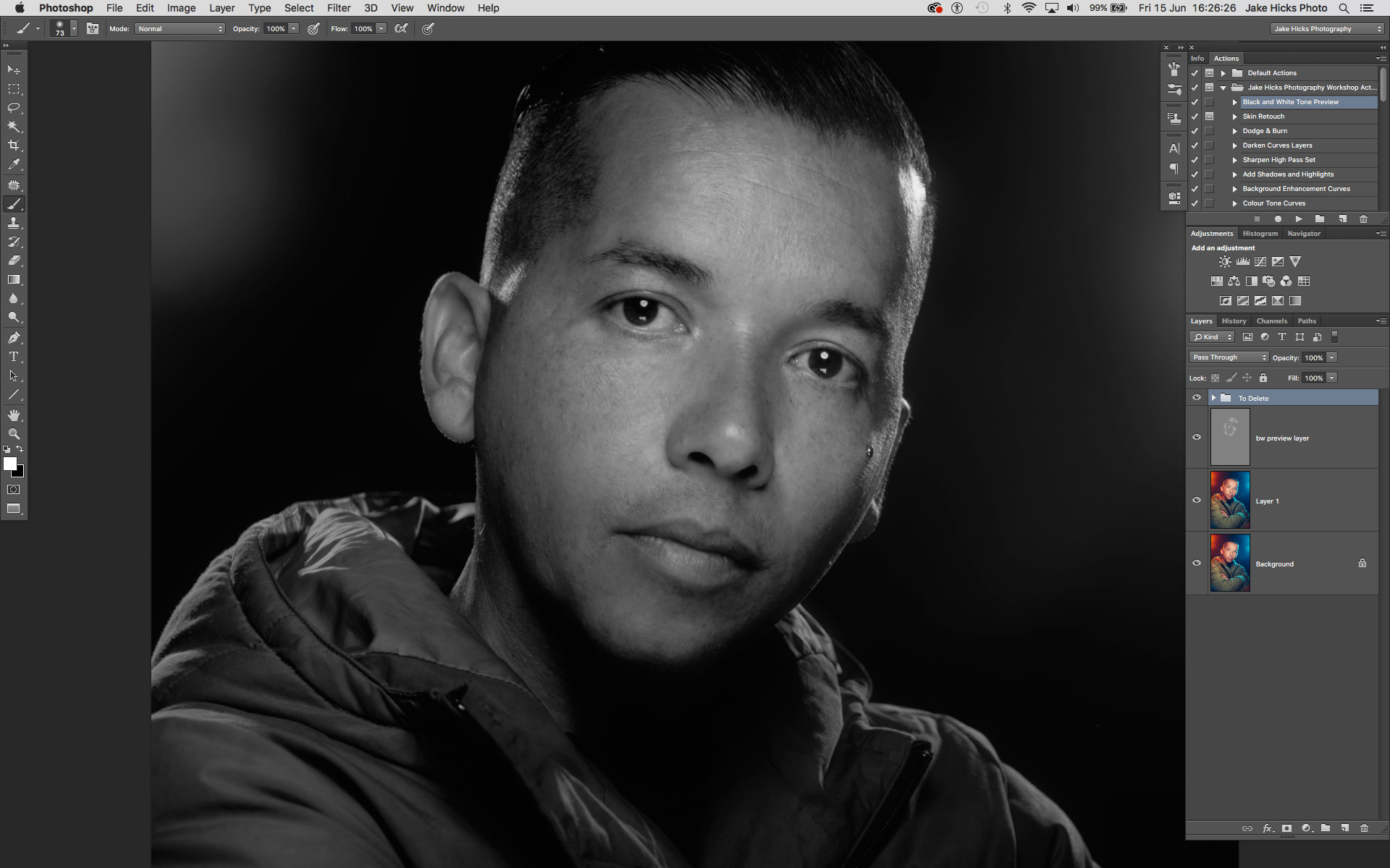
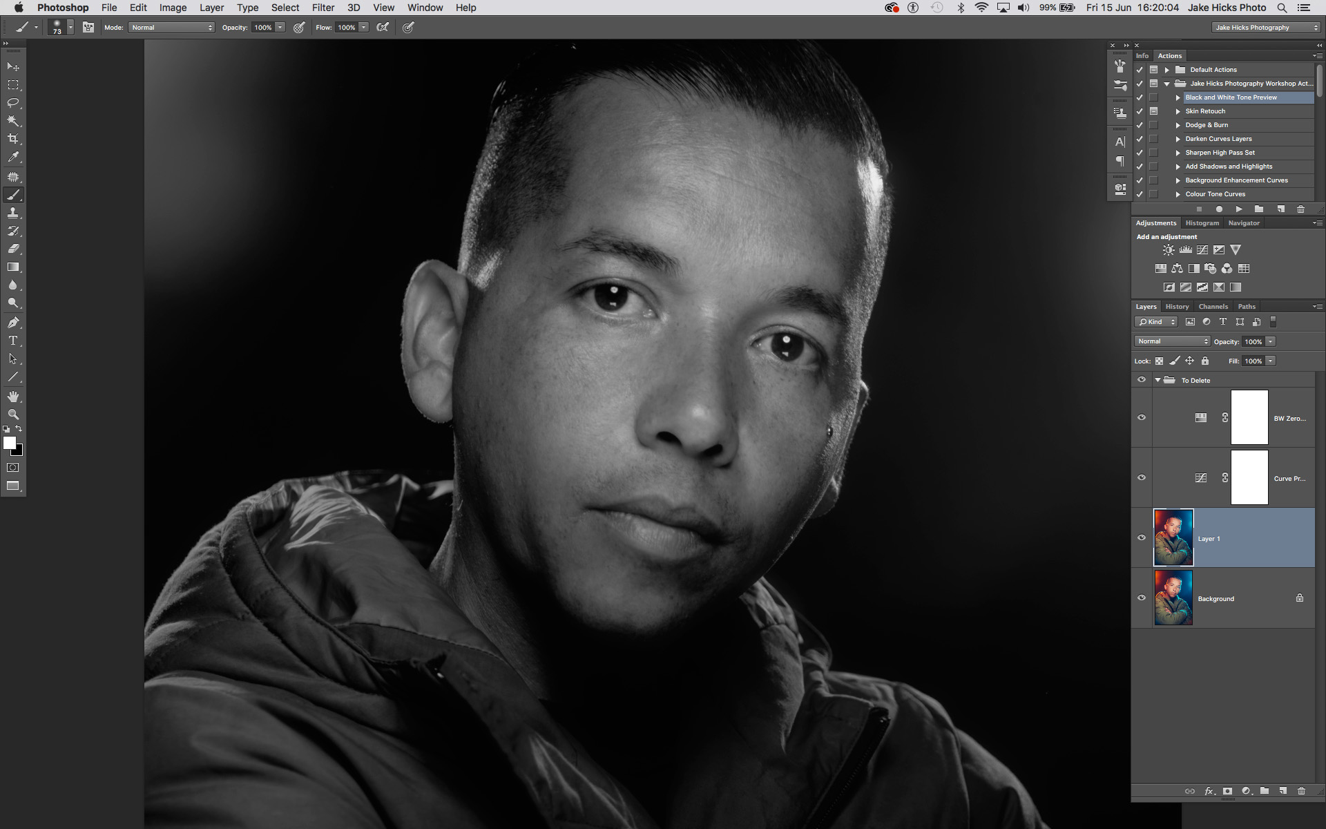
Now we can add our grey layer and begin with our dodge and burn technique using black and white paint. Here's what that looks like below.

Just the grey dodge and burn layer selected.

Just the grey dodge and burn layer selected.

Granted that looks pretty terrifying right now but let's see what that looks like when we turn the background layers on and look at the before and after.

shot with d and b aplied bw.jpg
shot with prev layers.jpg

Okay so above when you scroll from left to right you should be able to see the adjustments I made to the skin with white paint to just lighten some of those darker areas a little.

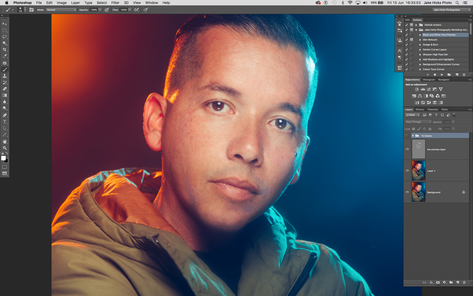
Now that we're happy with this, and we can clearly see in this black and white preview mode that we've kept the tone very clean all over, we can remove the black and white preview and marvel at our great work...

This image shows the image after the grey layer dodge and burn has been applied. Unfortunately, we have now introduced new issues.

This image shows the image after the grey layer dodge and burn has been applied. Unfortunately, we have now introduced new issues.

In the image above you should be able to see what I'm referring too and the problem ares are the discolouration as a result of the dodge and burn. If you're still not sure what I'm referring to then take a look at the highlighted areas below.

The above image highlights the problem areas and this is due to an apparent desaturation of colour thanks to the dodging of the previous layer.

The above image highlights the problem areas and this is due to an apparent desaturation of colour thanks to the dodging of the previous layer.

It should be a little clearer now but unfortunately thanks to our previous dodging layer we have now giving the appearance of very patchy desaturated skin. Thankfully there is a very simple and effective solution. So simple in fact that I was annoyed at myself for not doing it sooner.

Take a look at the image below to see the corrected image.

shot d and b applied.jpg
shot corrected.jpg

So you should be able to see the fix when you scroll from left to right above. Pretty impressive and in mind, damn near perfect especially when you consider how simple the fix was.

The Fix

Now let's take a closer look at how I did it.

NOTE: This is a technique to correct the desaturated look on global scale. If you're after a more localised and precise technique then there are plenty of solutions out there for that. This technique gets you 90% of the way there and focuses on speed over precision.

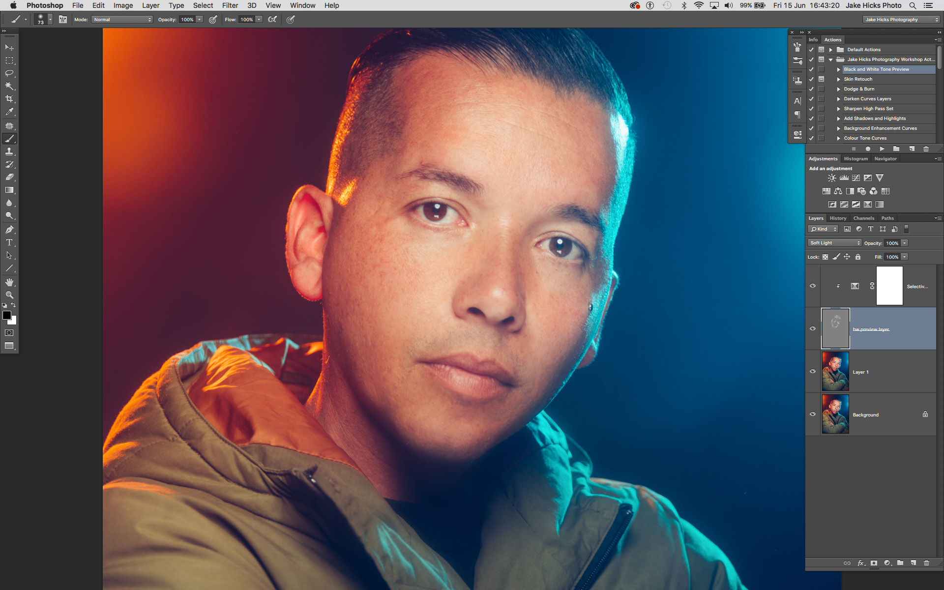
First off you simply need to add a 'selective colour' adjustment layer via;

Image -> Adjustments -> Selective Colour...

shot slective col.jpg

Next up we just need to open up that selective colour adjustments layer and target the white channel.

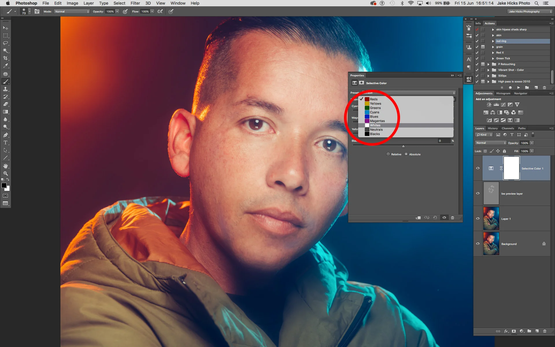
All you do is double click on the left hand side of the layer icon (on the diamond icon) and in the following window go to the colours dropdown menu and choose 'Whites'.

shot sel col whites.jpg

What this effectively does is open up a colour channel mixer and all the colour adjustments we do in here will only effect the whites of our image. The problem with this is that this will effect all the whites in shot below including areas like eyes and teeth etc. We need to lock this Selective colour layer so that it only affects our grey dodge and burn layer below.

To do this we simply hover our mouse between the two layers and with our alt or option key held down we should see our mouse icon change to a downward facing arrow with a white box attached. If we click now the layer above will be locked to the layer below. This results in any changes being made in the above layer now being locked exclusively to the layer below.

If you'd rather apply this via the menus then choose;

Layer -> Create Clipping Mask

clipping mask.jpg

 So now that we have our layer locked to only affect the layer below, we can now begin to make our colour adjustments. If the adjustment menu isn't already open, double click on the diamond icon on the left of the selective colour layer and the colour properties panel will open up. Make sure you have the whites selected and then begin making your colour adjustments.

sel col menu.jpg

We can see in the image above that I have now colour corrected the whites and it's applied those settings to the dodge and burn layer below only. I've corrected the desaturated look by adding a little red (removing cyan), removing a little magenta, adding back some yellow and then darkening all of that a touch by adding a little black.

Let's take one last look at the final image below, both with and without the selective colour layer applied.

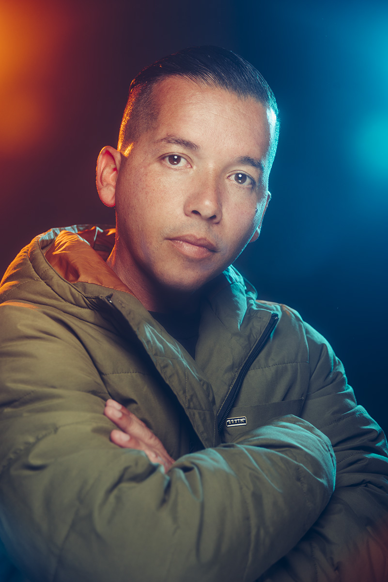
final no selective colour.jpg
final with selective colour.jpg

You should be able to see as you scroll from left to right in the image above just how effective the selective colour layer is to the final shot.

Like I said, these desaturated patches don't always present themselves but they can appear when you're applying heavy dodge and burn adjustments. And what's worse, like we saw in the image above, they often don't present themselves until you turn off the check layers.

But thankfully there is actually a very simple and very easy fix to this and one that I'm so pleased to have finally figured out to be incredibly effective.


Thanks once again for taking the time to read my articles, I certainly appreciate it and feel free to share this with anybody who you think could benefit from it.

Also, If you're new here then feel free to join our very active community of like minded lighting-nerds (c'mon, admit it, you're one of us :D ) on my Facebook page. I'm always discussing lighting ideas and offering feedback on community images over there.

If you'd like to stay up to date on more photography related tips and techniques then sign up to my mailing list where I'll send you a monthly roundup of all my articles (plus signing up gets you a free 10 page studio lighting pdf too :) ). Thanks again and I'll see you all in the next one.


:WARNING: Yet more cool stuff below that's 'almost'* free! -*not free at all


If you're interested in any of my work and would like to know more about how I created some of my shots then why not check out my workshops. Here you can find out everything there is to know about Gelled Lighting, Long Exposure Flash Photography and my entire Post-Pro Workflow. Jake Hicks Photography - Workshops

gel workshop trio.jpg

I've also just released a brand new 22 hour complete Gelled Lighting Tutorial video. I go over everything from studio lighting setups with gels to being on location with gels plus I also go through my complete retouching and post pro workflow. For more details and complete breakdown of everything that's include check out my Coloured Gel Portraits Tutorial

gel trio set video.jpg

I also offer comprehensive coloured gel packs. These collections of gels are what I use day to day to create some of the most highly saturated colours around. If you're looking at getting into gelled lighting or need to get stronger and richer colours in your coloured gel work why not check out my Jake Hicks Photography Gel Packs

gel trio set crop.jpg
Tuesday 06.19.18
Posted by Jake Hicks
 

LEE Filters - Portrait Lighting at Home with Jake Hicks

I often get told by people that they struggle to get the amount of experience they need to improve their studio lighting because they can't always afford to rent a studio. In this short video by LEE Filters I share how you can turn practically any space into your studio and even make this four light setup a reality in your living room with the right amount of light control.

Editorial fashion photographer Jake Hicks demonstrates a range of creative lighting effects that can be easily set-up in the home. He starts with a key light, then he adds a fill light followed by two hair lights. Then he introduces LEE coloured gels and finally achieves some gel flare with a LEE Soft Focus camera filter.

The LEE Filters coloured gels used in this video were from my 'Definitive' Gels pack. More info can be found on my website here: Jake Hicks Photography 'Definitive' Gels Collection

The LEE Filters product that I had in front of my lens to create the flared effect was the LEE Filters 'Soft'. This filter comes in a pack of 5 varying powers and I was using the 'Soft 2'. More details can be found on the LEE Filters website here. LEE Filters - Soft Set

Featured Model: Gabriella Grigo

Tuesday 06.12.18
Posted by Jake Hicks
Comments: 7
 
Newer / Older