• Technique
    • Latest Techniques
    • FREE TIPS
    • Quick Tips
    • Video
    • Site Search
    • Blog
    • Archives
  • Mentoring
  • >Online Workshops<
  • Workshops
  • Studio Lighting Books
  • Contact
    • Newsletter
    • Contact
    • Statement
Jake Hicks Photography
  • Technique
    • Latest Techniques
    • FREE TIPS
    • Quick Tips
    • Video
    • Site Search
    • Blog
    • Archives
  • Mentoring
  • >Online Workshops<
  • Workshops
  • Studio Lighting Books
  • Contact
    • Newsletter
    • Contact
    • Statement

6 Light Beauty and Fashion Lighting Setup

Technique Tuesday 6 light set.jpg

I know it's extremly trendy right now to say that 'one light is all you need', and although in certain situations this is true, a of the time extra lights will likely look better, or at the very least make your life easier.

A six light beauty and fashion setup. What are some of the pitfalls of 'too many lights'? Click to enlarge

Now before you rush to the comments section to proclaim the purity and simplicity of a black and white headshot being lit by a single light as being the very essence of great photography, I'll just add that I agree. Sometimes, complicated lighting and over-lit portraits can certainly get in the way of a subject but conversely, a more visually interesting shot can also be achieved with the addition of more lights to draw in and engage a viewer.

Timeless Lighting

This setup and shoot was done way back in 2009 and although I don't create imagery like this anymore due to my new found love of gels, I've recently received a few messages asking how it was done after a shared an image from this shoot in last weeks article.

I originally shared the results of this shoot all those years ago but like with any great lightning setup, it doesn't age and this setup is just as relevant now as it was almost a decade ago.

All those years ago I was heavily influenced by the great lighting masters like Jill Greenberg and this setup is very heavily inspired by her 'crying baby' portraits that were so incredibly popular back then. I'll get onto what I believe makes this lighting so visually interesting later on, plus I'll also speak about how I would improve this shoot were I to shoot it again today. But for now, let's take a look at the setup.

Sometimes, one light is all you need but there are times when you want to make your image stand out or if you're trying to make a person or product look their absolute best. In this instance, more lights will certainly help you achieve that but how much light is too much light? Click to enlarge


The Setup

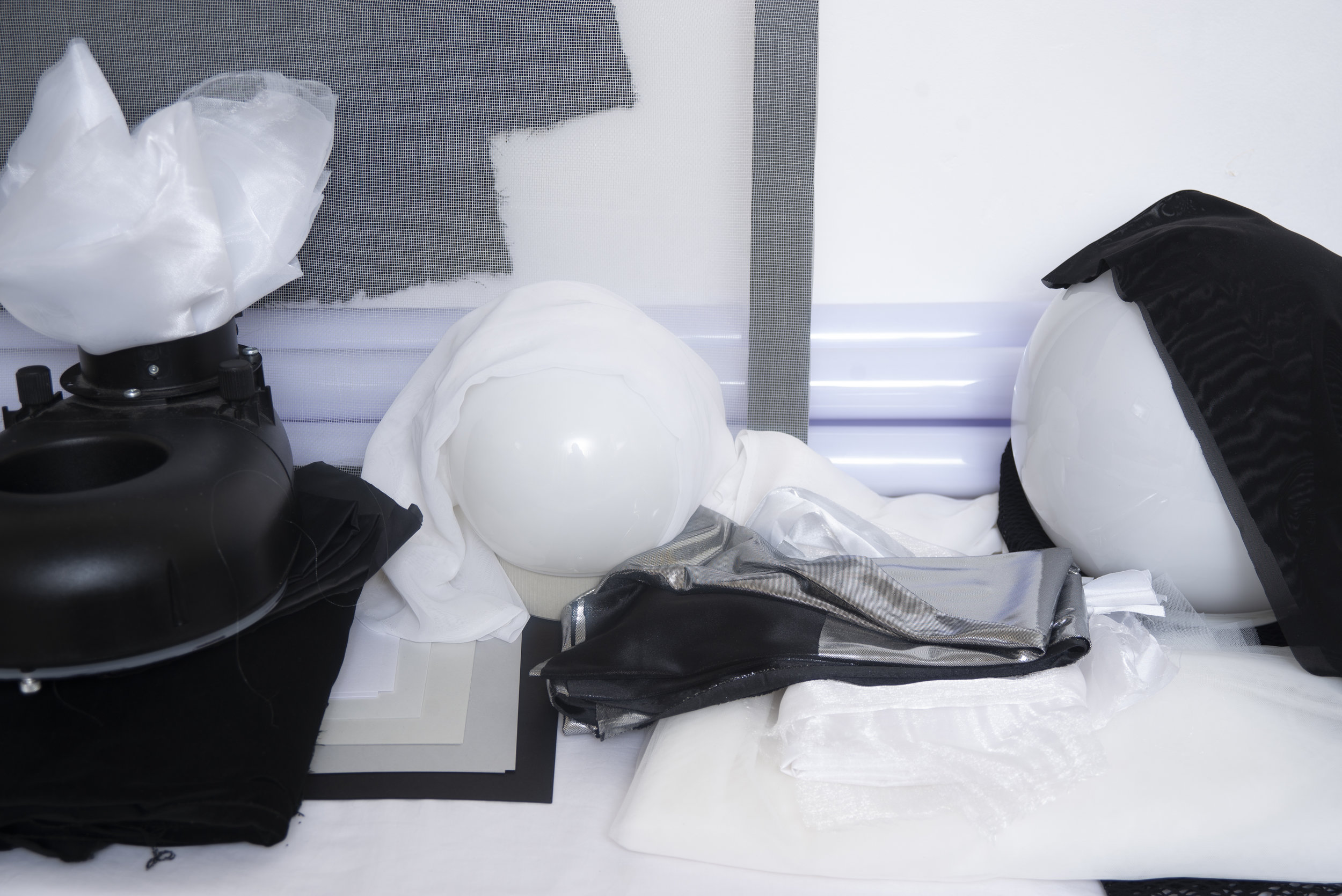
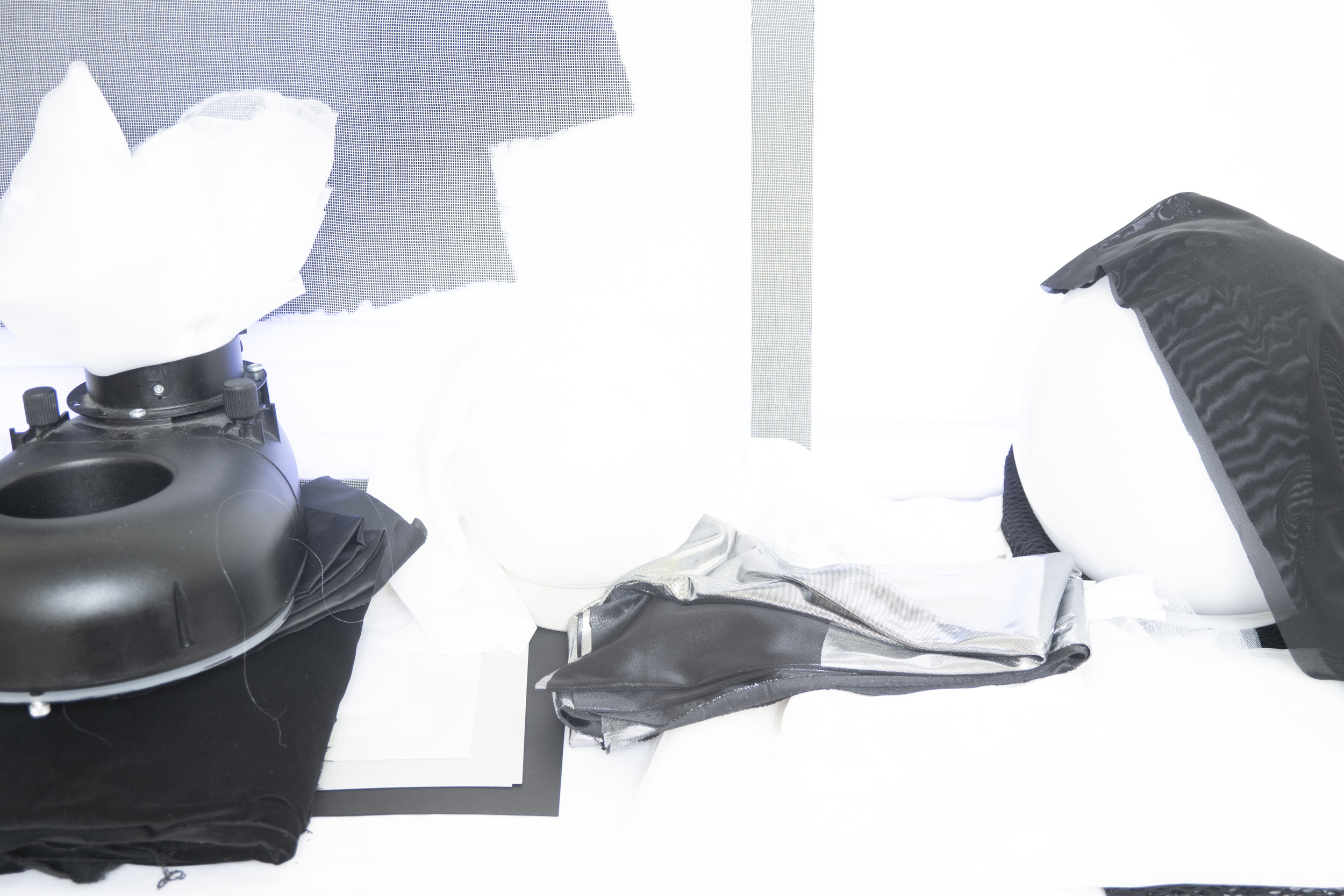
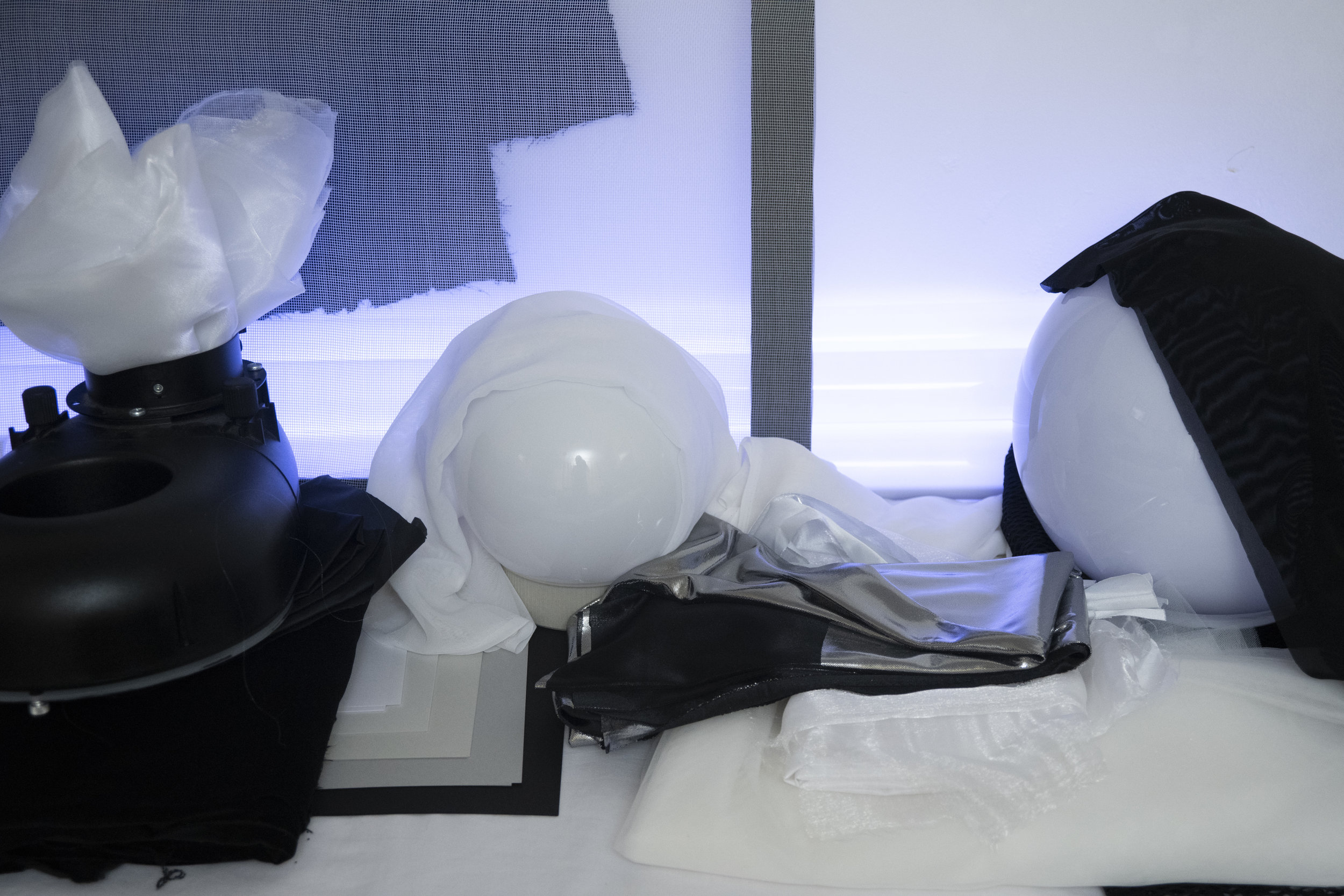
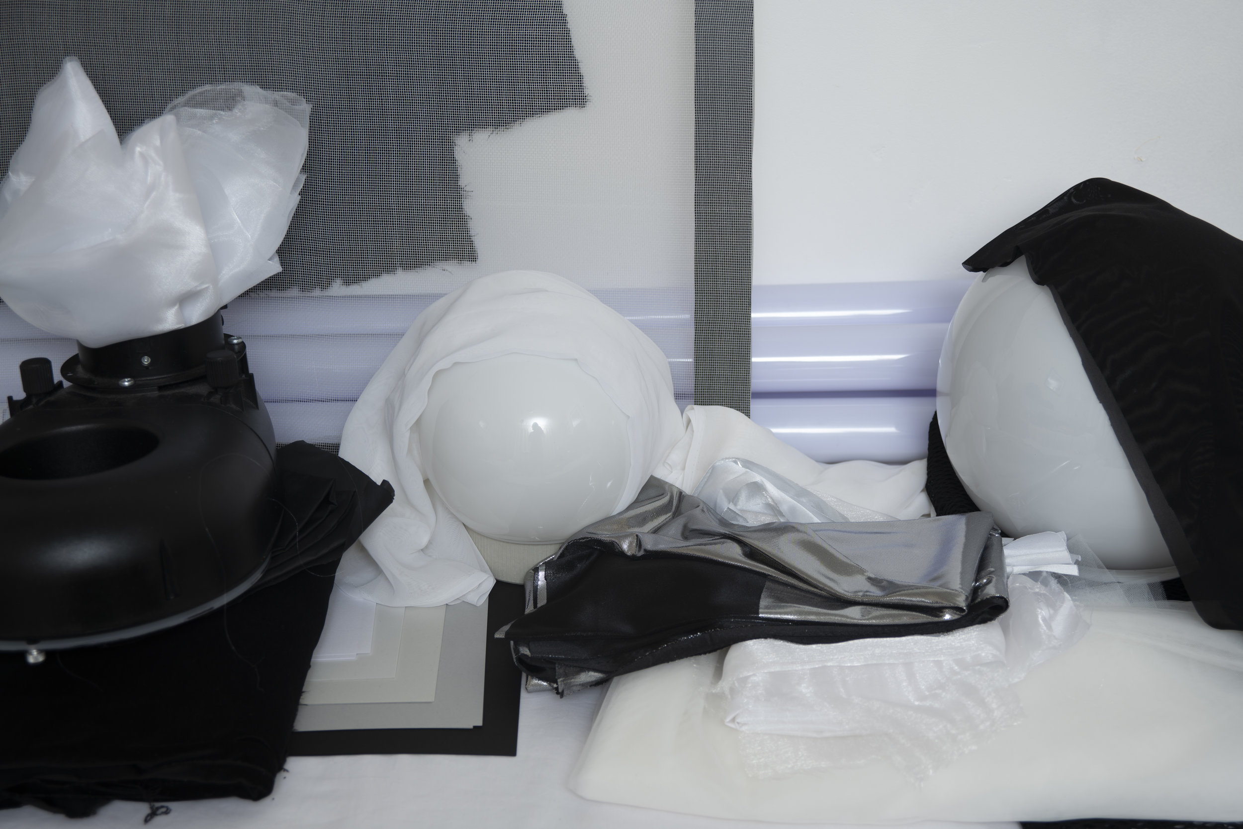
Let's just rip the bandaid off this and say that you'll need a significant about of kit for this one. First and foremost of course is the 6 lights which I appreciate wont be an option for most, but even if you don't get chance to test the lighting itself, you can certainly learn how the lighting setup is built and what lighting objectives I had in mind at the time.

Required Kit

  • 6 Flash Heads
  • 2 Large Grids
  • 2 Small Umbrellas
  • 1 Beauty Dish
  • 1 Ring Flash
  • 2 Black Poly Boards/Flags
  • Plus a small forest of lightstands and of course a backdrop.
  • Note: A boom arm is also preferable. At the time I didn't have a boom in the studio for the back beauty dish/hair light so it was simply stood behind the backdrop. A boom would have give a lot more control and is recommended.

Take a look at the diagram below to see how it all comes together.

In the diagram above we can see how the 6 lights are placed. Click to enlarge

In the image above you should be able to see how all the lights come together.

It's worth noting now that this lighting software does not currently contain a ring light, so instead I have placed a beauty dish in front of the camera to signify it. The resulting light in the top right final image will be a little off due to this though.

We have two reflectors up high behind the subject, a beauty dish up high behind the backdrop plus two small umbrellas acting as fills in the foreground and finally a ring flash in front to act as our key.


Gridded Hair Lights

Let's now break this down to see what each light is doing and why.

First off let's look at those back reflectors that are acting as hair lights.

In the diagram above we can see the gridded lights and what they are doing to models skin. Their purpose is to create a rim of light around the edge of the model to maintain a visual separation from model to background. When placing these lights there are things you should be looking for. Firstly, they should be high enough so as to light the tops of the shoulders and as much of the top of the head as possible. They should also be far enough back behind the model so as to not start lighting the tips of the models nose.


Gridded Beauty Dish

This could be argued as not needed but this final third hair light ensures a complete coverage of all of the skin on the model.

Click to enlarge

In the image above you should see that this third hair light reaches the areas that the other two heads do not. For example on the very top of the head as well as the inside of the models left arm.

When setting this up, it is advised to use a boom if possible. I'd have loved this light almost directly above the models head compared to very much behind her like we see here. Having the light directly above would add a much needed shine to the hair in the crown area of the head. This extra shine adds more depth to a shot and is crucial in doing hair work. As this was not a hair focused shoot we got away with it but the threat of severe lens flare was always an issue as well.


The Fill Lights

Again the addition of these lights might seem minimal but all of these elements add up to a final, complete look.

Click to enlarge

These fill lights are just small silver umbrellas but small softboxes could have also been used instead. In fact, in hindsight the softer light of softboxes is preferable as these are just to add a very subtle amount of light to the underneath shadow areas like chin and eyebrows etc. To make this work, they need to be very low in power to avoid them casting any additional shadows of their own.


The Ring Light

Like I mentioned before, this lighting software does not support the use of a ring flash so I have substituted it for a beauty dish here to illustrate the lighting. As a result, the final lighting appears a little odd due to its size.

Click to enlarge

A ring flash is strangely one of the easiest, yet simultaneously the hardest modifier to use. If you're using a ring flash on its own then it excels in its simplicity and all you have to do is expose the shot for that one light. When you start combining it with other lights in a scene it fast becomes a little trickier as the light starts to stack on top of one another which is never recommended. I advise playing with your distance to the subject as well as with your height to the subject. If you're finding it tricky to make work then turn off all the other lights and experiment with variations in exposure to see what's working.


Constructive Criticism

Take a look at the image above to see what I mean by sculpting shape and form through shadow and highlights. Without this, images can look a little flat and ultimately 'over-lit'.

Take a look at the image above to see what I mean by sculpting shape and form through shadow and highlights. Without this, images can look a little flat and ultimately 'over-lit'.

Thankfully, as the years whizz by I feel that I am getting better and better at reading the light and lighting in general. When I shot this nearly a decade ago, I was 'winging-it' a little. Sure I knew the premise of what I wanted but at that time I hadn't developed the ability to read the light like I can now, so with a little more experience under my belt now there are many things about these shots that I cringe about.

The main area that is making me wince in the images is that these shots are 'over-lit'. This means that I feel the light is overlapping in too many areas resulting in a shot that looks a little visually flat and lacking in contrast. If we look at my more recent work you'll notice that I'm striving for a continued variation from highlight to shadow to illustrate shape and form whereas in these shots, that shape and form is being lost into one continuous exposure.

What I'd Do Differently

So what could I have done differently? Well first and foremost I'd have advised a makeup artist of the exact idea to this shoot and explained that the lighting would be very bright. I'd ask if it would be possible to have a subtle shine to the skin rather then the skin being too matte. This skin shine would help the models facial features like cheek bones, chin and nose stand out giving them that extra dimension. With regards to the lighting; firstly I'd do my best to secure a boom. With this I could have gotten that beauty dish more overhead rather than behind the model, this would have in turn added more shape to the models hair and head. Secondly, I would also have spent more time tweaking the exposure of the ringflash in conjunction with the fill lights. At the moment I feel the fill lights are still a touch too strong which is largely why I feel the images are flat and looking over-lit. Lastly I'd also like to adjust my position with the ring flash, in hindsight I think I was too far away from the model which results in this overpowered lighting effect we see here. Had I come a little closer, I'd have had to turn the power of the ring light down a little which in turn would introduce more shadows towards the edges of the model and thereby bringing back that shape and form I was referring too.


Closing Comments

Like I said at the start of this article, there are going to be times when one light will work but if you want to achieve a more flattering portrait or a more engaging shot in general, multiple lights will be the way to go. But how much light is too much light? This all depends on the situation but we need to be careful that too much light doesn't visually flatten out a shot which results in you losing shape and depth in the subject. As a guide, constantly look for significant variances in highlight and shadow, look for multiple transitions in contrast to help add shape and definition to your subject and as soon as you start to lose this is when you've gone too far.

Thanks once again for taking the time to read my articles, I certainly appreciate it and feel free to share this with anybody who you think could benefit from it. I see a growing stigma around at the moment that says 'true photographers only need one light' and it's frankly laughable. There's a time and place for multiple lights and it's usually only those that swear by one light who can't light effectively with more.

Also, If you're new here then feel free to join our very active community of like minded lighting-nerds (c'mon, admit it, you're one of us :D ) on my Facebook page. I'm always discussing lighting ideas and offering feedback on community images over there.

If you'd like to stay up to date on more photography related tips and techniques then sign up to my mailing list where I'll send you a monthly roundup of all my articles (plus signing up gets you a free 10 page studio lighting pdf too :) ). Thanks again and I'll see you all in the next one.


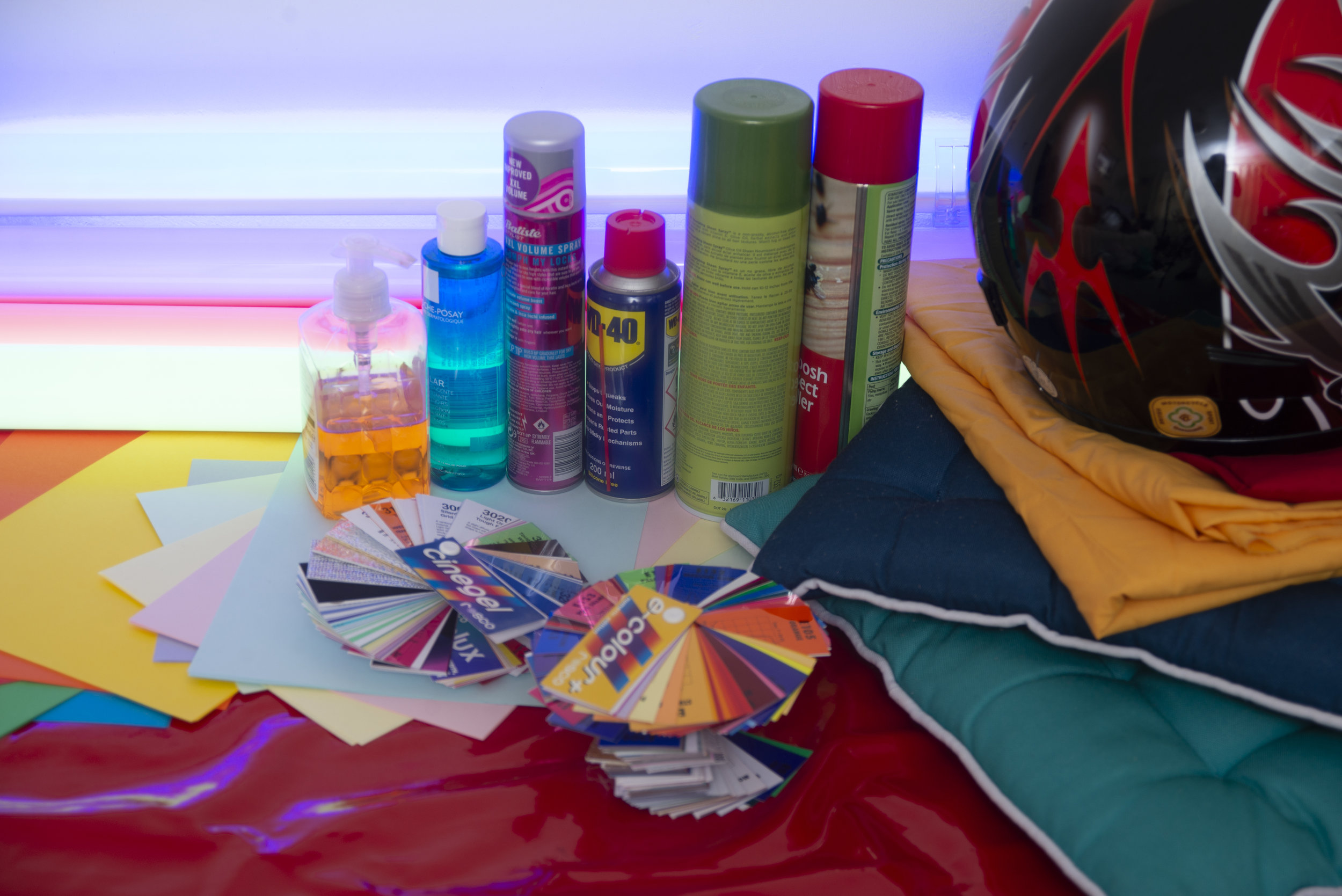
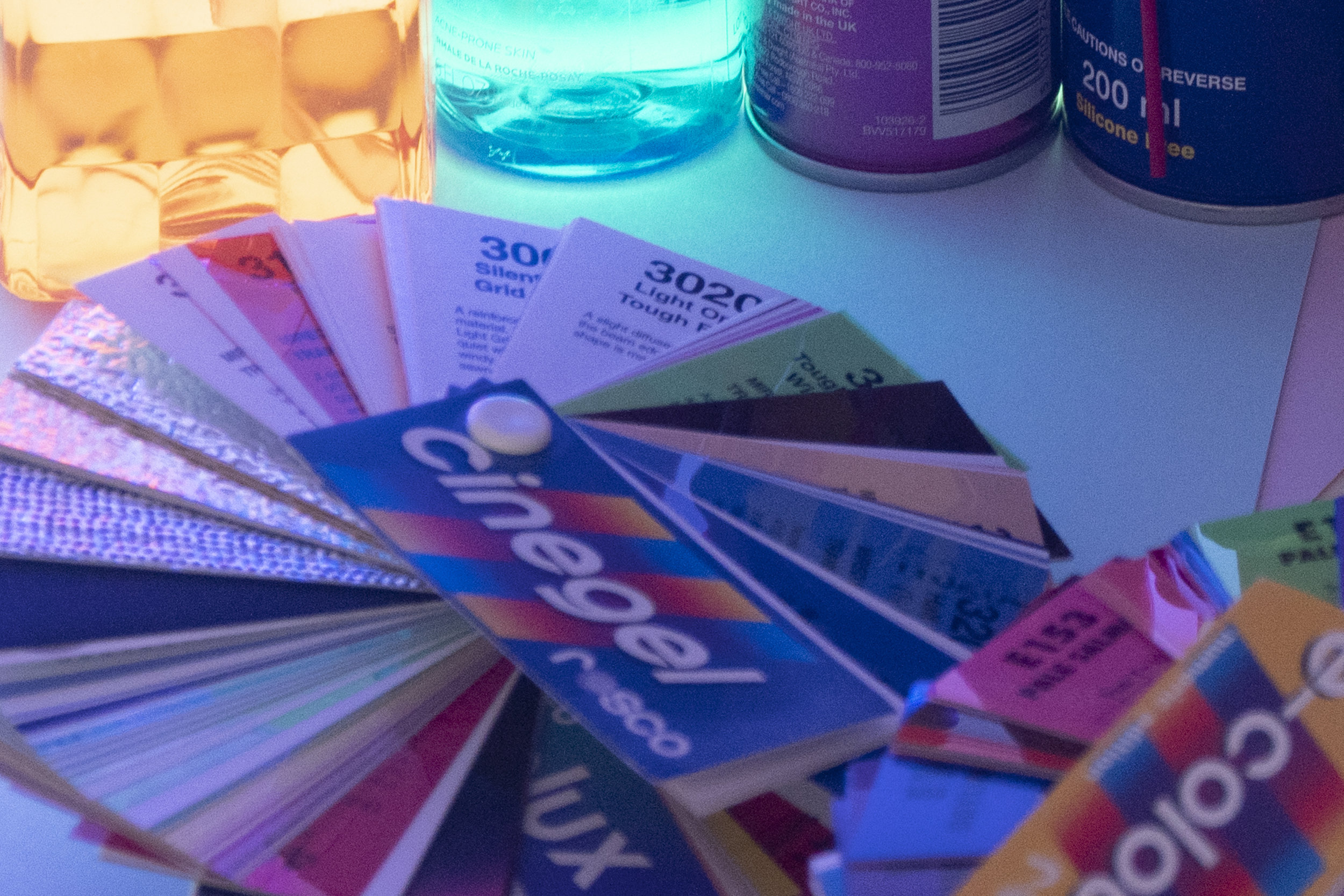
:WARNING: 'Potentially' Game Changing Products Await Below!


If you're interested in any of my work and would like to know more about how I created some of my shots then why not check out my workshops. Here you can find out everything there is to know about Gelled Lighting, Long Exposure Flash Photography and my entire Post-Pro Workflow. Jake Hicks Photography - Workshops

gel workshop trio.jpg

I've also just released a brand new 22 hour complete Gelled Lighting Tutorial video. I go over everything from studio lighting setups with gels to being on location with gels plus I also go through my complete retouching and post pro workflow. For more details and complete breakdown of everything that's include check out my Coloured Gel Portraits Tutorial

gel trio set video.jpg

I also offer comprehensive coloured gel packs. These collections of gels are what I use day to day to create some of the most highly saturated colours around. If you're looking at getting into gelled lighting or need to get stronger and richer colours in your coloured gel work why not check out my Jake Hicks Photography Gel Packs

gel trio set crop.jpg
Tuesday 05.29.18
Posted by Jake Hicks
 

Objective & Subjective Lighting - How I Teach Portrait Lighting

Technique Tuesday Facebook Thumbnail objective lighting.jpg

Like many things in life, there's no right or wrong way to learn photographic lighting... but I do believe there are easy ways and hard ways to not only understand it, but more importantly get better at it.

This is a 6 light setup shot but there is still only one 'objective' light, the one that lights the face. The others are all 'subjective' lights because their power is dictated by what looks good for the subject. For example, if the subject had been…

This is a 6 light setup shot but there is still only one 'objective' light, the one that lights the face. The others are all 'subjective' lights because their power is dictated by what looks good for the subject. For example, if the subject had been wearing a black faux fur coat, I would have increased the power of the edge lights, not because I'd be right or wrong but because I personally think it would look better.

I think every creative discipline evolves, but photography sees more significant jumps in its evolution due to it being so uniquely tied to technology. Every frame we capture is taken with a camera and that camera technology is evolving on a daily basis. Every frame we then have to develop is primarily produced through software and that too evolves on a daily basis. The tools that we use to create our work are constantly changing but I feel that the way we learn some of the techniques associated with these tools do not.

For example take the term 'lighting ratios'. I'm just going to come out and say this but what an utterly redundant term in modern image making. It's a term that only people who want to 'sound clever' use and I've NEVER once heard a professional working photographer use it since the turn of the century. Lighting ratios is simply a term that speaks to the relationship between more than one light, and in my opinion ratios only have value when teaching mindless robots and here's why.

I firmly believe that we should always have a goal when we pick up our camera, and for argument sake let's keep it focused on portraits. When we take a portrait of somebody the goal is to be able to portray them in a certain way. Sure we may want to make them look more beautiful or menacing for example, but to keep it simple we'll say this is a professional portrait and the subject wants to look their best. Most of the time, it's our responsibility to ensure their picture is correctly exposed and that's like saying it's a chefs responsibility is to make sure something is edible. It's a fundamental baseline not a bonus.

Beyond that though, it's up to us as to how we want to craft that shot.

Objective Lighting

Like I said, as a bare minimum to take a portrait, we need to correctly exposure the subjects face. It's this light that I refer to as our 'Objective Light' because it has one goal; to correctly expose the subject and everything else in the shot is open to your interpretation.

In portrait lighting we would refer to this objective light as our key light or our master light that everything else revolves around. It's this key light that I would always setup first, and I would ensure that I am 100% happy with the exposure of this light via a light meter or image review before I move on to setting up additional lights. As a general guide, if you're photographing one subject, there is really only ever one objective light.

The above images show an example of 'objective lighting'. When you have an objective in mind like lighting a person in a portrait there are right and wrong exposures. This objective light must be correctly exposed for you to fulfil your goal of lighting a portrait.

Subjective Lighting

This is where the portrait can get a little more creative because once we have our objective light set up, we can now consider adding additional lighting like fill lights and hair lights for example. It's these additional lights that I refer to as 'Subjective Lights' because their goal is more open to interpretation based on your personal aesthetic.

For example we may want to add a fill light beneath the subject to fill in some of the shadows under the chin. Maybe we want a lot of fill light to create a more beautifying appearance but maybe we only want a tiny amount instead. This is subjective lighting because that creative decision is up to you, there is no right or wrong answer here. Another example might be a hair light placed behind the subject to add a little shine to the hair. Maybe we want that hair light to be quite bright to give us spectral highlights, maybe we want that hair light to be a lot more subtle, that lighting decision is up to you. These are all subjective lights. 

In the images above we can see an example of 'subjective lighting'. Here we can see varying powers of light being applied to the fill light below our model. It's important to point out about subjective lighting that there is no incorrect value, having a lot of fill light is just as acceptable as not much fill light. It's your creative decision on how much light you want in the shot, it is purely subjective.

Here is another set of examples of 'subjective lighting'. In each of these shots we can see varying powers of light being used on our hair lights, none of them are either right or wrong as they are all viable options based on the look you're going for. This is subjective lighting.


Not all Ratios were created equal

After looking at the examples above you might think that ratios would be a perfect way of explaining the difference in exposure between a fill light and key light or the variation in power from the key light to the hair light. And although you'd be technically correct, ratios overlook one fundamental point, the subject.

If our subject was a little older, maybe we'd want more power on the fill light to fill in and soften some wrinkles. Maybe our subject had a very dark and dense afro hairstyle compared to a platinum blonde subject and as a result the afro hair would need a lot more light to give a similar effect to our blonde. Simply setting up a 2:1 lighting ratio shot will not take any of this into account and so we fall into a trap of laziness where we are not reading the scene in front of us, but most importantly we're not making creative decisions on how we might improve that shot based on the subject.

Hair is always a good way of explaining subjective lighting as its variants in texture and colour can fundamentally change the power of lighting you use. Incredibly fine platinum blond hair will clearly require less light to accentuate it than thick…

Hair is always a good way of explaining subjective lighting as its variants in texture and colour can fundamentally change the power of lighting you use. Incredibly fine platinum blond hair will clearly require less light to accentuate it than thick black afro hair. But ultimately that is your choice.

Objective and subjective lighting enables us to consider our goals a little more and to think about what we want to achieve. Yes the objective light has to be correctly exposed but beyond that, we need to make creative decisions with the rest of the lights based on what we want to achieve, not on what we're told is a 'correctly' lit image.


Closing Comments

I know this article may have sounded like I'm bashing on the lighting ratios but I felt it required a harsher tone to get across just how dated certain ways of learning photographic lighting actually are. Yes there are certainly valuable insights to be gleaned from understanding concepts like lighting ratios, but ultimately this is not teaching you how to read light only copy it which is a very dangerous way of learning anything. Being able to look at a scene and understand what you 'want' to achieve and 'why' you want to achieve it is far more useful as you learn how to interpret light in your own way for your own vision.

As photographers we need to be able to adapt to the subjects in front of us and that means we can't be bogged down by what we 'should' do but more by what we think will look best for each and every case. First understand what your 'objective' light is (usually your key light), once you have that correctly exposed it really is up to you as to how you light the rest of the shot.

During this process of adjusting the subjective lights, try to get into the habit of trying drastic adjustments in power. By doing this you may come across a look that you like and that you hadn't thought of, never be afraid to experiment.  A little confidence in your own ability can go a long way and with digital images being nearly free, never be afraid to test and play with exposures no matter how wrong you think they might be.

If it looks good, nobody cares what the lighting ratio is.
 

Thanks as always for checking out my articles, I certainly appreciate your time and feel free to share it with anybody who you think could benefit from this. I feel there are a lot of portrait photographers out there who are lacking confidence because they are in fear of doing something 'wrong' when in reality our ability to make mistakes only enables us to create something new.

Also, If you're new here then feel free to join our very active community of like minded lighting-nerds (c'mon, admit it, you're one of us :D ) on my Facebook page. I'm always discussing lighting ideas and offering feedback on community images over there.

If you'd like to stay up to date on more photography related tips and techniques then sign up to my mailing list where I'll send you a monthly roundup of all my articles (plus signing up gets you a free 10 page studio lighting pdf too :) ). Thanks again and I'll see you all in the next one.


:WARNING: You'll never believe how good the 'practically' free content is below!


If you're interested in any of my work and would like to know more about how I created some of my shots then why not check out my workshops. Here you can find out everything there is to know about Gelled Lighting, Long Exposure Flash Photography and my entire Post-Pro Workflow. Jake Hicks Photography - Workshops

gel workshop trio.jpg

I've also just released a brand new 22 hour complete Gelled Lighting Tutorial video. I go over everything from studio lighting setups with gels to being on location with gels plus I also go through my complete retouching and post pro workflow. For more details and complete breakdown of everything that's include check out my Coloured Gel Portraits Tutorial

gel trio set video.jpg

I also offer comprehensive coloured gel packs. These collections of gels are what I use day to day to create some of the most highly saturated colours around. If you're looking at getting into gelled lighting or need to get stronger and richer colours in your coloured gel work why not check out my Jake Hicks Photography Gel Packs

gel trio set crop.jpg
Tuesday 05.22.18
Posted by Jake Hicks
 

Comparing the Image Quality - Nikon D850 Vs. Nikon D610

Technique Tuesday Facebook Thumbnail d850 d610.jpg

I treat my camera like I treat a car, it has one core job and that's what I use it for with very little interest or need for the peripheral add-ons and shiny new features that may also be part of that product. A car gets you from point A to B and everything else is fairly superfluous, sure there are often quality-of-life features but when it comes down to it, we buy a car for transport not seat warmers and illuminated mirrors in the sun visor. A camera, like a car, is a tool.

For me a camera has that same tool-like function, and in my work I buy and use a camera for that one goal of simply recording what's in front of me. As a result, I keep my cameras a very long time, and just like my cars I usually only replace them when they break beyond repair. This time was different though, I had my backup Nikon D600 and main D610 body for many, many years and although they didn't break beyond repair, I decided to upgrade to the Nikon D850 largely due to seeing a deal that was simply too good to miss.

The Nikon D850 is one of the newest full frame additions to the Nikon lineup and was released late in 2017.

The Nikon D850 is one of the newest full frame additions to the Nikon lineup and was released late in 2017.

Was the upgrade worth it?

Was the upgrade from the D610 to the D850 really worth it though? After all, I just said that I'm only looking for a camera to do one thing and that's take pictures. If the D610 took pictures well, did I really need to upgrade?

So to see if it was worth the upgrade I wanted to check the image quality of both cameras to really see for myself if the D850 hype was justified.

Beyond the marketing rat-race that is the megapixel war of 'more is better', I want to look at the actual results of the photos this D850 can take and as such I wont be focusing on all the fancy bells and whistles like touch screens and D-lighting improvements. I really want to get down to the core of photography here and that to me means image 'quality'.

Granted quality is a very personal and subjective topic and it's also something that is all to often unjustly associated with megapixels. The size of the file produced by the 24 megapixel D610 is 6016 x 4016px. This is clearly dwarfed by the monstrous D850's 46 megapixels and 8256 x 5504px file but is that really the deciding factor of quaintly?

Don't get wrong, megapixels plays a role in quality but just like buying a car with a top speed of 202mph and using it on roads limited to 80mph, it's nice to have but rarely ever actually used or more importantly needed. 99% of photographers will never need a file larger than 8 megapixels due to most of our work never ever leaving our screens. I use to use an old crop-frame, 8 megapixel camera for years commercially and those files were cropped into by art directors and blown up to billboard sizes without anybody noticing or complaining. Mega pixels are nice but ultimately rarely required.

So if I'm not looking at image quality from a megapixel perspective, how will I be judging 'quality' between these two cameras.  I'll be looking at colour depth, tone separation, noise, latitude and anything at all that may influence the visual look and feel of a shot in my field of work, which is primarily artificially lit fashion and portraiture. If any of those factors are interesting to you as a digital photographer (that's a trick question by the way, they're fundamentally crucial to you) then let's get on with the test.

For my test I had to put stats aside and simply test it for myself and the following images and opinions are the results of those image tests. I've include all the images in a larger size on separate page too so you can make your own opinions too. They can be found here if you want to take a look.

If you're interested in the finer details of the D850 I highly recommend checking out these resources as they really know more than I'll ever want to know about the more technical aspects of the camera.

Nikon God, Ken Rockwell D850 Review

All around nice and safe review written by suspected androids DPReview D850 Review

 
The Nikon D610 and its predecessor the D600 served me well for many, many years but it was time to test out its much bigger brother. The D610 was originally released in mid 2014.

The Nikon D610 and its predecessor the D600 served me well for many, many years but it was time to test out its much bigger brother. The D610 was originally released in mid 2014.

The Test

Okay so if you're still here, let's get started with some horrendously unscientific image quality tests and some utterly biased personal opinions.

I set up two tests; the first was a scene of colour that contained varying surfaces, textures and brightnesses and the second was purely a greyscale scene. The colour one was to observe colour depth and how the separation of colour was maintained across various surfaces and the greyscale one was to check highlight and shadow detail as well as moire issues and general exposure latitude.

Each of the scenes was shot on both the Nikon D610 and the Nikon D850 one after another and they were swopped on and off a tripod to maintain as close a match as I could plus they both used the exact same basic 28-105 f4 Nikon lens.

Both cameras were set to shoot their largest raw and if you're not familiar with the image quality on both of these cameras then here's the figures:

Nikon D610

  • Full-frame CMOS sensor
  • Effective pixels - 24 megapixels
  • Max resolution - 6016 x 4016

Nikon D850

  • Full-Frame BSI-CMOS Sensor
  • Effective pixels - 46 megapixels
  • Max resolution - 8256 x 5504

Okay so obviously this is not a fair fight whatsoever and it's no spoiler to say that we're expecting the D850 to outperform the D610 with ease, but the point of the test was to see by how much. Was it worth the upgrade when I was more than happy with D610 originally?


The Image Tests

There are an awful lot of hi-res images that go with this test and it took me an hour just to upload them. To avoid boring most of you I've put the final shots in a separate page so as to not cripple your computer under the weight of them, if you're interested in viewing the actual files then by all means check them out via this separate page here. I was pulling my hair out trying to upload them, so hopefully at least one person will find them useful. For the rest of us, let's look at the tests I performed, the settings and lighting I experimented with and then finally some side by side comparisons of the results.

The colour setup looked like this. The lighting I ended up going with was fairly flat but it was a mix of flash and ambient via the coloured LEDs that can be seen in shot too.

The colour setup looked like this. The lighting I ended up going with was fairly flat but it was a mix of flash and ambient via the coloured LEDs that can be seen in shot too.

The greyscale setup was very similar and all that really changed was the scene and the coloured LEDs were turned to white.

The greyscale setup was very similar and all that really changed was the scene and the coloured LEDs were turned to white.


The Shot Settings

There were six shots taken on each of the two cameras and of each of the two scenes.

The 6 shot settings were as follows:

  1. 1/8th Sec - f5.6 - ISO 200 - With Flash
  2. 1/8th Sec - f5.6 - ISO 200 - No Flash
  3. 1/8th Sec - f5.6 - ISO 200 - Flash overpowered by three stops
  4. 1/8th Sec - f5.6 - ISO 200 - Flash underpowered by three stops
  5. 1/125th Sec - f5.6 - ISO 3200 - With Flash
  6. 1/125th Sec - f5.6 - ISO 30 (Lo.1) - With Flash (this is technically a little overexposed but I really wanted to check the Lo. 1 without altering the other parameters too much)
 

D610 Colour & Greyscale Setups - No post pro changes applied.

1/8th Sec - f5.6 - ISO 200 - With Flash
1/8th Sec - f5.6 - ISO 200 - No Flash
1/8th Sec - f5.6 - ISO 200 - Flash overpowered by three stops
1/8th Sec - f5.6 - ISO 200 - Flash underpowered by three stops
1/125th Sec - f5.6 - ISO 3200 - With Flash
1/125th Sec - f5.6 - ISO 30 (Lo.1) - With Flash
1/8th Sec - f5.6 - ISO 200 - With Flash 1/8th Sec - f5.6 - ISO 200 - No Flash 1/8th Sec - f5.6 - ISO 200 - Flash overpowered by three stops 1/8th Sec - f5.6 - ISO 200 - Flash underpowered by three stops 1/125th Sec - f5.6 - ISO 3200 - With Flash 1/125th Sec - f5.6 - ISO 30 (Lo.1) - With Flash
 

D850 Colour & Greyscale Setups - No post pro changes applied.

1/8th Sec - f5.6 - ISO 200 - With Flash
1/8th Sec - f5.6 - ISO 200 - No Flash
1/8th Sec - f5.6 - ISO 200 - Flash overpowered by three stops
1/8th Sec - f5.6 - ISO 200 - Flash underpowered by three stops
1/125th Sec - f5.6 - ISO 3200 - With Flash
1/125th Sec - f5.6 - ISO 30 (Lo.1) - With Flash
1/8th Sec - f5.6 - ISO 200 - With Flash 1/8th Sec - f5.6 - ISO 200 - No Flash 1/8th Sec - f5.6 - ISO 200 - Flash overpowered by three stops 1/8th Sec - f5.6 - ISO 200 - Flash underpowered by three stops 1/125th Sec - f5.6 - ISO 3200 - With Flash 1/125th Sec - f5.6 - ISO 30 (Lo.1) - With Flash
 

Below are some tight crops of varying elements of the two scenes from each of the two cameras. If you're viewing this on your computer browser then I've aligned the galleries so that the D610 and the D850 images sit side by side, making it far easier for you to compare the respective shots from each of the models.

D610

1/8th Sec - f5.6 - ISO 200 - With Flash
1/8th Sec - f5.6 - ISO 200 - No Flash
1/8th Sec - f5.6 - ISO 200 - Flash overpowered by three stops
1/8th Sec - f5.6 - ISO 200 - Flash underpowered by three stops
1/125th Sec - f5.6 - ISO 3200 - With Flash
1/125th Sec - f5.6 - ISO 30 (Lo.1) - With Flash
1/8th Sec - f5.6 - ISO 200 - With Flash 1/8th Sec - f5.6 - ISO 200 - No Flash 1/8th Sec - f5.6 - ISO 200 - Flash overpowered by three stops 1/8th Sec - f5.6 - ISO 200 - Flash underpowered by three stops 1/125th Sec - f5.6 - ISO 3200 - With Flash 1/125th Sec - f5.6 - ISO 30 (Lo.1) - With Flash

D850

1/8th Sec - f5.6 - ISO 200 - With Flash
1/8th Sec - f5.6 - ISO 200 - No Flash
1/8th Sec - f5.6 - ISO 200 - Flash overpowered by three stops
1/8th Sec - f5.6 - ISO 200 - Flash underpowered by three stops
1/125th Sec - f5.6 - ISO 3200 - With Flash
1/125th Sec - f5.6 - ISO 30 (Lo.1) - With Flash
1/8th Sec - f5.6 - ISO 200 - With Flash 1/8th Sec - f5.6 - ISO 200 - No Flash 1/8th Sec - f5.6 - ISO 200 - Flash overpowered by three stops 1/8th Sec - f5.6 - ISO 200 - Flash underpowered by three stops 1/125th Sec - f5.6 - ISO 3200 - With Flash 1/125th Sec - f5.6 - ISO 30 (Lo.1) - With Flash
 

The Results

Camera Cataracts

So granted that's an awful lot of images and I feel they speak for themselves but I'll share my opinions below for those of you that are interested.

Let's just deal with the elephant in the room right away here. Below is a side-by-side comparison of the same image from both cameras, the D610 is on the left and the D850 is on the right. Frankly, I was utterly stunned, there's no other word for it and I triple checked the file data and file numbers as I was convinced these two shots were not taken under the same lighting conditions and with the same settings.

Below: The image on the left is from the D610 and the image on the right is from the D850

JakeHicksPhotography (1 of 6).jpg

You need no technical acumen to be able to see the difference between these two files. The D610 looks like its been photographed through cataracts and if you're unsure of what cataracts are, let's take a look at the medical definition of them.

"A cataract is a clouding of the lens in the eye which leads to a decrease in vision. Symptoms may include faded colors, blurry vision, halos around light, trouble with bright lights, and trouble seeing at night."

This pretty much describes exactly what is going on with this D610 file. Halos around lights, faded colours and blurry. The D850 in comparison is clean, sharp and shows utterly incredible definition between very contrasting colours resulting in a stunning level of saturation and clarity. I can go on but the D610 is producing nothing short of a very muddied and cloudy image compared to what feels like a bright sunny day from the D850. It was these two images alone that closed the book on the 'was it worth the upgrade' discussion. Even if you don't read any more of this article, I feel you already have more than enough information to make the necessary decision.


Colour Clumping

In the images below, both shots were purposefully underexposed via not firing the flash. In Lightroom the images were brightened by three stops each to compensate and simply exported with no further adjustments.

Below: The image on the left is from the D610 and the image on the right is from the D850

JakeHicksPhotography (2 of 6).jpg

This test really looks at colour latitude and it goes a long way in showing how underexposed colour are rendered out in the files. For example, your subject may be correctly exposed but the background behind may be purposefully underexposed, and this test will show how colours are captured in the shadow areas of a shot.

Take a closer look and you'll see the colours maintain their contrast far more in the D850 file (the right hand image) after they've been corrected. And even in the colours that weren't too underexposed to begin with, like the turquoise bottle at the top of frame, look at how the D610 (left hand shot) clumps colours together to the point that the text is now unreadable. This is how colour banding forms and there's far more colour definition in the D850.


Moire

One other thing that I'd heard talk of was the moire effect being far less noticeable on the D850. Moire is that odd optical illusion that happens when photographing tight patterns like fabric. The shots below are unprocessed crops of two correctly exposed files

Below: The image on the left is from the D610 and the image on the right is from the D850

JakeHicksPhotography (1 of 6)-2.jpg
JakeHicksPhotography (1 of 6).jpg

In fairness to the D610, I can see very little difference between the two files where moire is concerned. Look at the crumpled white fabric at the top of this frame to see for yourself. Again, it's also worth noting the contrast halos appearing here again even though there is no colour involved. Look at where the grey paper meets the black paper and in the D610 file you'll see that frustrating cloudy effect once again. D610 file on the left, D850 on the right.


Exposure Latitude

Lastly, let's look at the exposure latitude and in the images below I've purposefully overexposed a shot by three stops and then reduced the exposure in Lightroom by three stops to compensate. This is a crude but effective method of forcing extremes in exposure in a single file to see how lights and darks perform when being badly lit. The images were exported with no further adjustments.

Below: The image on the left is from the D610 and the image on the right is from the D850

JakeHicksPhotography (3 of 6)-2.jpg

In fairness again there's very little difference in these two shots. The D610 shot is on the left and the D850 shot is on the right. The only noticeable difference is a slight increase in colour in the D610 due to the aggressive exposure compensation. This is very common and we're used to seeing it in high ISO images but it can be forced in tests like these too. Even with three stops of compensation, the D850 has very little, if any colour increase whatsoever in the pixels. The blacks and whites on the left and right are incredibly clean and the contrast is maintained which can be seen in the white fabric in the top left. 


JakeHicksPhotography (1 of 4)sq.jpg

Closing Comments

In all honestly I can go on and on discussing the image quality differences at varying ISO's, why I'll never take my D850 off ISO Lo.1 and more, but as you expected, the D850 excels in all of them when compared to a camera from a few years ago. So was the upgrade worth it? Yes, and although I was initially very sceptical of the new D850 thanks in part to Nikons obscure and frankly very poor marketing methods of selling the 'quality of life' features over actual image quality! Thankfully this test has proven itself beyond my wildest expectations to be a significant upgrade for what really matters for photographers, image quality and not the damn tilting touch screen or improvements to the 'picture modes'!

The biggest factor by far is that cataract/haloing effect and the subsequent issues it produces. With all light seemingly bleeding and bouncing around on that old chip of the D610, it leads to a lack of contrast, a lack of saturation and of course and very significant lack of sharpness. Truth be told, I was aware of this effect happening in my images on my D600 and D610, but I always blamed the lenses and never the camera. I now know better and although I can't say if this problem was fixed in the D800 and D810 it's certainly fixed now in the D850.


I'd love to discuss these images further and although this article was supposed to be a quick camera test article, the results threw me way off and I had to investigate further, resulting in this monster article. If you're interested then I urge you to compare some of the other shots I've provided here too. Notably, look at how the two cameras perform at ISO 3200 and also look at how the D850 performs at ISO 200 compared to ISO 30 (Lo. 1). That quality at Lo.1 is nothing short of incredible which is counter to what I hear people saying about always trying to shoot at the native ISO for the best quality.

If you have any questions or points to add, I'd love to hear them in the comments below. Also if something doesn't make sense, I apologise but let me know and I'll explain it further or correct something if need be.

Also, If you're new here then feel free to join our very active community of like minded lighting-nerds (c'mon, admit it, you're one of us :D ) on my Facebook page. I'm always discussing lighting ideas and offering feedback on community images over there.

If you'd like to stay up to date on more photography related tips and techniques then sign up to my mailing list where I'll send you a monthly roundup of all my articles (plus signing up gets you a free 10 page studio lighting pdf too :) ). Thanks again and I'll see you all in the next one.


:WARNING: Let me save you some money, don't buy a D850, check out these cool, utterly unrelated alternative purchases instead.


If you're interested in any of my work and would like to know more about how I created some of my shots then why not check out my workshops. Here you can find out everything there is to know about Gelled Lighting, Long Exposure Flash Photography and my entire Post-Pro Workflow. Jake Hicks Photography - Workshops

gel workshop trio.jpg

I've also just released a brand new 22 hour complete Gelled Lighting Tutorial video. I go over everything from studio lighting setups with gels to being on location with gels plus I also go through my complete retouching and post pro workflow. For more details and complete breakdown of everything that's include check out my Coloured Gel Portraits Tutorial

gel trio set video.jpg

I also offer comprehensive coloured gel packs. These collections of gels are what I use day to day to create some of the most highly saturated colours around. If you're looking at getting into gelled lighting or need to get stronger and richer colours in your coloured gel work why not check out my Jake Hicks Photography Gel Packs

gel trio set crop.jpg
Tuesday 05.01.18
Posted by Jake Hicks
Comments: 11
 

Comparing the Files - Nikon D850 Vs. Nikon D610 - All The Files

This page simply houses all the files and crops from the original post for your viewing pleasure. If you've found your way here without seeing the original article then that can be found here.


The Shot Settings

There was six shots taken on each of the two camera of each of the two scenes. The shot settings were as follows:

  1. 1/8th Sec - f5.6 - ISO 200 - With Flash
  2. 1/8th Sec - f5.6 - ISO 200 - No Flash
  3. 1/8th Sec - f5.6 - ISO 200 - Flash overpowered by three stops
  4. 1/8th Sec - f5.6 - ISO 200 - Flash underpowered by three stops
  5. 1/125th Sec - f5.6 - ISO 3200 - With Flash
  6. 1/125th Sec - f5.6 - ISO 30 (Lo.1) - With Flash (this is technically a little overexposed but I really wanted to check the Lo. 1 without altering the other parameters too much)

Colour Test

The following shots were untouched and simply exported straight from Lightroom at a size of 4000x2670px and saved as max quality jpegs.

Nikon D610

Camera settings for each shot is detailed under each shot. -Click to enlarge-

JakeHicksPhotography (3 of 6).jpg
JakeHicksPhotography (6 of 6).jpg
 

Nikon D850

Camera settings for each shot is detailed under each shot. -Click to enlarge-


Colour Test - Crop 01

The following shots were adjusted to compensate for under and over exposed shots. Crops were also applied to all shots to show detail in the colours, highlight and shadows. The cropped files were then exported straight from Lightroom at a size of 4000x2670px and saved as max quality jpegs.

Nikon D610

Camera settings for each shot is detailed under each shot. -Click to enlarge-


Nikon D850

Camera settings for each shot is detailed under each shot. -Click to enlarge-


Colour Test - Crop 02

The following shots were adjusted to compensate for under and over exposed shots. Crops were also applied to all shots to show detail in the colours, highlight and shadows. The cropped files were then exported straight from Lightroom at a size of 4000x2670px and saved as max quality jpegs.

Nikon D610

Camera settings for each shot is detailed under each shot. -Click to enlarge-


Nikon D850

Camera settings for each shot is detailed under each shot. -Click to enlarge-


Greyscale Test

The following shots were untouched and simply exported straight from Lightroom at a size of 4000x2670px and saved as max quality jpegs.

Nikon D610

Camera settings for each shot is detailed under each shot. -Click to enlarge-


Nikon D850

Camera settings for each shot is detailed under each shot. -Click to enlarge-


Greyscale Test - Crop 01

The following shots were adjusted to compensate for under and over exposed shots. Crops were also applied to all shots to show detail in the colours, highlight and shadows. The cropped files were then exported straight from Lightroom at a size of 4000x2670px and saved as max quality jpegs.

Nikon D610

Camera settings for each shot is detailed under each shot. -Click to enlarge-


Nikon D850

Camera settings for each shot is detailed under each shot. -Click to enlarge-


Greyscale Test - Crop 02

The following shots were adjusted to compensate for under and over exposed shots. Crops were also applied to all shots to show detail in the colours, highlight and shadows. The cropped files were then exported straight from Lightroom at a size of 4000x2670px and saved as max quality jpegs.

Nikon D610

Camera settings for each shot is detailed under each shot. -Click to enlarge-


Nikon D850

Camera settings for each shot is detailed under each shot. -Click to enlarge-


Sunday 04.29.18
Posted by Jake Hicks
 

Top 5 ways to achieve shiny skin in your photos

Technique Tuesday Facebook Thumbnail shiny skin.jpg
Shiny skin in photos can look amazing and even if you're not shooting sports or swimwear, the shiny skin can make colours and lighting really pop.

Shiny skin in photos can look amazing and even if you're not shooting sports or swimwear, the shiny skin can make colours and lighting really pop.

Shiny skin in photos is becoming more and more popular all the time and whether it's for sports, beachwear or even regular fashion, that metallic skin sheen is being seen everywhere. Long gone are the days where we we're desperately trying to matt-down skin to avoid the shine, now makeup artists are regularly being asked to produce the 'dewey' skin look.

In the past we were conscious of our cameras highlight limitations and we had to be very wary of oily skin clipping the highlights in our shots. Now with cameras being far more capable, we love that skin sheen as it helps to sculpt and shape the body through highlight and tone that's simply not possible with dry, flat looking skin.

So how do we enhance the skin shine?

The following five tips are what I use but bear in mind that these tips are really for adding shine to the body, not the face. If you're after the shiny, dewey face then a professional makeup artist is definitely recommend. the reason for this is that the face will have a lot of makeup on it and us adding oils on top of that to get the shine will very quickly destroy and ruin the makeup beneath. Makeup artists generally have to use an entirely different process to add shine to skin that also has makeup applied but if you're after some quick tips to add shine to the rest of the body read on.

JakeHicksPhotography (1 of 4)sq.jpg

1. Baby Oil

This is the classic 'go-to' skin shine solution. It's very cheap, very readily available and requires no knowledge to make it work. Simply ask the model to apply liberally to the skin and you're ready to shoot. One thing I will add is that different skin types will require more regular applications. Some naturally oily skin will just need one application but other dryer skin types will need the oil to be topped up every few minutes as it gets rapidly absorbed.

Johnsons Baby Oil - Amazon

 
JakeHicksPhotography (4 of 4)sq.jpg

2. Glycerin

This one is a little less well known but one that is incredibly effective. Glycerin can often be found in pharmacies and chemists as it's often used to treat very dry skin like eczema sufferers. Glycerin is clear, odourless and (apparently) sweet in taste, plus it's also very cheap. The key quality that we're looking for is that it's very thick... like spoon thick. This viscosity results in a perfect combination for what we're after when it comes to creating shiny skin. Food photographers will often use glycerin to simulate those perfect beads of water on fruit that you see in shots, so if you're after a sport-look with a lot of shiny sweat on the skin, glycerin is the solution.

Glycerin - Boots

 
JakeHicksPhotography (2 of 4)sq.jpg

3. After Shower Mist

This one is a little harder to describe and get a hold of but if you find a good one, this mist can produce some great shiny skin looks. The premise behind this product is that it produces a very fine, clear mist straight out of a can making it very fast and easy to apply but also results in an even spread all over the skin.

The core thing you're looking for in this product is that it's 'clear' when you spray it. I have tried countless mists in the past but they often have a moisturising element added to them which results in a white spray that needs to be rubbed in, you need to find one that sprays totally clear. I'm using a relatively pricey one here but the simple water-in-a-can ones are cheaper and also work.

Aveeno Shower Mist - Tesco

 
JakeHicksPhotography (3 of 4)sq.jpg

4. Hair Sheen Spray

This sheen spray gives a similar look to the baby oil but has the benefit of not needing to be applied by hand. The downside to baby oil is that it needs to be rubbed into the skin by hand which can reduce the skin shine as it gets absorbed, this spray negates that as it can be sprayed from a distance without requiring to be rubbed in. This sheen spray is designed for extremely dry hair and it's core ingredient is actually olive oil meaning that once your model is covered in this, it will stay on the skin an awful lot longer than baby oil before being absorbed. This is a specialist hair spray but it is often found in most afro caribbean hair shops or in the world-beauty section of larger stores including super markets.

ORS Olive Oil Nourishing Spray - Superdrug


5. The Glycerin/Water Combo

As I mentioned above, the glycerin is very thick and globular so although great for shine it can be a real pain to apply to the body. As a result I have a glycerin and water mix in a separate water spray holder that I can spray onto the body with a lot more ease. You can experiment with various amounts of each yourself but I've found three parts water, one part glycerin is a good place to start. I also find this mix can be a great addition to skin that already has baby oil applied to it. Once the skin has been oiled first, this can then be sprayed on top to get that beaded water effect.

Pro Tip: If you haven't used the solution in a while, just give it a shake to make sure the glycerin and water are mixed and spray as you normally would.

mixing glycerin beaded water small copy.jpg
 
JakeHicksPhotography (3 of 5).jpg

Closing Comments

As always, I really appreciate your time in checking out this article. I hope you found a couple of these shiny skin techniques useful but let me know if you have any alternatives :)

Also, If you're new here then feel free to join our very active community of like minded lighting-nerds (c'mon, admit it, you're one of us :D ) on my Facebook page. I'm always discussing lighting ideas and offering feedback on community images over there.

If you'd like to stay up to date on more photography related tips and techniques then sign up to my mailing list where I'll send you a monthly roundup of all my articles (plus signing up gets you a free 10 page studio lighting pdf too :) ). Thanks again and I'll see you all in the next one.

-cut out and keep- (click to enlarge)


:WARNING: Sales pitch ahoy!


If you're interested in any of my work and would like to know more about how I created some of my shots then why not check out my workshops. Here you can find out everything there is to know about Gelled Lighting, Long Exposure Flash Photography and my entire Post-Pro Workflow. Jake Hicks Photography - Workshops

gel workshop trio.jpg

I've also just released a brand new 22 hour complete Gelled Lighting Tutorial video. I go over everything from studio lighting setups with gels to being on location with gels plus I also go through my complete retouching and post pro workflow. For more details and complete breakdown of everything that's include check out my Coloured Gel Portraits Tutorial

gel trio set video.jpg

I also offer comprehensive coloured gel packs. These collections of gels are what I use day to day to create some of the most highly saturated colours around. If you're looking at getting into gelled lighting or need to get stronger and richer colours in your coloured gel work why not check out my Jake Hicks Photography Gel Packs

gel trio set crop.jpg
Tuesday 04.24.18
Posted by Jake Hicks
Comments: 3
 
Newer / Older