We all love to save some money and never more so than after the financial onslaught of Christmas. In todays post I look at how I cobbled together a couple of tech-items to make my DIY GoPro ring light for less than £10/$15.
The original problem I had to solve was the fact that the GoPro cameras are tricky to use in conjunction with additional lighting on the go. Ordinarily you don't need additional light when you're windsurfing in seas of the Caribbean or hang-gliding over the cliffs of Yosemite, but for those off-days when you're not risking life limb for YouTube views, it's nice to put the GoPro to use in other areas too and that's where I encountered my problem. How to light a video portrait whilst on the move?
With your feet firmly planted on dry land, the GoPro is also an incredibly versatile video camera and in the newer models like the GoPro Hero 6, the manual functionality is pretty impressive too, so not why use it? It's not just for extreme sports after all.
I had to shoot some short filler video sequences of other people and also film some selfie-style pieces to camera as well. The issue comes with the lighting of the person in the shot, sure you can adjust and compensate the exposure a little in the camera settings but balancing the ambient light and the subject light was becoming tricky whilst on the move. This is where the ring light came in to save the day as it did a perfect job of seamlessly lighting the subject whilst still looking natural enough with the ambient light behind the subject whilst they moved through their environment.
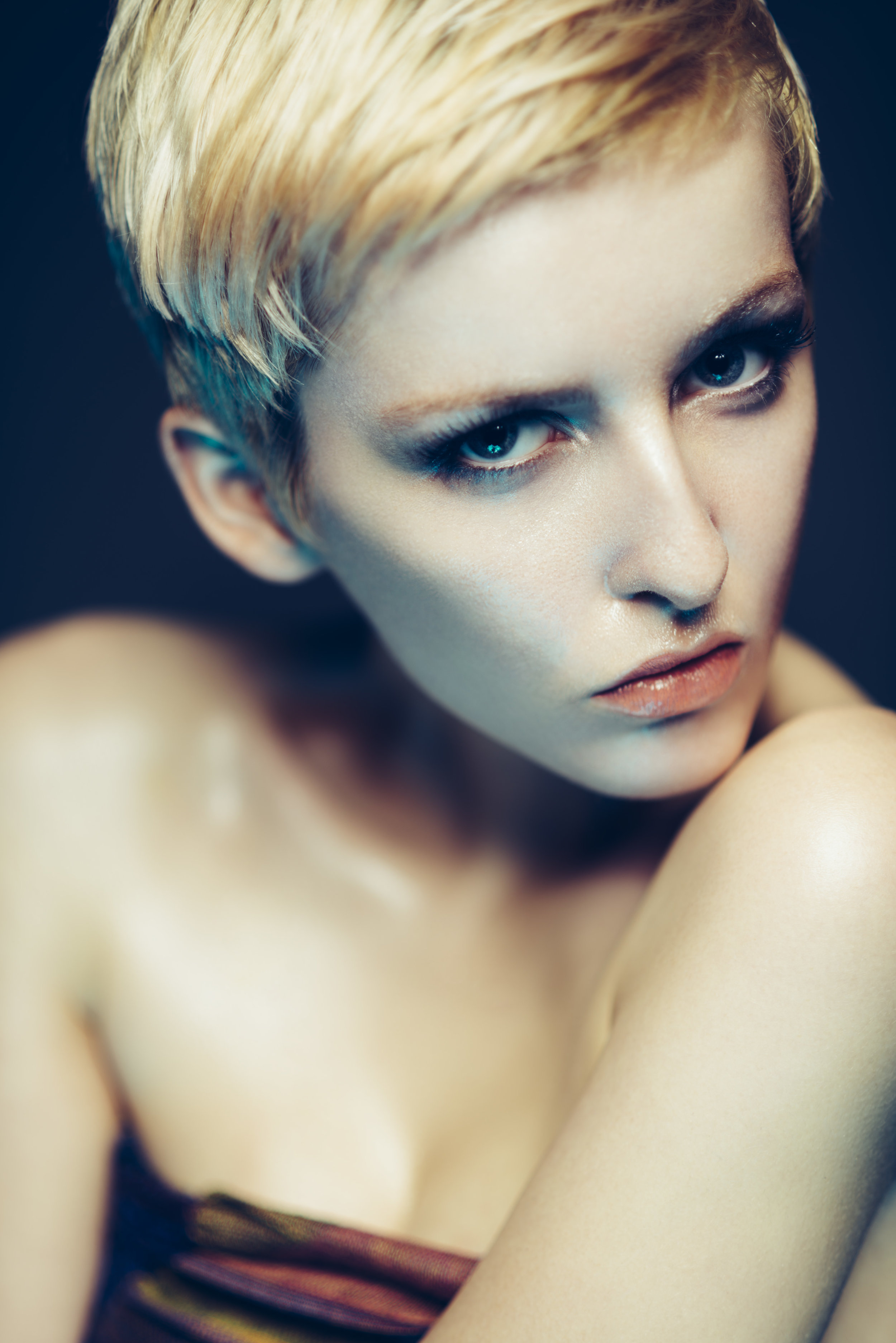
We don't have the final footage to share here just yet but here's myself illustrating the results with the ring light turned on and the ring light off on the street via a couple of stills below.
Raw GoPro Hero6 shots taken without ring light attached.
Raw GoPro Hero6 shots taken WITH ring light attached.
It should be pretty clear to see that when the ring light isn't switched on, the subjects face is pretty dark compared to the surroundings (and pretty unflattering if I might add). But when the ring is turned on, the lighting on the subjects face is completely transformed. The light is a lot more 'forgiving' on the subjects complexion but it's also fairly similar to the surrounding environmental light, making this a very useful tool to have in your bag if the need arises, especially as it will only cost you a tenner.
What do you need?
GoPro

GoPro Hero 6
First up you'll obviously need your GoPro. I'm guessing that if you're checking out this article then you already have one but in fairness this little tech-combo will work on any mini-lensed camera like a phone for a example. I'll share images of the mobile phone alternative down below if you're interested.
The ring light I'm using here is actually specifically designed for the GoPro Hero 3+/4 and 5 Session cameras but it works fine on my GoPro Hero 6 as you can see here with a little help.
Your Ring Light
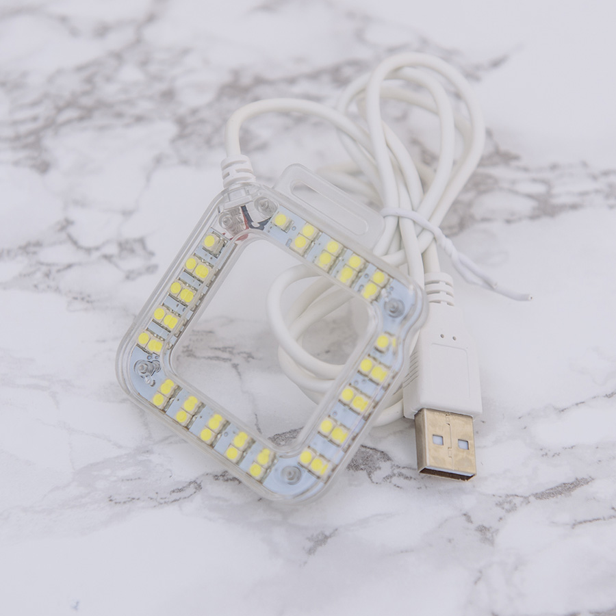
LED Ring Light
Obviously you'll need your ring light and here's the one I used with some links below. Like I mentioned above, this one is designed for the slightly larger lens housing in the older GoPro's but works absolutely fine on the newer Hero6 like you see me using here.
I've provided a link to the cheaper Chinese version here which is exactly the same product but will take a couple of weeks longer to arrive, or pay a couple of quid more and get it in a couple of days.
Cheap + Long arrival time (product posted from China)
Almost as Cheap + Get it in a couple of days (if you're UK based)
Your Power Pack

USB Power Bank
Once you have your ring light you'll soon realise it's completely useless without some power and oddly enough the ring light is USB powered. I say oddly as it's unlikely that you'll be using this ring light and GoPro combo with a laptop tucked under your arm. The next best thing is a mini USB power bank and thankfully, once again they can be obtained very cheaply.
The power packs actually provide a couple of benefits; firstly they don't require you to be plugged into anything leaving you to move around freely without hindrance and secondly, they're actually pretty lightweight. I think had this setup required AA's or AAA batteries the whole thing would be a lot heavier. Plus as a bonus point, the power bank acts as a mini-handle whilst attached so it makes the whole item a lot easier to hold and manoeuvre around.
Plus these power banks can be recharged as many times as you like so you only have to buy this one battery and you're done. Remember that this will also power and recharge any device that has a USB cable like smart phones and tablets etc so it's always going to be useful on or off the camera.
Here's a link to the one I used 2600 mAh USB Power Bank
Attachments

Elastic Bands
This is as basic as it comes really, just grab a bunch of elastic bands and you're done. Try to obviously get some that are going to hold the items together fairly firmly though. The ring light does actually come with a velcro strap that wraps around the camera and does a pretty good job of holding it on. The only down side is that it covers the screen on the back. If you're not bothered about seeing the screen then just use that instead.
Now What?
Once you have all the pieces, simply hang them off one another and you're done :D
Step 1

Attach the power bank to the side of the GoPro like you see here with a couple of sturdy elastic bands.
Step 2

Attach the ring light to the front of the GoPro via the attachment points provided.
Step 3

Lastly simply wrap the remaining cable around the 'handle' that is the power bank and put a final elastic band at the bottom to stop it from unravelling. Make sure to leave enough cable at the the end so that you can plug it into the power bank to turn it on.
You're Done

It really is as simple as that. You now have your ring light attached alongside the power bank that doubles up as a handle too.
One last tip, in the settings of the camera of the Hero 6 (not sure on other models) you can adjust the exposure compensation. This is the best way in my experience to manage any brightness issues you might encounter and I had mine at between EV-1 and EV-2.
For those that are interested, the brightness of this LED lamp is measured at f2.8, 1/60th sec, ISO 400 when the camera is at arms length from the face (approx. two feet).
Bonus Tip
For those without a GoPro or if you just wanted to use the ring light with varying cameras, here's how I attached mine to my iPhone.

So there you have it, a perfect little ring light for your GoPro for under £10 which actually does a really good job of lighting the subject at arms length when you're on the move or on location with surrounding ambient light. I'm not sure how long the battery lasts as I haven't run mine out yet, but seeing as it's a just a handful of small LEDs I think the battery life will likely easily match that of the GoPro anyway.
As always if you have any questions or something doesn't make sense, let me know and I'll do my best to answer them when I can. Thanks for reading guys and enjoy.
:WARNING: Oh look, some amazing ways to spend that money I've just saved you await below :D
If you're interested in any of my work and would like to know more about how I created some of my shots then why not check out my workshops. Here you can find out everything there is to know about Gelled Lighting, Long Exposure Flash Photography and my entire Post-Pro Workflow. Jake Hicks Photography - Workshops

I've also just released a brand new 22 hour complete Gelled Lighting Tutorial video. I go over everything from studio lighting setups with gels to being on location with gels plus I also go through my complete retouching and post pro workflow. For more details and complete breakdown of everything that's include check out my Coloured Gel Portraits Tutorial

I also offer comprehensive coloured gel packs. These collections of gels are what I use day to day to create some of the most highly saturated colours around. If you're looking at getting into gelled lighting or need to get stronger and richer colours in your coloured gel work why not check out my Jake Hicks Photography Gel Packs