There is an almost endless supply of lighting modifiers available on the market right now, some are cheap and some of the better ones are certainly a lot more expensive. But does cost directly relate to quality? Well a lot of the time yes it does if you're referring to build quality. In general the more you spend, the more well-made and durable the modifier will be. But does that extra money you spend mean you're getting a better lighting modifier overall? I would have to say no, in fact for less than £15/$20 you can get some stunningly beautiful light from a homemade lighting modifier. Read on to see examples of the stupidly cheap DIY lighting modifiers I'm referring too .
I'd like to think that my work is known for its creative approach to lighting. The reason for that is because I strongly believe lighting is the single most important subject in a shot.
I can honestly say that I've 'saved' some frankly awful shoots through engaging lighting alone. Terrible locations, inexperienced or even no experience in the model/subject can certainly make a shoot hard but far from impossible to pull off engaging results. Dynamic lighting can bring a boring room to life and flattering lighting can enhance any subject, lighting really is the one and only tool you need and should have complete control and mastery of.
So what makes good lighting? Well that is probably a topic/article/book/anthology for another day as there is certainly a lot opinions on the subject but I think no matter how experienced or inexperienced you are as a photographer, we all know what we don't like and we definitely know what we do like when we see it.
In this article I aim to show you a couple of very cheap alternatives to professional lighting modifiers that I think create some beautiful light that are very functional in a lot of situations.
Regular Household Lights
The lighting modifiers we'll be taking a look at are the dome-like frosted globes. These can be fantastic at lighting a scene in a shot as they spread light everywhere very evenly. It also turns out that not only do they spread light everywhere but they also create a beautiful portrait light as well. Let's take a closer look at the lights in question.
I purchased two white frosted dome lights from IKEA. One was small and the other was far larger. The smaller one is intended to be used as ceiling light in a bathroom. The reason it's intended for this is because it casts light everywhere from a very small source close to the ceiling making it ideal for small rooms and corridors.

Small bathroom ceiling dome light
The second one I purchased was far larger and is actually originally intended as a table lamp. Again this dome-like design is perfect for casting light over a large area without being overly harsh.

Large table lamp dome.
Where can you get them?
I got mine from IKEA and they are silly-cheap.
The small globe is a ceiling light called VITEMÖLLA and it can be found here (correct nov '17)for £13. The one in the picture looks slightly different as it has a white base compared to my silver one but the dome (the important part) is the same.
The large dome is a table lamp called FADO and that can be found here (correct nov '17) for £15. It's worth pointing out and making sure that you get the white one. There are several of these FADO's in a variety of tones so just make sure you choose the white one as the others will be fairly useless.

Regular Photographic Modifier
I also wanted to get a bit of a gauge on how the light from these domes looked compared to a regular photographic lighting modifier. For the sake of this test I actually compared them to a few shots taken with a 22" white beauty dish. There's a couple of reasons for this, firstly it's probably my most used lighting modifier so I have a very good idea of how the lighting looks with it and secondly, the beauty dish is pretty pricey compared to these domes so I thought it would be an interesting comparison.

The image above also gives a nice size comparison and it clearly shows how all three of the modifiers used in the test look when side-by-side.
Getting the Domes 'Shoot-Ready'
Obviously the domes are designed for an alternative purpose to a photoshoot so I needed to do make a few adjustments before they were 'shoot-ready'.
Small Dome
The smaller dome was fairly simple; I just removed the inner wiring and bulb housing and then I simply rested it atop one of my standard dish reflectors. I could have taped it on but there was no fear of it moving or tipping out so I just left it as it was and it was fine.

The small dome was easily made shoot-ready by removing the inner workings and then simply resting it in a current reflector dish.
Large Dome
The larger dome took a little more work but not much. I simply removed the inner workings once again and then found an old speed-ring to attach it too. A speed-ring is the metal rotating mount that attaches modifiers like softboxes to your flash head. I've acquired a few over the years that I no longer use so I simply taped one of them to the dome. With strong tape like gaffers tape it was surprisingly snug and there was no fear of it coming loose even when mounted on its side.
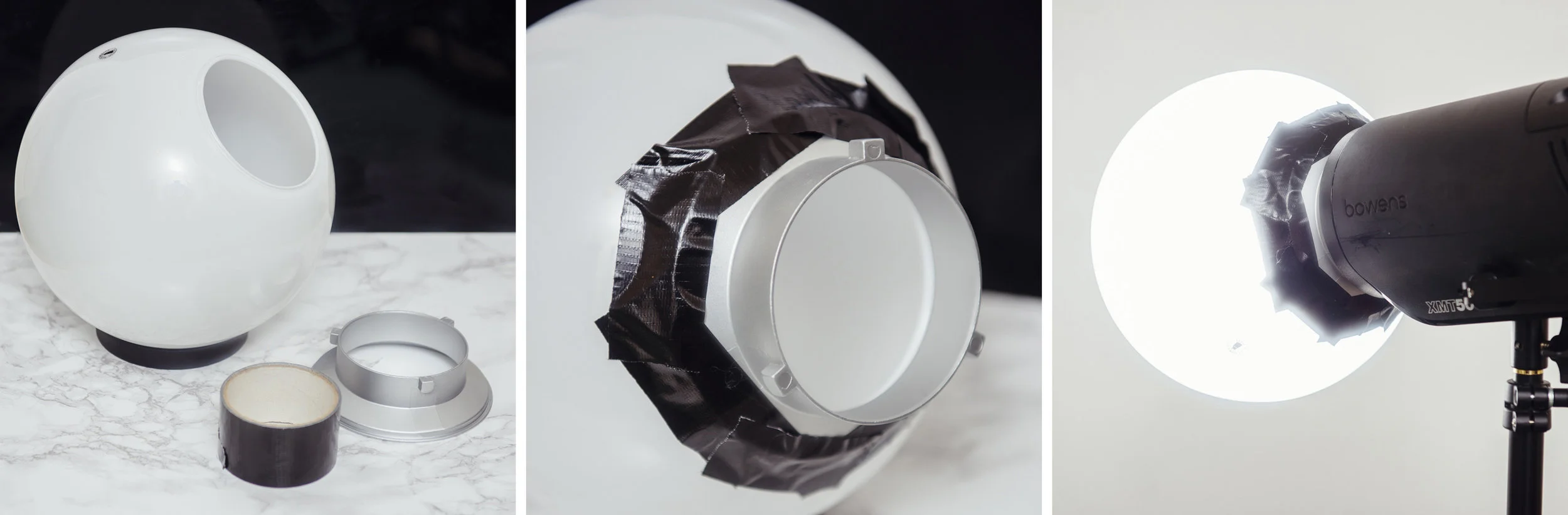
The large dome was taped snugly onto an old speed-ring which enabled me to attach it to my light horizontally if needed.
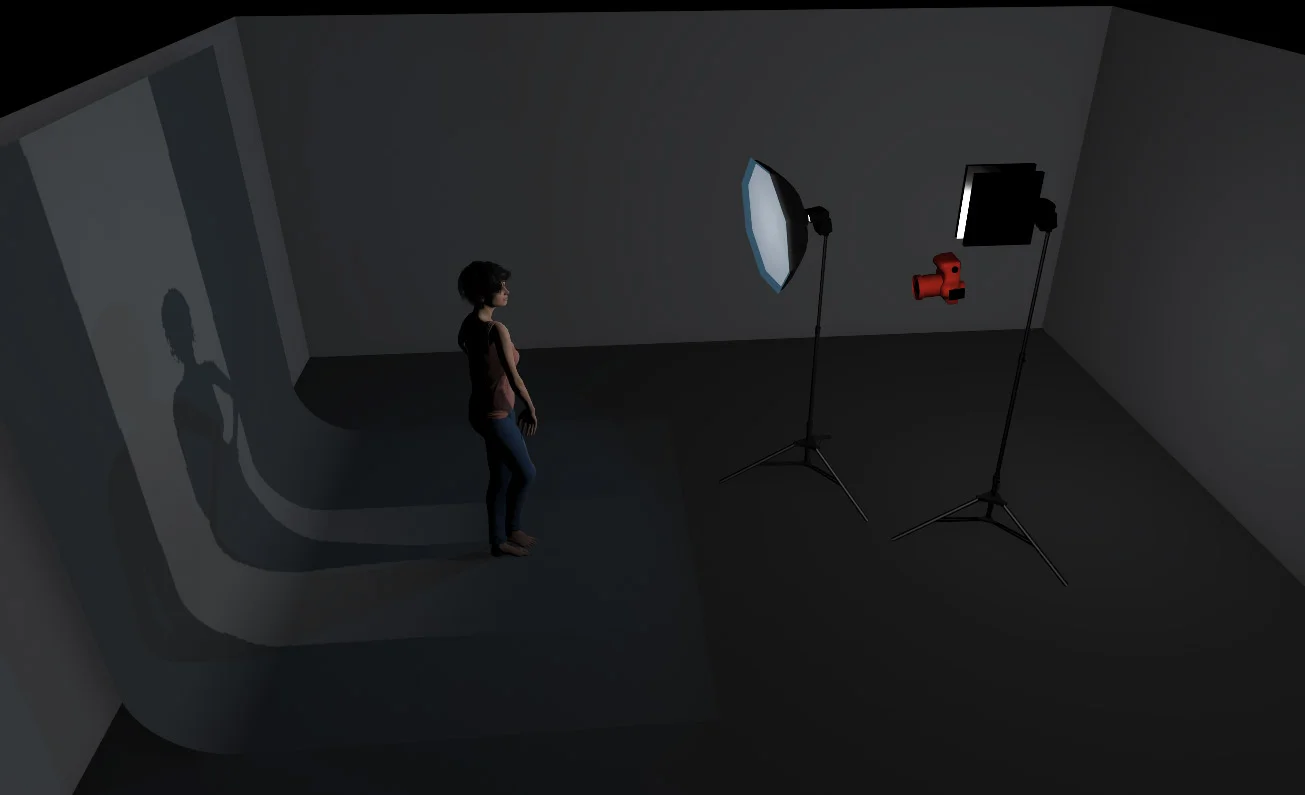
The Setup
The actual lighting setup was nothing fancy but I also wanted to try out some alternative colouring ideas at the same time. The model was positioned about 5 feet from the white wall behind her, I had the main lights positioned about 2 feet in front of her and above eye level and then I also had a small softbox on the floor at the models feet with an orange gel* in place for the entirety of the test. *Obviously you don't need to the orange gel but I was seeing how much the gel was washed out by the modifiers so that's why I had it in place.

A very simple setup that involves two lights; a key and orange gelled fill light.
The Results
After I had taken a few shots with the beauty dish, I switched that out for the larger dome and then after a few more frames I changed it too the smaller dome. The resulting images should speak for themselves.
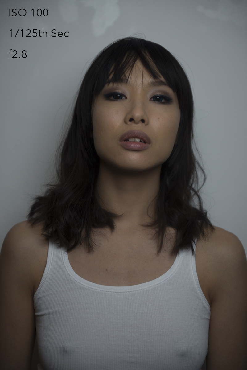
Beauty dish Images
Beauty Dish Shot - Click to Enlarge
Beauty Dish Shot - Click to Enlarge
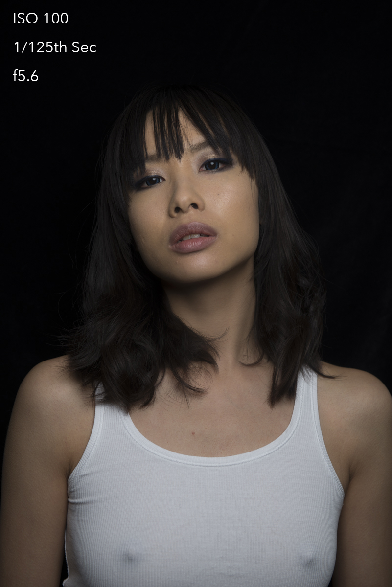
The Small Dome Images

The small dome setup
Small Dome Shot - Click to Enlarge

Small Dome Shot - Click to Enlarge
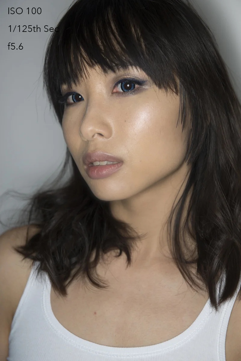
Large Dome Images

The big dome set-up
Large Dome Shot - Click to Enlarge
Large Dome Shot - Click to Enlarge
CAUTION: I'm using LED modelling bulbs in my flash heads which produce very little heat. If your flash heads have tungsten modelling bulbs, these globes will get VERY HOT as there is nowhere for the heat to escape when the globes are in position on the heads. Be sure to turn them down or off entirely.
Conclusions
I think you guys can draw your own conclusions from the images above and however you feel about the three looks, I think one thing is very clear that we can all agree on; you don't necessarily need to spend a lot of money on getting expensive modifiers to produce beautiful light.
The beauty dish obviously produces a more directional light and you can see that by how dark the background is compared to the other setups. The other dome shots throw light everywhere so more light is spilling onto the background.
Because of this beauty dishes directionality and lack of spill, you should notice that the shadows on the models face are darker too. In contrast the domes are bouncing light around the room and that spilled light is filling in a lot of the shadows on the models face. This gives the appearance of a far more flattering light as a result.
This dome spill is far from being a bad thing either, in fact if you're using the domes is a small space you use that spill and bounce to really bed the subject into a scene with just a single light. This type modifier is perfect for location shooting or environmental shots and its certainly something I'll be using for that type of work.
The small dome actually produced a far better light than I expected. It's small source creates a contrasty light that falls off quite quickly leaving brighter highlights and darker shadows as a result. I also found this to create some nice shimmering effects on the skin and makeup as a result of the hard-light properties.
I was really excited to try the big dome as I thought it was going to be far and away the best looking lighting. Although I wasn't disappointed, I still feel the resulting light didn't look like I expected. The light was very clean in that there was a very smooth transition from shadow to highlight which was nice but it was still darker overall than I expected.
As a singe beauty light I think the small dome won for me with its look. If I was shooting in a larger area and wanted to illuminate more of the subject in a scene then the big dome placed a little further away would surely be the best choice.
In hindsight I think I know where I went wrong with this test and what I would like to do differently next time. You'll notice that the light stand did not move the entire time, so from the small dome setup to the big dome setup the angling of the flash head caused the light source to get a lot closer to the model which required me to turn the power of the head down. That's not a problem normally but when I turned the power of the head down, I also reduced the amount of light that bounced around the room. This in turn reduced the amount of light falling back into the shadows making the light appear darker than it actually is. I would like to try this big dome again but move it further back from the model thereby allowing that light to bounce around the room and giving a far softer impression to the lighting, perfect for environmental shots.

Closing Comments
So there you have it, a couple of great lighting modifiers and at the cost of just over £25 for the both of them! That's pretty damn impressive in my book and you'd be crazy not to grab at least one of them and give them a go. Of course if you really wanted an excellent dome modifier then you can always grab the Profoto frosted dome one here for a cool $177! I'm sure that's miles better ;)
As always guys, if you have any questions then let me know. If there was something that didn't make sense and you wanted clarification on then let me know. Also if you've ever tested a DIY modifier that has provided excellent results, I'd love to hear about it :) Let me know in the comments.
:WARNING: OMG! You're so close to the JHP ads below you can almost taste the excitement :D
If you're interested in any of my work and would like to know more about how I created some of my shots then why not check out my workshops. Here you can find out everything there is to know about Gelled Lighting, Long Exposure Flash Photography and my entire Post-Pro Workflow. Jake Hicks Photography - Workshops

I've also just released a brand new 22 hour complete Gelled Lighting Tutorial video. I go over everything from studio lighting setups with gels to being on location with gels plus I also go through my complete retouching and post pro workflow. For more details and complete breakdown of everything that's include check out my Coloured Gel Portraits Tutorial

I also offer comprehensive coloured gel packs. These collections of gels are what I use day to day to create some of the most highly saturated colours around. If you're looking at getting into gelled lighting or need to get stronger and richer colours in your coloured gel work why not check out my Jake Hicks Photography Gel Packs