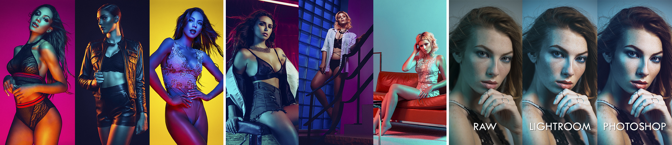
• >>>NEW Water Shoot Workshop<<<
  • Technique
    • Latest Techniques
    • FREE TIPS
    • Quick Tips
    • Video
    • Site Search
    • Blog
    • Archives
  • Mentoring
  • 2026 Workshops
  • >Online Workshops<
  • Studio Lighting Books
  • Contact
    • Newsletter
    • Contact
    • Statement
Jake Hicks Photography
  • >>>NEW Water Shoot Workshop<<<
  • Technique
    • Latest Techniques
    • FREE TIPS
    • Quick Tips
    • Video
    • Site Search
    • Blog
    • Archives
  • Mentoring
  • 2026 Workshops
  • >Online Workshops<
  • Studio Lighting Books
  • Contact
    • Newsletter
    • Contact
    • Statement

Social Media Analytics Year on Year Post - Instagram Vs. Facebook

Click to enlarge

So another year down and yet another yearly round-up of ‘Top Ten images of 2017’. Yes I know every monkey with an iPhone in the last 24 hours has shoved these ‘best of’ posts down your throat and yes I know that we all feel obliged to ‘like’ them so I apologise for yet another one.

For me though, I do genuinely do this list for myself in the hope that I may glean some knowledge from the results. There’s no short-cut to it either on FB I’m afraid because you have to manually select them yourself but I t think it’s worth doing if you have some similar data to look at.

Why bother?

Well I think that us as image creators have to admit one thing; If we’re posting on social media then it’s because we value an ‘audience’. Without getting to existential about this, I personally believe art doesn’t exist without an audience, so to understand your art you should at least consider who your audience is and what they like. Remember your clients were all your audience before becoming a client.

Is Facebook still a relevant platform to display work?

This was and still is a big concern of mine. We are becoming culturally conditioned to ‘drive-by’ like the occasional post we see. The newer generation wants to be anywhere BUT where their parents are hanging out so as we still use FB, they’re obviously flocking to Instagram. I use Instagram (occasionally) but I don’t enjoy it. I can’t get a meaningful discussion going with you guys there like I can on FB, nor can I write posts like this, it’s simply not built or designed for it.

Surely Instagram is where the audience is though right?

Well yes… and no. Let me share some numbers with you; my Instagram following has grown by about 8000 in 2017. Conversely my FB following grew by about 4000 in 2017 compared to about a 7000 growth increase in 2016. This is conclusive proof to me that the FB growth is slowing down dramatically compared to a huge and ravenous growth on Instagram.

Facebook Page following growth is slowing dramatically year on year.

Facebook Page following growth is slowing dramatically year on year.

But it’s the ‘wrong’ growth I’m afraid. Sure I get 10-15 message requests from models a day to shoot but that’s not my business model at the moment. In contrast, I very rarely get FB model request yet I often get commercial businesses and potential clients reaching out consistently on FB.

So I’ll let you guys decide where you want to focus your attention but for me, I’ll be continuing to focus on my interactive and client friendly FB page.

Do image ‘likes’ matter?

I was genuinely surprised if I’m honest, I really thought that image ‘likes’ had dropped off. Thankfully the contrary turned out to be true. In 2016, not a single top-ten image crept into the 400+ zone whereas 2017 saw all of the top 5 scooping that accolade and even into the highly coveted 500+ realm!

You may not immediately understand the relevance of this but let me also say that in 2015 and 2016, I saw hardly any uplift in individual image ‘likes’ whatsoever. Check both the 2015 and 2016 top-ten images below to see what I mean. This actually tells me that although new member growth is down by half this year, engagement and interaction is up massively year on year compared to previous years! This is great news to me and maybe the ‘like/love/wow’ system that FB introduced in recent times has encouraged people to interact more but some of my images even saw a staggering 25,000 person reach! There’s no denying that figure exists, we just have to make the right content to achieve it.

Click to enlarge

Click to enlarge

What about your snaps ‘tho?

So finally we can now take a quick look at the top ten shots of 2107 :D

Like I said a moment ago, what a huge uplift in image interactions this year. The top three all getting 500+ and the top five all getting 400+.

From a personal creative standpoint I tried to push my style in different directions last year. Sure it’s just another gel shoot-out but I was very adamant about trying some softer pastel looks and I was over the moon to see how well they were received b you guys especially as the pastel shots got three in the top ten including the number one spot.

Either my location work wasn’t as strong last year or my studio shots are simply just preferred, we had none in this list surprisingly. I’d like to do more this year but I personally love the challenge of location gels.

Of course I love working with all the models I have the good fortune to photograph but all of them here are simply exceptional without question. In fact Aly Sky gets the entire podium to herself this year and Maria Amanda also manages to equal her with three images in the top ten too, not to mention Lady Lauren competing with herself with a tied 9th spot. I can highly recommend any of these ladies and I guarantee you wont be disappointed by the results if you are lucky enough to work with them in 2018.

Thank you

So there we have it, JHP 2017 in numbers. Thank you to the one brave soul that will probably read this far down and to you I ask 'will you be focusing on Instagram or FB in 2018?'

Thanks as always to all the teams I worked with last year, you’re all fantastic :D But more importantly thank you to you guys, you’re the ones continuously interacting and engaging so seriously, thank you for that :)

This was YOUR favourite pictures of 2017, I’ll be sharing my personal favourites next week so we’ll see how different they are ;)

Have a great 2018 guys :D

Tuesday 01.02.18
Posted by Jake Hicks
Comments: 2
 

Using Coloured Gels with your Lensbaby

Technique Tuesday Facebook Thumbnail Temp edge 80.jpg

Often a scene can be visually confusing, especially if there’s multiple colours and objects in focus that are fighting for our viewers attention. This simple technique that I'm sharing here uses a single dominant coloured gel to simplify the scene visually, then we can draw the attention of our viewer with our Lensbaby lens.

One of the key characteristics of this shot is the blurred focus effect. First impressions might tell you that this effect is created in post-production but in actuality this look is created in-camera with a Lensbaby lens.  Lensbaby is a lens manufacturing company that specialises in making lenses that take photos with with very distinctive effects baked into every frame. These lenses create these effects without the need for editing programs and filters and the effects that these lenses can create range from user defined radial blurs, slices of focus and even swirly backgrounds, all of which are achieved with each and every shutter press.

In this setup we’ll be using the Lensbaby Sweet 50 in conjunction with coloured gels to grab the attention of our viewers by leading our viewers gaze exactly where we want it and by creating a uniform and less distracting colour palette with a single coloured gel.


Taking Control

Click to enlarge/fit to screen. This technique is all about taking control of a scene by removing distracting elements. We will use a coloured gel to simplify the scenes colour palette and then we will use a Lensbaby lens to direct our viewers gaze where we want it.

What you'll need

  • 1x Lensbaby Sweet 50
  • 1x Camera
  • 1x Light stand
  • 1x Floor stand (simply resting the light on the floor will also work)
  • 2x Flash heads or Speedlights
  • 1x Key light modifier. Beauty Dish/Softbox/Umbrella
  • 1x Fill light modifier. I recommend a small softbox.
  • 1x Backdrop
  • (Optional Fan)
  • Some coloured gels. I used a blue gel here.
  • Photoshop
 

Setting up your camera

We will be shooting with flash so I firstly recommend you set your camera to Manual mode. Next we’ll set our shutter speed to 1/125th of a second to sync it to the flash and we’ll set the ISO to 100 or as low as your camera will go. If you can adjust the White Balance on your camera then set it to the flash setting (lightening bolt). We will be using a manual focus lens with the Lensbaby so we can’t set the aperture just yet and we’ll do that next.

Step 1 Camera Stettings.jpg
 

Setting up your Lens

If you’ve never used a manual focus lens before then this might seem odd, but we have to adjust the aperture of the shot on the lens itself. A lot of these specialist lenses don’t ‘talk’ directly to the camera so we have to adjust aperture and focus manually. For this shot I went with f4 to offer me the best balance of depth of field versus lens blur. I’m also using the Sweet 50 Lensbaby lens so I’m going to position it at the angle you see in the image below. This will allow me to position the ‘in-focus’ area of the Lensbaby on the models face when I’m using the camera in portrait orientation.

Step 2 Lensbaby.jpg
 

Selecting and setting up your key light modifier

It's worth thinking about which modifier you'll be using for your key light. I used a 22" white beauty dish with a diffusion sock here but a small 60cm softbox or umbrella would work just as well. For this setup I positioned the beauty dish off to camera right, about arms reach away from the model and just above her head, angled down at about 45 degrees.

Step 3 Keylight.jpg
 
Step 4 Fill Light.jpg

Setting up your Fill Light

I used a small 60cm x 60cm soft box on a floor stand but you could get away with resting this on the floor if you don’t have one. I placed it on the opposite side of the model as the key light so off to camera left. This will allow the fill light to colour the shadows created by the key light. I’ve also angled it up towards the models face.


Gelling your Fill Light

This is thankfully far easier than you might think. You don’t actually need huge sheets of gels to cover your entire soft box. As long as the flash tube is covered then your light will be gelled. I simply tear open the soft-boxes front diffusion panel to expose the flash tube and tape a gel on the inside. If you’re using a flash that has tungsten modelling bulbs then this will get very hot, I strongly recommend turning off or removing the modelling bulbs to avoid melting any gels.

Step 5 Adding Gel.jpg
 

Setting up the background

I’ve chosen a textured and mottled backdrop that isn’t too dark in colour. You can use what you prefer but I’ve chosen this as I want some visible texture in the background when I start to implement the Lensbaby blur. I also want my background to be light enough to take some of the blue gelled light so that the whole image visually ties together.

Step 6 Backdrop.jpg
 
Jake Hicks Photography Main Setup Shot.jpg

Backdrop

You can use any backdrop you want but I opted for a background that would take some of the colour from the coloured gel and that also had some texture to blur with the Lensbaby.

Model

Position your model about three feet away from the backdrop. Not so close that the key light will cast a shadow on it and not so far away that no light from the coloured fill light will hit it.

Keylight

Beauty Dish. You can substitute this for a softbox or umbrella but you should position it above the models head, about 2-3 feet away and off to one side.

Fill Light

I recommend a small soft box here. Mine was placed on the opposite side to the model as the key light.


Click to enlarge

Final Image

Once you start shooting you're looking to obviously keep the models eyes in focus but you should now see that the bottom half of the image is blurred. Don't confuse this with being out of focus as this is actually the lens that is blurring it and as long as the eyes are in focus the image should look great.

Also bear in mind that the amount of blurring can be adjusted via the aperture of the lens as well as the amount at which you angle the lens via its ball joint. Wider apertures like f2.8 will create far more blur than smaller ones like f8. Plus more dramatic angles and tilts on the lens will produce far more blurring whereas less tilt will produce a more subtle effect.


If you're interested in trying out different Lensbaby lenses then here's a quick look at what some of them look like in the image below.

For a more in-depth rundown of the individual effects then check this previous article of mine on the subject 'Comparing the Lensbaby Lens Effects'

Click to enlarge


So there you have it, a super quick and easy lighting setup to try with gels and your Lensbaby. I really like this setup as it adds a lot of colour via the gel and that extra colour is a great way to add interest and detail for the Lensbaby lenses to show off their affects.

Definitely give it a go and as always if you have any questions let me know :)


I also have a discount code for anybody who is interested in picking up any of the Lensbaby lenses here in the U.K. via WEX Photographic

I have worked very closely with the fine people over at Lensbaby for many years and they have very kindly allowed me to share my discount code with you. If you decide to use my code to get some money off your purchases then I will also receive a few pennies for the beer fund so please feel free to use it if you'd like to :)

Use the code JAKEHICKS10 at checkout to get 10% off any Lensbaby lens at WEX Photographic.


:WARNING: Imagine if you had some way to spend that Christmas money you've just received! I have the answer to all of your photographer problems below :D


If you're interested in any of my work and would like to know more about how I created some of my shots then why not check out my workshops. Here you can find out everything there is to know about Gelled Lighting, Long Exposure Flash Photography and my entire Post-Pro Workflow. Jake Hicks Photography - Workshops

gel workshop trio.jpg

I've also just released a brand new 22 hour complete Gelled Lighting Tutorial video. I go over everything from studio lighting setups with gels to being on location with gels plus I also go through my complete retouching and post pro workflow. For more details and complete breakdown of everything that's include check out my Coloured Gel Portraits Tutorial

gel trio set video.jpg

I also offer comprehensive coloured gel packs. These collections of gels are what I use day to day to create some of the most highly saturated colours around. If you're looking at getting into gelled lighting or need to get stronger and richer colours in your coloured gel work why not check out my Jake Hicks Photography Gel Packs

gel trio set crop.jpg
Tuesday 12.26.17
Posted by Jake Hicks
 

Skin Retouching with Dodge & Burn - How to Maintain Skin Detail

Technique Tuesday Facebook Thumbnail post pro dodge and burn.jpg

There are so many viable ways to retouch human skin in Photoshop and if you've found yourself here then you're probably looking at alternatives to the way you already do it. Maybe you're not happy with the results you're currently getting or maybe you're frustrated at other skin smoothing techniques that destroy or remove skin texture. It's useful at this stage to also point out that there is a lot of heated debates on what's an acceptable level to retouch skin too? What's the 'best' way to retouch skin?  And of course whether or not we should be retouching skin at all.

The point of this article is not to provide answers for those questions directly but to make everybody aware from the start that you as a photographer need to decide where you stand on this. The reason for this is that retouching (in my opinion) plays a fundamental role in our photography in the 21st century. Some great photographs can be ruined by inexperienced retouching but more importantly and perhaps more controversially, some terrible photographs can be made to look amazing after some very expert retouching.


Because I have just announced a brand new post-production workshop for 2018, I thought I'd put this skin retouching article together to cover a topic I get asked a lot about. If you're interested in finding out more on what's involved in my retouching workflow then you can see exactly what's covered at my full-day in-person event via the link provided here Jake Hicks Photography - Post-Pro Workshop


Are you creating a piece of art or a photographic portrait?

As a photographer I think you need to decide whether you're going to create 'art' and if so are going to blur the skin to get a desired effect? You shouldn't have to defend yourself for that, it's art after all and you can do what you want. Alternatively, you can decide to make your work about the subject and make them look the best they possibly can do whilst still looking realistic and believable as a person. This means that when a viewer looks at your image they should say 'wow, what a brilliant portrait' and not 'wow, look at the retouching on that'.

For me personally, I always try and push the retouching to the limit of what looks perfect without that getting in the way of the subject. Some may say I over-retouch my shots and that's fine but remember I've also been asked to retouch my work more by clients too. Everybody has different acceptance levels of what they believe is good retouching.

Preserving Skin Texture

One of the things that I look for when trying to maintain this 'human' look is skin texture and detail and I'm always looking to retouch the skin in a way that doesn't destroy or blur the texture on the skin. There are plenty of ways to blur the skin but in this particular retouching technique I'm going to be sharing how I retouch skin without loosing any skin detail whatsoever, and I'm going to be doing this through a technique called dodge and burn skin retouching.

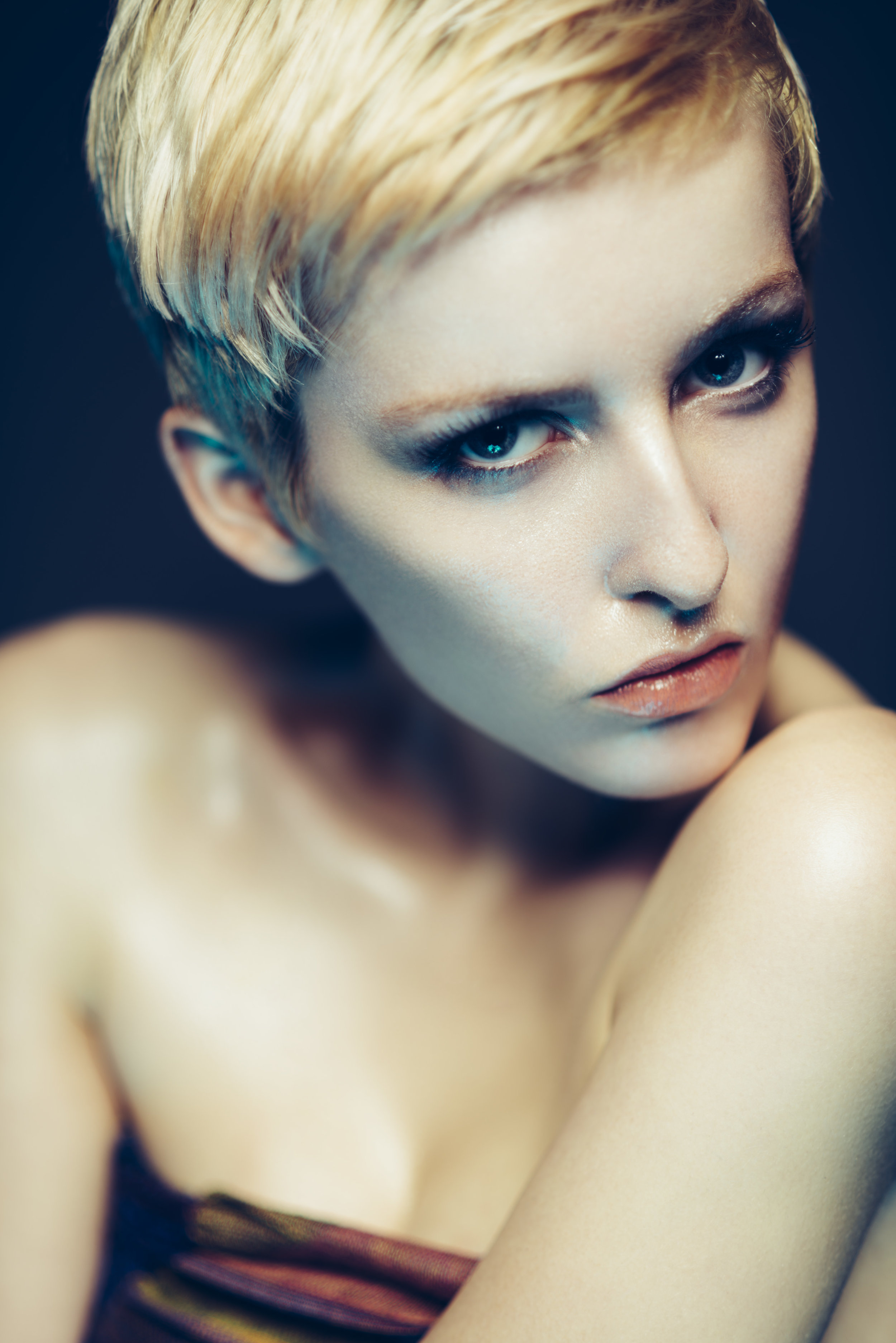
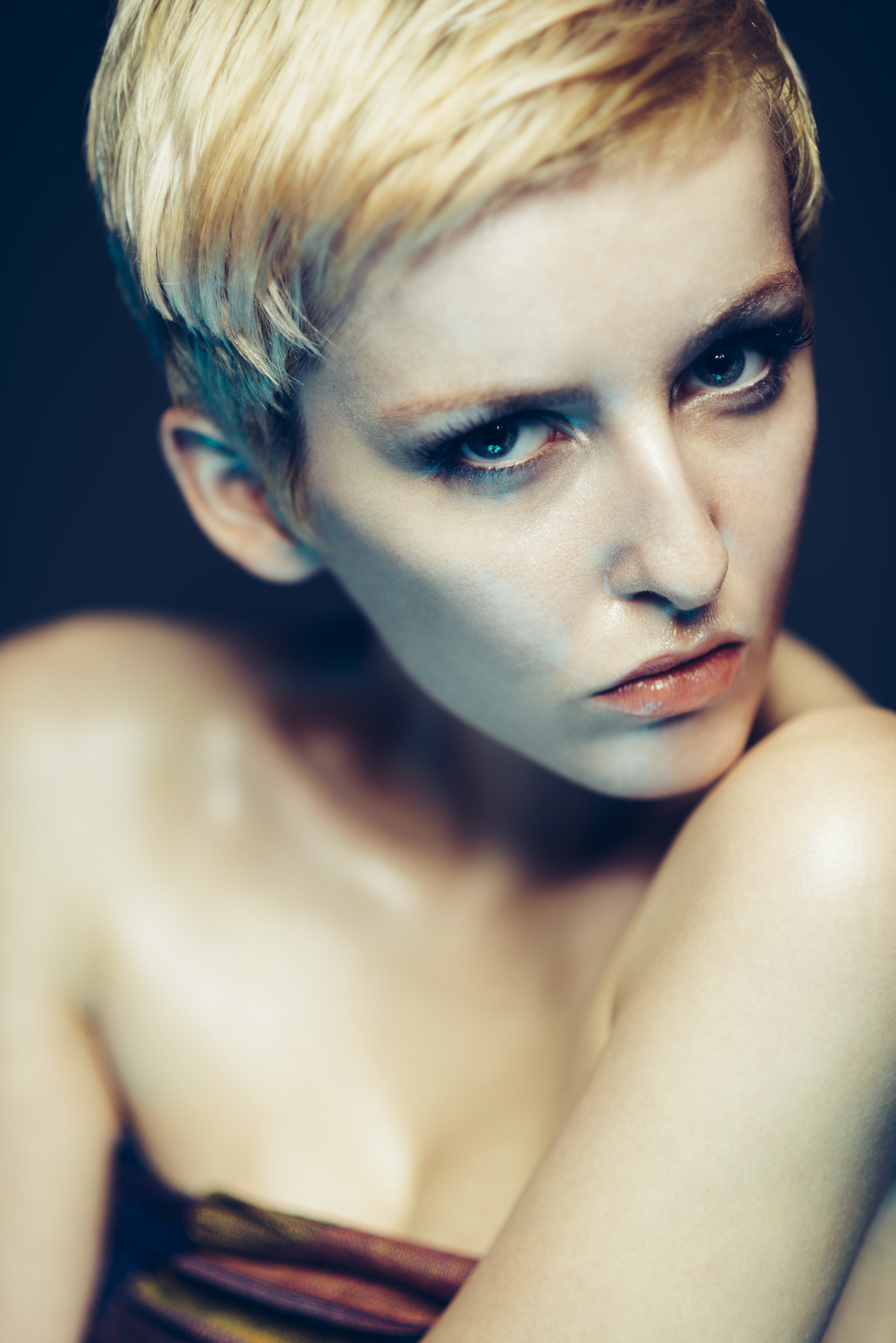
Click to enlarge. Dodge & Burn is often used to increase the contrast of a shot, in this technique we use dodge & burn to do the complete opposite. In the above image I have used the dodge & burn skin retouching technique to even out the skin tone and it is the most non-destructive form of skin retouching I'm aware of which ensures your skin texture is completely preserved.

For those that don't know; 'dodging' in photographic terms means 'to lighten' and 'burning' means 'to darken'. We use this technique in the darkroom to add shadows and highlights on an image to increase the visual contrast of a shot. In this particular retouching technique though we're going to be using it in the opposite way. We're going to look at the darker points on the skin and 'dodge' (lighten) them and we're going to look at the brightest points on the skin and 'burn' (darken) them. This will even out the tone overall and visually reduce the appearance of bumps and skin issues.

Why would we do this?

All 2D images, like photographs are visual representations of 3D objects. We show shape and form through light and shadow that gives the illusion of a 3D object on a screen or piece of paper. If we take that same principle down to the pore level, all lumps, bumps and pimples are simply a collection of highlights and shadows.

If we can even those out and reduce the highlights and shadows on a pimple for example, it will start to visually blend back into the skin around it.

Click to enlarge. Here's an simplistic representation of skin as seen in the form of highlights and shadows. See what happens when we darken the highlight side of the pimple and darken the shadow side of the pimple. They cancel each other out and blend back into the surrounding skin.

In the above illustration I have drawn out how a pimple on a skin is actually visible to us in photograph. A pimple is simply a bump that has a highlight side and a shadow side. If we can add dodge and burn that pimple we can counteract that visual depth so that it disappears back into the skin.

Take a look at the Pimple image above and then look at the Dodge & Burn diagram. See how they are opposite. I've painted white where there was shadow and black where there was highlight. When I combine the dodge and burn layer with the pimple layer in the technique I'm about to show you, it visually cancels out the pimple whilst having no negative effect on the the skin texture around it.


The Dodge & Burn Technique

Okay so now that I've finished waffling on about the theory, let's get stuck into the technique before we loose the millennials entirely.

Step 1

Open up your shot and create a new layer via:

Layer -> New -> Layer...

In the following dialogue box you want to select 'Soft Light' as you layer blend mode like we can see below. Once you've selected that, an additional option will become available that allows you to select 'Fill with Soft-Light-neutral colour (50% grey). Make sure that box is checked like you see below.

Rename the layer if you like but once you hit ok nothing should visually change. In the layers panel though you should now have what appears to be a completely grey layer.

Step 2

These next couple of steps are going to help us see what needs to be adjusted in the image as we are about to add a couple of 'check-layers'. Check layers are essentially visual aids that we can delete once we're done with them but can really help us out before hand.

Firstly go to:

Layer -> New Adjustment Layer -> Hue/Saturation...

In the following pop-up box just hit ok.

Next what we need to do is to double click on the layer icon so that an adjustment window opens up. In that window we need to reduce the saturation slider all the way to -100. 

screen 4.jpg

Your image should now be look completely black and white. The reason for this is that it's far easier for us to dodge and burn when we aren't distracted by the colour in the shot. Once we're done dodging and burning we can delete this layer but for now its going to act as visual aid or a 'check-layer'.

Step 3

We're now going to add one more final check layer to help us and like before we will delete this later but for now it will increase the visual contrast of the shot which again will make our dodge and burning far easier.

Firstly go to:

Layer -> New Adjustment Layer -> Curves...

Then hit ok in the following dialogue window.

Then all you need to do is change the blending mode of that curves layer to 'Multiply'. -Above the curves layer should be a drop down menu titled 'Normal', click that and in there you should see the blend mode 'Multiply'.

At this stage you dont need to do anything else and you don't need to adjust that curve in any way whatsoever. The reason for that is because the multiply blend mode should have noticeably darkened down your image. This darker image will make it a lot easier for us to see any areas we need to work on and again, we're going to delete that curves layer later on too.

Step 4

Finally we're now ready to start dodging and burning but before we do we need to make sure we have our grey 'Dodge & Burn Skin' layer selected. Then select your brush tool (B) and then reset your palettes to white and black by hitting the (D) key.

With your brush selected make sure you have the hardness set to zero and the brush size fairly small. You can adjust this by clicking on the little brush icon at the top of the screen.

Step 5

Now we can take a look at our shot and try to even out some of the bumps with out white and black paint. Start off with a very low opacity of around 5-10% and start to paint with white paint first onto the visually darker areas that you think might need lightening and evening out.

Let's take a look at this area here for example. In the above shot you can see that there is an area that appears visually darker than the surrounding tones. If we paint with our white brush over it gradually we can start to bring that darker area back up to be a visually similar tone as the surrounding the skin.

In the above shot you can see that the darker area has now been lightened which has given the skin a far smoother appearance. But remember, we've only lightened it so we haven't removed or destroyed any of that skin texture or detail.

Take a look at that before and afters below with the check layers turned off.

Now I appreciate this may not seem like much on its own but if we continue on with the rest of the image using that same principle, all these little adjustments and changes add up to make a big difference.

Take a look at the below before-and-after images to see what I mean and remember all that has been done to the image is this dodge and burn technique.

DSC_4239 dodge and burn after.jpg
DSC_4239 dodge and burn before.jpg

Step 6

Up until this point you've probably only used the white paint, but there will be times when you've either gone too far with the white, in which case you can add some black over the top of that to reduce the effect, or there may be areas that are too bright that you need to darken down a little.

Simply switching to black paint and continuing on as you did before using the same visual principles to try and even out the tone of the skin.

Step 7

Once you're done and you're happy that you've evened out the skin tone, you can delete those check layers as there is no reason to keep them around any more.

If you're interested to see what you've been painting on that grey layer up until this point, simply turn off the background layer beneath it. But be warned, it isn't pretty!

Although this looks more than a little spooky, I think it does a great job of illustrating just how much you end up doing with simply white and black paint on a grey layer. Plus, and most importantly in my mind, this technique isn't destroying any skin texture whatsoever.


So there you have it, the most non-destructive skin smoothing technique I'm aware of and I use this technique on all of my images and have done for many years. This dodging and burning technique is used by nearly every commercial retoucher in some form or another as it completely preserves the skin texture, something that a lot or most other techniques don't do. I think a lot of people might also be surprised to hear how few commercial retouchers choose not to use frequency separation for this reason as it can lead to destructive and sometimes arbitrary results. I for one don't use frequency separation for this reason and never have.

This technique does take some practice to get good with and it's a little harder than a lot of other Photoshop techniques as it requires you to be able to see differences in skin tone, a skill that comes with practice and experience over time. Stick with it though and you'll be rewarded with stunning results in the end as that perfect looking fresh skin on models comes from maintaining maximum skin texture and there is no better technique for that than this one.

Good luck with it guys and as always, if you have any questions then let me know. Also, if you have a variation on this technique or a completely different skin retouching technique that maintains skin detail I'd love to hear about it :)

Lastly, if you're interested I have a new post-production workshop available now. It's a full day of face-to-face training where I cover my entire post-produciton workflow from my Lightroom processing and colour management of raws through to my complete editorial retouching techniques in Photoshop. Full information and details can be found at the link here Jake Hicks Photography - Post-Pro Workshop


:WARNING: If you're looking for the perfect present for YOURSELF, I have the answer below :D


If you're interested in any of my work and would like to know more about how I created some of my shots then why not check out my workshops. Here you can find out everything there is to know about Gelled Lighting, Long Exposure Flash Photography and my entire Post-Pro Workflow. Jake Hicks Photography - Workshops

gel workshop trio.jpg

I've also just released a brand new 22 hour complete Gelled Lighting Tutorial video. I go over everything from studio lighting setups with gels to being on location with gels plus I also go through my complete retouching and post pro workflow. For more details and complete breakdown of everything that's include check out my Coloured Gel Portraits Tutorial

gel trio set video.jpg

I also offer comprehensive coloured gel packs. These collections of gels are what I use day to day to create some of the most highly saturated colours around. If you're looking at getting into gelled lighting or need to get stronger and richer colours in your coloured gel work why not check out my Jake Hicks Photography Gel Packs

gel trio set crop.jpg
Tuesday 12.19.17
Posted by Jake Hicks
Comments: 9
 

Should I be using a White or Grey Background with Coloured Gels?

Technique Tuesday Facebook Thumbnail Temp edge 80.jpg

This is another one of those questions I get asked a lot: 'Should I be using a white or grey background with coloured gels?' As with so many things in photography, the answer isn't always as simple as you might think.

In this article I show you a recent lighting test where I fired a collection of coloured gels onto a white background and then repeated the same test on a grey background to see the difference. The images below speak for themselves but I'll also explain some of my personal reasons for using one over another and I'll also discuss the pros and cons for each.


The Lighting Test

As I mentioned, the test was super simple and nothing moved or changed between the two setups.

The first test on the left had and grey background and the second test on the right had a white background. Simple.

The first test on the left had and grey background and the second test on the right had a white background. Simple.

A single light was position at about 150cm from a white and grey backdrop and a camera was mounted on a tripod behind that.

A series of 8 coloured gels had a single shot fired at single stop increments in a five stop range. The power was adjusted on the light as the aperture of f8, shutter speed 1/125th and ISO 100 stayed the same throughout.

As well as a coloured gels I also used a 'diffusion gel' (sometimes refereed to as a 'frost') on each of the shots. This gel helps a lot in the reduction of colour banding of gels on open reflectors like this and I would always try to use them when shooting a backdrop regardless of the colour.

Note: The five stop range was 1 stop brighter on the grey background to actually show any variation. The grey backdrop consumes so much light that if I had not done this, 3 stops of the test on the grey would have been nearly completely black.


The Resulting Images

The first set of shots were agains the white backdrop. Here's the resulting images.

Click to enlarge: White background shots


Next up I changed the background to a grey one and repeated the exact same test. Here's the resulting images from a grey backdrop.

Click to enlarge: Grey background shots.


Conclusions

Although the whole point of running a test like this and showing you the results means that you can draw your own conclusions, I'll add my own thoughts here and you can choose to agree with them or not.

The Vignette

Firstly and most obviously, grey as a gelled surface heavily reduces the amount of light in the shot. In fact the whole grey light test is one stop brighter throughout just to show vaguely similar results. This extra darkness does have its own pros and cons though. To begin with, it's clearly going to be far easier to get a strong vignette (dark corners of an image) on the background if that's what you're after. The coloured light drops off very, very quickly which means that a tight spot of light is far easier to achieve. If however you're looking for a more gradual colour on the background with very little vignetting, perhaps a grey backdrop isn't the way to go.

The Water Colour Effect

Secondly we have a slight concern with the colouring in some of the lighter coloured gels like the yellow. Shining the yellow onto a white surface is always going to yield cleaner results in my opinion over shining it onto a grey. Sure it's still usable at certain exposures but look at how you have less usable exposures in the grey than in the white. Think of it like painting with watercolours onto a white canvas and then onto a grey canvas. The white canvas underneath is helping to give that colour its saturation and often the resulting colours on a grey surface can appear muddy in comparison. Imagine trying to use pastel coloured gels on a grey background (this dawns on me now as that would have been useful to test too), using pastel gels is hard enough on white but practically impossible on grey. Like I said, this is really only prominent in the lighter, less vibrant colours and in the more saturated colours like the reds and blues it's far less noticeable.

Muddy Colours

So if we combine those two concerns of heavy vignetting and muddy colours with the grey backdrop do we have a problem? Personally I feel we do. If we take the very strong contrast (the speed at which the colour drops from highlight to shadow) of the grey backdrop and then combine that with the fact the gel colours are designed with a clean white surface in mind, we may find the colours difficult to control.

Click to enlarge: The image on the left is against a grey backdrop and the image on the right is against a white backdrop (grey backdrop image one stop brighter to compare).

It's my feeling that you will get muddy colours appearing across the grey backdrop versus the clean white one regardless of the colour that you're using. The white backdrop produces a far smoother and more even colour in comparison.

Contrast = Saturation

The other issue I have with the grey is the fact that due to its rapid change from highlight to shadow, it visually creates a lot of contrast which with colour translates to saturation. All gels have what I call a 'saturation limit'. This saturation limit is not down to the gels themselves but often the technology we use to capture them and the limitations they have. Take a look at the shots below to see what I mean.

Click to enlarge: Here we can see where the camera stops being able to see variations in colour and starts to group similar colours together. This is what we often refer too as colour banding.

When our gels reach their saturation limit, the camera starts to group these colours together, the resulting effect is often referred to as colour banding. You should be able to see this above, particularly in the pink where the colour seems to 'step' from one colour to another.

This same effect will happen on white backdrops as well (and you can see it in the test shots) but due to the contrasting nature of gels on a grey backdrop, it's far easier to get this ugly effect to show itself on a grey background. You'll see this effect of a saturation limit appearing a lot on portraits of people because skin is not white, as a result people tend to have the gels too powerful to get the colour to show through resulting in this saturation blow out.

White backgrounds produce more usable shots

Lastly I'll just add that I think grey background gels has become a thing because it's easy. A little knowledge is a dangerous thing and the rise of anybody like myself writing a blog post or making a YouTube video can pass on any info we like regardless of whether we've actually tested it or not. Using gels against a grey backdrop produces strong vibrant results that are very hard to blow-out (overexpose) but it gives you very little room for adjustment. Look at the shots at the start of this article again; how many stops of variation are useable colours against the white backdrop compared to the grey? For me, the answer is easily 3 or 4 white background shots of each colour are usable compared to only about 1 or 2 stops of usable colour on the grey.


Closing Comments

Lastly I just want to make it abundantly clear that I've provided the shots above so that you can make your own opinions on what you think works best. I'd hate to think that I'm preaching or forcing my own opinions on you without backing it up with evidence or tests at the very least to substantiate what I'm saying.

For me personally though, I would never use a grey backdrop with gels. Have I used a grey backdrop with a backlight? Absolutely, I love that strong, fast drop off of light and aggressive vignette but I wouldn't add a gel to it to colour my backdrop. If I wanted a gelled background I would always use a white backdrop because it offers me so much more control and more importantly for me a cleaner colour.

I would personally only use a white backdrop with coloured gels. It offers me far more control and in my opinion a far cleaner colour with less vignetting.

I would personally only use a white backdrop with coloured gels. It offers me far more control and in my opinion a far cleaner colour with less vignetting.

Using a grey backdrop is an excellent way to get strong and contrasty vignettes behind the model with white light. They're perhaps not the best choice however if you're planning on gelling them.

Using a grey backdrop is an excellent way to get strong and contrasty vignettes behind the model with white light. They're perhaps not the best choice however if you're planning on gelling them.

Like I mentioned at the end of my conclusions, grey backdrops are very easy to use with gels. The biggest problem people have when using gels in general is overpowering them. Doing this will quickly expose the gels saturation limit and you're left with ugly colour banding issues, something that is far easier to do against a white background. A grey backdrop makes this overexposing issue incredibly hard to propagate resulting in this illusion that grey backgrounds are a must for coloured gels.

You'll see this same illusion appear with other people who teach the use of gels, they'll often have a black or dark skinned model because their dark skin is incredibly easy to gel, but unfortunately it's a lot harder to show a strong tonality from light to dark. Imagine them trying to do a pastel gels shoot on a dark skinned model. Almost impossible.

So although a grey background will produce instantly pleasing results, I would urge you to persevere with the white backdrops. Just make sure to turn the power of the flash down far lower than you might think to ensure you get the best colours without that saturation clipping :)

 
If you're interested, the gels used in this test were all from my 'Definitive Colour Collection' Gel pack. Clicking on the image above will take you to my products page.

If you're interested, the gels used in this test were all from my 'Definitive Colour Collection' Gel pack. Clicking on the image above will take you to my products page.

The 'diffusion' gels I used in this lighting test can be found in my 'Utility Gel Pack'.&nbsp;Clicking on the image above will take you to my products page.

The 'diffusion' gels I used in this lighting test can be found in my 'Utility Gel Pack'. Clicking on the image above will take you to my products page.


As always, if you have any questions about any of that then don't hesitate to let me know in the comments down below. Have you tried both a white and grey backdrop? Which do you prefer and why? I'd be interested to hear your thoughts :)


:WARNING: Everything BUT Black Friday deals below!


gel workshop trio.jpg

If you're interested in any of my work and would like to know more about how I created some of my shots then why not check out my workshops. Here you can find out everything there is to know about Gelled Lighting, Long Exposure Flash Photography and my entire Post-Pro Workflow. Jake Hicks Photography - Workshops


gel trio set video.jpg

I've also just released a brand new 22 hour complete Gelled Lighting Tutorial video. I go over everything from studio lighting setups with gels to being on location with gels plus I also go through my complete retouching and post pro workflow. For more details and complete breakdown of everything that's include check out my Coloured Gel Portraits Tutorial


gel trio set crop.jpg

I also offer comprehensive coloured gel packs. These collections of gels are what I use day to day to create some of the most highly saturated colours around. If you're looking at getting into gelled lighting or need to get stronger and richer colours in your coloured gel work why not check out my Jake Hicks Photography Gel Packs

Tuesday 12.05.17
Posted by Jake Hicks
 

Cheap DIY Lighting Modifiers - Turn household lights into studio lighting modifiers

Technique Tuesday Facebook Thumbnail diy globes.jpg

There is an almost endless supply of lighting modifiers available on the market right now, some are cheap and some of the better ones are certainly a lot more expensive. But does cost directly relate to quality? Well a lot of the time yes it does if you're referring to build quality. In general the more you spend, the more well-made and durable the modifier will be. But does that extra money you spend mean you're getting a better lighting modifier overall? I would have to say no, in fact for less than £15/$20 you can get some stunningly beautiful light from a homemade lighting modifier. Read on to see examples of the stupidly cheap DIY lighting modifiers I'm referring too .

I'd like to think that my work is known for its creative approach to lighting. The reason for that is because I strongly believe lighting is the single most important subject in a shot.

I can honestly say that I've 'saved' some frankly awful shoots through engaging lighting alone. Terrible locations, inexperienced or even no experience in the model/subject can certainly make a shoot hard but far from impossible to pull off engaging results. Dynamic lighting can bring a boring room to life and flattering lighting can enhance any subject, lighting really is the one and only tool you need and should have complete control and mastery of.

So what makes good lighting? Well that is probably a topic/article/book/anthology for another day as there is certainly a lot opinions on the subject but I think no matter how experienced or inexperienced you are as a photographer, we all know what we don't like and we definitely know what we do like when we see it.

In this article I aim to show you a couple of very cheap alternatives to professional lighting modifiers that I think create some beautiful light that are very functional in a lot of situations.


Regular Household Lights

The lighting modifiers we'll be taking a look at are the dome-like frosted globes. These can be fantastic at lighting a scene in a shot as they spread light everywhere very evenly. It also turns out that not only do they spread light everywhere but they also create a beautiful portrait light as well. Let's take a closer look at the lights in question.

I purchased two white frosted dome lights from IKEA. One was small and the other was far larger. The smaller one is intended to be used as ceiling light in a bathroom. The reason it's intended for this is because it casts light everywhere from a very small source close to the ceiling making it ideal for small rooms and corridors.

Small bathroom ceiling dome light

Small bathroom ceiling dome light

The second one I purchased was far larger and is actually originally intended as a table lamp. Again this dome-like design is perfect for casting light over a large area without being overly harsh.

Large table lamp dome.

Large table lamp dome.


Where can you get them?

I got mine from IKEA and they are silly-cheap.

The small globe is a ceiling light called VITEMÖLLA and it can be found here (correct nov '17)for £13. The one in the picture looks slightly different as it has a white base compared to my silver one but the dome (the important part) is the same.

The large dome is a table lamp called FADO and that can be found here (correct nov '17) for £15. It's worth pointing out and making sure that you get the white one. There are several of these FADO's in a variety of tones so just make sure you choose the white one as the others will be fairly useless.

ikea domes.jpg
 

Regular Photographic Modifier

I also wanted to get a bit of a gauge on how the light from these domes looked compared to a regular photographic lighting modifier. For the sake of this test I actually compared them to a few shots taken with a 22" white beauty dish. There's a couple of reasons for this, firstly it's probably my most used lighting modifier so I have a very good idea of how the lighting looks with it and secondly, the beauty dish is pretty pricey compared to these domes so I thought it would be an interesting comparison.

JakeHicksPhotography (6 of 19) set pan.jpg

The image above also gives a nice size comparison and it clearly shows how all three of the modifiers used in the test look when side-by-side.


Getting the Domes 'Shoot-Ready'

Obviously the domes are designed for an alternative purpose to a photoshoot so I needed to do make a few adjustments before they were 'shoot-ready'.

Small Dome

The smaller dome was fairly simple; I just removed the inner wiring and bulb housing and then I simply rested it atop one of my standard dish reflectors. I could have taped it on but there was no fear of it moving or tipping out so I just left it as it was and it was fine.

The small dome was easily made shoot-ready by removing the inner workings and then simply resting it in a current reflector dish.

The small dome was easily made shoot-ready by removing the inner workings and then simply resting it in a current reflector dish.

Large Dome

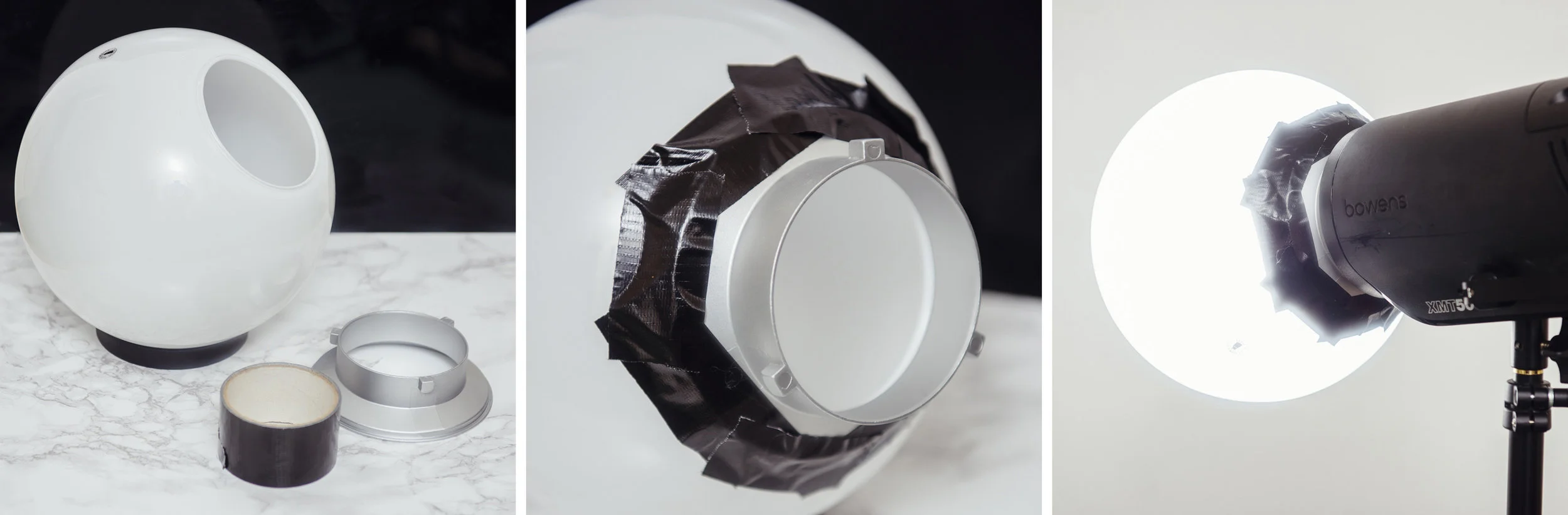
The larger dome took a little more work but not much. I simply removed the inner workings once again and then found an old speed-ring to attach it too. A speed-ring is the metal rotating mount that attaches modifiers like softboxes to your flash head. I've acquired a few over the years that I no longer use so I simply taped one of them to the dome. With strong tape like gaffers tape it was surprisingly snug and there was no fear of it coming loose even when mounted on its side.

The large dome was taped snugly onto an old speed-ring which enabled me to attach it to my light horizontally if needed.

The large dome was taped snugly onto an old speed-ring which enabled me to attach it to my light horizontally if needed.


The Setup

The actual lighting setup was nothing fancy but I also wanted to try out some alternative colouring ideas at the same time. The model was positioned about 5 feet from the white wall behind her, I had the main lights positioned about 2 feet in front of her and above eye level and then I also had a small softbox on the floor at the models feet with an orange gel* in place for the entirety of the test. *Obviously you don't need to the orange gel but I was seeing how much the gel was washed out by the modifiers so that's why I had it in place.

A very simple setup that involves two lights; a key and orange gelled fill light.

A very simple setup that involves two lights; a key and orange gelled fill light.


The Results

After I had taken a few shots with the beauty dish, I switched that out for the larger dome and then after a few more frames I changed it too the smaller dome. The resulting images should speak for themselves.

Beauty dish Images

Beauty Dish Shot - Click to Enlarge

Beauty Dish Shot - Click to Enlarge


The Small Dome Images

The small dome setup

The small dome setup

Small Dome Shot - Click to Enlarge

Small Dome Shot - Click to Enlarge

Small Dome Shot - Click to Enlarge


Large Dome Images

The big dome set-up

The big dome set-up

Large Dome Shot - Click to Enlarge

Large Dome Shot - Click to Enlarge


CAUTION: I'm using LED modelling bulbs in my flash heads which produce very little heat. If your flash heads have tungsten modelling bulbs, these globes will get VERY HOT as there is nowhere for the heat to escape when the globes are in position on the heads. Be sure to turn them down or off entirely.


Conclusions

I think you guys can draw your own conclusions from the images above and however you feel about the three looks, I think one thing is very clear that we can all agree on; you don't necessarily need to spend a lot of money on getting expensive modifiers to produce beautiful light.

The beauty dish obviously produces a more directional light and you can see that by how dark the background is compared to the other setups. The other dome shots throw light everywhere so more light is spilling onto the background.

Because of this beauty dishes directionality and lack of spill, you should notice that the shadows on the models face are darker too. In contrast the domes are bouncing light around the room and that spilled light is filling in a lot of the shadows on the models face. This gives the appearance of a far more flattering light as a result.

This dome spill is far from being a bad thing either, in fact if you're using the domes is a small space you use that spill and bounce to really bed the subject into a scene with just a single light. This type modifier is perfect for location shooting or environmental shots and its certainly something I'll be using for that type of work.

The small dome actually produced a far better light than I expected. It's small source creates a contrasty light that falls off quite quickly leaving brighter highlights and darker shadows as a result. I also found this to create some nice shimmering effects on the skin and makeup as a result of the hard-light properties.

I was really excited to try the big dome as I thought it was going to be far and away the best looking lighting. Although I wasn't disappointed, I still feel the resulting light didn't look like I expected. The light was very clean in that there was a very smooth transition from shadow to highlight which was nice but it was still darker overall than I expected.

As a singe beauty light I think the small dome won for me with its look. If I was shooting in a larger area and wanted to illuminate more of the subject in a scene then the big dome placed a little further away would surely be the best choice.

In hindsight I think I know where I went wrong with this test and what I would like to do differently next time. You'll notice that the light stand did not move the entire time, so from the small dome setup to the big dome setup the angling of the flash head caused the light source to get a lot closer to the model which required me to turn the power of the head down. That's not a problem normally but when I turned the power of the head down, I also reduced the amount of light that bounced around the room. This in turn reduced the amount of light falling back into the shadows making the light appear darker than it actually is. I would like to try this big dome again but move it further back from the model thereby allowing that light to bounce around the room and giving a far softer impression to the lighting, perfect for environmental shots.

light spill.jpg
 

Closing Comments

So there you have it, a couple of great lighting modifiers and at the cost of just over £25 for the both of them! That's pretty damn impressive in my book and you'd be crazy not to grab at least one of them and give them a go. Of course if you really wanted an excellent dome modifier then you can always grab the Profoto frosted dome one here for a cool $177! I'm sure that's miles better ;)

As always guys, if you have any questions then let me know. If there was something that didn't make sense and you wanted clarification on then let me know. Also if you've ever tested a DIY modifier that has provided excellent results, I'd love to hear about it :) Let me know in the comments.


:WARNING: OMG! You're so close to the JHP ads below you can almost taste the excitement :D


If you're interested in any of my work and would like to know more about how I created some of my shots then why not check out my workshops. Here you can find out everything there is to know about Gelled Lighting, Long Exposure Flash Photography and my entire Post-Pro Workflow. Jake Hicks Photography - Workshops

gel workshop trio.jpg

I've also just released a brand new 22 hour complete Gelled Lighting Tutorial video. I go over everything from studio lighting setups with gels to being on location with gels plus I also go through my complete retouching and post pro workflow. For more details and complete breakdown of everything that's include check out my Coloured Gel Portraits Tutorial

gel trio set video.jpg

I also offer comprehensive coloured gel packs. These collections of gels are what I use day to day to create some of the most highly saturated colours around. If you're looking at getting into gelled lighting or need to get stronger and richer colours in your coloured gel work why not check out my Jake Hicks Photography Gel Packs

gel trio set crop.jpg
Tuesday 11.21.17
Posted by Jake Hicks
 
Newer / Older