• >>>NEW Colour 2.0 Workshop<<<
  • Technique
    • Latest Techniques
    • FREE TIPS
    • Quick Tips
    • Video
    • Site Search
    • Blog
    • Archives
  • Mentoring
  • >Online Workshops<
  • Workshops
  • Studio Lighting Books
  • Contact
    • Newsletter
    • Contact
    • Statement
Jake Hicks Photography
  • >>>NEW Colour 2.0 Workshop<<<
  • Technique
    • Latest Techniques
    • FREE TIPS
    • Quick Tips
    • Video
    • Site Search
    • Blog
    • Archives
  • Mentoring
  • >Online Workshops<
  • Workshops
  • Studio Lighting Books
  • Contact
    • Newsletter
    • Contact
    • Statement

What will next years most popular colours be? - Who decides this & why?

Technique Tuesday pantone color prediction.jpg

There is certainly an awful lot of evidence out there that demonstrates just how significant colour is in our everyday lives. Colour permeates every single thing that we do from the clothes we wear to the food that we eat and it even affects the mood that we're in. So can a colours future significance be predicted when other far smaller things simply can't be?

In this article I will discuss what the colour predictions are for next years trending colours but more importantly than that ( so no matter what the year is that you're reading this in) how are those predictions made and are they even predictions at all? I take a hard look at the colossal industry behind colour prediction and how it shapes the world we live in.

2018 Colours

Okay so let's get the reason you came here out of the way first. Next years New York fashion week spring 2018 colours will be as follows.

Here's what the Colour Institute has to say about them,

"The Spring 2018 palette encourages a sense of fun and playful release. With an air of complexity and distinctiveness, we find ourselves in a sanctuary of color that is ideal for some more unique and dramatic color mixing."
2018 pantone 12 colours.jpg

And just incase you really hate colour then don't worry the 'Colour Institute' has you covered as they've also predicted that you'll love these additional four 'Classic' colours as well.

pantone classic colours 2018.jpg

This is what the Colour Institute has to say on the classic colours,

"For many consumers, classic color is the mainstay of the wardrobe and the foundational core upon which they start building their own personal style. The core classic shades play a critical role in any wardrobe, and we wanted to highlight the nuance of these classic colors for the spring 2018 season."

It would seem that choosing blue (the most universally loved colour by humans) and white is a fairly safe bet to me but either way the Colour Institute has spoken on whats going to be big in 2018.

Full article and details on NY fashion week collection can be found here

Who are these 'Colour Institute' people?

The colour institute is actually the guys and girls over at Pantone and Pantone is possibly the most well known colour manufacturer in the world. I know that statement might sound strange but Pantone as a company is literally responsible for creating and standardising colour across many mediums on a global scale. They are quite literally responsible for standardising colour.

1200px-Pantone_logo.svg.png

Pantone

Pantone started out in the 1950's in New York as a printing house. In 1956 the founders Mervin and Jesse Levine hired a part time employee by the name of Lawrence Herbert. Herbert, with his chemistry knowledge went on to standardise and simplify the printers inks. In '62 Herbert was running the ink and division part of the plant at a profit while the Levine brothers struggled to see growth in their commercial display side. Herbert decided to buy the brothers out and rename his new venture 'Pantone'.

Here is where the real genius of Pantone came to life. Any entrepreneur will tell you that the key to success is to standardise your market. The person who does this first nearly always comes out on top as everybody else has to follow behind from then on.

Shortly after his accusation, Herbert went on to release his companies primary product, his 'Pantone Guide'. To you and I we now know this as simply just a swatch book of colours. The idea behind them was to enable designers to 'colour match' specific colours throughout the entire design process from start to finish wherever they were in the world. It sounds simple now but think about how industry was being globalised and manufacturing was migrating overseas, you literally had multiple parties involved across multiple mediums across multiple countries so there were so many chances for a colour to drift and change during the production process. The Pantone Guides helped companies unify these colours across an entire brand from initial design to final product.

10211_g_desktop.jpg

PMS

This Pantone guide grew and grew and over time became known as the Pantone Matching System (PMS). Pantone was eager to point out that it was strongly recommend to purchase one of these expensive PMS guides annually due to the inevitable colour fading that may occur over time.

That Herbert fellow was no fool when it came to running a successful business. I'm sure that annual 'design flaw' which resulted in people having to purchase a PMS once a year was morally very troubling for him.

That being said, a universal colour matcher must be just that, it must be exactly the same across every single one throughout the globe. So if there was a faded yellow version that was a few years old, that could potentially cause major problems if not replaced.

Standardisation

As I mentioned before the beauty of Pantone was its standardisation but Pantone was more than that. The Pantone system has 1,114 spot colours in its guide and they're made with the Pantone 13 base pigments (14 including black). The staggering trick here was that Herbert saw the shortcomings of CMYK early on, even before it became popular. Most printers will use CMYK in their printing process but they all rely on one thing, the fact that their colours can only be mixed and made on a white surface. Change the colour of the page even slightly and all the resulting colours will be off. With the Pantone system you were able to produce nearly any colour on any surface which opened up the world of specialised colours like metallics and fluorescents too and again because it was on the PMS standardised scale, industries across the world could manufacture products to exacting colours without deviation.

In fact its standardisation has become so prolific that even nations flags are given a specific Pantone colour which is referred to by a number on the Pantone Matching Scale. I think it's fair to say that with this level of standardisation across the globe and with so many colours that Pantone is certainly one of the biggest dictators of colour today and possibly ever.

PCI-Logo-Full bigr.jpg

Pantone Partners

So now that we've established that Pantone is the dictator of colour, how do they affect our world and our industries?

Imagine you're the boss of a washing machine company or a car company or fashion label or makeup brand, in fact nearly any major global brand for that matter. Now imagine you have a new line of products coming out in two to four years time. You're going to start to invest an awful lot of money in developing and producing those products and because of this investment you want to make sure that your new product is extremely successful upon release. As a smart boss of your company you also know that the success of your new line of products is dependant on you not only releasing a quality product, but a quality product that also looks great too. But how do you know what will look great in the market place two to four years in the future?

Welcome to the world of Pantone Partners and the Pantone Color Institute.

You see if you're that big company with potentially millions of dollars on the line for a new product launch, you don't want people to not like it because they don't love the colour you've made it. So to reduce the chance of your product releasing in the wrong colour your company becomes a Pantone Partner. As  Pantone Partner you pay a lot of money to get the insider knowledge on what colours will be big in the next couple of years. That way, when your product is finally released, people love the colour you've made it and they're happy to buy it.

Sounds fairly simple right? Well now imagine all industries doing a similar thing and you start to see how you can 'predict' next years colour. After all, the Pantone Color Institute has told their Pantone parters to make their products a certain colour for next year and guess what? When companies all release a certain colour product, it is hardly surprising that we as the public end up buying that colour product. What choice did we really have?

The Pantone Institute ensures enables industries to all get it right when choosing next years trendy colour. As long as that industry sticks together they can all benefit from being right.

The Pantone Institute ensures enables industries to all get it right when choosing next years trendy colour. As long as that industry sticks together they can all benefit from being right.

The Dictator of Colour

I have to be honest, I find this whole process incredibly fascinating and a simply ingenious business strategy from Pantone.  But more importantly it appears to be one that seemingly benefits everybody involved with it (granted there's a tenuous definition of 'benefit' here when talking about capitalism but bear with me).

The side of Pantone that deals with this 'Colour Trending' and informing it's Pantone Partners is called the 'Pantone Colour Institute' and it's those guys who dictate what the next big colour will be.

Let me just explain in a little more detail of how the process works. The whole Pantone Partner system can only work if a specific industry essentially agrees to make Pantone its colour dictator. Let's take the fashion industry as an easy example. To keep it simplified let's just say that 10 core fashion labels all agree to be Pantone Partners. They all pay Pantone a ludicrous amount of money for the future colour predictions but they do this because they don't want to be the odd one out when it comes to next years fashion trends. If all 10 fashion labels sign up and Pantone tells them that red will be the hot new and trendy colour next year, all 10 labels will go away and bring out their fashion lines in red and guess what, the public loves it and buys them. Now let's imagine one of those labels didn't sign up to the Pantone program and they brought out a line of clothes in blue that year not red. You now have a market that has 9 lines of red and 1 blue, by very definition you and your blue fashion line of clothes is simply not fashionable.

I am evidently simplifying it here but the point is clear, make somebody a dictator of your industry as a whole and then all agree to follow what they say. As long as you do, we can all benefit from it together but it can only work if you all agree to follow it in the first place and that in my opinion is the real genus of Pantone.

The Pantone Color Institute

To some of you, after hearing what I've mentioned so far about large corporations clubbing together to potentially sway the populous and mainstream trends, it may sound a little nefarious. But in all honestly, like I mentioned before, it's actually a very sensible way for industries to stay focused and not fall foul of having to release 30 different colour ranges of their designs. But who are these Colour Institute people? Well they aren't some clandestine illuminati group pulling the strings of big industries behind the curtain, they are very open about what they're doing, as they should be. After all they're doing nothing wrong but nobody likes to hear they're secretly being told what to like so as a result they can come under some scrutiny. If you're at all interested in this topic and want to find out more about it then I strongly recommend you check out their website as they have some interesting topics and stories on trendsetting over there. Pantone Color Institute

In 2013 the Pantone Colour Institute had predicted emerald green to be that years big colour. They had probably never been so right either as the colour was everywhere.&nbsp;Image from InStyle Magazine in April 2013.

In 2013 the Pantone Colour Institute had predicted emerald green to be that years big colour. They had probably never been so right either as the colour was everywhere. Image from InStyle Magazine in April 2013.

How to Predict Next Years Colour

The job of the Color Institute is obviously to predict what colours will be trending in the coming years, but how do they 'predict' what will be next years hot new colour? Well, here's where it gets a little tricky. PCI can only maintain a successful business model, and industries will only continue to pay them each year for their info, if their predictions are correct. There's no point in paying Pantone for the prediction that hot-pink will be trendy next year, going away and making a bunch of stuff in hot-pink only for sunflower-yellow to be a hit instead.

Back in 2013 the Pantone Color Institute predicted emerald green to be the next big thing. It was possibly their most successful prediction of all time as the marketplace was swamped with the specific colour. From fashion to makeup to shoes and accessories, everybody and anybody couldn't get enough of the emerald green colour. In a 2013 Business Insider interviews Pantone Vice President of Consumer Licensing Lisa Herbert (I assume a relative of Pantone founder Lawrence Herbert) and they go into a little detail on the process and how the new colour gets chosen. Lisa Herbert explains that the executive director of the Pantone Color Institute is Leatrice Eiseman and as head of the decision making on colour for the last 13 years her opinion is by far away the key to a successful prediction. Eiseman then goes onto explain how she came about the emerald greens colour prediction.

"It's hard to explain to anyone how you really arrive at the specific color," Eiseman explains. "But it's picking up nuggets of information wherever you travel — and I travel all over the world. If I see that a color is coming into prominence (for instance, if I'm in Asia and I see the same color in Italy and Germany), then I would say that color is on the rise and starts to have a collective impulse."

Obviously Eiseman and her team do more than travel about the world with a book of colour swatches but essentially it has to come down to a prediction that is based on a public perception at the time too. She goes on to elaborate.

"We knew that greens have been big in the last few years, and people are still very much attracted to green and the message that it gives: the whole idea of being connected to the environment, unity, elegance, rejuvenation, and clarity. The color green stands for all of these things, and is universally appealing."
On the left you can see Pantone's colour of the year prediction for 2016. On the right you can see one of their partner companies Sephora releasing their new range of makeup.

On the left you can see Pantone's colour of the year prediction for 2016. On the right you can see one of their partner companies Sephora releasing their new range of makeup.

So is it as simple as that? Can you really just guess the colour that will be popular in years to come? Well although this is a good starting point, Pantone has to ensure that this prediction turns into a reality and so the drip feed of suggestive marketing begins. Remember, like I mentioned before, if everybody signs up to release green next year, guess what? Green is a popular colour because it's everywhere whether you like it or not. In fact early on in the interview VP Lisa Herbert goes onto cement this knowledge by saying.

"It becomes a self-fulfilling prophesy because people are going into the stores asking for it [emerald green]," Herbert said. "[Retailers] have to have it, even if they have to scramble to do it."

So you see if you were one of the companies who didn't sign up for the early info on next years colour green, you're left scrambling to get green dresses in your line but by then, it's simply too late.

Keeping it Secret

As I'm sure you can imagine, keeping next years colour a secret is a balancing act. You don't want everybody knowing too early because otherwise nobody would pay for the knowledge, but let everybody know too late and it doesn't become popular enough for it to be a success. To this end Pantone's VP Lisa Herbert in the aforementioned Business Insider article goes on to perpetuate the secrecy and mystery around the colour predictions by saying,

"We deliver the news in a sealed envelope, and we have our representatives go out to [partner companies] in their trench coats with their suitcases," Lisa Herbert, Pantone's Vice President of Consumer Licensing, explained over the phone. "They have to sign a confidentiality agreement and the color cannot be revealed until we say so."
Above we can see a list of the colours that the Pantone Colour Institute have predicted. As time goes on I'm sure we'll see an inevitable pattern begin to emerge but even now you can see that it's the cleaner more muted tones that take the stage.

Above we can see a list of the colours that the Pantone Colour Institute have predicted. As time goes on I'm sure we'll see an inevitable pattern begin to emerge but even now you can see that it's the cleaner more muted tones that take the stage.

It's big business to them and those partner companies pay a lot of money for that information. This is not quite the same but I knew a fashion house intern nearly 20 years ago and she said that her companies fashion 'Trend Bible' cost them £8,000. This is essentially a huge book (pre-internet remember) of data showcasing all the latest predictions on fashion including fabrics, accessories, cuts and so on, that they used to make their new fashion line. I personally think that this type of information is worth an awful lot more now that the world has shrunk thanks to the internet and all of these companies now have an international audience.

Whatever the cost of this information, it's clearly worth it to these companies because without it, you're alone in the market place and that's never smart.

Pantone as a brand has to assert their dominance as the global director of colour. They invented the language now they have to ensure that they are known for being the voice of colour predictions. One way to do that is to make colour cool and using …

Pantone as a brand has to assert their dominance as the global director of colour. They invented the language now they have to ensure that they are known for being the voice of colour predictions. One way to do that is to make colour cool and using everyday objects their vehicle to deliver that message. Clocks, chairs, even toothbrushes and baubles, all of it is a reminder that they are the powerhouse of colour. (I do actually really want that clock).

For Pantone, their business model is not only predicting the next big colour but also ensuring that prediction comes true. Pantone has done a fascinating job of building the language of colour. They standardised colour in the 60's with their swatches and now they have a company that is globally known for that language. They are so well known in fact that they even have mugs, t-shirts and toys dedicated to their brand awareness to ensure that when they say a colour is going to be cool next year, we listen.

The Jake Hicks Photography Colour Prediction Master!

As always, thank you for reading down this far. Once again I found this article fascinating to research so I hope you all learnt something within it too. While I was doing some research for next years colour I stumbled across the 2018 New York Spring Collection colours that I shared at the start of article and I thought they looked somewhat familiar to me...

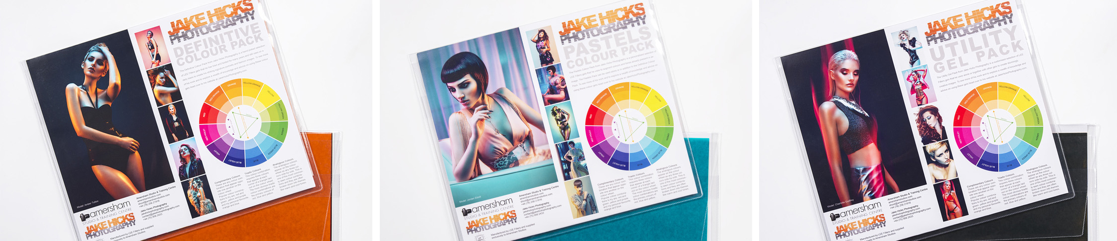
Click to Enlarge Take a look at the above diagram to see just how close I was two years ago to predicting what colours would be cool in 2018. Pantone's Colour Institute released 12 colours and my Pastels Colour Gel Pack has 8 out of 9 of the potential colours. JHP: Trendsetter extraordinaire at your service people! 

Hahahaha, I nearly fell off my chair when I lined up the 2018 colour predictions against my Pastel Gel Pack colours, they are nearly all identical. Sure, the browns and whites aren't there but seeing as you can't have brown or white gels I was hardly likely to have those. The only single outlier was the chilli-red but otherwise the remaining 8 are all there.

So there you have it, proof that I'm a trendsetter plain and simple and now I finally have the evidence to show my wife ;)

So if there's any massive global corporations out there who want to save a few thousand and find out what's going to be cool in 2020, just let me know and I'll see if I can do you a deal :D

But if the rest of you want to take some red-hot and on-trend photos in 2018, grab some JHP Pastel Colour Gels before the New York fashion week buys them all up! #shamelessselfpromtion


Thanks again for reading guys and as always, if you have any other questions, please feel free to let me know in the comments below. But also feel free to let me know your thoughts on this too. Do you agree with Pantone steering the course of colour trends or do you feel like this is a borderline monopoly. Do you think that we'd see more variety of colour in the shops if we had no Pantone Colour Institute? Or have you had any successful colour predictions yourself? Let me know in the comments below :)


LAST 2017 WORKSHOP DATES ANNOUNCED - If you're interested in any of my work and would like to know more about how I created some of my shots then why not check out my workshops. Here you can find out everything there is to know about Gelled Lighting, Long Exposure Flash Photography and my entire Post-Pro Workflow. Jake Hicks Photography - Workshops

gel workshop trio.jpg

I've also just released a brand new 22 hour complete Gelled Lighting Tutorial video. I go over everything from studio lighting setups with gels to being on location with gels plus I also go through my complete retouching and post pro workflow. For more details and complete breakdown of everything that's include check out my Coloured Gel Portraits Tutorial

gel trio set video.jpg

I also offer comprehensive coloured gel packs. These collections of gels are what I use day to day to create some of the most highly saturated colours around. If you're looking at getting into gelled lighting or need to get stronger and richer colours in your coloured gel work why not check out my Jake Hicks Photography Gel Packs

gel trio set crop.jpg
Tuesday 11.07.17
Posted by Jake Hicks
Comments: 3
 

How to Avoid Colour Banding when using Coloured Gels

Donate & Support

I've always wanted my photography education on here to be free, so although there is no paywall to any of my -Technique Tuesdays-, any and all support is greatly appreciated. ❤️

PLUS: Donate any amount and I’ll send you a link to the hi-res print version of my studio lighting book.

||

PLUS: Donate any amount and I’ll send you a link to the hi-res print version of my studio lighting book. || PLUS: Donate any amount and I’ll send you a link to the hi-res print version of my studio lighting book. ||

Ever wonder why I'm so fussy about 'clean' lighting with my coloured-gel photography? Simply put, failing to produce cleanly lit gel shots simultaneously produces horrendous-looking shots with gels.

When I refer to clean lighting, I'm referring to the fact that I like to keep all of my lights in my scene exactly where they're supposed to be. If I have a background light, then I have it lighting the background and nothing else. When I have a hair light, I have it lighting the hair and nothing else and so on. This might seem fairly obvious, but when you're using white-light and large modifiers like softboxes, the lighting is going everywhere whether you like it or not. You have a 5-light white-light setup, and you likely have the same colour white-light falling on all areas of the image, but because all those lights are the same colour, we barely notice. We simply can't get away with being that sloppy with coloured gels.

I will explain colour banding more thoroughly later on in this article but for now just know that it's where adjacent colours don't appear to blend very smoothly. They 'step' quite aggressively like you see here on this models arm. The colour appear…

I will explain colour banding more thoroughly later in this article, but for now, just know that it's where adjacent colours don't appear to blend very smoothly. They 'step' quite aggressively, as you see here on this model's arm. The colour appears to go from blue to grey to orange, and this can sometimes be referred to as colour banding. But is that accurate?

So why do I insist on clean lighting with gels? Well, it's because when two coloured lights mix, they don't mix like paint, they mix like light does.

Not only do they not mix like we think they should, but they also start to produce an awful-looking side effect we call 'colour banding'. I'll explain colour banding and what it looks like in more detail later, but first, let's take a look at what I'm referring to when I say 'mixing' light versus mixing paint.

The physical mixing of colours is referred to via a 'subtractive' colour wheel, which is used to describe mixing colours like paint. Light hits the paint on a canvas and is reflected back into our eyes, and we see the colour that way. This is the regular colour wheel we're all used to seeing and using.

However, for mixing light, we use the term 'additive' colours, specifically referring to how light mixes from transmissive devices like TVs, smartphones, and so on. No light is reflected off any surface like a canvas, and the colour is mixed as we see it directly on the screen.

Take a look at the diagram below to see just how differently colours mix with paint compared to light.

Click to enlarge - It should be pretty clear to see just how differently red, green and blue mix when we do it with paint compared to light.


How do we create coloured light?

So, before we get ahead of ourselves, what is coloured light? The short form of this is that white light is actually made up of a full spectrum of colours. Basically, that means that when you shine multiple coloured lights on top of one another, you're actually just getting closer and closer to a white light with no colour at all. But don't worry, you're not alone if you think this is weird because we've all spent our entire early school years learning that mixing colours and paint is very different to this. We've been told that mixing colours like blue and yellow will result in green and that if we mix red and yellow, we'll get orange, and so on.

You can literally forget everything you were taught at school about colour mixing as it’s completely different when it comes to photography and mixing coloured lighting.

The diagram below illustrates that white light is, in fact, a complete rainbow (spectrum) of colour.

jake hicks photography red gel spectrum.jpg

So, how does this relate to us as photographers? Take a look at the diagram above to get an idea of what coloured gels actually do to our light once it has left the flash. ‘White’ light leaves the flash and travels into the gel. As we mentioned before, white light is actually a complete rainbow (spectrum) of colour, so when it hits our red gel, the gel isn't actually turning the light red, but instead, it's filtering out all the other colours of the spectrum and leaving only red behind.

So now imagine the same thing happening with a blue gel and a green gel alongside this too, with their powers combined (they produce Captain Planet - if you get that reference you're officially old ;) ) they create white light once again on the resulting surface.

When RED, GREEN & BLUE light are combined they produce white light.


The Two Colour Wheels

Yes, that's right. You heard me correctly earlier on. There are, in fact, two colour wheels, and we need to understand how they both work, how they relate to one another, and what's important for us as photographers before we can continue.

I spoke about 'additive' colours and 'subtractive' colours before, now I'd like to try and explain these in terms that relate to us as photographers, so from now on, I'll be referencing 'subtractive' colours as the painters colour wheel and 'additive' as the lighting colour wheel.

First off, let's take a look at how the two colour wheels differ visually.

Click to enlarge

They're certainly very similar but there are a few key differences in the way the colours are laid out to illustrate how colour is mixed between them.

First, we should clarify the primary colours in both of these colour wheels. If you're not sure what defines a 'primary' colour, it's the core set of three colours from which all other colours are derived. In the painter's wheel, it's Red, Yellow, and blue, and in the lighting colour wheel, it's Red, Green, and blue (RGB).

Click to enlarge

Now that we know the primary colours for both the painter's and lighting colour wheels, we can start to examine how these primary colours mix to create other colours. As we mix these colours, we can see why these colour wheels are laid out the way they are. Take a look at the two sets of colour wheels below to see what I mean.

Click to enlarge. Now, we're starting to get a clearer idea of why the two wheels are laid out differently. The secondary colours are between the primary colours, as we see here.

You should see that secondary colours are simply the colours that sit between the primary colours on each wheel. So, although both colour wheels appear to have a red and a blue in common for their primaries, the secondary colours are clearly quite different.

There is a very reasonable scientific reason for why we have two colour wheels and how reflected light and transmissive light of subtractive colours and additive colours, respectively, vibrate at different wavelengths to create varying colour combinations... but this article is long enough already. I aim to create an article specifically targeted at photographers and what we NEED to know but if you're interested in the deeper-dive physics of this topic, then I recommend this linked article for some light bedtime reading (see what I did there) on Light Absorption, Reflection and Transmission. Enjoy :)


Complimentary Colours

Now, let's take the principles we've learned about what 'white' light actually is and apply a little colour theory to it. In art, we have something called colour theory. This is the principle that certain colour combinations are more favourable and resonate well with us as people than other colour combinations. One of the most popular colour theories is the one we refer to as 'complementary colours', and we'll be exploring this a little deeper with coloured light here.

If you have a colour wheel, complimentary colours are very easy to understand as a complimentary colour is simply any colour that is opposite one another on the colour wheel.

These three complimentary colour combinations of yellow+purple, red+green and blue+orange are certainly the most popular combos, but is there a reason for that?

These three complementary colour combinations—yellow + purple, red + green, and blue + orange —are certainly the most popular, but is there a reason for that?

Take a look at the colour wheels above, and you'll see the examples of complementary colours that I've pointed out. These three colour combinations are certainly the most popular: red and green, purple and yellow, and orange and blue. But is there a reason for that?

These complimentary colour combos are so popular because they each contain a primary and a secondary colour. If you're a bit rusty on your primaries and secondaries, take a look at my handy image below to refresh your memory.

Click to enlarge

Now, let's take a look at how those secondary colours are created by mixing two primary colours.

Blue & Yellow = Green

Yellow & Red = Orange

Red & Blue = Violet

The primary colours and the secondary colours - Mixing primaries will result in secondary colours.

The primary colours and the secondary colours - Mixing primaries will result in secondary colours.

It stands to reason that colours that are essentially derivatives of their primary brothers actually become their complementary counterparts.

For example, yellow and purple are complementary colours. The other two primaries that aren't yellow are red and blue. Mix those together, and you get purple, which is complementary to yellow.

JEEZ JAKE! I normally only come here for the pretty pictures of ladies covered in oil and coloured lighting!!! This is a bit much!

Yes, I do apologise if this is a bit of a headache, but you really don't need to know the math behind colour theory to be good with it. However, it certainly can be nice to know how it all ties together. Here's a quick list of the complementary colours and how they relate to their primaries.

Complimentary colours are simply primary colours and the combination of their brother primary colours. For example the complimentary colours yellow and purple are yellow plus the other two primaries combined, red and blue.

Complimentary colours are simply primary colours and a combination of their brother's primary colours. For example the complimentary colours yellow and purple are yellow plus the other two primaries combined, red and blue.

So, although you don't need to fully understand the reasoning behind how certain complimentary colours are made, you do need to know how important they are.

Everything from room decor to corporate branding, from the clothes we choose to wear to the packaging we're drawn to on the shelves, undergoes colour theory before it's released.

I cannot overstate how powerful colour is in our everyday lives, so it stands to reason that colour theory is incredibly important, too.

The biggest distinction about colour theory so far is that it uses the painter's wheel to figure out harmonies in colour. Do not use the lighting colour wheel to work out what colours work well together; that is purely used to show how certain coloured lights will mix to generate other coloured lights.


Mixing Complimentary Colours with Coloured Paint

In the previous section, I explained the importance of complementary colours and how powerful the colour theory behind them is. Before we talk about using complementary colours in lighting, I just wanted to quickly show you what happens when we mix complementary colours with paint.

I doubt the resulting images below will surprise anybody. Paint mixes the same way physical colours have always done, and the resulting colours are the same now as they were when we were crushing up beetle shells and mixing them with fern roots. The important thing here is how different this is from mixing complementary colours in lighting.

JHP paint mix text.jpg

Yes, when I use the term brown to describe the resulting colours above, I'm generalising greatly, as there are many different versions of brown. But let me explain how the colour theory of paint works when it comes to mixing colours.

When you mix primary colours (red/yellow/blue) you get the secondary colors (orange/green/purple). When you mix the primary colors with the secondary colours or use different amounts of primary colors, like if you have more yellow than blue, you get all the other shades in the color wheel like yellow-green, blue-green, red-orange, yellow-orange, blue-purple, red-purple, and so on.

When you mix two complementary colours like purple and yellow, you simply get a shade of 'brown'. The brown isn't important, but what is important is how we get a very different result when we mix complementary colours in lighting.


Mixing Complimentary Coloured Light

Okay, so now let's apply the test to our photography world and see how colours mix when using light compared to paint. First, let's see what happens when we mix the lighting primary colours of Red, Green, and Blue. This will give us a baseline of how light mixes compared to paint and will also show us why the RGB colour wheel is laid out the way it is to create its secondary colours of Magenta, Yellow, and Cyan.

Thankfully, this test was fairly simple. All I did was attach coloured gels to the ends of two gridded strobes, fire them against a white wall, and take shots of the colours separated and another couple of shots of the colours mixed.

Click to enlarge Above, you can clearly see how the coloured light mixes on a white wall. Red and Blue make Magenta, Red and Green make Yellow, and Green and Blue make Cyan.

The results above speak for themselves. Although I was aware of the principle of mixing coloured light before I did this test, I was still pretty surprised at how well these coloured lights actually mixed on a wall. Remember, the lighting colour wheel is based on mixing transmissive colours, colours that mix as they are emitted from a screen and not shone onto a surface.

The next stage was to test how the complementary coloured lights mixed. The results were very different and, honestly, pretty surprising.

Click to enlarge This is the result of mixing the complimentary colours together; purple & yellow, red & green and orange & blue.

What's interesting about these results is why it is so important for us to employ clean lighting when using coloured gels. Thankfully, red and green are two of our primary colours on the lighting colour wheel, so mixing those two coloured lights produced the expected results of yellow, but it's when we mixed the other two complementary colour combinations that it got interesting.

Mixing both violet & yellow and orange & blue actually produces grey.

It's probably more technically correct to say that these colours cancel each other out, but essentially, mixing these two complementary-coloured lights together removes their colour, leaving a dull white colour in its place.


Colour Banding…. or Bad Lighting?

So, you made it this far, and we can at last discuss this 'colour-banding' problem that I'm sure we've all faced at some point.

What is colour banding? Colour banding is the odd 'stepping' of colour that can be produced in very saturated images. It is when colour doesn't smoothly transition from one colour to another in our digital images. In the image below, you should see that the colour on the model's arm goes from orange to grey and then to blue, and this look is often referred to (sometimes mistakenly) as colour banding.

Now, technically speaking, this example isn't strictly colour banding, but for the sake of argument, we're going discuss what causes this effect and how to avoid it.

This infuriatingly ugly effect is a huge problem with coloured gelled lighting, and for years, I thought it was simply crappy digital cameras not having the power to render all the colours I wanted or even online platform compressing my files which resulted in this ugly visual stepping effect, and although this certainly plays a part, it would seem we can only blame our tools so much.

Click to enlarge The image above clearly shows what I mean by colour banding but take a closer look. Is it actually colour banding or is it messy lighting?

The above raw image clearly illustrates what looks like colour banding, but in actuality, it's not the camera's fault; in fact, it's messy lighting.

What is happening here is that two complementary colours meet on the skin, and when they do, they appear grey as they cancel each other out. Look closely at the circled section above, and you'll see that the colour on the arm goes from blue to grey to orange—not a pretty look. Remember what happened in our lighting test earlier when we mixed complementary coloured lighting? Does it look familiar?

So how can we avoid this? Well, the simple answer is first to be very aware of what happens when you mix certain coloured lights together in a scene. The biggest offenders (and likely the ones you'll be mixing the most) are the complimentary colours. Thankfully, red and green only produce yellow, which, although unlikely to be a good thing, is still better than grey, and of course, the biggest culprits are the mixing of orange & blue plus the purple & yellow creating grey. This unsightly gelled lighting phenomenon is certainly something you want to avoid at all costs, and thankfully, you can do just that with proper light control as we see below.

Click to enlarge Colour banding can be avoided with proper light control but more importantly so can the ugly grey overlap of complimentary colours.

All of the images above show heavy use of the complementary colours orange and blue, but you should see that I've avoided the dreaded grey colour overlap that can occur when combining these lights by keeping the lighting clean and never spilling the two colours onto one another.

Now, I understand that this is a lot easier said than done, and actually keeping the lighting separate is the topic for another article. Still, I hope you can see how important clean lighting is now, especially with colour gels.


Closing comments and conclusions

Firstly, thank you if you've made it this far in the article. I'm not known for my short, snappy social media posts or articles, and this monster of a piece is no different. But I do feel that everything being said here is relevant and although I debated splitting this up and getting multiple posts out of it, I really think everything here needs to be seen together to fully understand what is going on.

Although I didn't want to complicate this any further, I will add that we, as photographers, actually operate between the two colour wheels. Don't panic; what you've read so far is relevant, but we, as artists who use light as our medium, fall between the two colour wheels because the lighting colour wheel is for transmissive RGB displays only. Yes, we use light, but we shine that light onto an object and then photograph that reflected light, and reflected light is what painters use to mix colour. I know that is a bit of a mind-bender, but really, all you need to know is that light mixes like it does with RGB, but bear in mind that it requires a white surface to be the subject for it to remain relatively accurate. Chances are you're not photographing coloured gels on white walls, so caution is required when making assumptions about the mixing of colour on another surface that has its own colour, like skin. Like I said, I didn't want to overcomplicate something that was already fairly complicated, but I wanted to highlight that point to any of you who may have been wondering about it.

Points to remember

  1. Use the painter's (subtractive) wheel for colour theory. For example, use it to work out complementary colours.

  2. Use the lighting (additive) wheel to work out what coloured lights to mix, or what will happen if you do mix certain coloured lights together.

  3. The more paint you mix together, the darker the colour will become. The more lights you mix together, the lighter the colour will become.

  4. Complimentary colours are always opposite one another on the painter’s wheel. For example, orange and blue.

  5. Mixing two of the three primary colours will result in a secondary colour for both the painters and the lighting colour wheels.

  6. Mixing certain complementary coloured lights will result in grey, such as orange and blue or purple and yellow.

  7. Always try to keep the coloured lights separate on whatever you're photographing. Failure to do so will result in an ugly-looking colour banding effect.

For reference, print out or save these 'cheat sheets' below on how colour theory works.

Click to enlarge. The painters colour wheel theory

Click to enlarge. This is the difference between mixing paint and mixing light

Click to enlarge. How complimentary colours are created

Click to enlarge. The two colour wheels you must understand and why

For more of these cheat-sheets, head over to my Quick-Tips page that has loads more of them on all kinds of photographic topics.


I know this was a monster-brain-melting article, but I've seen very little on this topic that is specifically targeted at us photographers, so I hope it helps at least one person understand more clearly what's going on when mixing coloured gels.

As always, thank you, and if you have any questions or anything to add, feel free to keep it to yourself.......sorry, I meant post it in the comments below ;)


:WARNING: Items that wants your monies below!


LAST 2017 WORKSHOP DATES ANNOUNCED - If you're interested in any of my work and would like to know more about how I created some of my shots then why not check out my workshops. Here you can find out everything there is to know about Gelled Lighting, Long Exposure Flash Photography and my entire Post-Pro Workflow. Jake Hicks Photography - Workshops

gel workshop trio.jpg

I've also just released a brand new 22 hour complete Gelled Lighting Tutorial video. I go over everything from studio lighting setups with gels to being on location with gels plus I also go through my complete retouching and post pro workflow. For more details and complete breakdown of everything that's include check out my Coloured Gel Portraits Tutorial

gel trio set video.jpg

I also offer comprehensive coloured gel packs. These collections of gels are what I use day to day to create some of the most highly saturated colours around. If you're looking at getting into gelled lighting or need to get stronger and richer colours in your coloured gel work why not check out my Jake Hicks Photography Gel Packs

gel trio set crop.jpg
Tuesday 10.17.17
Posted by Jake Hicks
Comments: 15
 

Getting Creative with Speedlights - 5 Simple DIY Setups

Technique Tuesday Facebook Thumbnail speedlights 5 simple setups.jpg

As some of you already know, I recently developed and released a brand new lighting workshop called Creatively Simple Lighting. In that workshop, one of the core foundations of what I teach is how to get creative with simple lighting and simple lighting doesn't get any simpler than when you use Speedlights. At their most basic, Speedlights can simply sit on top of your camera and illuminate whatever is in front of you. If you want to get a little more creative however, the first thing to do is to get that flash off your camera and step into the vast world of off-camera flash.

Off-camera flash is where it gets interesting and it's very easy to throw a cheap softbox on your speedlight and take some pleasant yet fairly basic shots. So how do we make it a little more engaging without spending a fortune? Well, as part of my workshop I wanted to prove that all the setups I was teaching could be achieved with a couple of Speedlights and some very basic modifiers. The following article is the result of me dusting off my Speedlights and playing with some homemade modifiers to see if I could create some engaging and creative effects without it costing me a penny.

20 Years Ago

About 20 years ago when I was at Uni studying photography (yes, I'm that guy who actually studied a course he eventually got a job in) we were pretty poor. In fact there was a group of three of us that always hung out and we helped each other do shoots but only one of us had a Speedlight. We all used that single Speedlight but we had no real modifiers to speak of (unless you count the Rizla [cigarette paper] over the end to act as a diffuser 'modifier') so we had to get creative with how we modified the light that emerged from that poor little overworked Speedlight.

Circa 1998: Behold, the power of a single Speedlight and a Frosties cereal box at work!

Circa 1998: Behold, the power of a single Speedlight and a Frosties cereal box at work!

The above image that I took well over 20 years ago now is a great example of working within the constraints you've been afforded. My good friend Dan is the model here, I'm taking the picture and my good friend Chris is holding the flash by hand off to my right. Because we had no fancy telemetry systems this flash is firing 'cold' which means it's not connected to the camera in any way. Because we couldn't fire this flash remotely, we had to come to this old abandoned bus factory in the middle of the night so it was dark enough for me to use a one second exposure on my old OM-1 35mm camera. During that single second exposure, I would count down from 3 and then Chris would manually fire the flash by hand down an opened cereal box... hopefully at Dan. I remember he struggled because he had a broken arm at the time and his cast kept getting stuck in the box. Good times haha ;)

Now remember, it's pitch black and the middle of the night in place that we weren't technically supposed to be. Also there were no mobile phones back then to act as lights (I know right?! I'm that old - NO MOBILE PHONES!) so with no auto focus on the camera, focusing in the dark was almost an impossibility beyond judging the distance and then adjusting the lens accordingly. Plus, there's no modelling bulbs on the Speedlight so Chris had to use his best guess that he was pointing his Frosties box in roughly the right direction.

PLUS: It was an old film camera - NO BACK OF CAMERA IMAGE!

I think I shot an entire roll of 24 frames of just this setup and hoped we had at least one frame that was passable. But we wouldn't know until tomorrow.

Looking back on that now, I learned about and worked through so many problems on that one little shoot and for that I'm so grateful I grew up learning with the madness that is film photography. It forced us to be so creative every single time we picked up a camera where we now may be guilty of relying on post-pro just a little too much a little too often.

Using Speedlights 20 years on

JakeHicksPhotography (1 of 9) speedlight square.jpg

So fast forward nearly 20 years and I pick up speedlights once again to prove a point. It fact it had been so long since I'd used Speedlights that I actually started the shoot with no batteries and had to run out and get some. I was certainly a little rusty with using them. But if Speedlights are so versatile and simple to use, why did I ever leave Speedlights in favour of strobes to begin with? Essentially Speedlights are fantastic but they do have limitations and in the end your skill with lighting will exceed what they can offer you.

I liken using Speedlights versus strobes to a master chef making a fine meal. The chef can either make the meal with fresh meat and vegetables from a country market or they can make the exact same meal from ingredients bought from the corner store. Both results will produce the same meal but one will definitely taste better than the other. The result is only ever as good as the ingredients.

So now that we're aware of what Speedlights can do and the limitations they have, let's take a look at some of the creative ways I used them without spending any money.

The Humble Speedlight

I'm sure you all know the type of light that a Speedlight produces, its pretty hard due to the nature of its size. If you aren't aware of what I mean by 'hard' light then I simply mean that it's quite harsh and generates a contrasting light. The shadows are very dark and the highlights are very bright so it's not always that flattering or interesting to look at.

Let's add some household product packaging into the mix and see if we cant rustle up something a little more visually engaging with very little effort.


5 Simple and Very Cheap Creative Effects with Speedlights

Setup 1 - Controlling the Light

First off, I got one of those silver tubes you eat crisps out of. I cut the end off and put the Speedlight inside. In this first shot I had the Speedlight quite far into the tube so that I could control the light and stop it from bouncing around the white room. This resulted in some very strong and very clean shadows.

A simple silver lined crisp tube with the base cut off and a Speedlight inserted.

A simple silver lined crisp tube with the base cut off and a Speedlight inserted.

JakeHicksPhotography (3 of 6).jpg

Normally what happens when you use a Speedlight in a small white room is that light bounces everywhere and you loose some of the contrast. Channeling the light down this silver tube allows you to limit this light from bouncing unnecessarily and results in a stronger shot.


Setup 2 - Drawing your Viewer in

The simplest way to engage a viewer is to control where they look. If you can guide their eyes to the focal point of your shot then you automatically create a more engaging image. For this next shot I simply pulled the Speedlight out from the silver tube as much as I could and it created a very clear vignette of shadow around the model resulting in a more visually engaging lighting effect.

With the Speedlight pulled further out of the tube I was able to create a vignette of shadow around the model resulting in a more engaging lighting.

With the Speedlight pulled further out of the tube I was able to create a vignette of shadow around the model resulting in a more engaging lighting.

JakeHicksPhotography (2 of 6).jpg

Setup 3 - Directional Yet Soft Shadows

So can we take the edge off this strong yet directional light? Well thankfully yes and you'll be pleased to know its simple and very cheap to implement. All you will need is your crisp tube lid and a piece of toilet tissue and you're done.

Simply place a single sheet of toilet tissue over the lid and attach it to the tube.

It's not classy nor does it look pretty but it is cheap :D &nbsp;Take the edge off your hard lit portraits.

It's not classy nor does it look pretty but it is cheap :D  Take the edge off your hard lit portraits.

The resulting image is far softer than before yet it still maintains a strong directionality. Compare those shadows on the wall behind the model to the previous shots.

The resulting image is far softer than before yet it still maintains a strong directionality. Compare those shadows on the wall behind the model to the previous shots.

So with the minor addition of a single sheet of toilet tissue you should see a dramatic difference in the way the shot looks. Pay close attention to how soft the shadow edges are now. Ironically this type of lighting is actually fairly tricky to achieve with strobes. The reason for this is because there's actually a lot of light in the shadows. Look at how bright the shadows are compared to the original shot with no diffusion tissue on the end. The lighting now creates very strong directional lighting but with detail in the shadows thanks to the light spread.


Setup 4 - Channeling the Light

Next up I'm going back to my roots of 20 years ago and channelling the speedlight down a cardboard box once again. This next idea, couldn't be simpler. All you need is to find a cardboard box and open up the end and fire the speedlgiht through it. Once you have that in place you can adjust the angle and tilt of the box to create more interesting slits of light and shadow.

Any long and thin cardboard box will do, even an old Frosties cereal box will do if you've still got one ;)

Any long and thin cardboard box will do, even an old Frosties cereal box will do if you've still got one ;)

Adjusting the angle of your box can create different effects and simply twisting it a little will creates slits of light and shadow like this.&nbsp;

Adjusting the angle of your box can create different effects and simply twisting it a little will creates slits of light and shadow like this. 

It should be pretty easy to see how effective and engaging this look can be with a little effort. Plus, remember that this is just a single speedlight and a cardboard box! Nothing fancy here yet its a beautiful looking light.


Setup 5 - Adding some Colour

This next step is for those that want to take the creativity to the next step by adding an extra light. This time around we will take the 'Channelling the Light' technique from before, leave that exactly as it but with the addition of a second light and softbox.

We can place this softbox where we like but just out of shot will be fine. Before we attach a softbox to our speedlight though, we're going to add a blue gel to it. This will add a whole other dimension of colour and interest to the shot and thereby making it far more engaging for the viewer.

Adding a second light can obviously open up a whole new world of creative possibilities but adding some colour to that light can certainly be a great way to go if you want to add some interest.

Adding a second light can obviously open up a whole new world of creative possibilities but adding some colour to that light can certainly be a great way to go if you want to add some interest.

The addition of some colour here completely changes the way the shot looks.

The addition of some colour here completely changes the way the shot looks.

With very little effort, an inexpensive softbox and a cardboard box found at home and you can quickly add a lot of interest into your images.&nbsp;

With very little effort, an inexpensive softbox and a cardboard box found at home and you can quickly add a lot of interest into your images. 


So there you have it, a look at some cheap and very basic ways of getting creative with a speedlight. It's good to see that I'm still able to make use of an old cardboard box as a speedlight modifier 20 years on from when I first played with it haha ;)

But I'd love to hear about your cheap and homemade modifiers. Have you ever used something odd as a modifier to create some interesting effects? If you have then let me know in the comments below. As always, if you have any questions then fire away and I'll do my best to answer them as soon as I can :)

Thanks for reading.

Patient model: Jaye


WARNING: Slightly more expensive ways of improving your photography await below :D


NEW 2017 WORKSHOP DATES ANNOUNCED - If you're interested in any of my work and would like to know more about how I created some of my shots then why not check out my workshops. Here you can find out everything there is to know about Gelled Lighting, Long Exposure Flash Photography and my entire Post-Pro Workflow. Jake Hicks Photography - Workshops

gel workshop trio.jpg

I've also just released a brand new 22 hour complete Gelled Lighting Tutorial video. I go over everything from studio lighting setups with gels to being on location with gels plus I also go through my complete retouching and post pro workflow. For more details and complete breakdown of everything that's include check out my Coloured Gel Portraits Tutorial

gel trio set video.jpg

I also offer comprehensive coloured gel packs. These collections of gels are what I use day to day to create some of the most highly saturated colours around. If you're looking at getting into gelled lighting or need to get stronger and richer colours in your coloured gel work why not check out my Jake Hicks Photography Gel Packs

gel trio set crop.jpg
Tuesday 09.26.17
Posted by Jake Hicks
Comments: 3
 

5 Hidden Tips & Tricks in Photoshop

This weeks article comes in the form of a video of me discussing some of the less intuitive features of Photoshop. Although I would class these five things as 'hidden' they're not exactly secret so you may already know some of them of have been aware of them but never used them in this way before. I certainly hope theres something in here for you and as always if you have any questions let me know :)

A list of five hidden things in Photoshop that can certainly save you time and speed up your workflow.

1. Fade Function 0:42

2. Content Aware 3:55

3. Mask Stacking 11:27

4. Multi-Document Layer Dragging 16:47

5. Accessing Legacy Versions of Photoshop 22:48

Tuesday 09.19.17
Posted by Jake Hicks
Comments: 2
 

Shooting through Prisms at Home or in the Studio

Technique Tuesday Facebook Thumbnail Temp edge 80.jpg

In this tutorial we will be going over how to create gorgeous in-camera flared effects that can add a lot of depth and interest to a simple portrait image. To do this we will be using a glass prism which can be found on any number of online retail sites. The glass prisms are generally used for school science experiments so they're readily available and very inexpensive.

25mmx100mm glass prism on Amazon link here

The prisms are very easy to use out on location as you simply hold them in front of the lens and shoot away. If you're looking to use them in a studio environment though there are a few key things to bear in mind to maximise the flared effect that creates that signature look.

In this setup we'll be keeping it super simple with just two lights and a backdrop. One light to illuminate the model and one light to shine into the prism to create the effect. Even the backdrop used here is a simple window blind so the whole thing is very cost effective and I even shot this in my front room so it doesn't even need much space either.

Prisms reflect the surrounding scene into your lens so shooting with prisms indoors is a little tricker than when you're outside. They're harder to use indoors because quite often there's nothing else that interesting around you to reflect into the …

Prisms reflect the surrounding scene into your lens so shooting with prisms indoors is a little tricker than when you're outside. They're harder to use indoors because quite often there's nothing else that interesting around you to reflect into the shot. In this instance we'll be using an additional light behind the model to shine back into the scene to create this flare and additional interest.


Predicted shoot time

30-40 minutes

Suggested shoot skill level

Beginner - Intermediate

If you're happy shooting with off-camera flash and want to get a little more creative, this is a great next step to add some interesting elements.

You will need

  • 1x Prism
  • 1x Camera
  • 2x Light stands
  • 2x Flash heads or Speedlights
  • 1x Key light modifier (Beauty Dish/Softbox/Umbrella)
  • 1x Simple Reflector Dish Modifier
  • 1x Backdrop

Setting up Your Camera

Step 1 Camera Settings Full Res.jpg

If you're going to be shooting outside on location with available light then simply setting your camera to aperture priority will be enough. To get the most out of this technique though, a wider aperture of around f2.8 to f5.6 will yield the best results. If you're in a studio then setting the camera to manual mode will be best.

Have your starting settings at a wider aperture, around f2.8 to f5.6 should be fine. Set the ISO 100 (as low as your camera will go) and your shutter speed to 1/160, this will be fast enough to limit ambient light but still sync to the flash.


Selecting the Key Light Modifier

Step 3 Beauty Dish Full Res .jpg

It's worth thinking about which modifier you'll be using for your key light. I used a 22" white beauty dish here but a small 60cm softbox or umbrella would do equally well too. Using any of these modifiers will give you a softer more flattering light on the subjects skin. I prefer to use the softer lighting modifiers like these over the less flattering modifiers like grids and snoots. Roughly translated, the larger the light source the softer and more flattering the light will be. Also the other benefit to using larger modifiers like this is that the light will spill onto the background behind the model. This eliminates the need for an additional background light.


Setting up Your Key Light

Step 2 Key Ligth Postion Full Res.jpg

You want to position your key light above the models head, angled down and about 2-3 ft away. Your subject should be about half way from the background to the key light, by doing this the key light should now illuminate the model and spill onto the backdrop to light that as well. I'm using strobes here but speedlights will be just as good. You can either take a light meter reading or take a shot and review the results. Remember we are adjusting the lights to the camera not the other way around. If the shot is too bright then turn down the power of the light, don't adjust the camera to compensate.


Setting up Your Backdrop

Step 4 Setting up Your Backdrop Full Res.jpg

When using prisms in your photography it's important to pay close attention to your backdrop. This becomes less important when shooting on location because the whole world is your backdrop but in a studio environment the prism will distort the field of view so make sure that you have a backdrop large enough to accommodate for this effect. I actually shot this in my front room so I simply used a window blind as a backdrop. They're relatively inexpensive, and there's loads of variety plus it can easily be rolled up and stored away after use.


The Flare Light

Step 5 Flare Light Full Res.jpg

This flare light was simply an open reflector dish. The trick here is this flare light will double up as our hair light as well as the light that generates flare into the prism we're holding to get the lovely soft glow effect in-camera. Place this light behind the model and off to the side just out of shot. A good starting point on the power of this light is to set it about one stop brighter than our key light, this will ensure a strong flaring effect through the prism into the camera lens. Take a few shot and adjust the power until you get the desired amount of flare into the lens.


The Complete Setup

Set up Diagram.jpg
Set up Diagram Plan View.jpg

Backdrop - This is a very inexpensive silver window blind. We will be shooting at a wider aperture so this wont be in focus.

Model - Position the model a couple of feet away from the backdrop. Get them correctly placed and the key light will fall off nicely onto the backdrop simultaneously lighting them both.

Keylight - Beauty Dish. You can substitute this for a softbox or umbrella but you should position it above the models head and about 2-3 feet away.

Flare Light - Open wide reflector. This will be the light positioned just over the models shoulder and pointing towards the lens and prism we will be holding. 


The Prism

Step 6 Prism Full Res.jpg

Now the fun part begins. Simply start shooting away whilst holding the prism in front of your lens at different angles. Try it with the prism held horizontally above the lens or to the side and don't forget to try twisting it as well to produce different looks. One thing to keep in mind is to always keep the prism quite close to the lens and to just have it creeping into shot, don't have it dominating the frame to much otherwise it will obscure the image entirely.

Experimentation is key here as there is no right or wrong way to do this, only what you prefer.


The Final Image

Using prisms indoors can be tricky at first but if you persevere with them you can get some beautiful in-camera effects like the flare and rainbow effects you see here.

Using prisms indoors can be tricky at first but if you persevere with them you can get some beautiful in-camera effects like the flare and rainbow effects you see here.


Shooting through Crystals

You needn't stop with just the prism in front of the lens, in fact you can try any number of glass objects to produce some stunning results. Think about trying simple wine glasses and other glassware or even crystals. Crystals give a slightly more distorted look compared to the prism but simply holding a crystal or several crystals directly in front of your lens can create some gorgeous colours and bokeh effects. One quick tip to bear in mind for best results is to try and get your hands on some antique crystals, these slightly older crystals were coated in a very thin film of lead which gave them those gorgeous rainbow colours as you look through them. You can get away with shining lights directly into them to get some great bokeh effects too.

Using crystals or anything vaguely transparent that refracts the light can be shot through. Experimenting with a variety objects can produce some vey interesting results.

Using crystals or anything vaguely transparent that refracts the light can be shot through. Experimenting with a variety objects can produce some vey interesting results.


The Retouch

Plus, if you're interested in the five minute retouch techniques I used to edit this image, take a look at the image below for the details :)

Click to enlarge...

As always, questions comments and ideas are always welcomed :) If you've given this a go yourself then please feel free to let me know as I'd love to hear how you got on. Thanks again for reading and good luck!


:WARNING: Pay-To-Win below :D


NEW 2017 WORKSHOP DATES ANNOUNCED - If you're interested in any of my work and would like to know more about how I created some of my shots then why not check out my workshops. Here you can find out everything there is to know about Gelled Lighting, Long Exposure Flash Photography and my entire Post-Pro Workflow. Jake Hicks Photography - Workshops

gel workshop trio.jpg

I've also just released a brand new 22 hour complete Gelled Lighting Tutorial video. I go over everything from studio lighting setups with gels to being on location with gels plus I also go through my complete retouching and post pro workflow. For more details and complete breakdown of everything that's include check out my Coloured Gel Portraits Tutorial

gel trio set video.jpg

I also offer comprehensive coloured gel packs. These collections of gels are what I use day to day to create some of the most highly saturated colours around. If you're looking at getting into gelled lighting or need to get stronger and richer colours in your coloured gel work why not check out my Jake Hicks Photography Gel Packs

gel trio set crop.jpg

Tuesday 09.12.17
Posted by Jake Hicks
 
Newer / Older