As a lot of you may know, I like to use the occasional gel in my shots to add a bit of interest. Sometimes these gels are rich and vibrant colours that drench an image in saturation and other times I just want to add a little something extra colour-wise without overpowering the whole image with a synthesised coloured look.
For a more subtle colour look you'll want to use tones that our eyes are more accustomed to seeing, for example orange and blue tones are heavily present in our daily visual journeys already. Orange tones are found in sunrises and sunsets and blueish tones are often found in twilight and overcast days. These are what I call 'natural' colours compared to the rich pinks and purples or reds, these are great for adding effect but can sometimes overpower an image quite quickly. The 'natural' tones that I am referring to are measured in Kelvin and we use this value to adjust the white balance of our shots in our cameras.
So to add a more natural colour effect to your shots what better place to start than by looking at the tones already found in the Kelvin values in your camera via the the white balance. I'm sure we all know we can add a little extra warmth to a shot simply by increasing the Kelvin via the white balance and conversely we can cool down an image be decreasing the Kelvin value.
The Kelvins
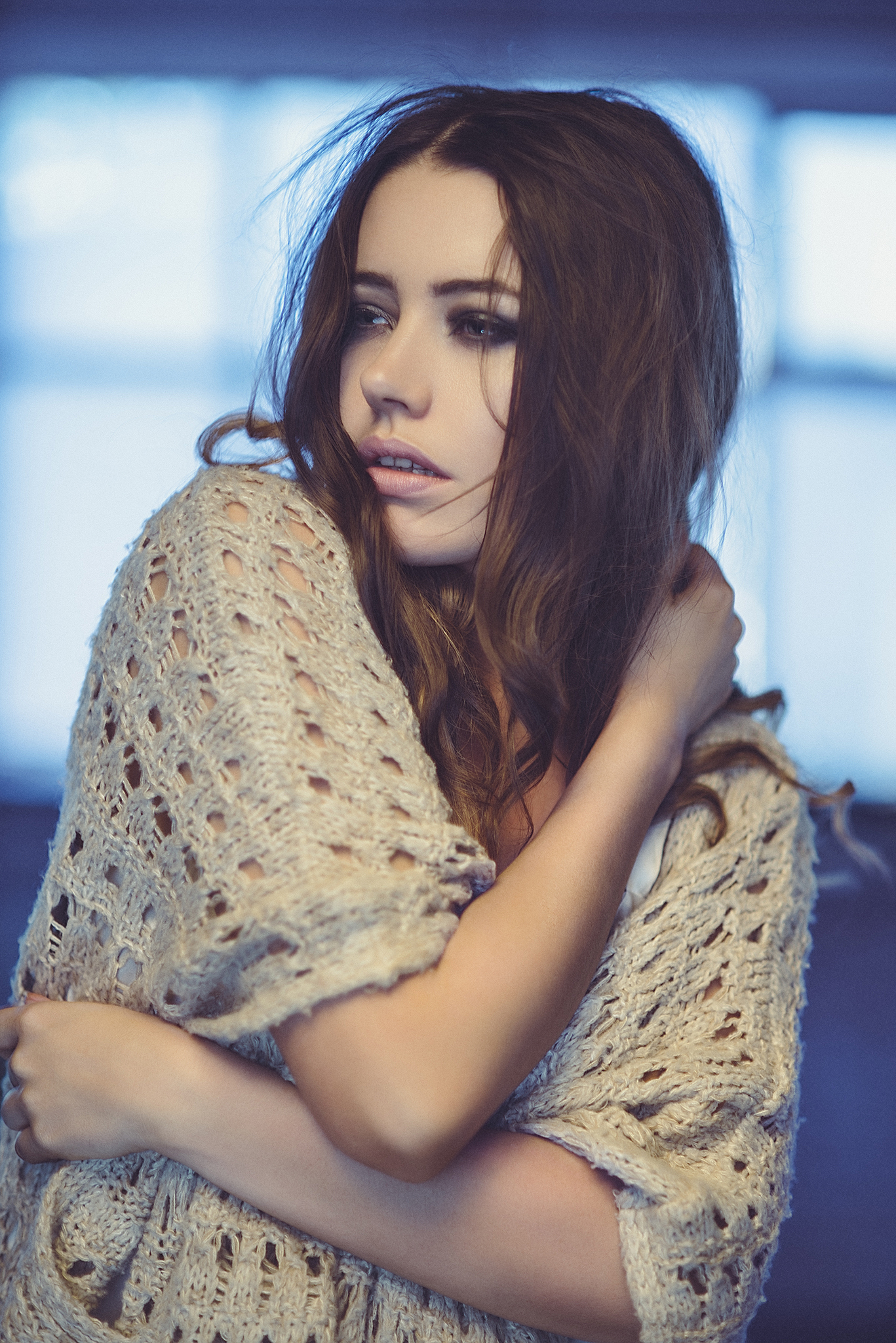
Take a look at these two images below; nothing has been changed apart from the Kelvin value in Lightroom, the left hand image is set to 4500k and the right hand image is set to 5500k. It's my personal opinion that there is no 'correct' white balance in photography and that it's purely down to personal preference. I think that both of these images are viable and if seen alone most wouldn't question the overall tone because I believe they are both within 'natural' parameters.
The only difference between these shots is the Kelvin input know as white balance. The left hand shot is a lot cooler in appearance with a Kelvin of 4500k and the right hand shot is a lot warmer with a Kelvin value of 5500k. Neither of these shots are right or wrong and I believe they are both viable because they both contain 'natural' colour tones. Click on the image to enlarge.
So now that we know we can create natural looking colour toned images as long as we use colours within a certain Kelvin value. But lets mix it up a little and take what we've learned to add some creative effects. To do this we're going to use coloured gels but these gels have been specifically designed to match a Kelvin value, these are referred to as CTO (colour temperature orange) and CTB (colour temperature blue) gels.

What are CTO & CTB normally gels used for?
If you aren't to bothered about this or already know it then feel free to skip on the next section.
The CTO and CTO gels or colour correcting gels as they're also known come in a few different strengths and these are usually referred to as quarter, half or full values with the 'full' version offering the highest value of conversion. Just briefly I'll explain why these correction gels exist. Most photographers don't normally use these correction gels but they're a staple of videographers who mix different types of lighting within a single scene. Photographers tend to stick to either daylight or flash, we don't often introduce constant lighting into our images because we are simply capturing still images whereas videographers are capturing extended periods of time and thus can't use flash. They have to use 'hot-lights' or tungsten lighting that is a lot warmer in colour temperature (kelvin) to flash and daylight. So if they wanted to film a person sat indoors in front of a window they would light the person with a tungsten light but that colour temperature wouldn't match that of the daylight seen outside so they would add a 'full' CTB gel (blue gel) on the tungsten light. Granted this seems super complicated when written down but when you actually put this into practice it's really obvious when you visually see whats going on.
I've included a simple visual reference of the different colour correcting conversion gels here too, it can sometimes help to see a visual interpretation of the colour rather than a number. The Kelvin conversion values shown here are taken from the LEE Filters website. For more info you can always head over there to get super geeky on the numbers too.
The Technique
Cool ok so as with a lot of my techniques lets take what we know and forget it. I only say this as a lot of the time photographers can get a bit bogged down with what's technically correct but instead lets try to concentrate on taking an interesting shot over a 'correct' one. We're going to use these correction gels against themselves because we are going to mix two different light sources in a shot that actually hold the same Kelvin value (flash and daylight) but we're going to add CTO and CTB gels to one anyway.
Let me explain, lets take a look at the super simple setup to begin with. In fact this one couldn't actually be any simpler and it will give us a great way to show off what we're doing with the colours without any complicated lighting getting in the way.
For my setup I simply used a Bowens 22" Silver Beauty Dish and positioned my model with daylight behind her. In reality this really isn't the best way of showing this setup off because I'd ideally like a lot more daylight in the shot so doing this outside with Speedlights or portable strobes would create a far more dramatic effect. But lets stick to what we've got and you'll definitely clearly see the results anyway.
Super simple one light setup plus daylight behind. A 22" silver beauty dish is positioned directly in front of the model with the daylight behind her. Click on the image to enlarge it.
The beauty dish is placed about 3 or 4 feet away and is set just above eye level and angled down at about 45 degrees.
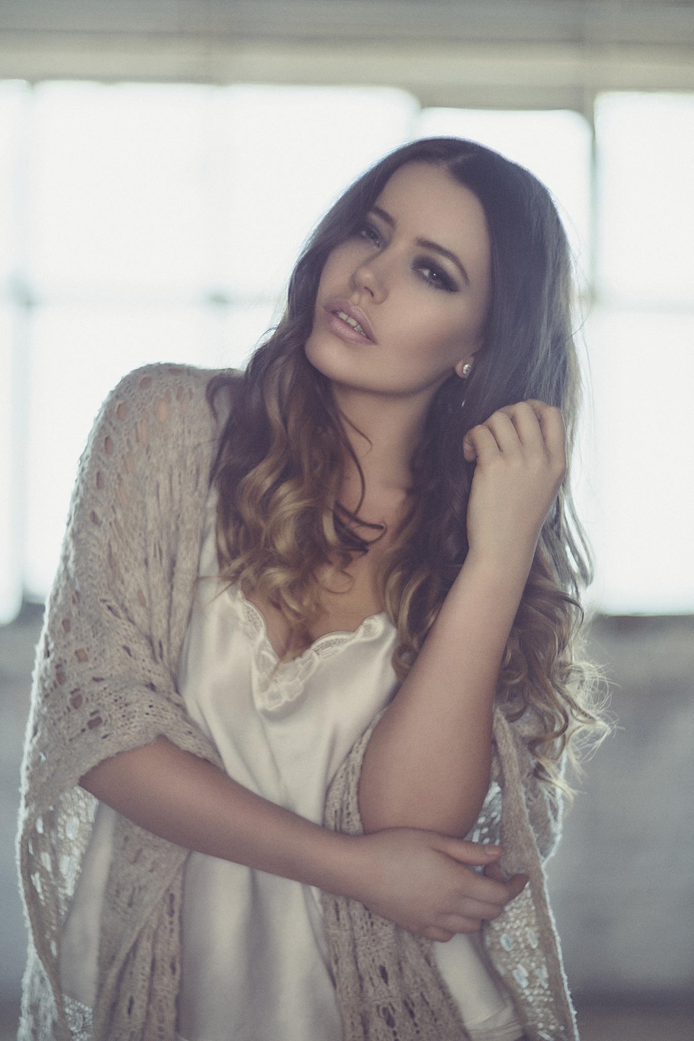
Lets take a look at what the shot looks like with no gels or kelvin adjustments.
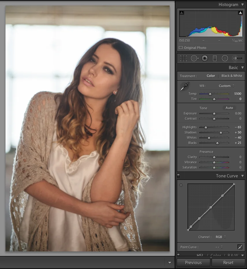
Simple one light setup in front of a window. The white balance is set to a relatively neutral point of 5500k to keep both the widow light behind and the flash key light looking natural.
For the sake of this test I am going to be using a Kelvin temperature of 5500 and a zero tint value. I will be keeping this as a constant example of a daylight value although as we've discussed earlier this may not always be the case and it could be reasonably argued this is a little on the warm side.
For those that are interested this original shot was taken on an old 50mm manual focus lens hence why this is a little 'soft' and that Lightroom isn't showing the settings but I think this was taken at around f4. For the additional gelled images I realised this old manual focus lens wasn't the best choice so I switched to a modern 85mm lens and the settings should appear in the Lightroom histogram window from now on.
Ok so that was fairly simple, one light in front of a window with daylight behind, nothing complicated there but to add a little something extra to this lets play with adding some CTO and CTB gels to our key light.

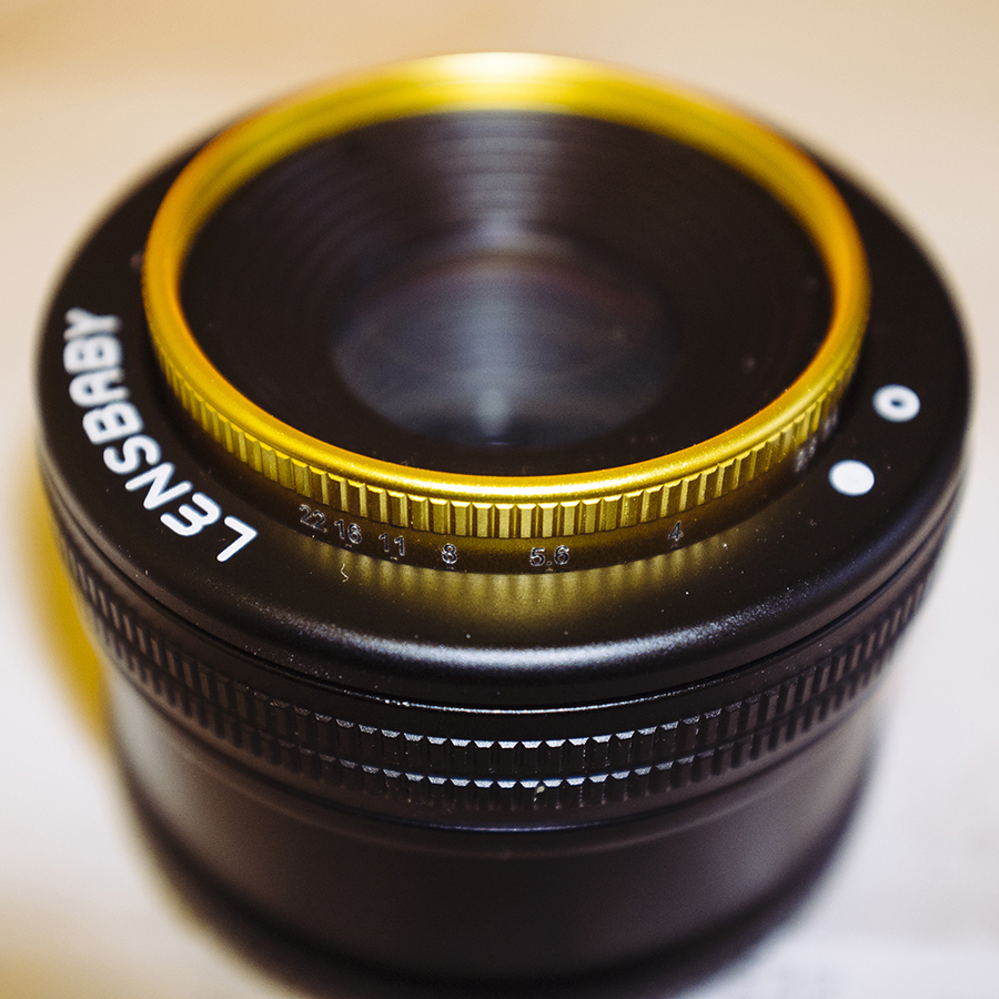
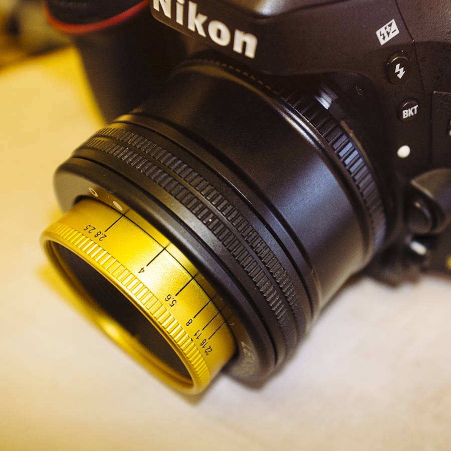
Attaching a CTO to the inside of a beauty dish is pretty simple and can often be a lot easier than attaching it to a softbox too. Simply use a few bits of tape and you don't even need to be as precious as you might think, just as long as the flash tube is covered you'll be fine. *A word of caution, I strongly recommend removing the modelling bulb to make this a lot easier and it will also ensure you don't melt your gel.
It's really simple to attach a gel to the inside of a beauty dish, simply grab a few bits of gaffers tape and tape it over the middle. You don't need to be as cautious as you might think and as long as the actual flash tube is covered you should be fine.
PRO TIP: Remove the modelling bulb; this will not only make it a lot easier to cover the flash tube but it will stop you from accidentally meting the gel too.
Attaching a gel to the inside of a beauty dish is a lot easier than a soft box too, for one it's a solid metal surface so it's easier to get a solid bond and secondly the flash tube isn't as exposed so its easier to cover completely.
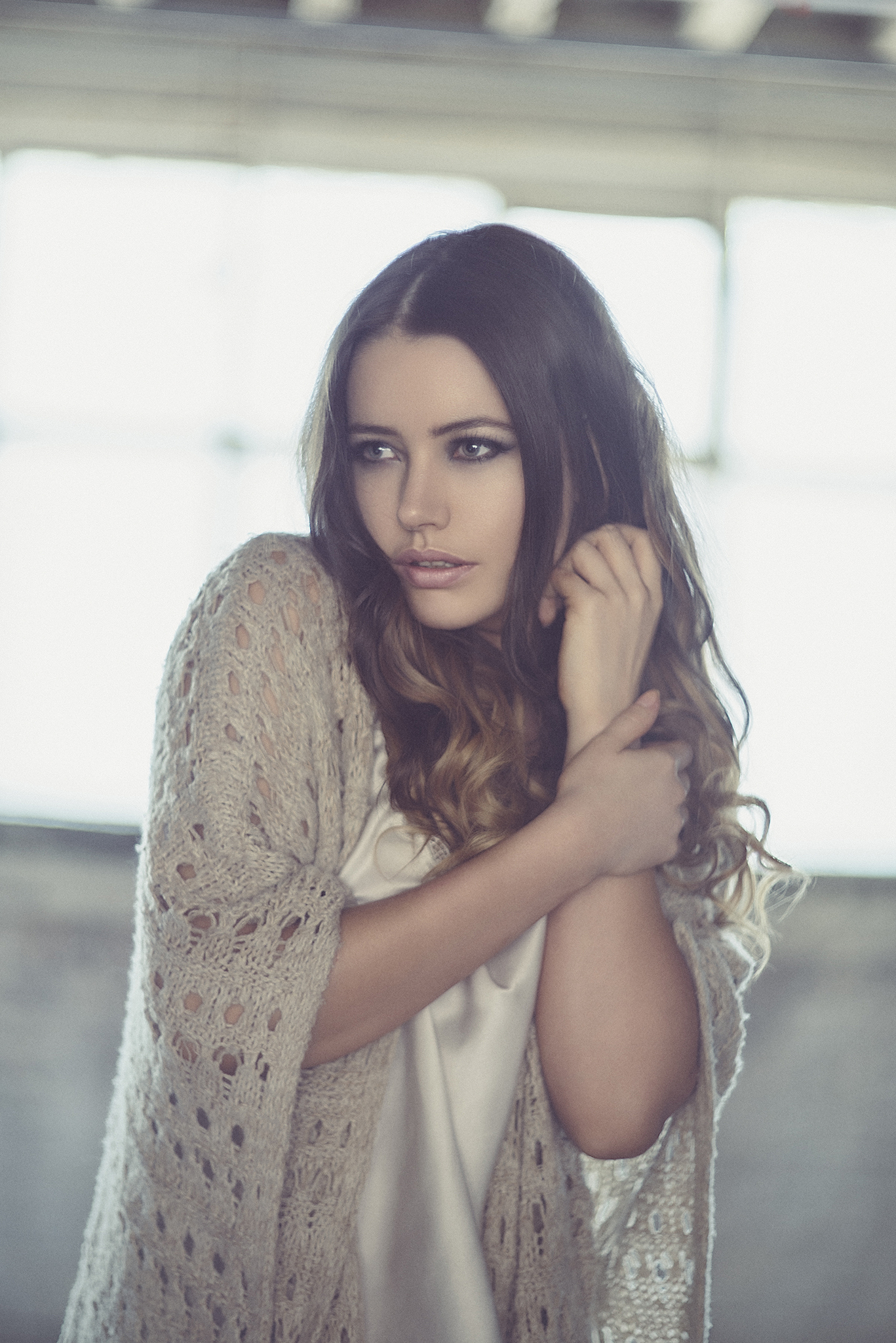
Right, now that we've attached our CTO gel to the inside of our key light lets take some more shots.

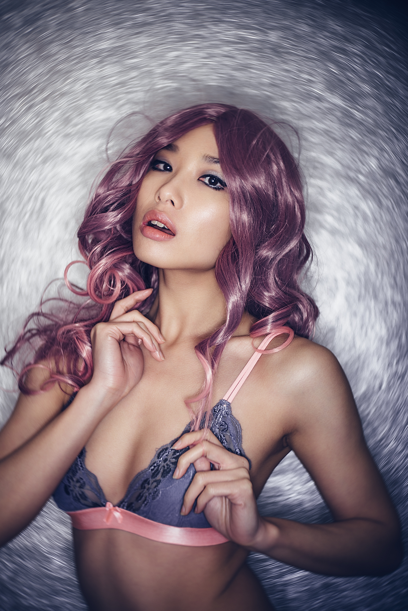
A shot taken in front of a daylight window with a CTO gel on our key light with a Kelvin value of 5500k.
Whoa! Ok so I think its fair to say that's 'Colour Temperature Orange'! Remember we haven't changed anything yet apart from the CTO addition on the Key light. But lets just tweak that Kelvin value about a bit and see if we can't fix that skin tone a little.

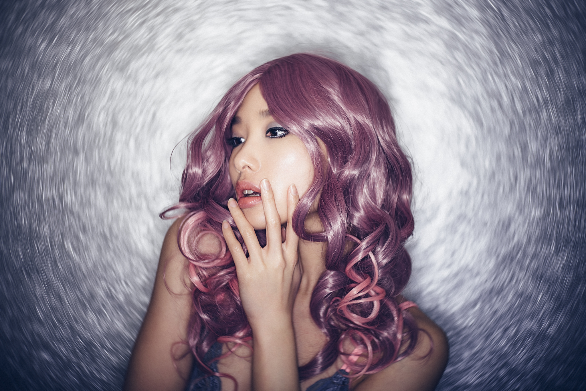
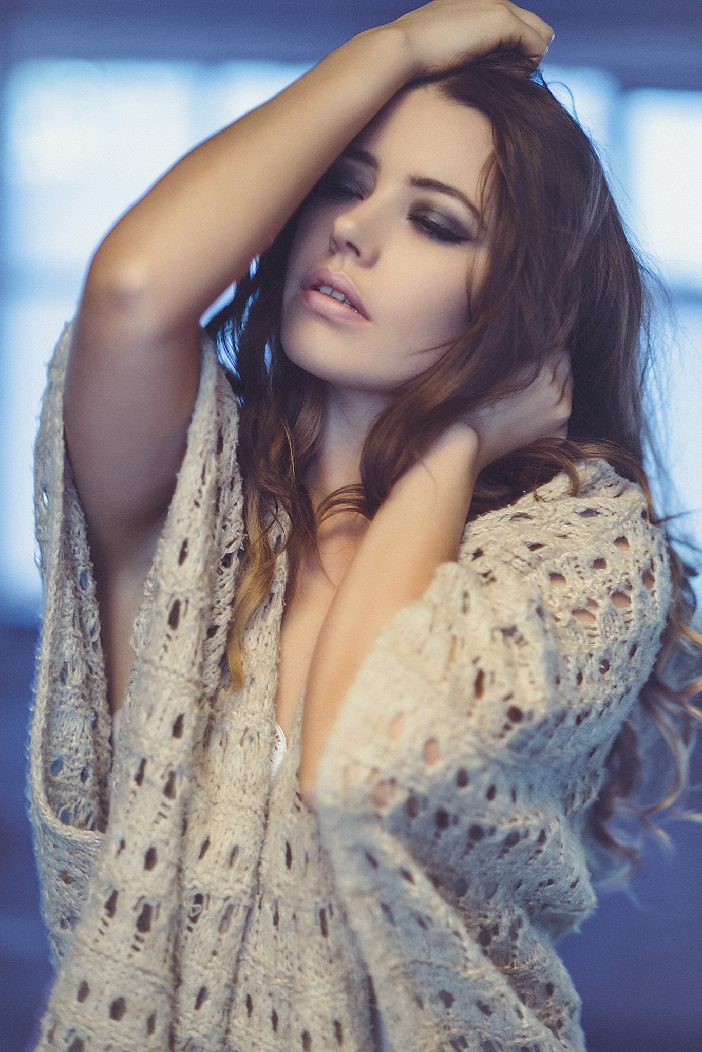
Shot taken with CTO key light and daylight behind but with manual adjustment of Kelvin values applied.
Nice, ok now we're getting somewhere. By playing with the Kelvin value and Tint we are able to get a more interesting and usable shot. By adding a lot of blue to the image via the Kelvin we've balanced out the key lights orange tone and as result cooled down the daylight behind her. This is personal preference of course but I actually really like this effect.
Ok so lets trying going the other way, this time I'll take out the CTO gel from the beauty dish and replace it with the CTB gel. Now lets take a shot with the CTB attached and see how it looks.

Shot taken with CTB key light and daylight behind and a flat Kelvin value of 5500k.
Oddly the effect isn't as dramatic as you might first think but remember we're using a very warm 5500k base value to begin with so the visible effect is reduced anyway, you may find that when you try this with a cooler base value that your results are stronger. That being said the subtle nature of this effect can have its advantages, lets take a look at it once it's been Kelvin 'corrected'.

A shot taken in front of a daylight window with a CTB gel on our key light with manual Kelvin values applied.
The resulting image after playing with the white balance alone is actually now quite nice, we've warmed up the image a little and taken away some of the coldness from the skin tone. As a byproduct of that you can now also see that the background has a warm glow to it, almost like its been taken at sunset. In fairness you could happily warm this up even more and the skin tones would still be more than acceptable too.
The Results
So now lets take a look at all the results side by side to see the variations achieved through a single light, colour conversion gels and Kelvin adjustments.
Here's the resulting images side by side. Click on the image to enlarge it.
I personally find this a really effective and super simple technique to employ if you're looking for a quick and easy way to add a little interest to a shot without overpowering it with crazy colours. I mentioned at the start that the studio environment that I used here probably isn't even the best place to give it a go to show off the effect and if I was doing this again I would use it on location where there was a lot more daylight in the background to really show off the colour a little more.
Think about adding a CTO gel and then taking a corporate headshot in a modern urban office with daylight illuminating the cold steel and concrete of the background. Tweak the white balance and that background would look great in a steel blue wash of colour. Conversely you can get that LA sun-kissed backdrop by using a CTB gel on your key light and doing a model shoot outside. Adjust the white balance and the background will go a golden brown. Also its worth remembering that I only used 'full' CTO and CTB gels, if you wanted to reduce the blue effect in the background for example you could use a CTO-half and the effect would be greatly reduced.
PRO TIP: There's just one last point I'd like to add and that this effect only really works with Kelvin value coloured gels. For example you can t just grab any old orange gel you might have and get the same effect. I'm not saying that you couldn't get close to colour correcting it out later with more advanced post production tools but you won't be able to simply adjust the white balance and expect a natural skin tone to appear. For best results just stick to the gels that are Kelvin conversions like the the CTO and CTB's.
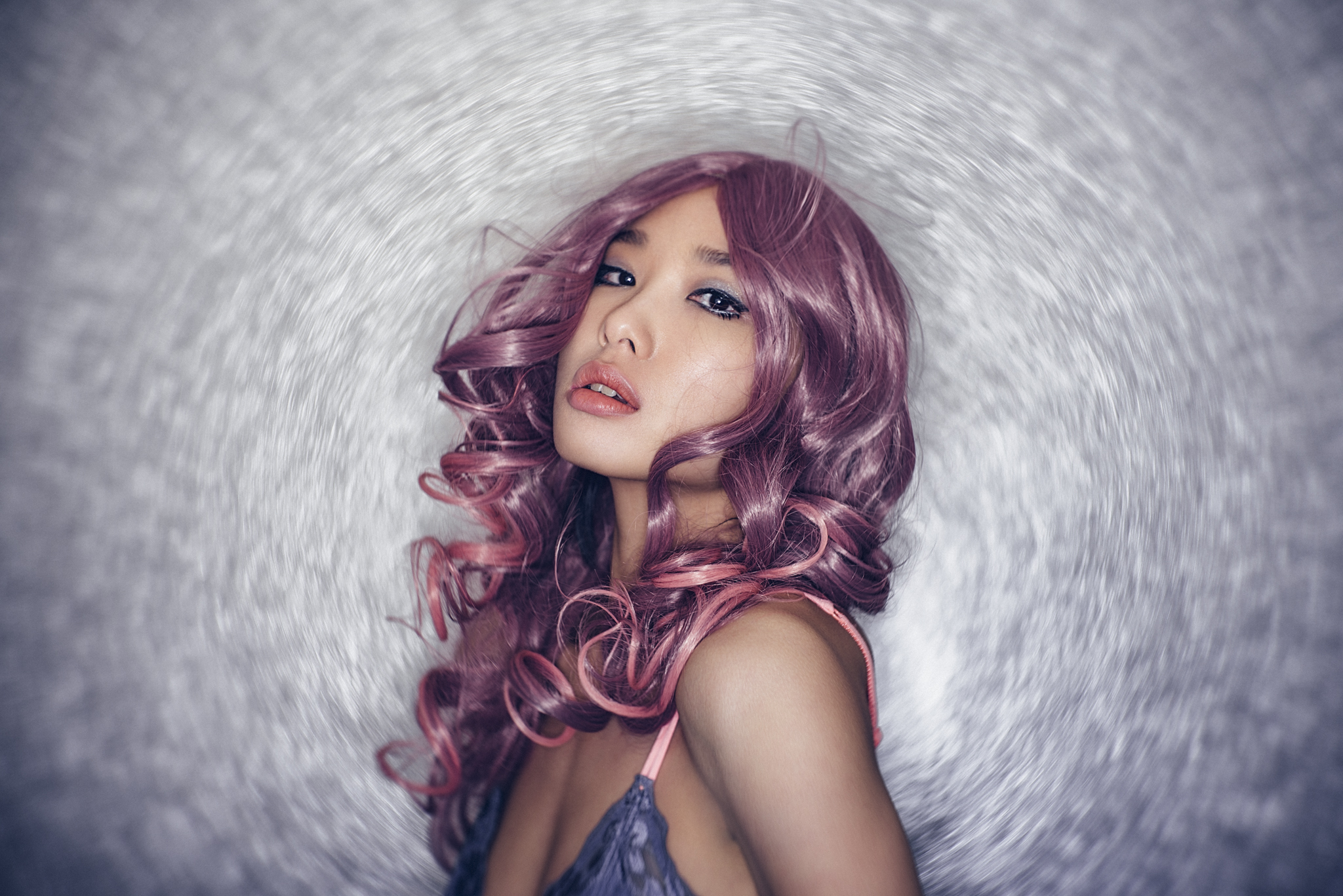
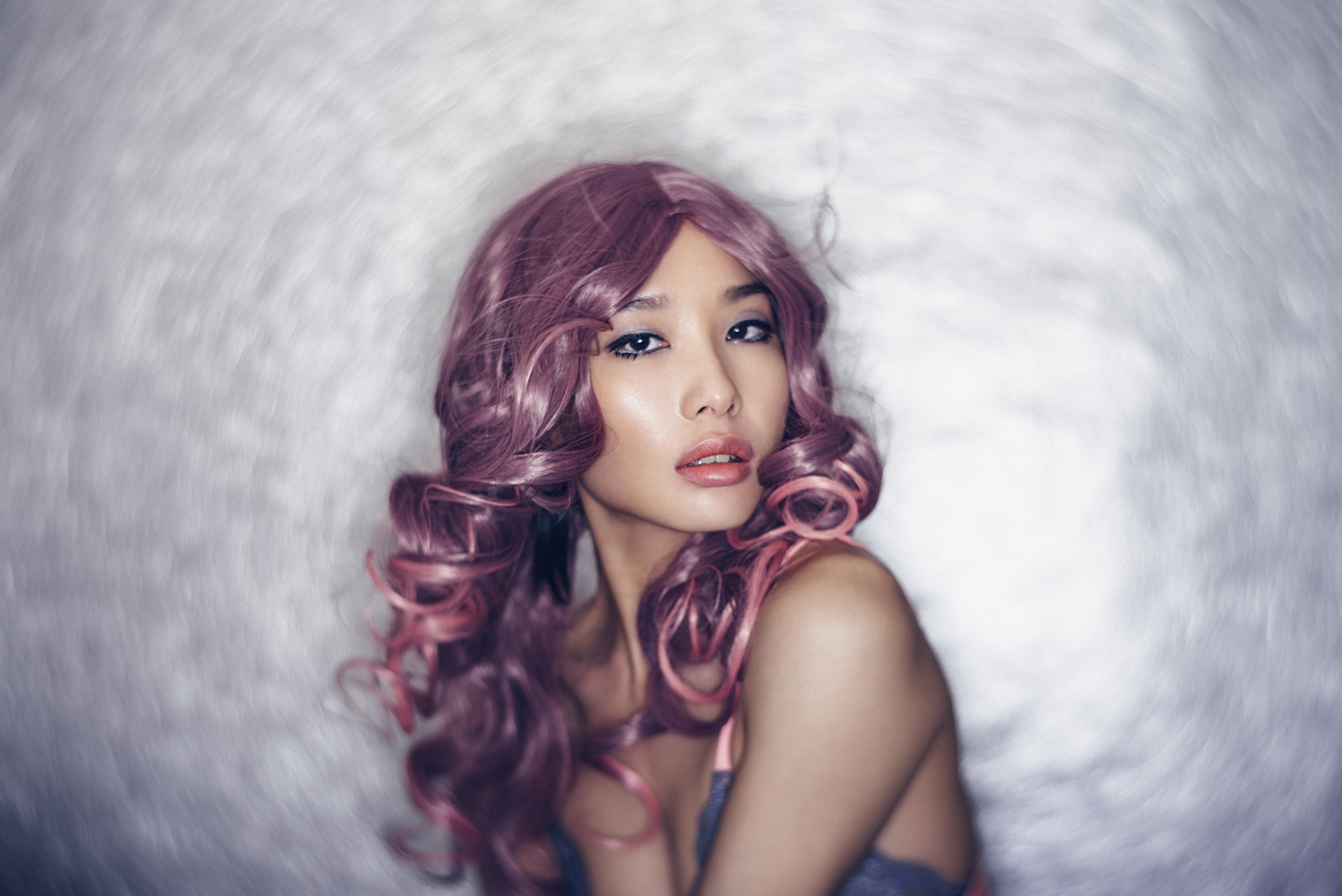
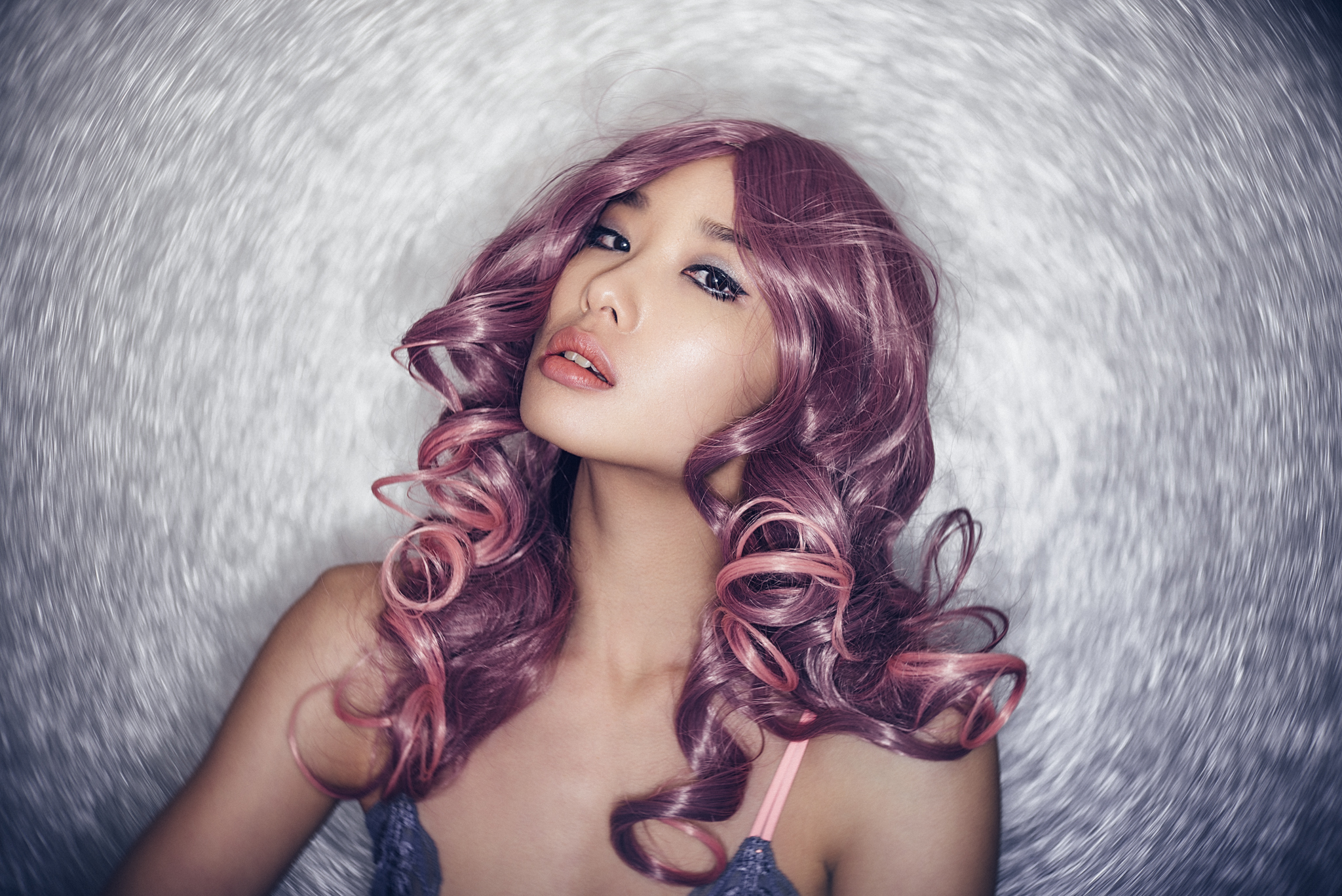
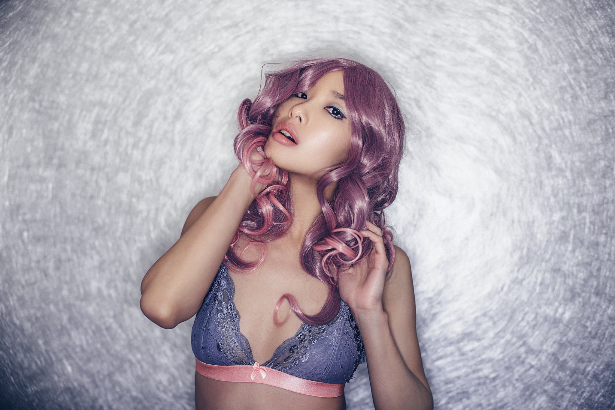
If you're interested here's my final retouched versions from the setup :)


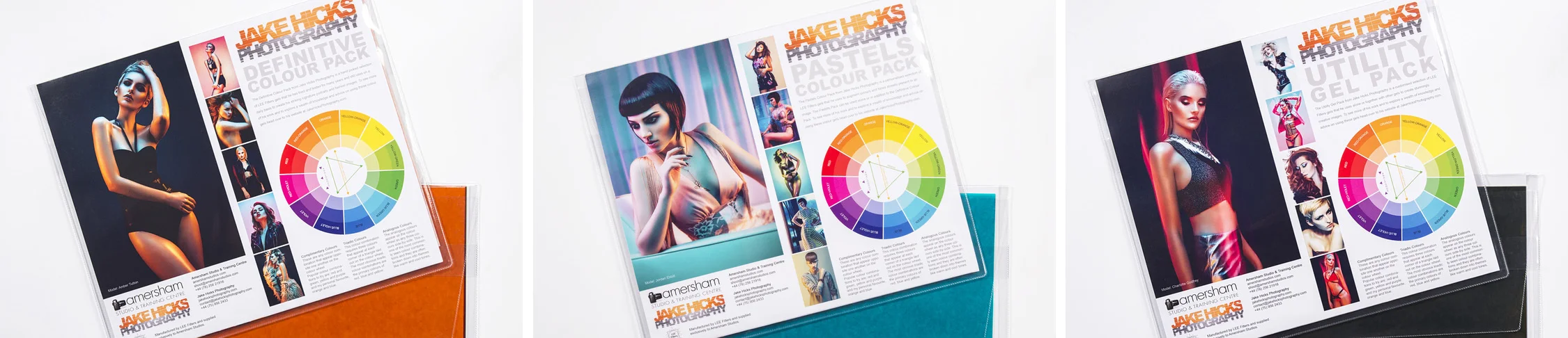
I know a lot of you have already purchased these anyway but if you don't already have them I'm currently selling packs of Utility Gels that contain all the CTO and CTB combinations you need to give this technique a go.
If you'd like to pick up a pack of Utility gels then head on over to my products page to find out more. The links on there will take you to the Amersham Studio website to take final payment.
2x Full Colour Temperature Orange
2x Full Colour Temperature Blue
1x Half Colour Temperature Orange
1x Half Colour Temperature Blue
Plus:
2x Two Stop Neutral Density
2x One Stop Neutral Density
2x Heavy Frost - Strong Diffusion
Also if you'd like to learn more about gelled lighting then why not check out one of my gelled lighting workshops. I've been running these for a little while now, they're always really popular and everybody walks away brimming with knowledge and tons of cool shots so why not check it out. Jake Hicks Photography - Gelled Lighting Workshops