If you can look beyond the painfully obvious click bait nature of the title for a moment, I promise you that the following 5 things need to become a mandatory part of your pre-upload checklist.
Remember you only get one chance to impress with your shots and I know we all get very excited to share an image as soon as we've taken it, but just take a few moments to check these 5 things are done before you do so and I promise you'll thank yourself later.
Take a look at the following 5 things and make sure they're part of your workflow, if they already are then great, if not then consider implementing them as soon as possible. This list is in no specific order as they all carry the same level of importance in my mind and although it doesn't necessarily matter at what stage of the post-pro process some of these are done, some can only be done just before you share them.
1. Straighten Your Image
I've started off with the one that annoys me the most when I see a wonky shot. It is such a simple fix but one that gets overlooked all the time. Don't get me wrong, not every shot needs to be taken with a spirit level in hand, nor does every shot benefit from a perfectly balanced horizon line but it's the shots that are slightly off by a few degrees that can kill the visual impact instantly.

Images that can benefit the most from a quick straighten are the ones with strong horizontal lines behind the subject. Like the image above, a quick and subtle image rotation can help a huge amount if you're not a fan of the on-board-ship look.
As a guide, if the horizon is in the background of a shot it really needs to be dead straight. If the shot has very strong vertical lines either in the foreground or background then it needs to be straight too. And if you're not going to straighten it, then the angle needs to be dramatic enough so as to look purposeful and not because you have one leg slightly shorter than the other.
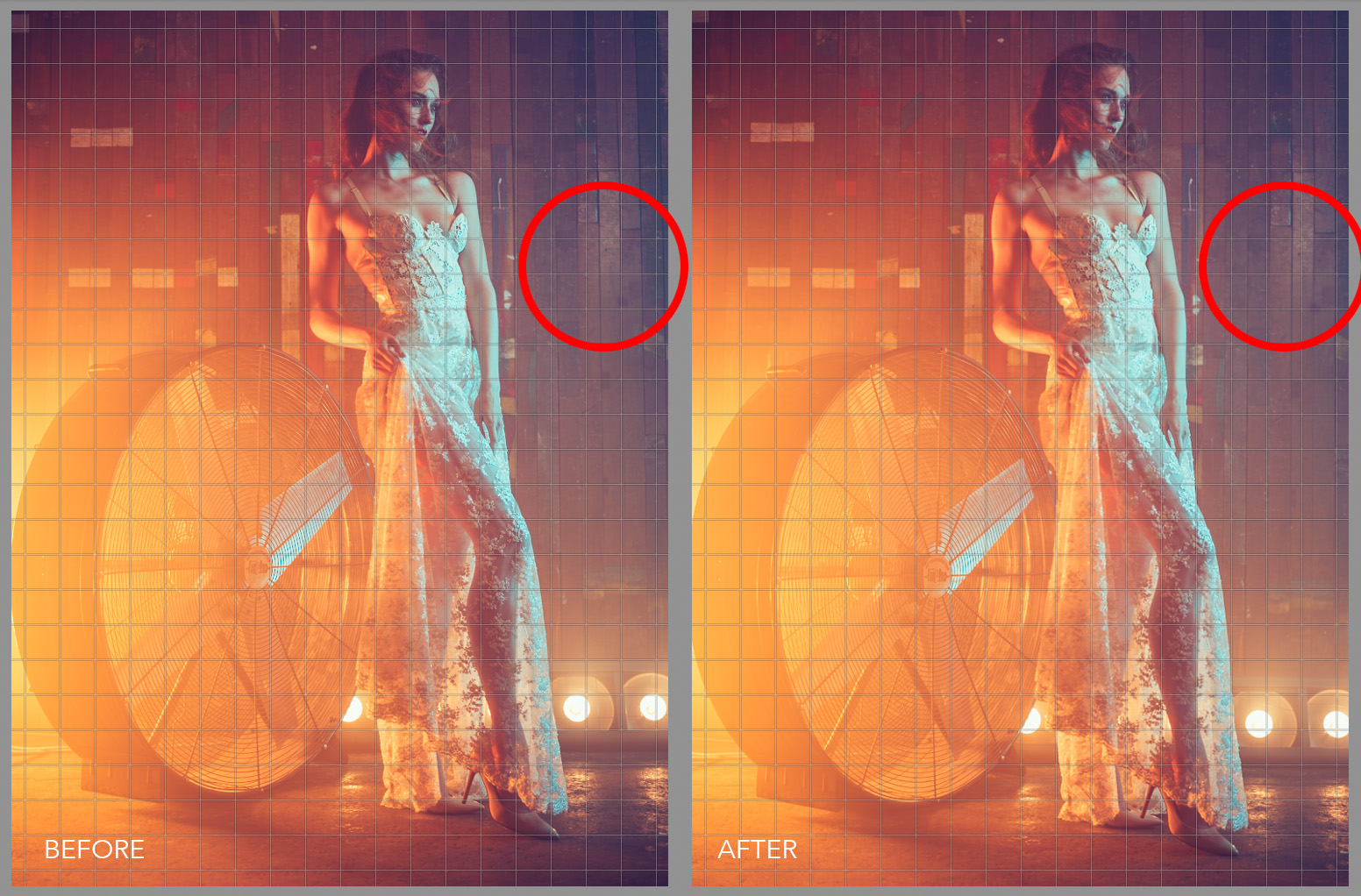
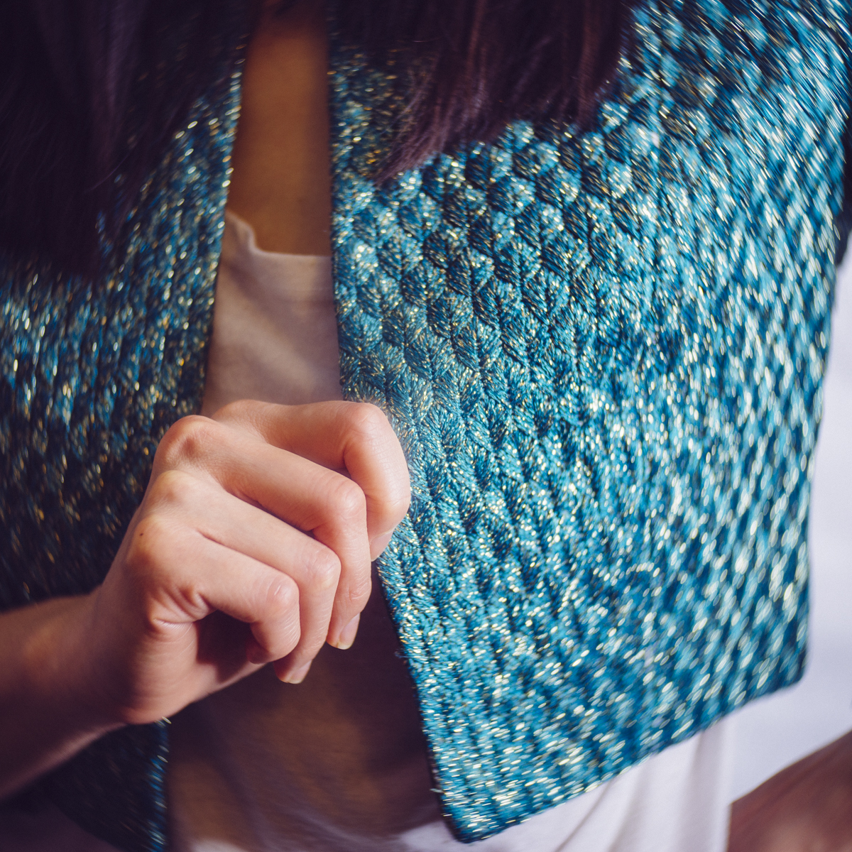
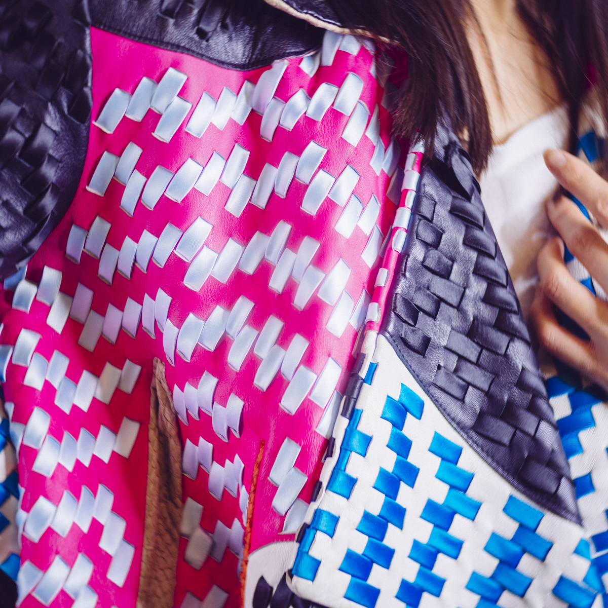
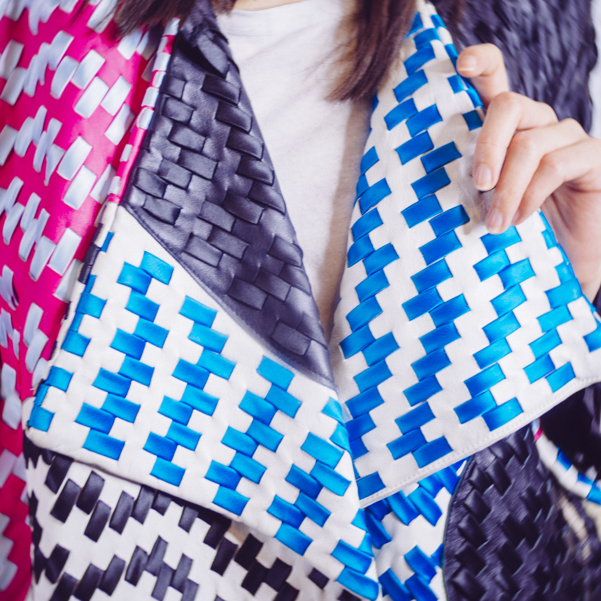
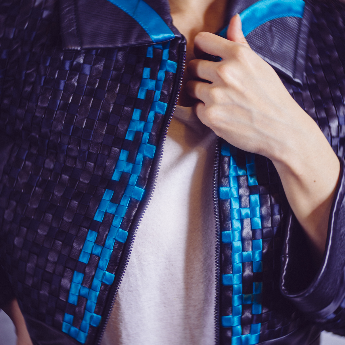
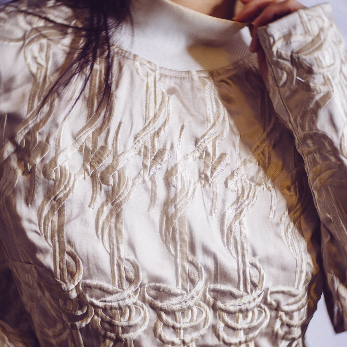
It's not just horizontal lines you need to watch out for either, check for vertical alignment too. Like here in this image, a few degrees of rotation has helped to straighten out the wooden panels behind the subject.
Obviously doing this in camera at the time of taking the shot is ideal but don't waste precious shooting time with a spirit level on every frame when getting it close enough is good enough. After all, it only takes a few seconds to straighten it in post pro later on.
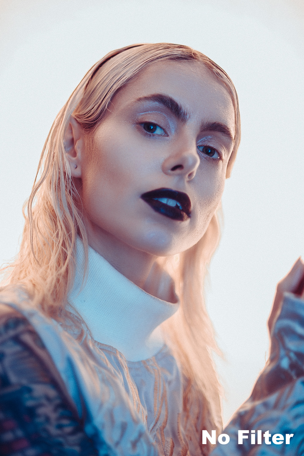
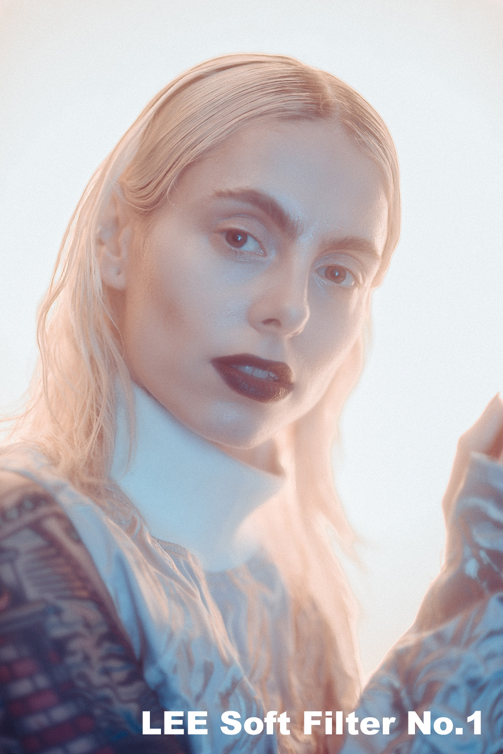
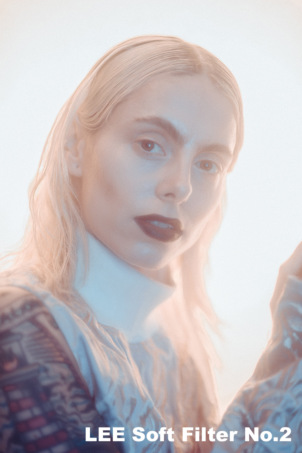
2. Sharpening Your Image
This one is a little more subjective but I'll give you my thoughts regarding what I personally do in my workflow. Sharpening should be one of the last things you do in the post-production process but failing to do it altogether can mean the difference between an image popping off the page or simply being overlooked and with this in mind, I believe that every image can benefit from some form of sharpening.
I mentioned that sharpening was subjective and that's because there is no definitive rules on what looks good, plus there are so many different ways to sharpen an image and in Photoshop alone you have 'Smart Sharpen', 'Sharpen Edges', 'Unsharp Mask' and so on. Consequently, it's hard to know which is the right one for the task and to further complicate the matter portrait shooters will add a very different type of sharpening to an image compared to a landscape shooter so there really is no perfect one-size-fits-all approach.
Lastly, you should always sharpen a different amount depending on whether the shot will be viewed in print or on screen. If it's for the web then I would tend to sharpen the image a little more than if it was viewed in print for example.
But here's the sharpening process for my portrait and fashion shots. First off, remember sharpening is always done at the end of the process so all the skin retouching, dodging and burning etc is done before you sharpen. It's at this stage that I might choose to save a couple of copies, one for print and one for screen, each of which will have varying sharpening amounts applied.
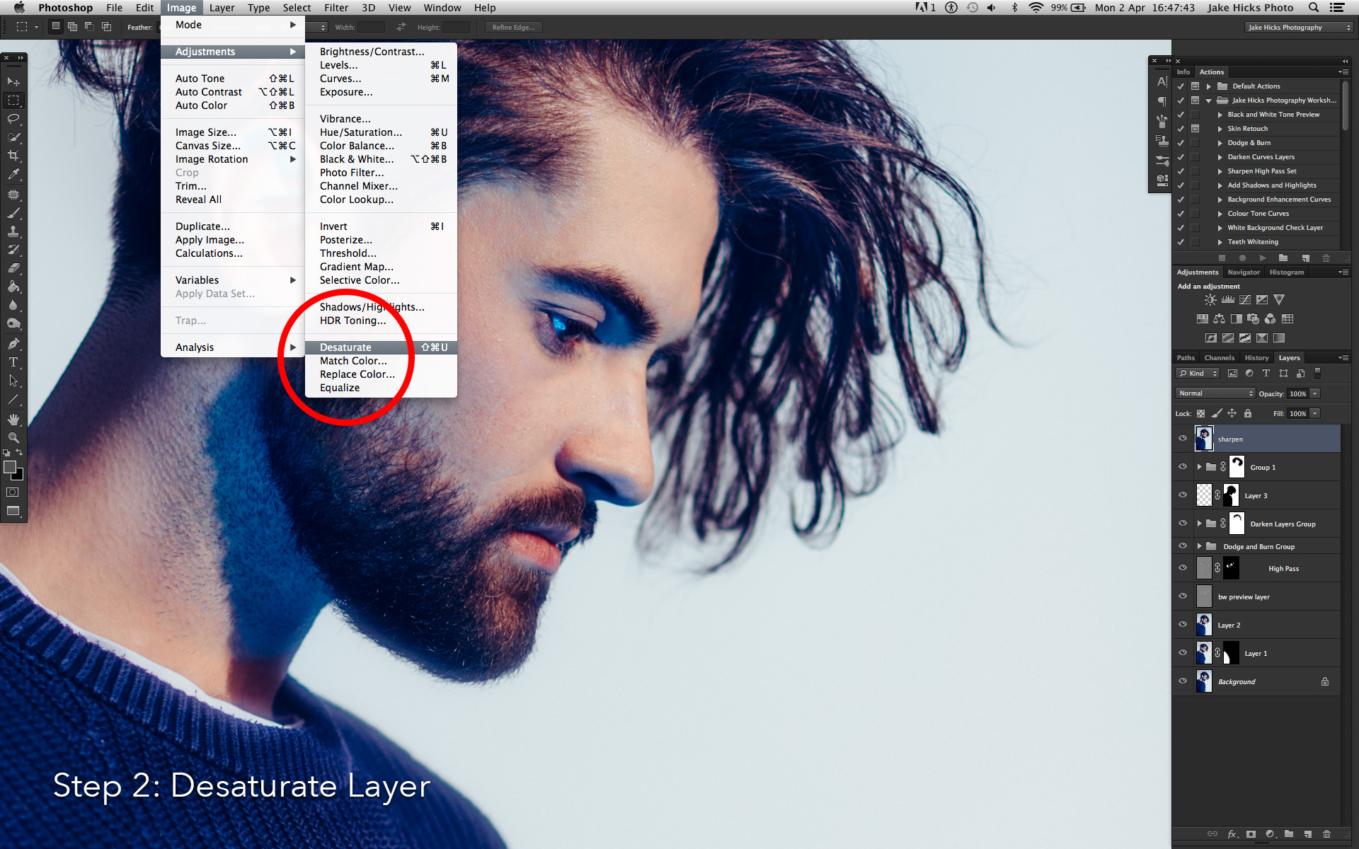
1. Select your top layer and duplicate stack with CMD+ALT+SHIFT+E.
2. Desaturate that layer via CMD+SHIFT+U
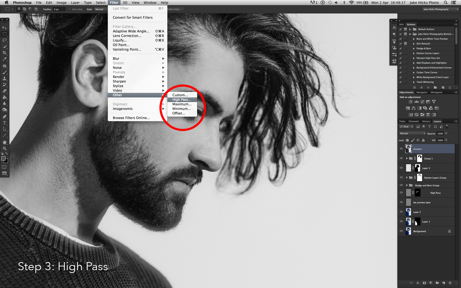
3. Apply the sharpening by going to: Filter -> Other -> High Pass...
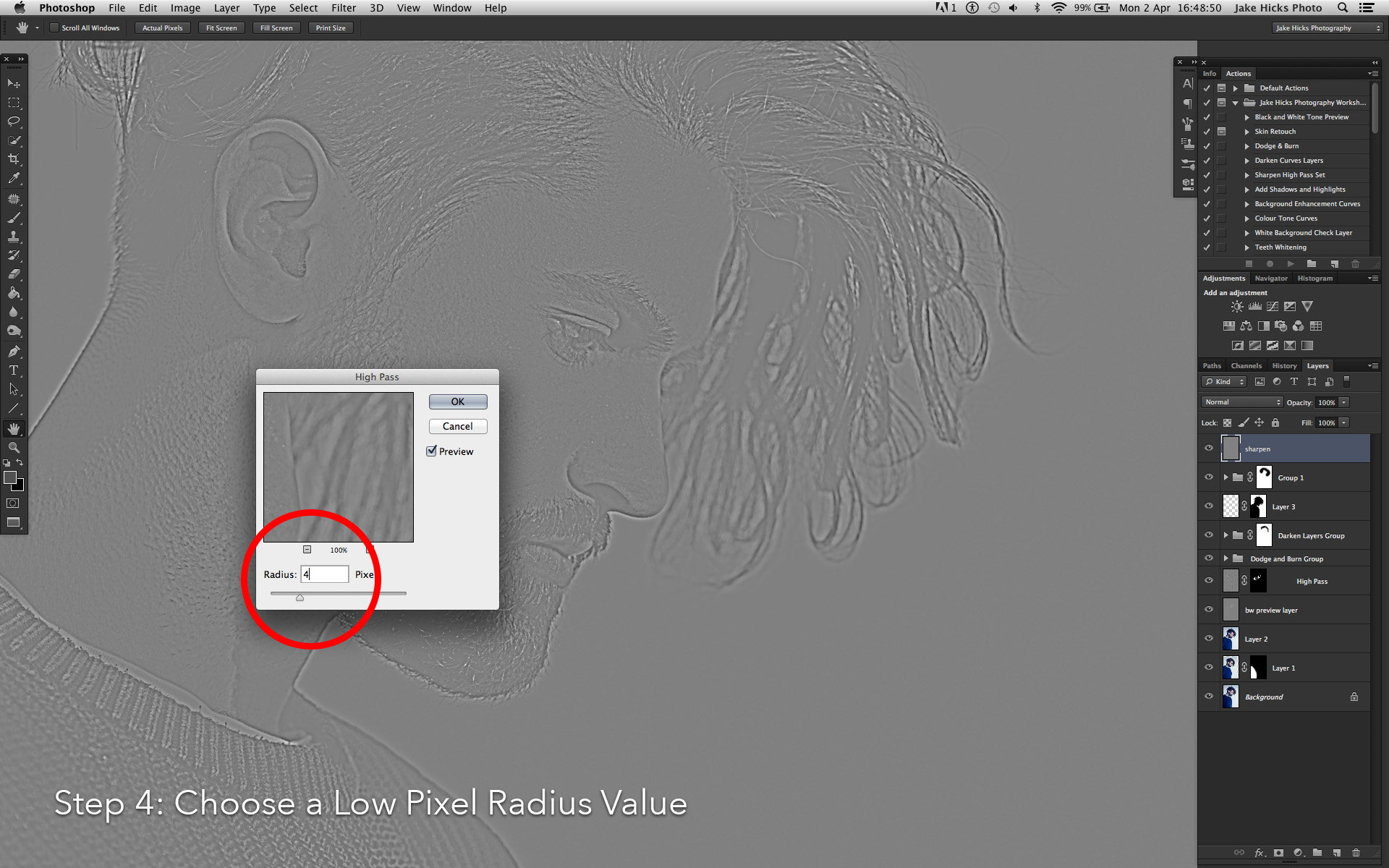
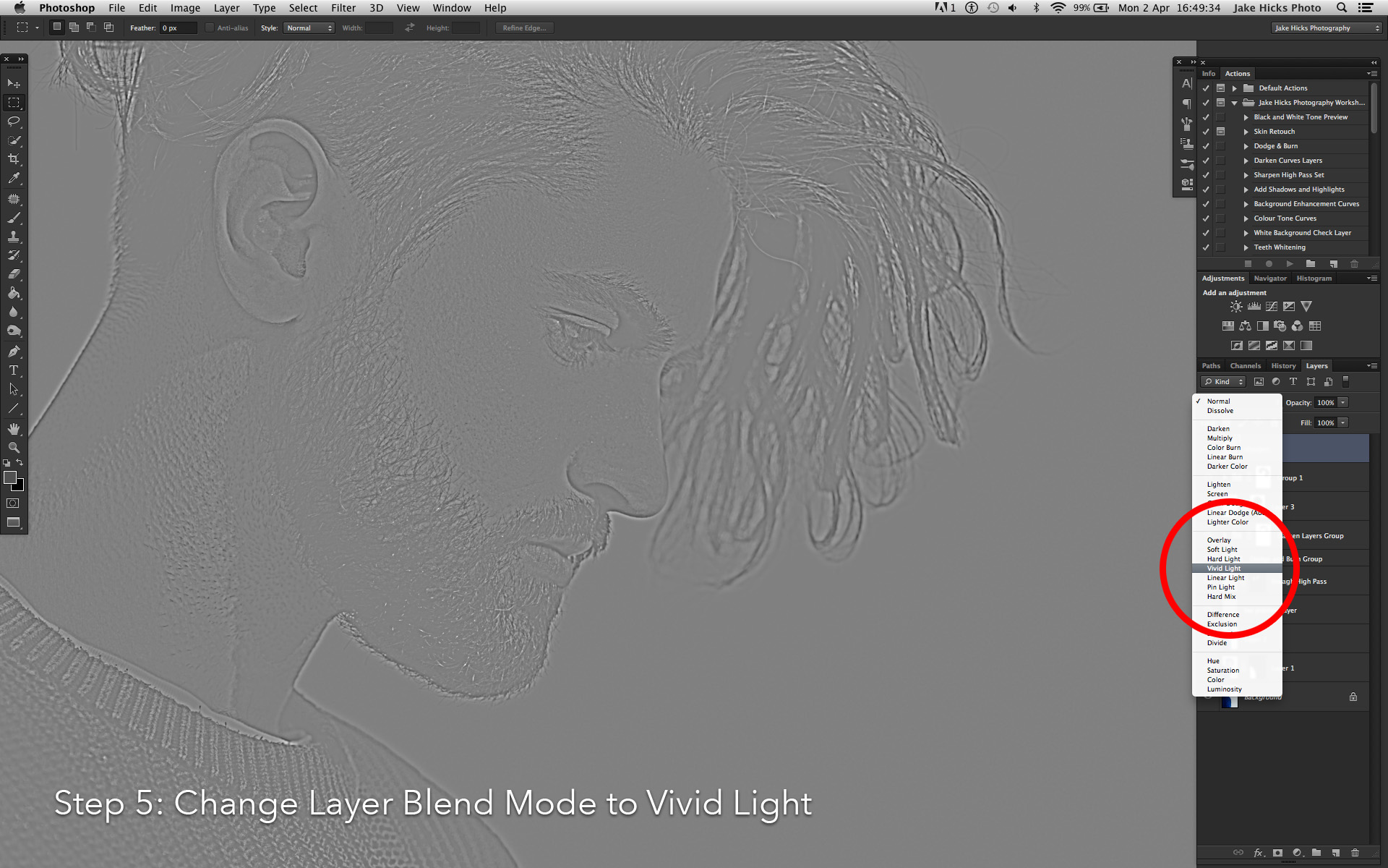
4. With an image of 4500px x 3000px choose a sharpen amount of around 4px. Hit OK.
5. In the layers 'Blending mode' drop down choose 'Vivid Light'.
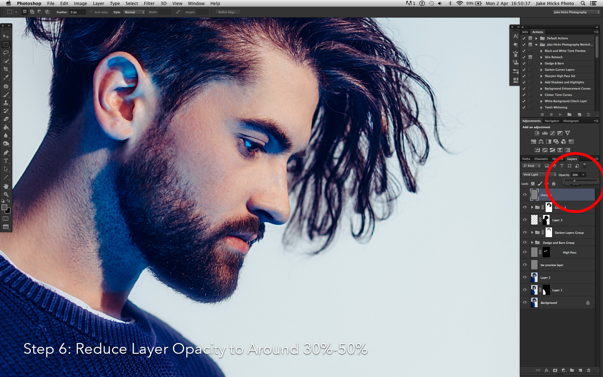
6. Adjust the opacity of the layer to meet your desired outcome needs. For example if it's for the web I would choose a percentage of around 40%-50% opacity. If it was for print I'd go with a lower amount of around 20%-30%.

For a far more detailed look at my sharping techniques for a variety of situations you can follow my dedicated sharpening tutorial here: The Three Levels of Sharpening you Should be Applying in Photoshop - Detail, Global & Local
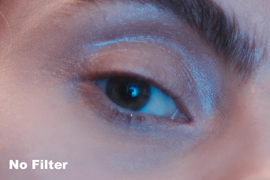
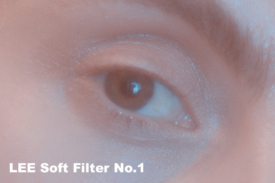
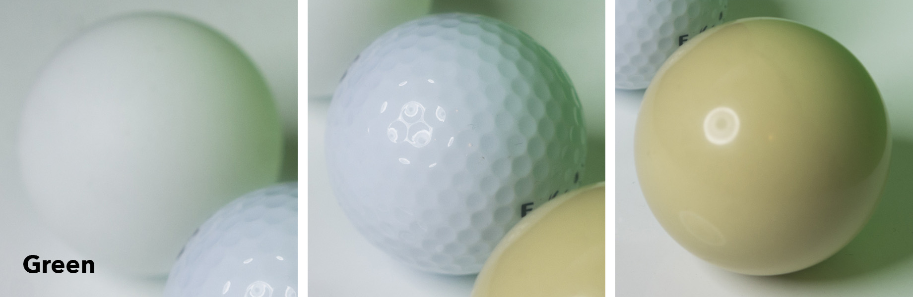
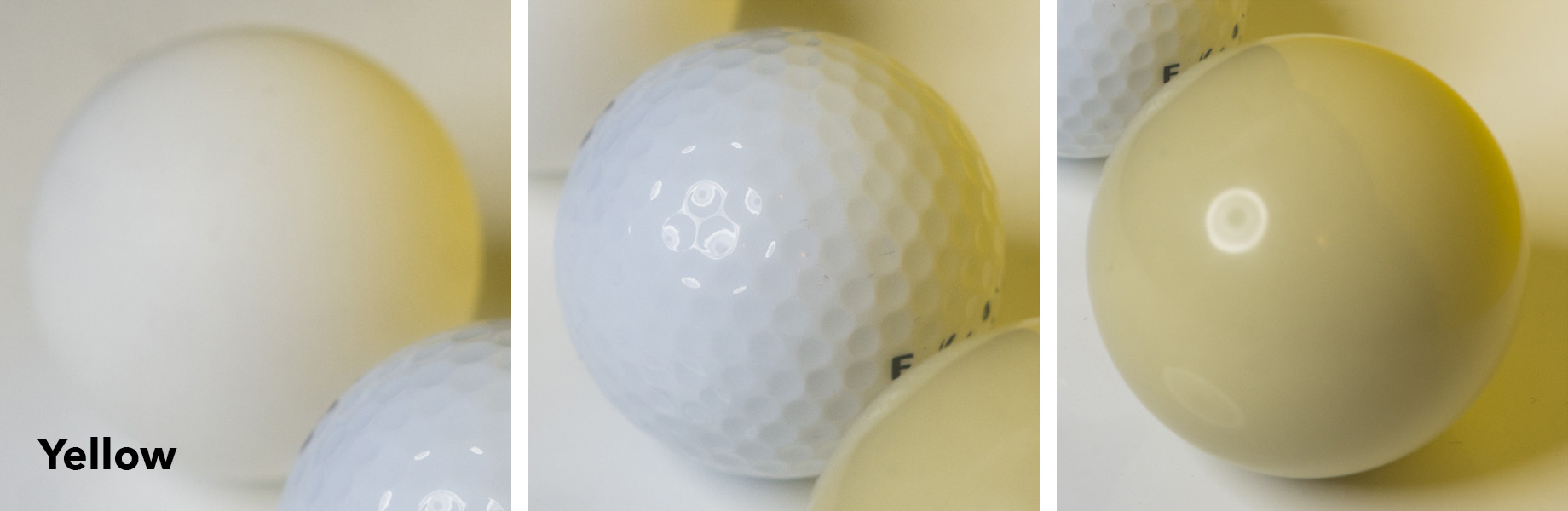
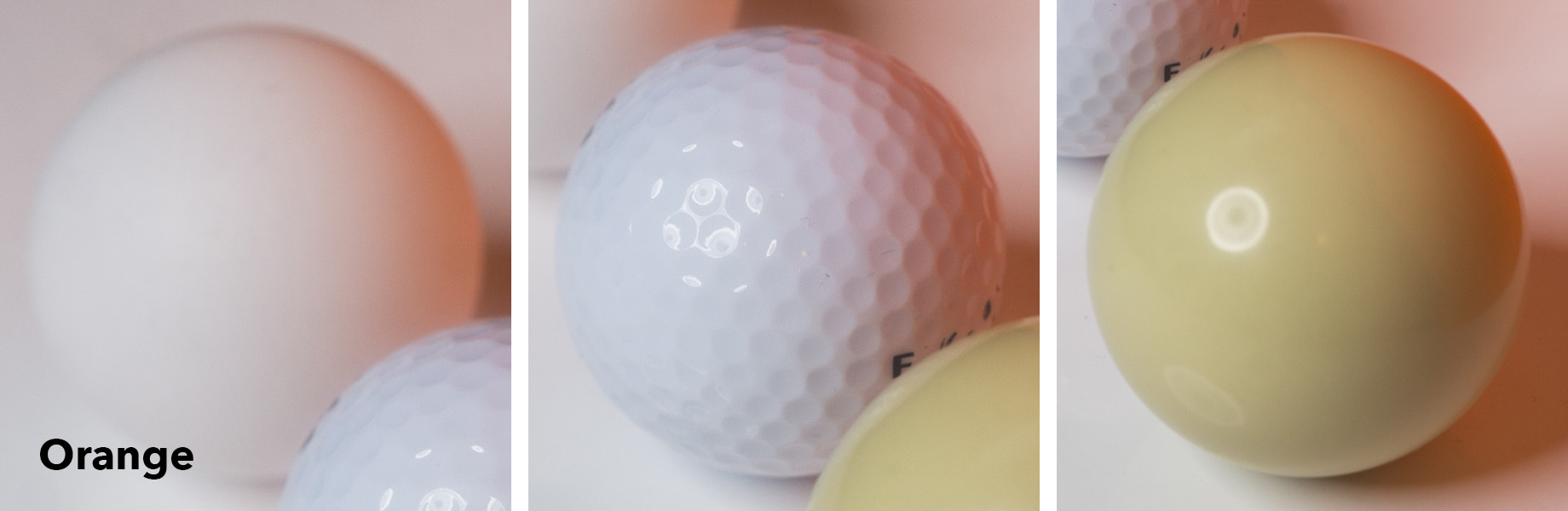
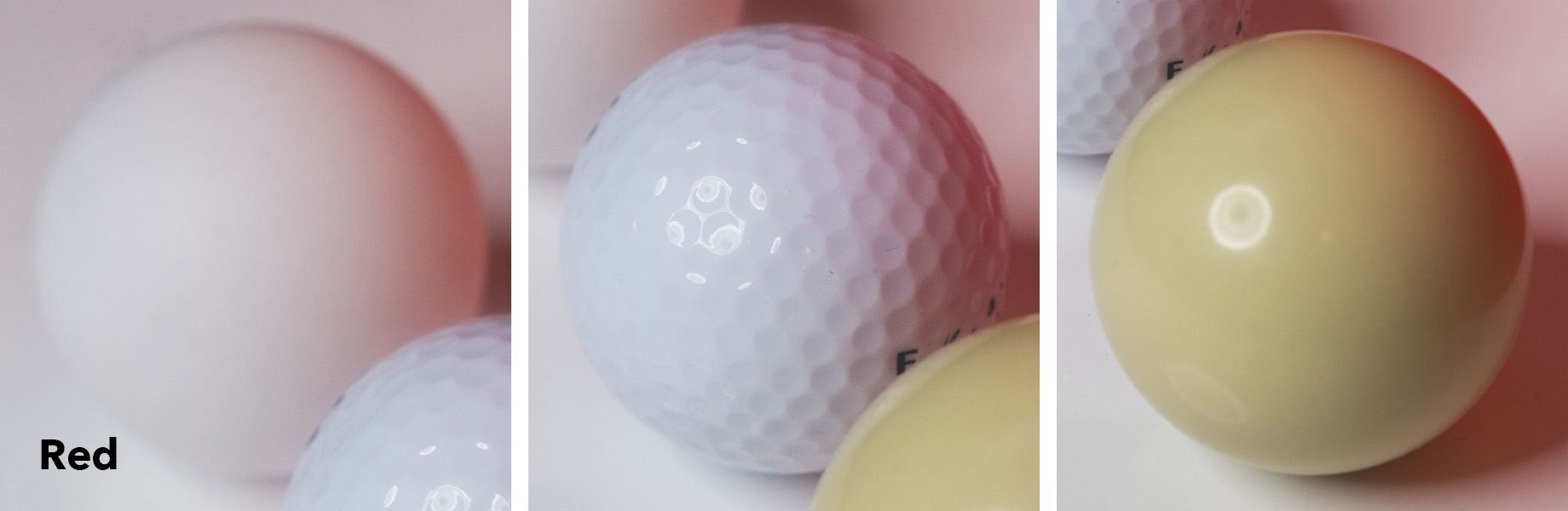
3. Colour Toning
Again colour toning is part of the post-pro process I do right at the very end. In Lightroom I will likely play around with the global colouring of the raw to give me a baseline before I bring the file into Photoshop, but I will always without fail add a final colour tone right at the end. Colour toning is one of two things I do after the sharpening and that's to allow me to adjust and tweak the colour tone later on without me having to resharpen the whole image again.
The reason I seemingly colour tone twice like this is because your images tonality will likely have changed during the retouch process. Your shadows and highlights may well have been enhanced or reduced during the dodge the burn, the colours might have been tweaked via the sharpening and the final colour tone will help to tighten everything back up right at the end.
My colour toning is very simple but one that is entirely non-destructive and very easy to adjust and tweak at a later date if need be. This ability to fine tune and tweak the colour tone later is something that I believe to be crucial to any colour toning process.
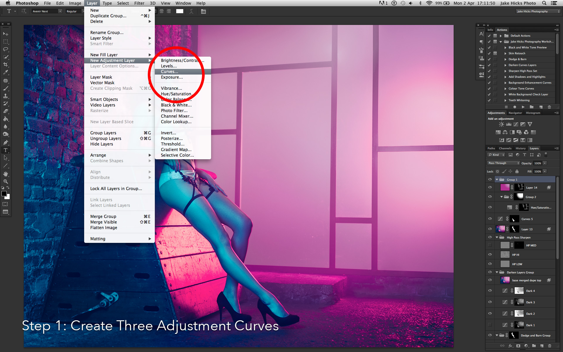
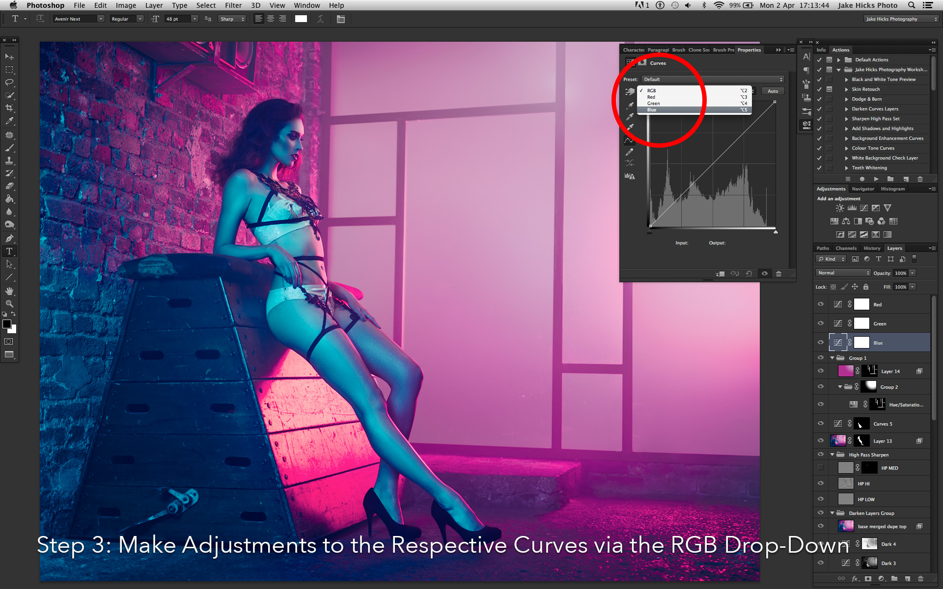
1. With your top layer selected you'll need to create three separate curves adjustment layers: Layer -> New Adjustment Layer -> Curves...
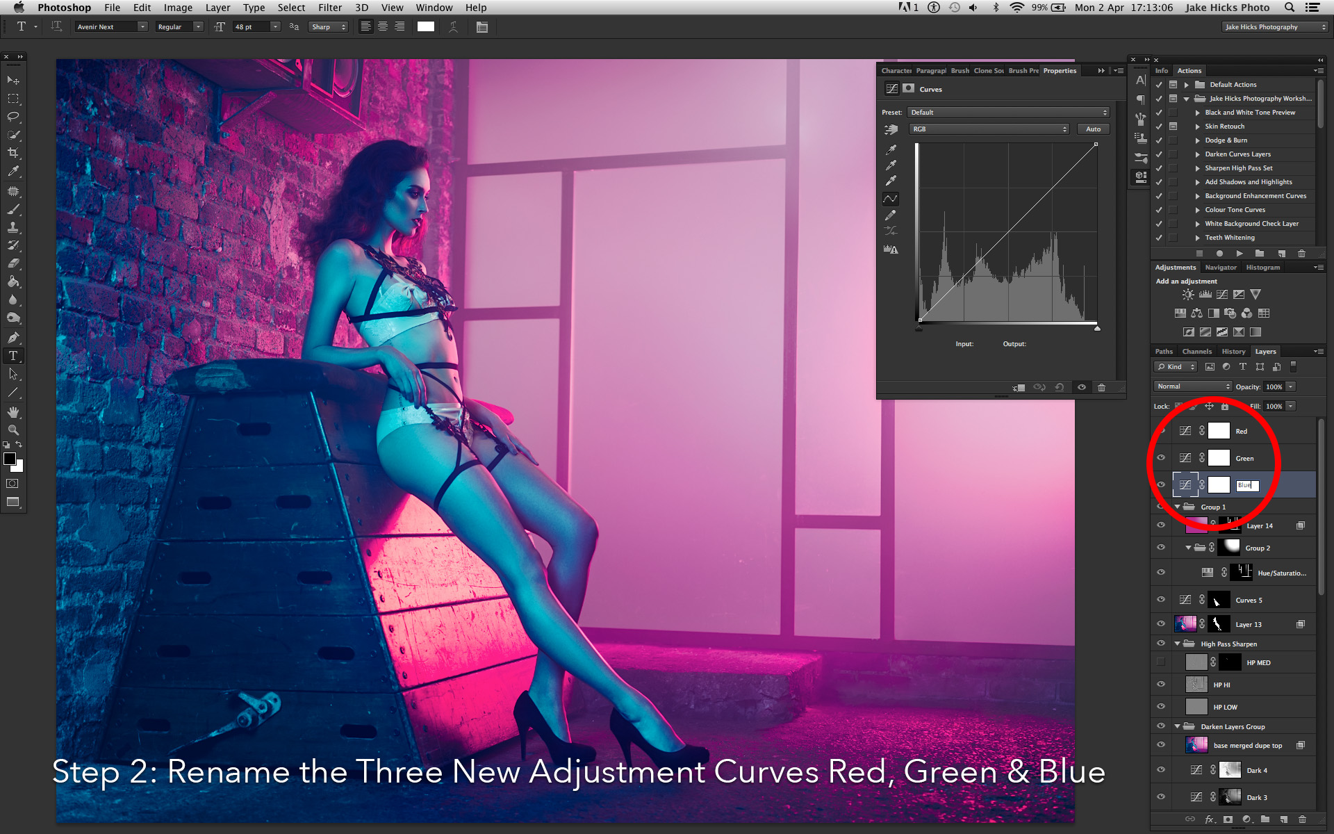
2. Name each of your new three adjustment layers, Red, Green & Blue.
3. Now we can go into each of these curve adjustment layers and tweak the colours to our liking. Be sure to only adjust the Red curve in the Red adjustment layer and Green curve in Green adjustment layer and so on. The individual colours can be accessed via the RGB drop down bar.
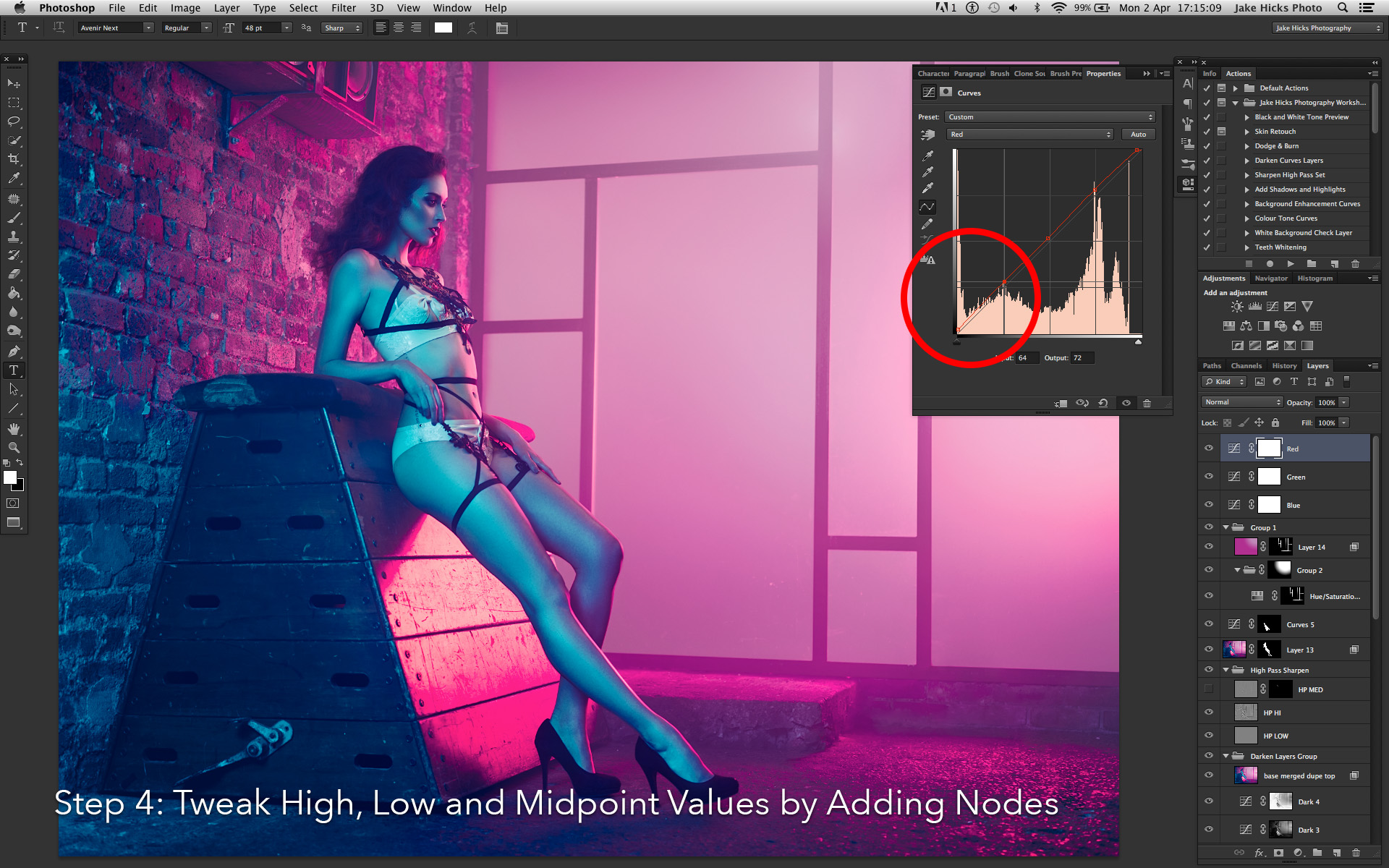
4. Once in the the individual curves, begin to play with the black point (far bottom left node) and white point (far top right node). Then move on to adding and tweaking mid-tone points.
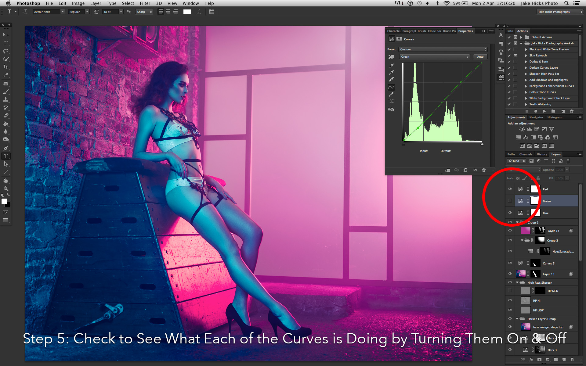
5. Move on to each of the separate curves making subtle adjustments and remember that with this 3 tier colour tone, we can turn on and off any of the curves independently at any time to see what's working and what's not working.
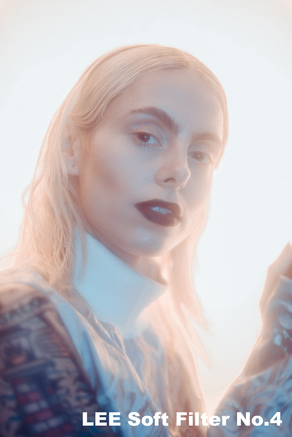
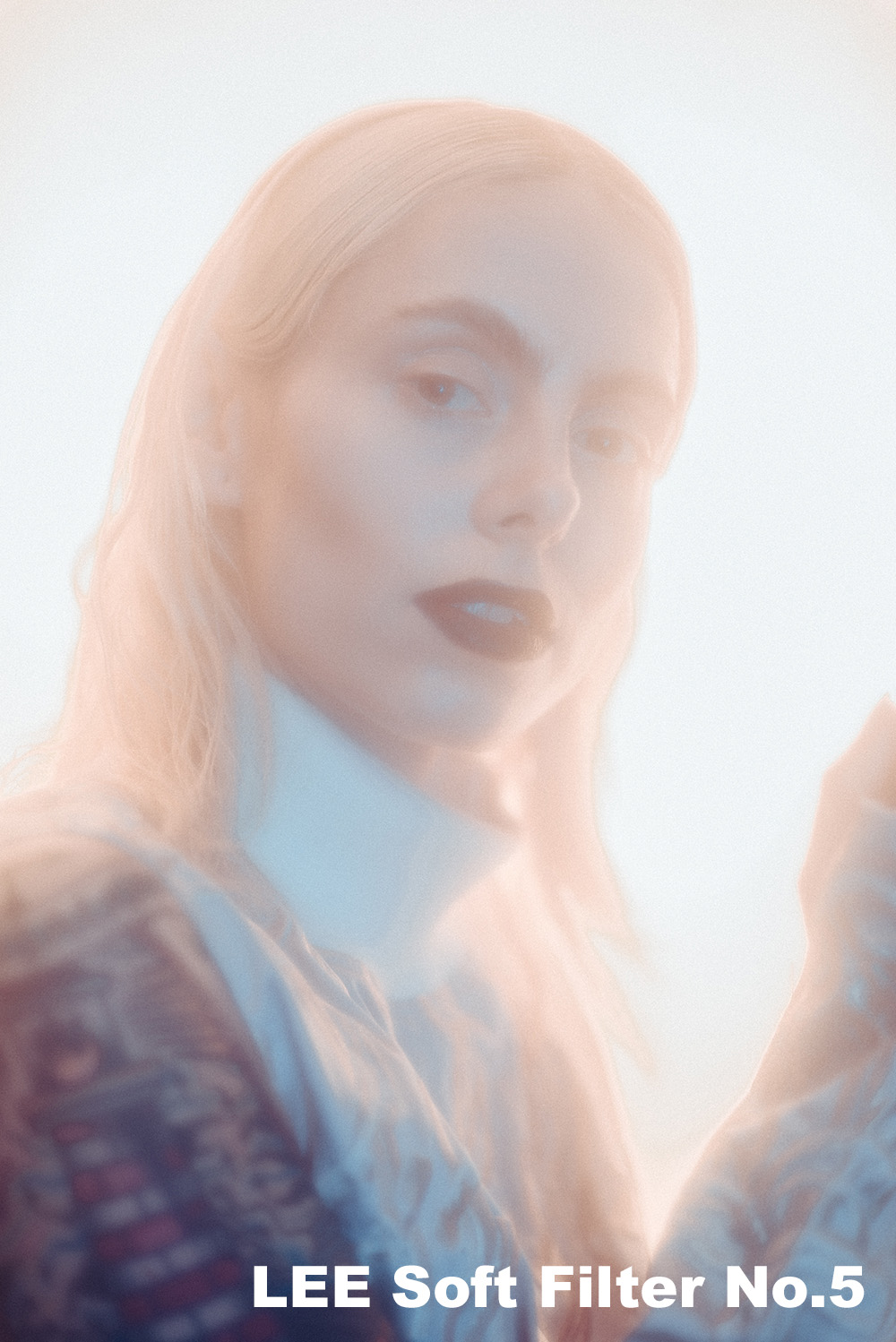
4. Adding Grain
At first 'adding grain' might sound like an odd step to have in a digital process but hear me out on why you need to be doing it and why every single image of mine has this effect applied.
Nearly every website you upload your images to will compress your file in some way. For example, you may upload a 2.5mb file to Facebook but Facebook will shrink that file down to less than 10% of that. Facebook and other sites have to do this because literally millions of cat and baby photos are uploaded every day and these sites just don't have the server space for all of them. Their solution to this ever growing data problem is to compress the images and that can lead to some painfully depressing results if we're not careful.
So what gets lost in that file size compression process? Essentially file compression works by grouping similar looking pixels together and this is partially apparent in studio lighting shots like mine that tend to have a single coloured backdrop. This compression results in what we call image break-up or colour banding and it's not how you want your shots to look after you've spent hours refining them. So to combat this effect you can add more detail into your flatter areas of tone via some digital grain. If applied properly, the grain effect shouldn't even be noticeable to your viewers but it tricks the compression engine into thinking there's details that can't be grouped together resulting in less compression and more importantly less colour banding.
This technique is by no means perfect but it will certainly help and again it's a process I do right at the end. In the colour toning section I mentioned there was two things I do after sharpening, colour toning was one and adding grain is the other. Here's the process that I use:
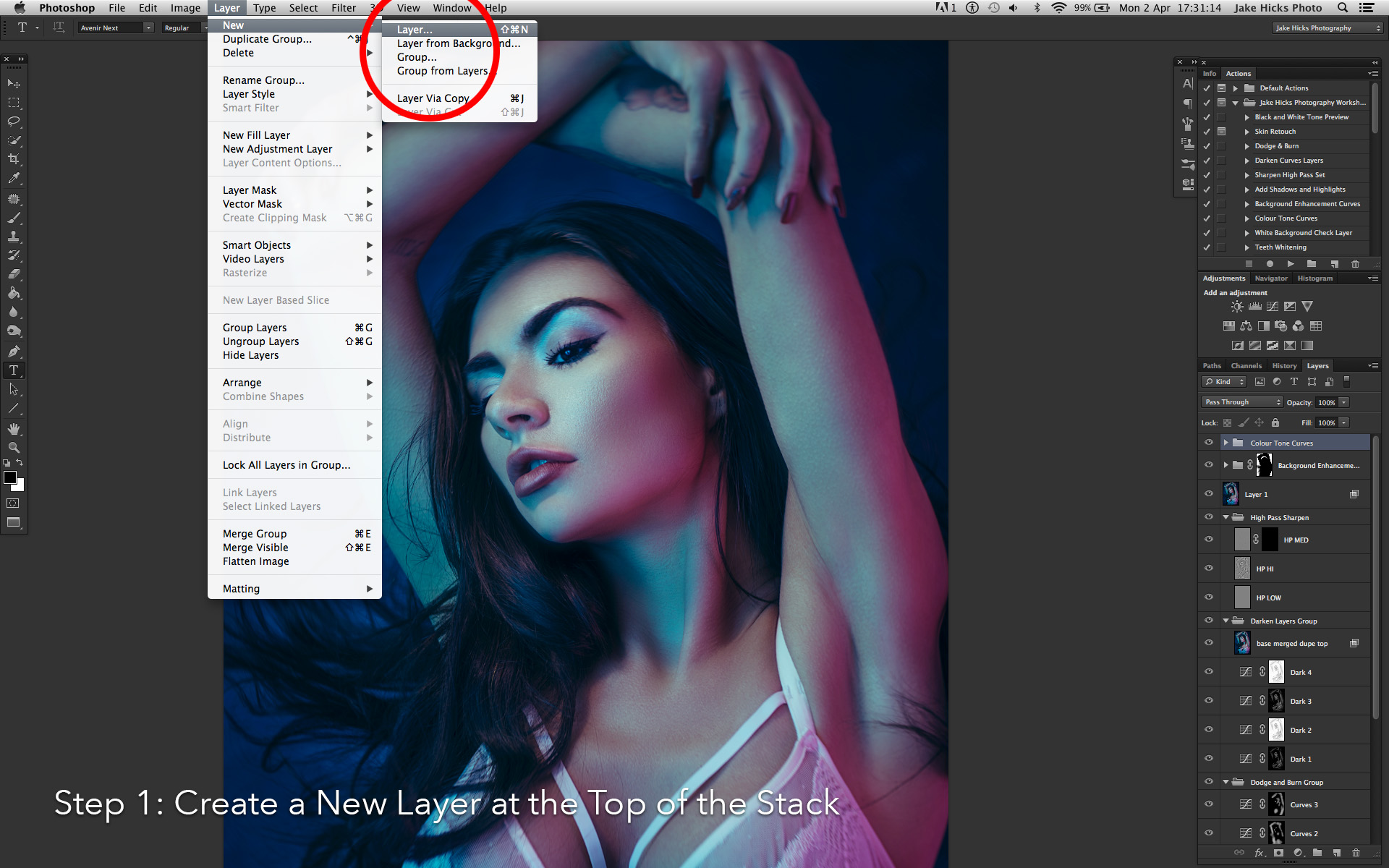
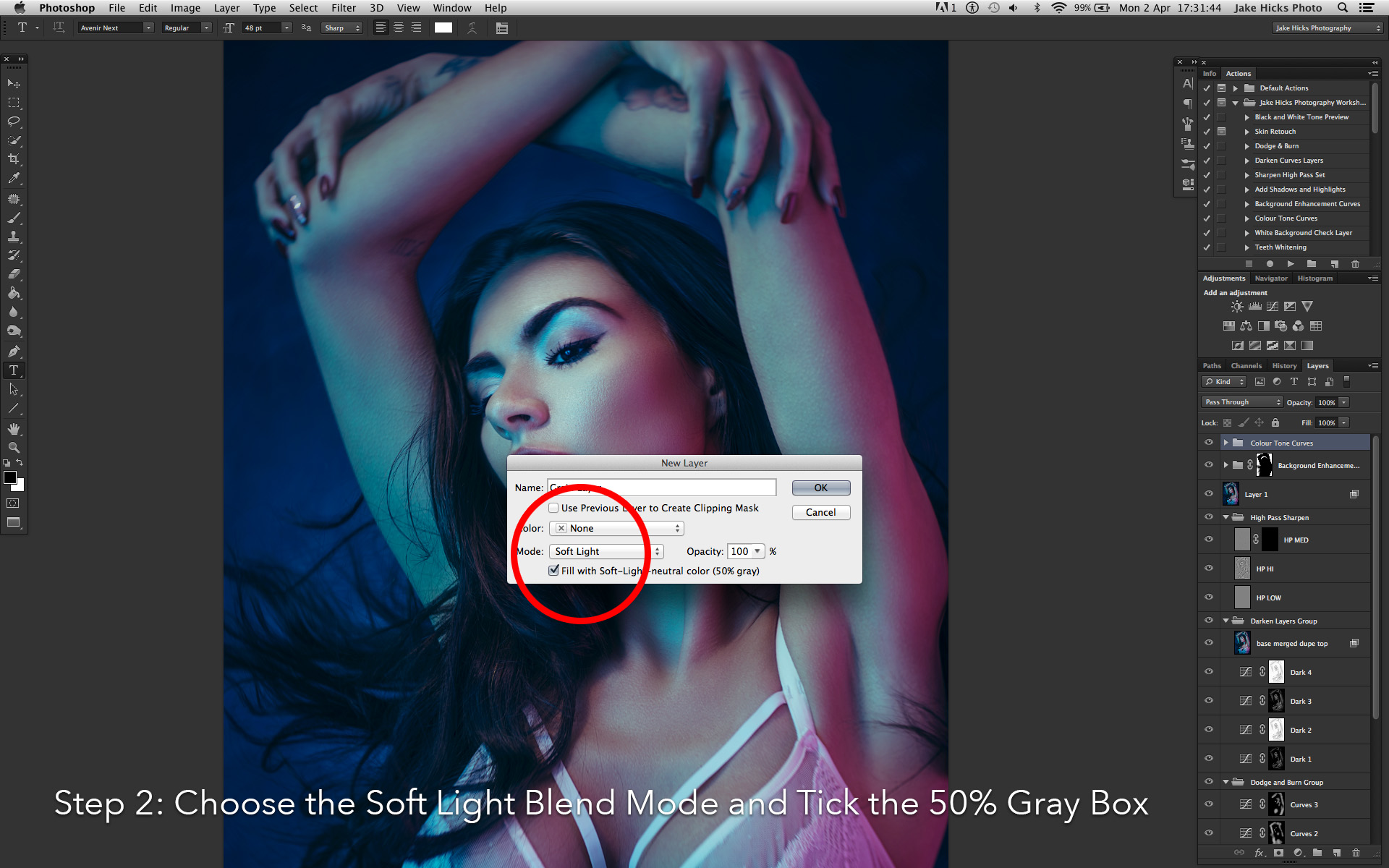
1. With your top layer selected go to Layer -> New -> Layer.
2. In the following box change the layer mode to 'Soft Light' and click the box below that's marked 'Fill with Soft-Light-Neautral Color (50% Gray)' and hit OK.
3. With our new grey layer selected, go to Filter -> Noise -> Add Noise. In the Noise options set the amount to around 15%. Make sure the Gaussian and Monochromatic boxes are checked and then hit OK.
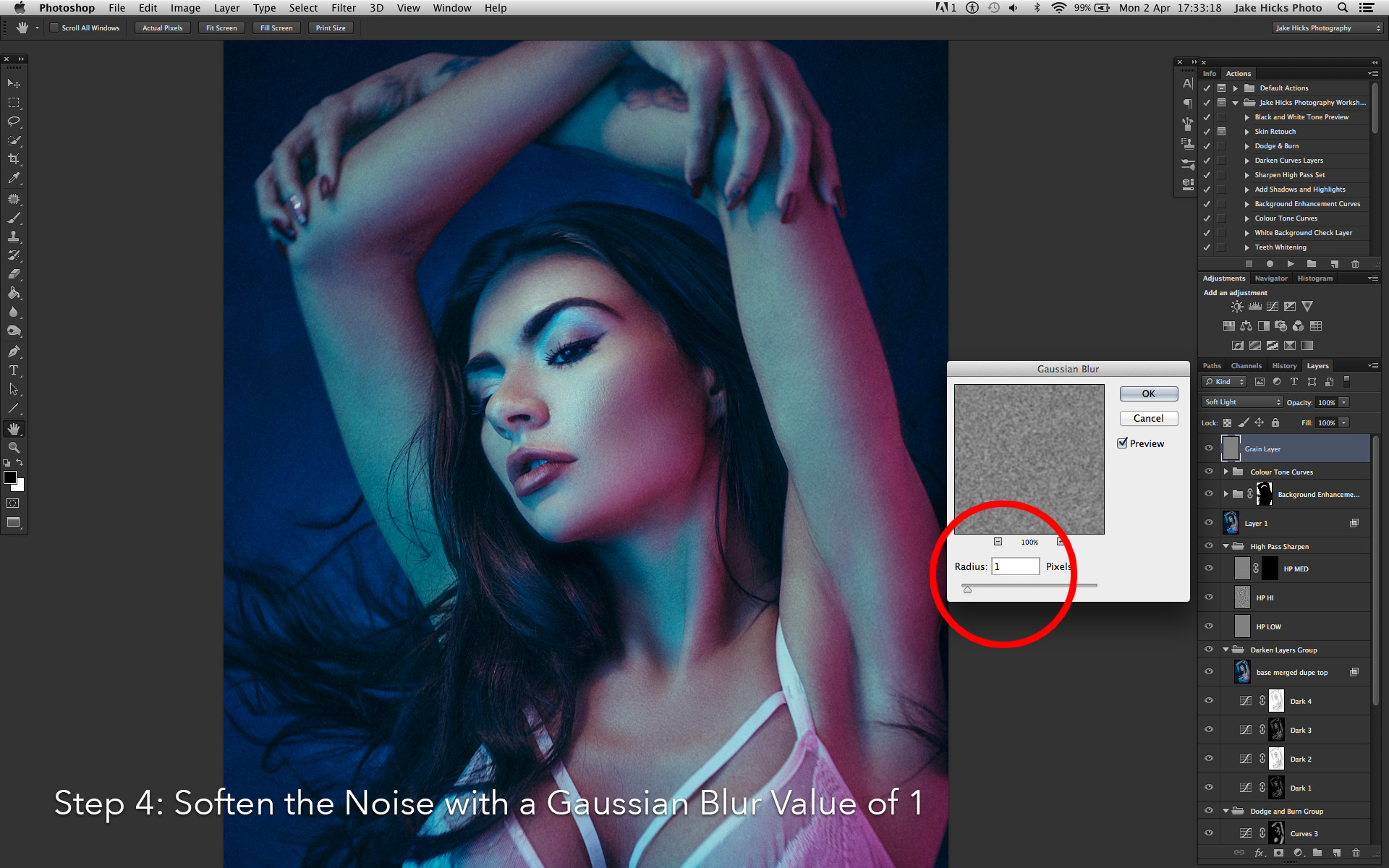
4. With our grainy layer selected we want to soften that noise a little. Go to Filter -> Blur -> Gaussian Blur. In here we just want to soften the noise a little so a Radius of about 1 should be fine. Hit OK.
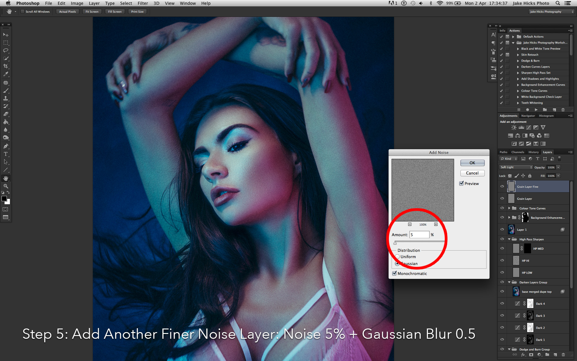
5. Next we want to add some depth to the effect to give a more realistic feel and we'll do this by creating an additional grain layer of a finer amount. Repeat the process of creating a new layer, changing it to soft light and filled with 50% gray. Than add your grain again on this new layer with a lower amount of around 5%. Once you've done that, don't forget to soften it a little via the Gaussian blur and this time we'll choose a lower amount of around 0.5% blur.
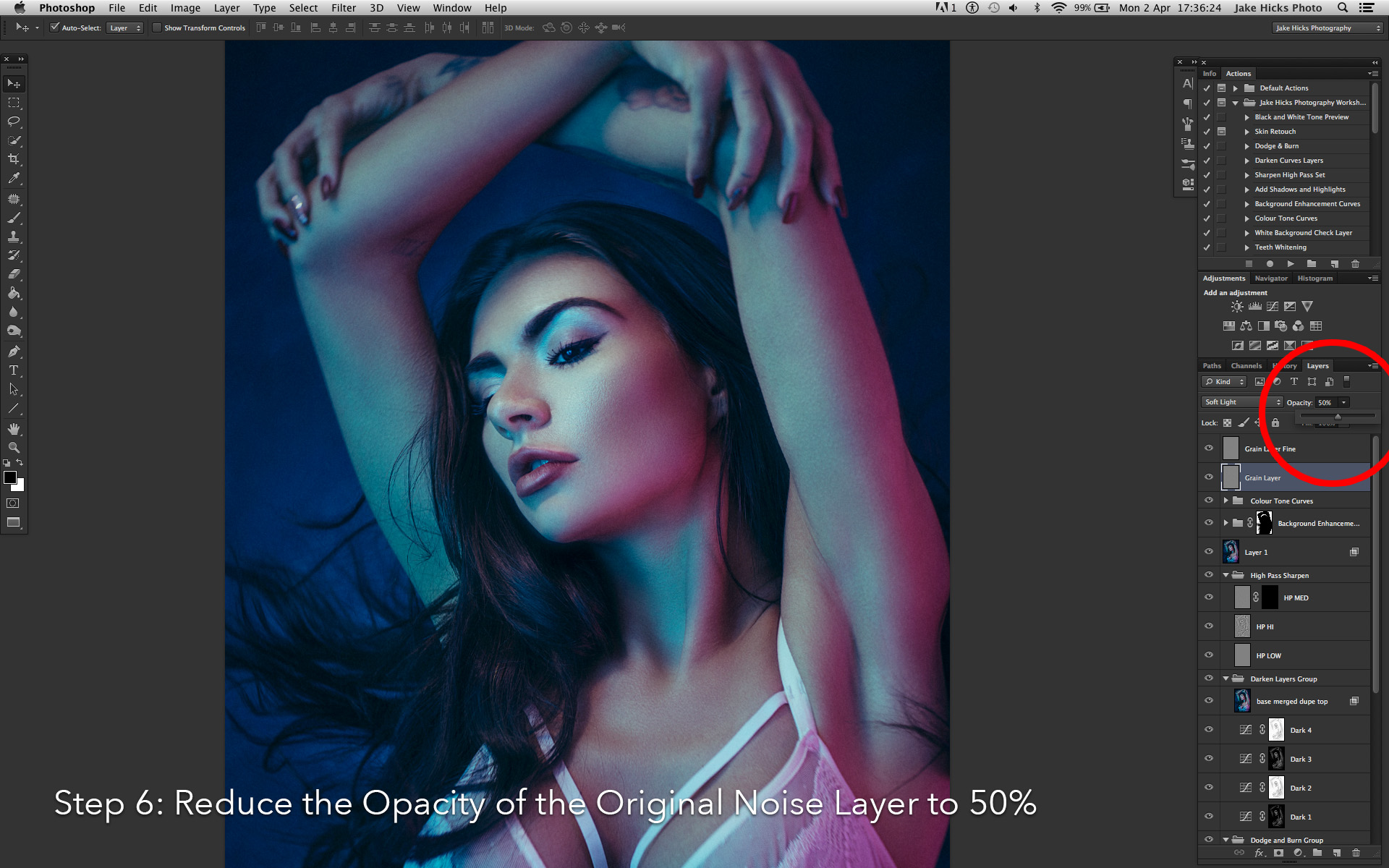
6. Finally you should now have two grey layers both containing grain with one far coarser than the other. It's with these two layers that we can reduce the opacity of each them to get the desired result. Try reducing the original coarse layer to 50% and see how it looks to begin with.

For a more detailed explanation of this process then feel free to check out the dedicated article here Adding Analogue Grain to a Digital Image to Reduce Colour Banding

Back in the film days it used to be cool to wet print your shots with the negative edge showing. That proved you got it in-camera but today, final composition is far more important than 'trendy' looking borders.
5. Re-Cropping
I've put this one last because it's the one that I am the most guilty of not following myself. I think the re-crop is something that is more prevalent in the younger photographers that grew up in the digital age of 45+ megapixel cameras. You can re-crop those huge files all day and post them online without any fear of image degradation but that wasn't always the case.
I come from an era where you really needed to 'get the shot' in-camera with very limited cropping options available to you after the initial shot unless you wanted to severely compromise the 35mm image quality.
Plus it was super cool at the time to wet-print your shots with the negative sprockets showing in the final image. Although this printing technique told everybody you nailed it in-camera it obviously meant zero re-cropping was available.

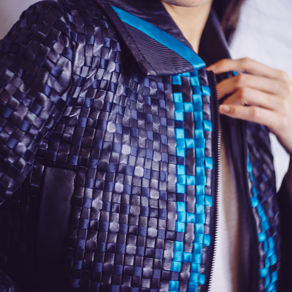
Cropping out dead space in a frame can add impact, especially if it means the subject appears to visually dominate the frame. We should never be afraid to re-crop our shots and whether we do it at the start or the end of the post-pro process, it's fundamental to the final composition of the shot. Like we can see with this image above, even minor amounts of re-cropping can have an impact.
But times have changed, we should never be too proud to re-crop an image in post. Even a minor re-crop can have a dramatic effect and you need to make cropping a fundamental part of your post pro process.

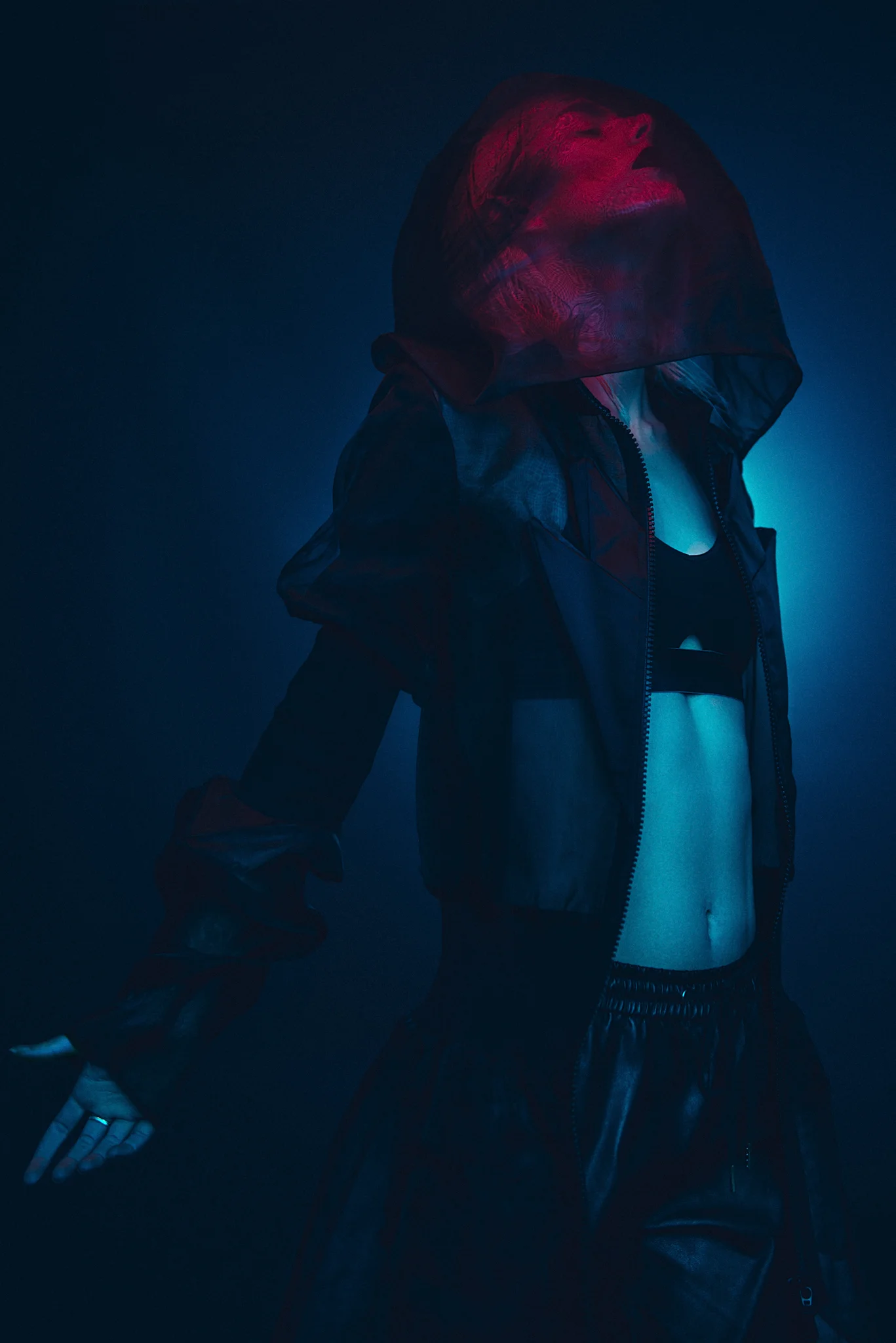
Sometimes re-cropping is key to the compositional balance of the shot. I struggled with this image as I liked the amount that the subject was filling the frame, but they were facing the wrong way for the composition to work. Visually, you rarely have the empty space behind the subject so to maintain the compositional balance I had to re-crop the shot to put the space back in front of the subject.
I hardly need to teach you how to re-crop an image but I'd recommend keeping it in the original aspect ratio from a compositional standpoint, but again that is subjective. It's also up to you when you decide to re-crop a shot. You can either do it at the raw export stage in Lightroom or you can choose to retouch the entire file and choose a crop later on prior to saving in Photoshop. Obviously doing it earlier means you're not retouching parts that will be cropped out later but sometimes you just need to see the completed file before you can confirm a final composition.
Closing Comments
Thanks as always for checking out my articles, I know the majority of articles out there are only a couple of hundred words long as that's all most people want to engage with so I appreciate your time all the more :)
I hope you consider implementing these 5 things as standard into your workflow because I believe they are all crucial and if you have any questions then let me know and I'll do my best to answer them as quickly as I can.
Also, If you're new here then feel free to join our very active community of like minded lighting-nerds (c'mon, admit it, you're one of us :D ) on my Facebook page. I'm always discussing lighting ideas and offering feedback on community images over there.
If you'd like to stay up to date on more photography related tips and techniques then sign up to my mailing list where I'll send you a monthly roundup of all my articles (plus signing up gets you a free 10 page studio lighting pdf too :) ). Thanks again and I'll see you all in the next one.
NEW POST-PRODUCTION WORKSHOP NOW AVAILABLE
For more details click on the link provided below

:WARNING: You won't believe what happens in number 2 below ;)
If you're interested in any of my work and would like to know more about how I created some of my shots then why not check out my workshops. Here you can find out everything there is to know about Gelled Lighting, Long Exposure Flash Photography and my entire Post-Pro Workflow. Jake Hicks Photography - Workshops

I've also just released a brand new 22 hour complete Gelled Lighting Tutorial video. I go over everything from studio lighting setups with gels to being on location with gels plus I also go through my complete retouching and post pro workflow. For more details and complete breakdown of everything that's include check out my Coloured Gel Portraits Tutorial

I also offer comprehensive coloured gel packs. These collections of gels are what I use day to day to create some of the most highly saturated colours around. If you're looking at getting into gelled lighting or need to get stronger and richer colours in your coloured gel work why not check out my Jake Hicks Photography Gel Packs