At first glance, this seems like an easy thing to achieve. How hard can it be to get a great looking gelled background in your shot?

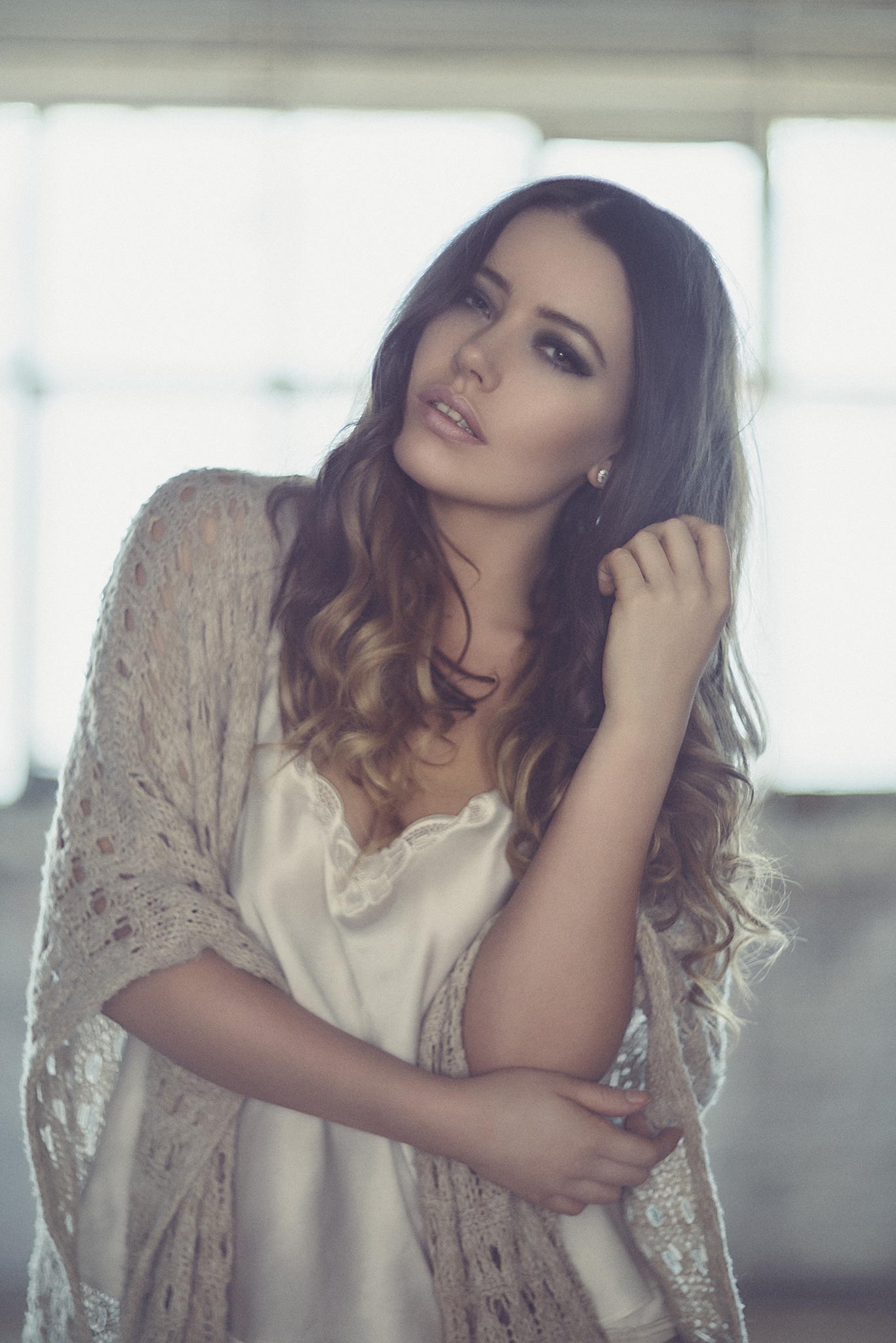
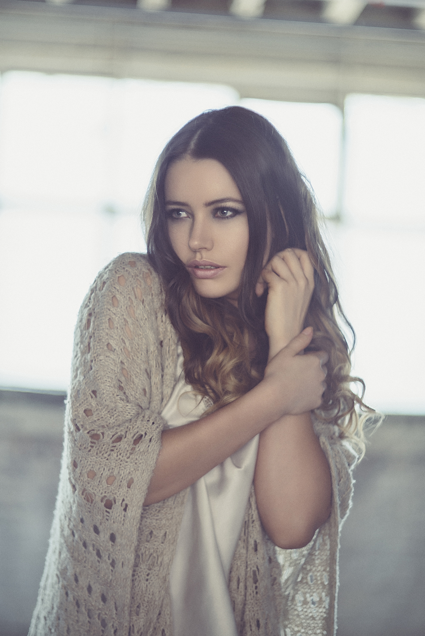
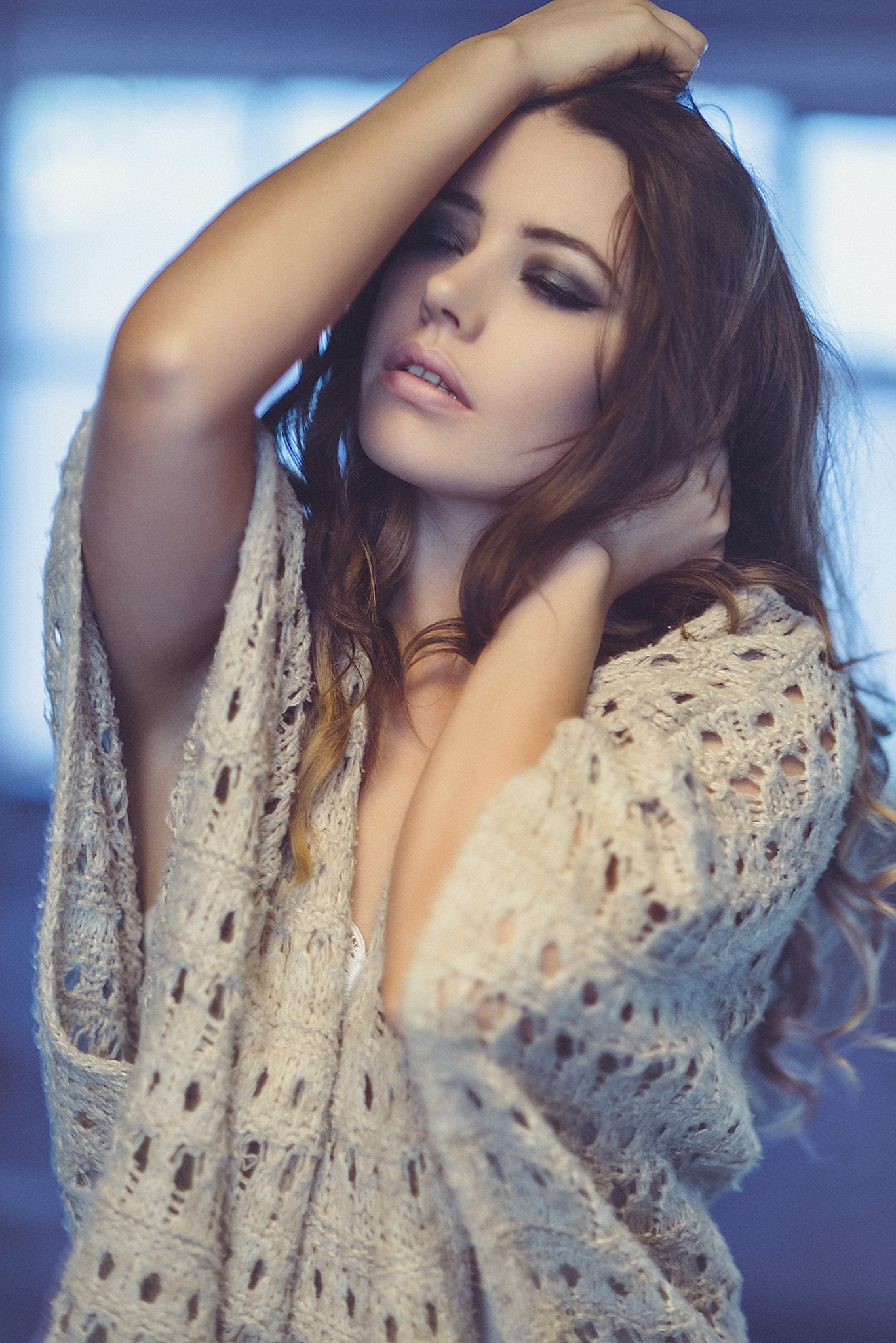
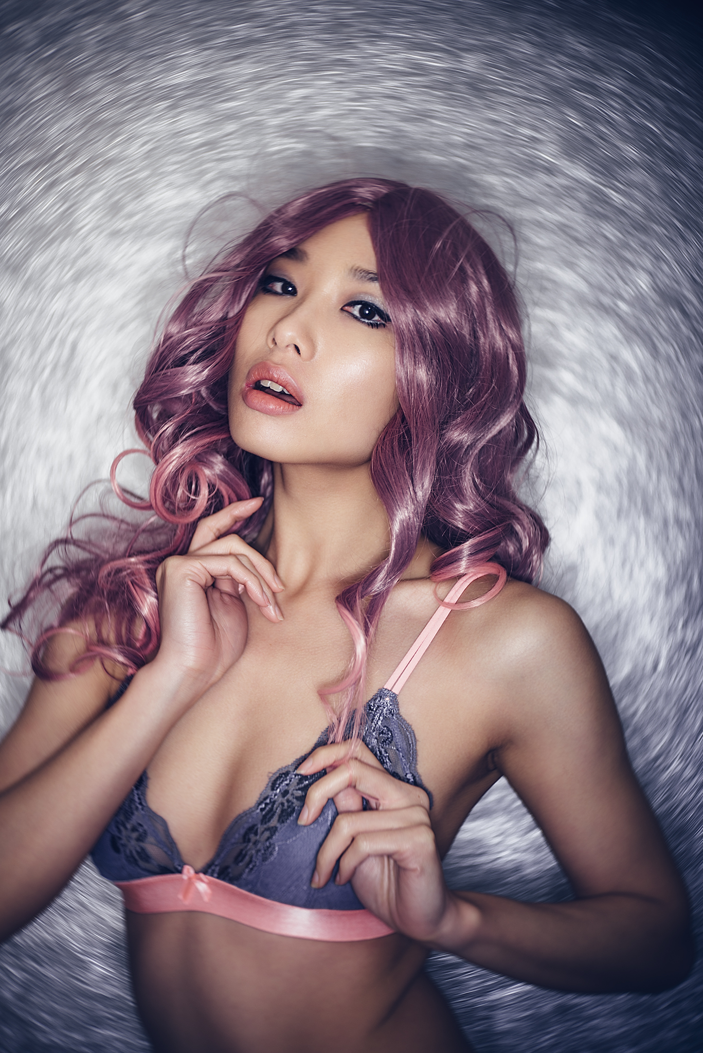
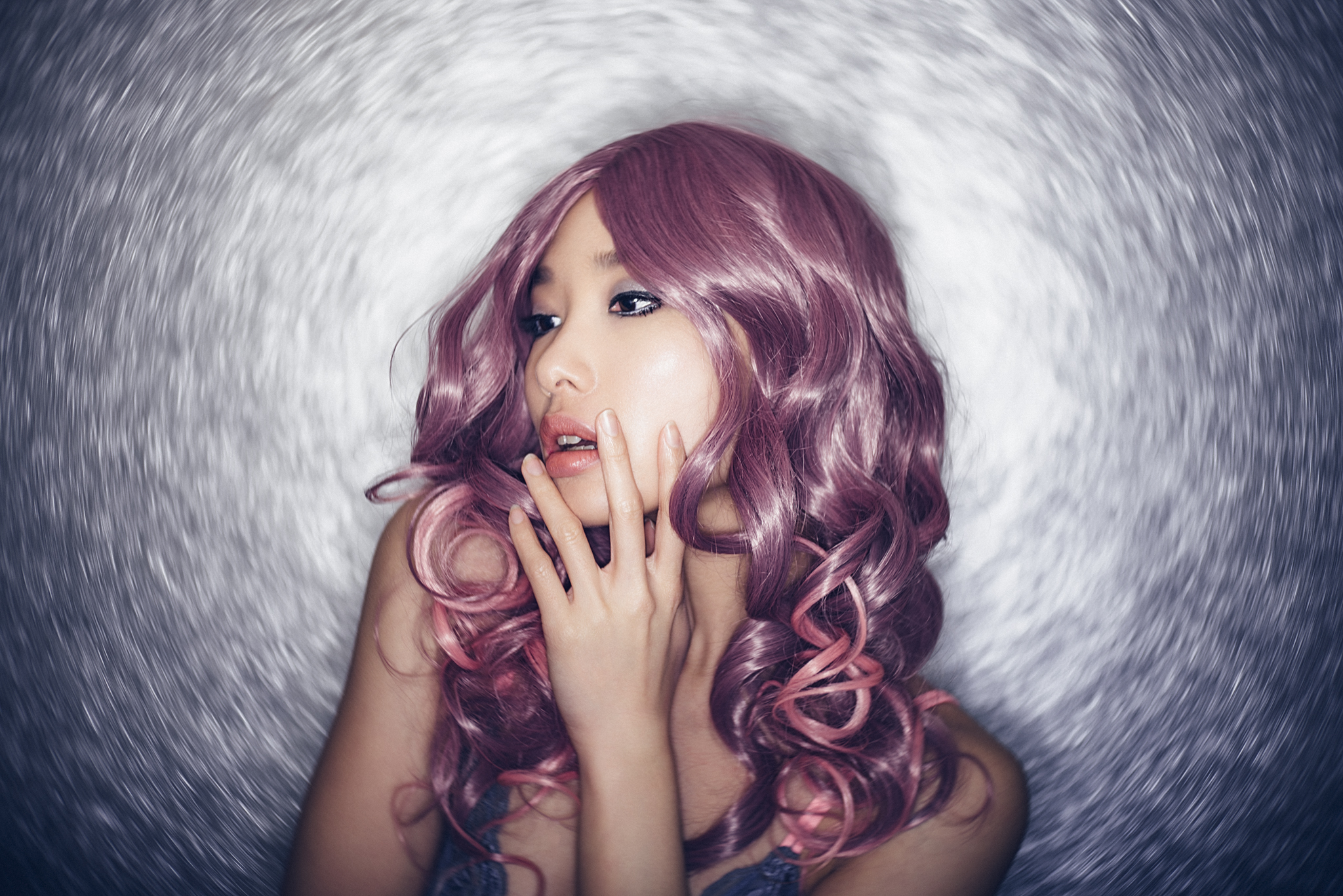
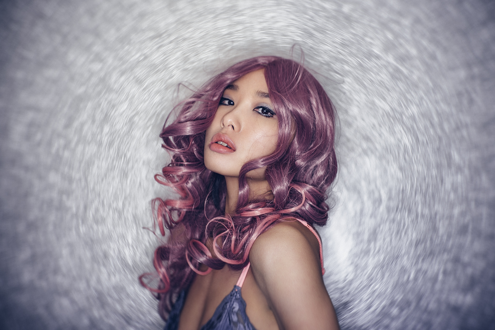
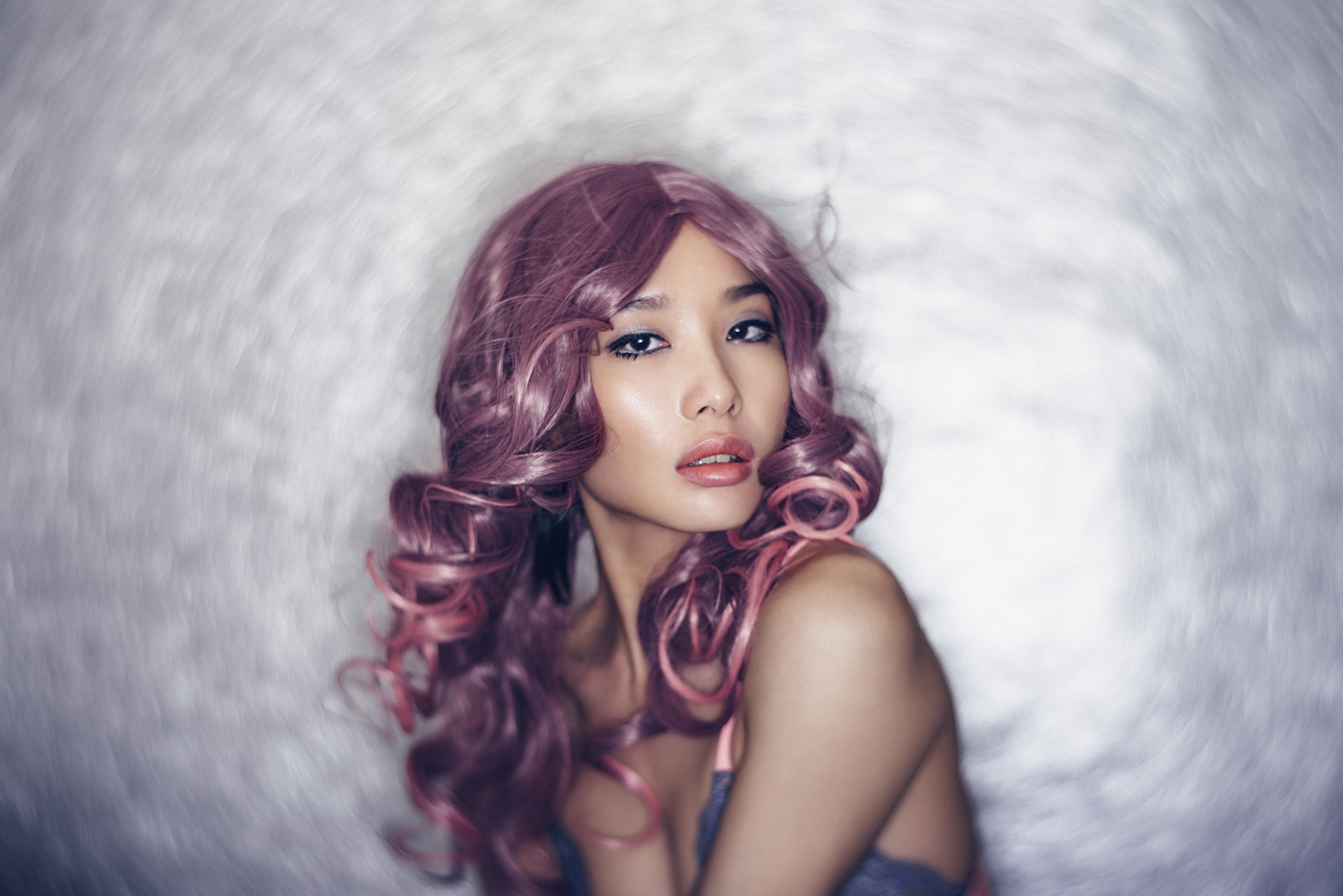
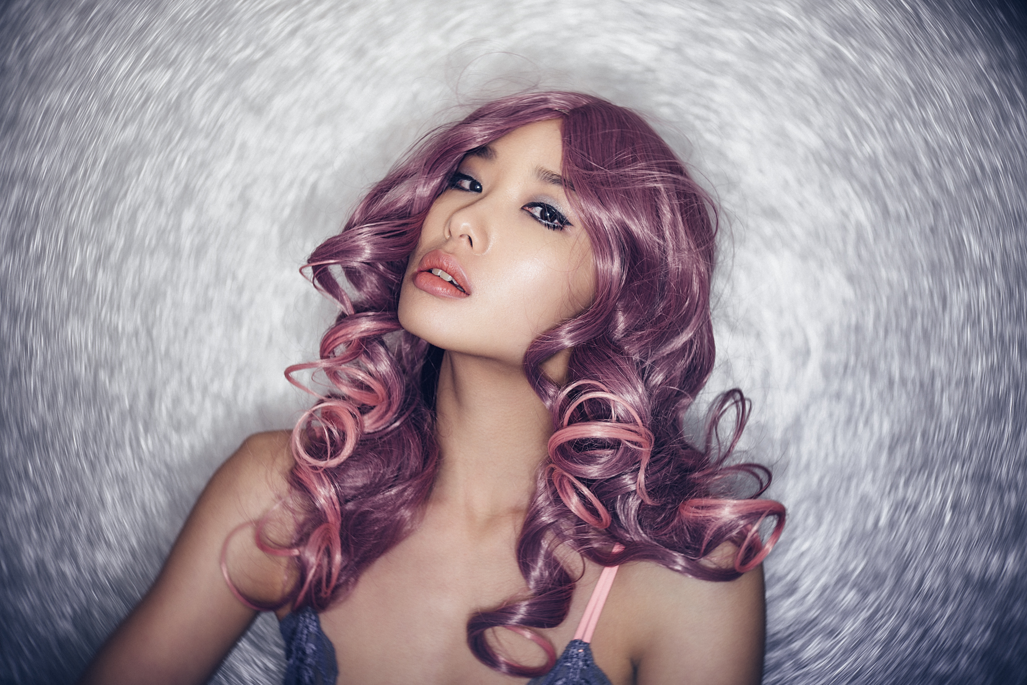
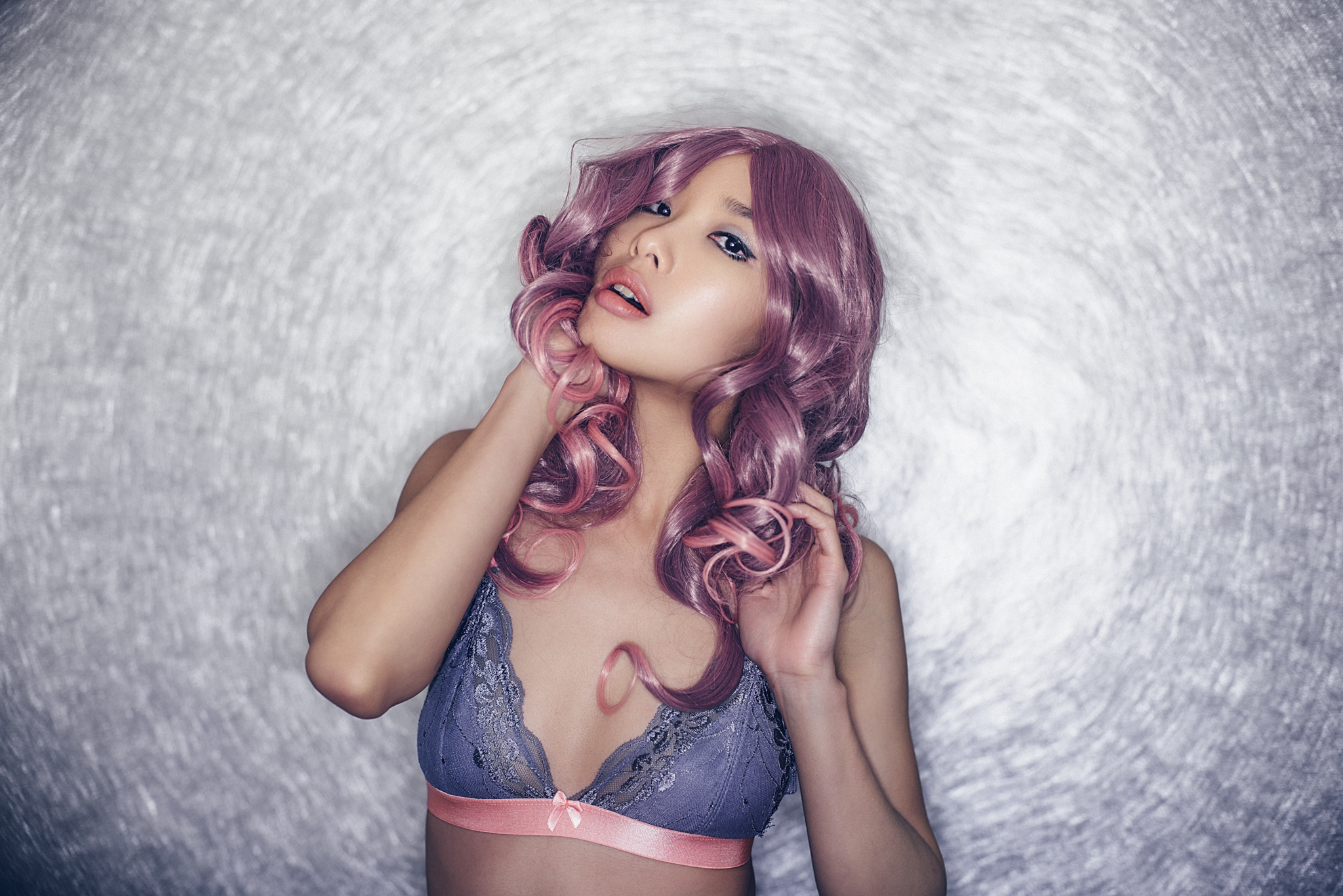
Getting clean, saturated and even colour from edge to edge on your gelled background with a subtle vignette needn't be a mystery. Simply remember Exposure, Modifier and Distance to get the perfect gelled background every time. *Image taken at my Gelled Lighting Workshop of the stunning Amber Tutton.
As anybody who’s used gels in the past will tell you, there's certainly a few key things to pay attention to if you want to avoid those washed-out and uneven gelled backgrounds. If you want clean, saturated and brightly coloured backgrounds by using gels alone, read on.
First off, why even use coloured gels rather than a coloured backdrop or Colorama? There's a couple of reasons, but the most popular is simply variety. All you need is one white wall and you can quickly and easily shine 100's of inexpensive gel colours onto it and change the look of your shot in a matter of seconds. Gels also have the ability via lighting to add depth in the form hot-spots and vignetting, whereas a Colorama (Colarama is just an industry name for long rolls of coloured paper) is a fixed tone all over. Coloured backdrops are also fairly expensive, especially if you want multiple colours and you'll have spent hundreds of pounds long before you ever get more than a few different colours in your collection.
The biggest limitation of gels over the simple coloured Colorama's is that you can't light the model if she's standing right next to the background, not without washing out the gel colour you already have back there. Gels are also pretty tricky to shoot full body shots with, if you're shooting full length fashion shots and you want the gel colour to cover the background and the floor under the models feet then yes, a seamless Colorama style backdrop is going to be the way to go.
If like me however, and you're happy to never photograph another foot ever again, gels are your inexpensive, varied and simple to use coloured background of choice.
Hot-Spots can be Good…
So let's take a look at how to create that perfect gelled background. Firstly there's a couple of options to consider in the finished look. On one hand you can go for a flat even colour and tone across the background of the image, or you can go for a vignetted look that consists of a hotspot of colour that tapers out to shadows towards the edges and corners of the frame. See below.

In the two images above we can see how the two different variations of a gelled background. The gel is shone against a white wall and depending on different factors you can either achieve a more even tone like the background on the left or a more vignetted background with hotspots and darker edges like the background on the right.
There's no right or wrong version here, just personal preference but whichever version you're trying to achieve, there are three basic factors that you can control to achieve the look you want.
By taking control of the following three factors you can manipulate the look and effect your gel has on your backdrop:
1. Exposure - This is the power of light you pass through your gel.
2. Lighting Modifier - This is the type of lighting modifier you choose to use in conjunction with you gel.
3. Gel Distance - This is the distance of the gel to the background you are trying to colour.
The following results and ideas are all based on shining a gel against a white wall or backdrop, yes you can shine them against different colours but that is a topic for another day.
Exposure
This one is the easiest to control, but also has the most effect on the result. You cannot light meter a gel because a gel changes tone with more or less exposure, some gels like the richer colours of reds and blues will often look a lot better with less power passing through them whereas some lighter coloured gels like yellows will look muddy if they don't receive enough light. As a result, you cannot 'correctly' light meter the gel. Take a look at the tests I did with my gels below. You can clearly see that the colours change drastically with variations in exposure from the light being passed through them.

The above diagram shows you just how varied a gel colour can be by simply changing the amount of light that passes through them. When I was doing this test, I set up my strobe with a medium power output and simply adjusted the aperture on my camera and took a shot at each aperture increment. The same results would have been obtained had I simply kept my camera set to a specific aperture and turned my strobe power up and down.
So in conclusion there is no 'correct' exposure, only the one that produces a colour and tone that you're happy with. I'd personally recommend you doing a similar test with your own gels to see just what colours you can produce at varying exposures. For more on this topic, read the specific article on Gel Exposures here Coloured Gels Exposed
Lighting Modifier
Lighting modifiers obviously play a big factor in how the gels will look on the background. In short though, soft light modifiers like softboxes will produce more of an even tone, but will never have deep saturated colours as a result. It's also a lot harder to get rich brighter hotspots with softboxes over harder lighting modifiers like grids and snoots.

The images above show the difference between modifiers when used in conjunction with gels. The image on the left is a small softbox with a blue gel. The colour is less vibrant and lacks in saturation from edge to edge, plus there is little sign of a distinctive hotspot. On the right we have a gel attached to gridded reflector dish and the resulting light is a lot more saturated but has a significant hotspot that drops off dramatically. If you wanted a flat even toned gelled backdrop, then the softbox is the way to go.
Taking our modifier choices a step further, we also have variations within the hard light modifiers as well. Some are more open/wider than others and the addition of a gridded modifier being the most directional and hardest modifier of them all.

In the three sets of images above we can clearly see how variations in hard light modifiers affect the gel appearance. On the left we have the tightest spot with the grid on a 60 degree reflector. In the middle we have a bare 60 degree reflector that still has a relatively controlled but tight vignette and then on the right we have the open 65 degree maxilite reflector dish from Bowens. This dish is arguably my personal favourite mix of control and spread.
Every modifier will clearly affect the gel spread and even without changing any other factor, the modifier plays an important role in determining the look. For myself and what I do, I prefer a harder modifier over the softer ones as it offers more colour saturation and control and with the hard light modifiers themselves, I prefer the open dish like the Bowens Maxilite 65 degree reflector dish. This modifier offers me the best balance of saturation, control and spread of colour.
Gel Distance
Gel distance technically refers to the distance of your gelled light and modifier from the backdrop. The closer the light to the backdrop the smaller and tighter the vignette of colour is going to be. Also, if the exposure isn't modified, the brighter the hotspot at the centre will be too. Again, this is personal preference and it depends greatly on how far away you'll be when shooting the model. For example if you're quite close to the model and shooting on a 50mm lens the gelled effect on the background will look very different than if you're a long way away but shooting at 200mm.

The two images above are drastically different, but the only thing that has changed is the length of lens used. The image on the left is a 200mm lens that has compressed the background so you get a more even tone of gel exposure. The right hand image is shot on a 50mm lens and shows a far wider area of the background in shot which in turn shows the heavy vignetting present at the edges of the gel.
Playing with your preferred lens length and gel placement (distance to background) will be key to getting the right look for you. For example if you want to shoot at 50mm you can still get the 200mm background look, you simply have to move your gel further away from the backdrop to get a wider spread of colour.
Once you're happy with the lens choice you need to fine-tune the look you're after. Moving the gelled light closer to the backdrop will produce a stronger vignette of colour compared to moving it further away, as this will produce a smoother tone from centre to edge.
The following images below were actually taken on my Gelled Lighting Workshop to show attendees exactly what was going on. I've included a lighting setup diagram with each of the images to explain the setups visually here.

The image above was taken at my gelled lighting workshop, but it shows what a gelled background looks like when the gelled light is placed quite close to the backdrop. The background has a very heavy vignette and you start to lose colour altogether at the top of the frame.

By bringing the gelled light further away from the background and hiding it just behind the model, you get a far more even colour tone from centre to edge.
So bringing your gelled light further away creates a more even tone of colour across the background which is what I prefer, but moving it closer will provide a similar look if you're shooting on a longer lens.
In Conclusion…
That's it, keep those three things in mind; exposure, modifier and distance. Just remember to adjust each of them to your taste. Lowering the exposure of a gel will often add saturation, using soft light modifiers will reduce saturation and moving your light further away will even out the tone and reduce vignetting.
REMEMBER - There's no right or wrong, just personal preference, so play with what suits your style.


Keep it Clean…
There's just one last thing and that's how to actually maintain that richly saturated colour backdrop with a perfect vignette that you've just crafted.
I get sent gelled lighting shots all the time from people asking for a little advice, 9 times out of 10, it's with a gelled background that looks washed out. When I respond with 'Your background colour looks a little washed out' I tend to get the response 'Oh no, I was going for more of a pastel tone'. Uh huh, I believe you ;)
Joking aside, we've all done it and I spent years teaching in studios where washed out colours in the background is by far and away the biggest offender of ruined gelled lighting shots.
I've rambled on long enough for one article so in the follow-up piece, I'll be going through 'How to Keep Perfectly Lit Gelled Backgrounds'. I shall see you then :D

The image on the left is the result of our hard-earned efforts to sculpt a perfectly lit gelled background. We've exposed the gel to get the tone we want, we've used the perfect modifier, we've placed it at the right distance from the wall and we've even chosen the right lens…. but it's all been ruined in an instant with the addition of just one more light!!! :'( Learn how to avoid gel-nemesis in my KEEPING Perfectly Lit Gelled Backgrounds article.
Let me know your thoughts guys, is there anything I've missed here? Are there any modifiers that you swear-by to get great results? Post a comment down below as I'd love to hear your experiences and as always, if you have any questions, please feel free to sound off and I'll try to answer them the best I can.
Another article that might interest you is the one on 'Colour Gels Exposed'
Also here's the article I wrote on some Photoshop techniques 'Maximising the Colour in Your Coloured Gel Shots'
:WARNING: Self Promotion is rife beyond this point!
If you're interested in finding out literally everything there is to know about gelled lighting then why not check out my new Gelled Lighting Workshops

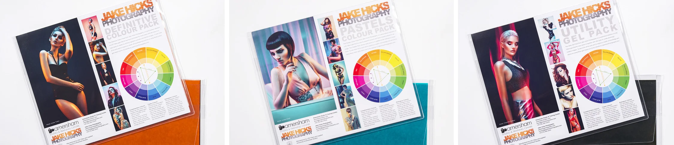
Don't forget that if you need some more awesome gels that have been curated into some phenomenal collections of must-have colours ;) then why not check out my own Jake Hicks Photography Gel Packs