• Technique
    • Latest Techniques
    • FREE TIPS
    • Quick Tips
    • Video
    • Site Search
    • Blog
    • Archives
  • Mentoring
  • >Online Workshops<
  • Workshops
  • Studio Lighting Books
  • Contact
    • Newsletter
    • Contact
    • Statement
Jake Hicks Photography
  • Technique
    • Latest Techniques
    • FREE TIPS
    • Quick Tips
    • Video
    • Site Search
    • Blog
    • Archives
  • Mentoring
  • >Online Workshops<
  • Workshops
  • Studio Lighting Books
  • Contact
    • Newsletter
    • Contact
    • Statement

Simplest and Most Effective One Light Setup I've Ever Used

I'll come clean right off the bat here and say that I stumbled across this little super easy lighting technique more by luck than skill.

I'm pretty sure I can't be the only one who has taken a portrait whist using a single key light and reflector and fought with the reflector in one hand and the camera in the other. You know the scene; super quick and clean 'clamshell' lighting with the key just above the models eyeline and the reflector just below the chin bouncing some well needed light back up to fill in the shadows. You're micromanaging the reflector with one hand trying to bounce just the right amount of light back into the shot, you're scooping, flapping, bouncing and bending the damn thing around the key-light stand with one hand desperately trying to look professional. The result? Well the result for me is that when I load the images up on the laptop for review I find that half the damn shots have the actual reflector peeking in the bottom of the frame! Not good.

A while back I was experimenting with the reflector by bouncing back light into the shot from two hair lights behind the model pointed towards the camera. I had the reflector on a stand and I was literally holding the camera up in front of it so that the viewfinder was pressed against it and taking pictures using the blessings of autofocus alone because I couldn't look through the lens.

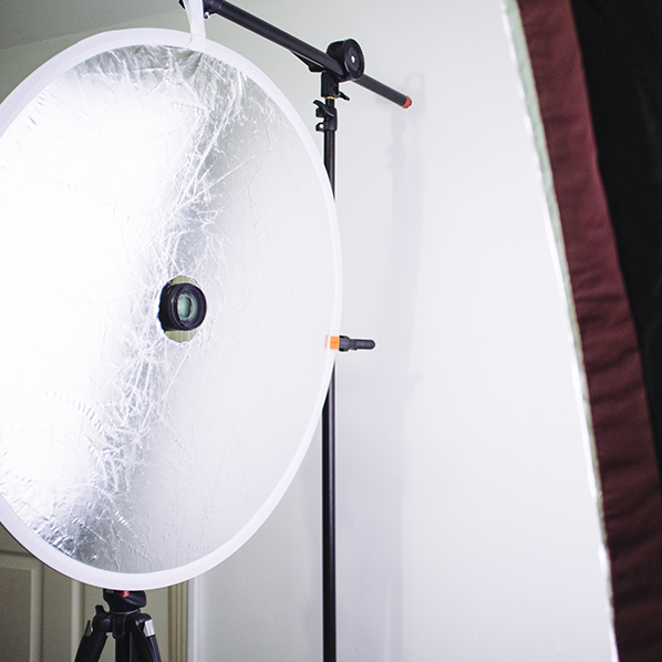
It then dawned on me 'to hell with this' and I cut a very rudimentary hole in the middle of my reflector so I could see what was actually going on.

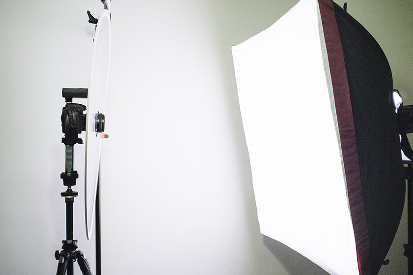
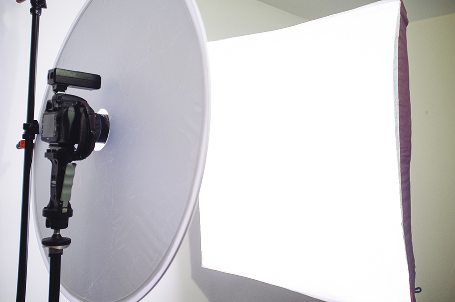
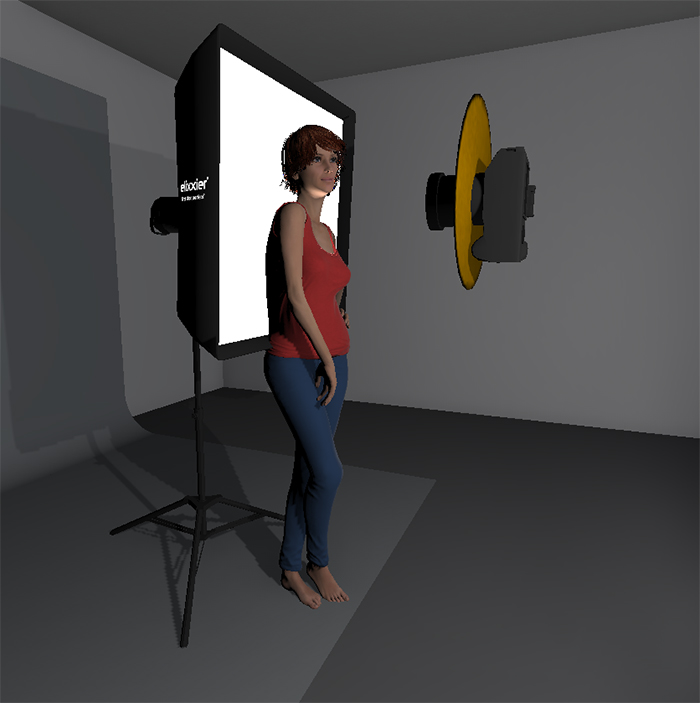
From there I ended up changing the lights around by putting a big softbox behind the model and letting my reflector simultaneously be the key-light and the fill-light. In actuality this super simple setup produces such a flattering light that its got to be one of the cheapest ring flashes you'll ever find.

Step one

Pick yourself up a super-cheap reflector of a decent size. The one that I got was a 32inch/80cm diameter one. I wouldn't go much smaller than that as you want to bounce back as much light as possible. I was fortunate enough to get a reflector that had both silver on one side and white on the other. That means that I can use the silver side to get more of a contrasting look but I can also flip it over to get a far softer look to. I managed to find mine on ebay for about a fiver. In fact heres the link to CameraKing UK 80cm 2in1 Silver & White Collapsable Circular Reflector (and no, I unfortunately I don't have any affiliation with the guy but I am going to message him right now and let him know you lot are coming and to ask where I can buy shares in 'CameraKing UK' sharpish ;) ).

 
Time to get crafty. A pen, a cutting mat and a craft knife and you're ready to make the cheapest ring-light ever.

Time to get crafty. A pen, a cutting mat and a craft knife and you're ready to make the cheapest ring-light ever.

Step Two

Grab yourself some real simple hobby tools like a craft knife, a thick pen, something circular to draw around (I used a roll of gaffer tape) and something like a cutting mat or cardboard so that you don't also slice a digestive biscuit sized hole in your lino!

 
Find something circular to draw around, preferably larger than your lens!

Find something circular to draw around, preferably larger than your lens!

Step Three

Hopefully you've found something of a decent size to draw a circle around in the middle of your reflector. This should obviously be larger than the diameter of your largest lens and I used a roll of gaffer tape as that seemed large enough. In actuality I might go back and find something larger and cut a larger hole so I can stand back a little and still shoot through the hole without getting the reflector in shot.

 
Cut the hole ensuring you've got your cutting mat beneath to protect the floor.

Cut the hole ensuring you've got your cutting mat beneath to protect the floor.

Step Four

Once you've found something of a suitable size to draw around its time to cut that hole. It's worth mentioning that I just plonked the hole roughly in the middle of my reflector and drew around it. I did think about placing the hole off centre so that when I shot through the reflector I could rotate it to adjust the amount of light I had coming from the top or bottom. It's probably worth an experiment at some point but for these shots I just had it in the centre. Place the cutting matt/cardboard underneath and simply cut the hole tracing the line you drew previously.

 
JakeHicksPhotography (5 of 7).jpg
JakeHicksPhotography (6 of 7).jpg
JakeHicksPhotography (7 of 7).jpg
reflector setup.jpg
JakeHicksPhotography (5 of 7).jpg JakeHicksPhotography (6 of 7).jpg JakeHicksPhotography (7 of 7).jpg reflector setup.jpg

Step Five

That's it, you're pretty much done! All that's left to do is to set up your one light. I had a big softbox placed behind the model and then hung the reflector on a light-stand in front of her. You don't even need to hang the reflector though really and it's pretty easy to just hold it in your other hand. Also your lens is poking through the hole so the reflector is never getting in the shot anyway so it makes it really easy to control.

 
JakeHicksPhotography (1 of 6).jpg
JakeHicksPhotography (2 of 6).jpg
JakeHicksPhotography (3 of 6).jpg
JakeHicksPhotography (4 of 6).jpg
JakeHicksPhotography (5 of 6).jpg
JakeHicksPhotography (6 of 6).jpg
JakeHicksPhotography (1 of 6).jpg JakeHicksPhotography (2 of 6).jpg JakeHicksPhotography (3 of 6).jpg JakeHicksPhotography (4 of 6).jpg JakeHicksPhotography (5 of 6).jpg JakeHicksPhotography (6 of 6).jpg

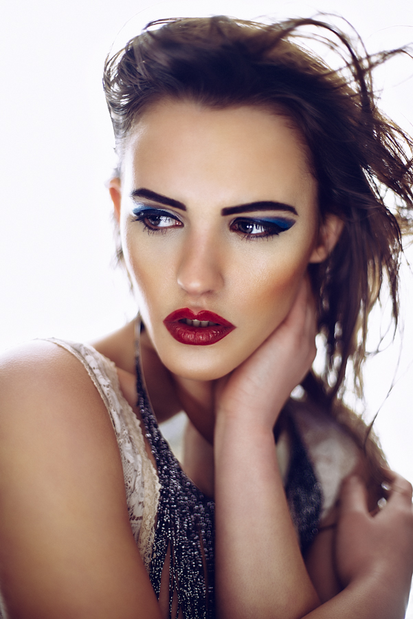
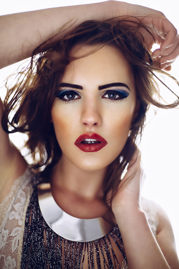
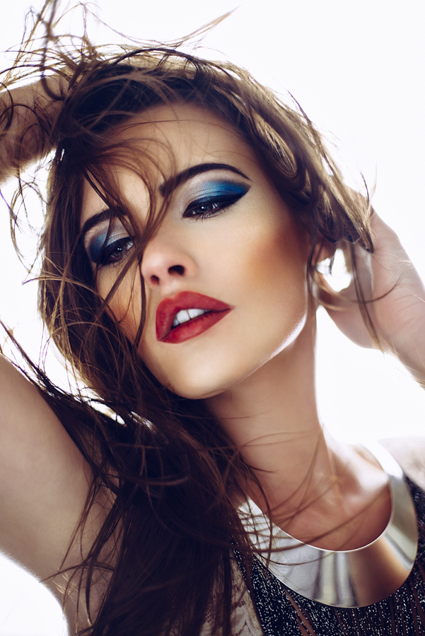
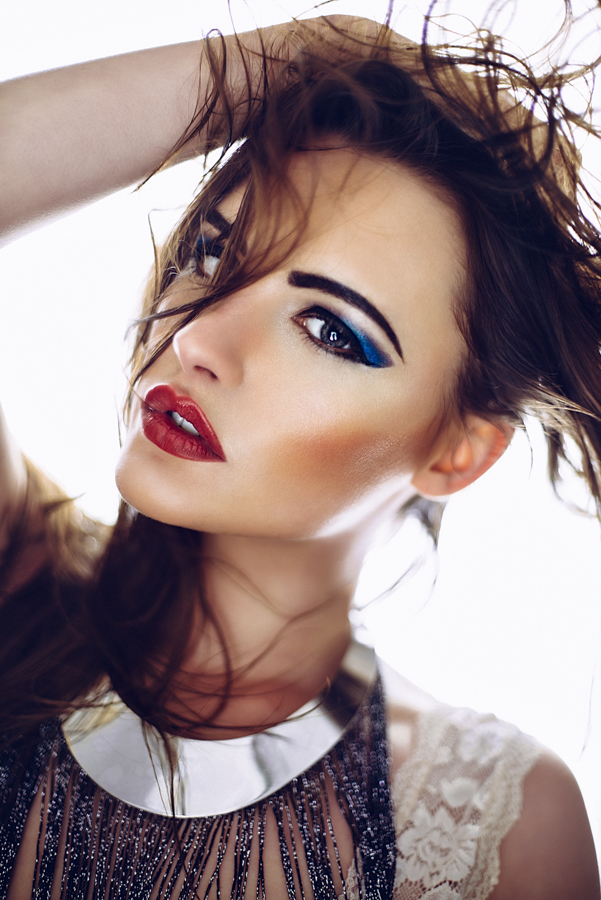
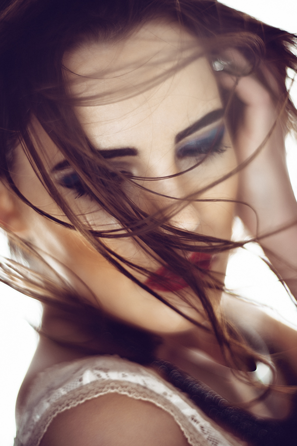
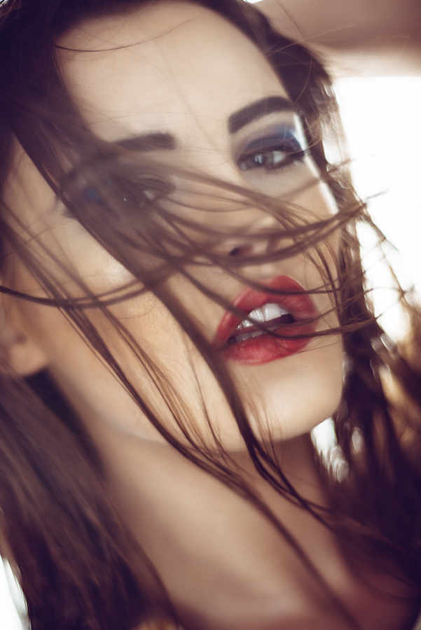
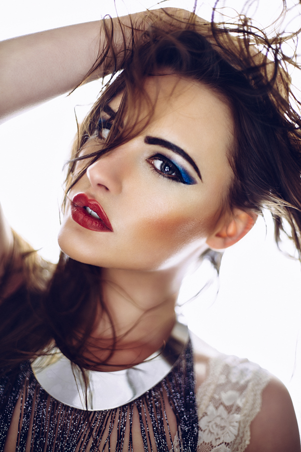
Check out some of the shots I got in literally a few minutes, I was genuinely shocked as to how stunning the lighting looked on the back of the camera straight away. The reason for this is simply just how flattering the lighting is and how that single light wraps around the model and bounces back into the shot giving the impression of the light coming from everywhere. The softbox light bleeds around the model and cuts into her which has a visually slimming effect (especially noticeable with a shallow depth of field) and then bounces light back into her face from a source that is relatively large to her. This reflected light is coming from everywhere equally so it gives the appearance of very soft, flattering light. 

Key Points to Remember

1. Use a silver or white reflector of a decent enough size to cover a half body shot. A 80cm/32in size is a good place to start.

2. Cut a hole in the centre of your reflector large enough to take the diameter of your largest lens.

3. Don't cut a hole in your carpet.

4. The bounced light of your reflector is your key light. To adjust the exposure of this light you will have to move the reflector closer and further away until you're happy.

5. Use an Neutral Density filter on your lens to reduce any unwanted power from your strobe and shoot as wide open as your lens will allow.


You may have noticed from these shots here that they are all shot with a very shallow depth of field which works particularly well with this type of lighting. I was able to shoot at low apertures with my 500w strobes because I also had a LEE Filters ND filter on my lens. A lot of studio strobes are so powerful it's sometimes difficult to shoot wide open when using them but by using neutral density filters you're able to reduce the amount of light entering the lens and shoot at f1.8, f2 etc to get some beautiful looking shots. This one was a ND 0.6 which stopped 2 whole stops of light from entering the shot. If you're a studio strobe user and want to start using faster lenses to get these effects then an ND filter is smart accessory to get. LEE Filters Neutral Density Filters

Instead of an Neutral Density filter for your lens you can also purchase ND filter gels for your strobes to. This gives you greater flexibility with individual lights rather than reducing all light entering the lens. If you're interested in getting some then Neutral Density gels then they are included in my 'Utility' Gels pack at the link below. Scroll down to the bottom of the page to check the contents http://jakehicksphotography.com/products/

Interested in learning more? Why not check out one of my workshops to learn a whole host of different lighting tips and techniques http://jakehicksphotography.com/training/

As always guys, any questions then simply fire away in the comments section below and I very much look forward to seeing what you guys come up with when using this super simple one light technique :)


:WARNING: Even more amazing things that require monies below :D


If you're interested in any of my work and would like to know more about how I created some of my shots then why not check out my workshops. Here you can find out everything there is to know about Gelled Lighting, Long Exposure Flash Photography and my entire Post-Pro Workflow. Jake Hicks Photography - Workshops


I have also just released a brand new 22 hour complete Gelled Lighting Tutorial video. I go over everything from studio lighting setups with gels to being on location with gels plus I also go through my complete retouching and post pro workflow. For more details and complete breakdown of everything that's include check out my Coloured Gel Portraits Tutorial


I also offer comprehensive coloured gel packs. These collections of gels are what I use day to day to create some of the most highly saturated colours around. If you're looking at getting into gelled lighting or need to get stronger and richer colours in your coloured gel work why not check out my Jake Hicks Photography Gel Packs

Tuesday 02.09.16
Posted by Jake Hicks
 

Using a Projector in your Photoshoot

This shot was taken of the lovely Jaye using a projector and one other ambient light. Settings: 85mm lens, 1/100 second, f2, ISO 100, WB 3400.

This shot was taken of the lovely Jaye using a projector and one other ambient light. Settings: 85mm lens, 1/100 second, f2, ISO 100, WB 3400.

There are literally thousands of different ways to modify your light but there is one that probably offers the most versatility and variety in look and that's the humble projector.

The projector is something that has fallen out of fashion in recent years but  in the 1960's and 70's nearly every household owned one. Back then one of the most common ways to take photographs was by shooting with E6 film or as it was more commonly known, slide film. This slide film produced 35mm transparencies that would be loaded into your projector, you'd set it up on your new smoked glass and chrome coffee table and then the full glory of your Kodachromes would be projected huge onto the nearly white wall in the lounge as you gazed in wonderment from the cosy confines of your deep shag pile carpet.

Even as a child in the 80's I remember my father digging out the projector and shining the holiday snaps up onto the screen to go through them. It was actually an incredibly impressive way to view your shots and it's crazy to think that we traded that immersive 6 foot by 4 foot viewing experience for swiping through our latest and greatest shots in the palm of our hands. Surely we missed the point somewhere along the line where convenience trumped experience.

 
These are what our old photo albums looked like. A rack of transparencies ready for the projector.

These are what our old photo albums looked like. A rack of transparencies ready for the projector.

OG Projector

Fast forward to the present and very few homes still have a projector, we've all opted to view our holiday snaps on our phones and maybe sometimes our T.V's if we're feeling really organised. That being said a lot of people still have their old projectors up in the attic somewhere languishing in obscurity, I know my father did and I nabbed it many years ago to give it a new lease of life as a photographic light/modifier. Using the projector as a light in your photography opens up a world of possibilities and once you start off down the path of projecting different images into new images you'll soon realise the potential the projector has to add something unique to your shots is boundless. When I was at University I had a lot of fun experimenting with it and if you get the chance I recommend you having a rummage in the loft or asking your parents/grandparents if they've still got one hanging about. If they do, dust it off, change the fuse and have a play with it.

When you're using just a projector to light your shot it's a bit easier to light your subject. You just choose your image to project, set it up, expose for that one image and you're done.

When you're using just a projector to light your shot it's a bit easier to light your subject. You just choose your image to project, set it up, expose for that one image and you're done.

My fathers old projector that I found in the attic when I was at Uni. Still going strong. Fully complete with that suspiciously familiar red dot ;)

My fathers old projector that I found in the attic when I was at Uni. Still going strong. Fully complete with that suspiciously familiar red dot ;)

The properties of a projector to be aware of when using them in conduction with photography are first and foremost the slides. If you want to use a projector to shine an image into your scene then you first have to buy some E6 film, find an old 35mm camera, learn how to use it, shoot your shot, send it away for a fortnight to be processed, wait around for it to be delivered and then and only then can you delicately place your precious 35mm transparency into a slide mount, pop it into your projector and finally shine it into your scene. (Phew, that's a to of steps! Be thankful you weren't trying to read that last sentence aloud). Pretty safe to say that firing up your old projector is not going to be a quick and spontaneous idea but if you've got a well thought out shot and an awesome image to shine into it then the results it can produce are very cool indeed.

 
The modern projectors are digital, they can be plugged into nearly every digital device and project any image that you want.

The modern projectors are digital, they can be plugged into nearly every digital device and project any image that you want.

Going Digital

So what if you don't have two weeks to spare and the patience of a saint but you'd really like to use a projector in your shots? Welcome to the digital age. The modern alternative of course is the digital projector and this thing can literally shine any image you could possibly think of into your shot and if you have the right cable, you can shine that image from any device you like. Your T.V, your laptop and even your phone. The digital projectors have come down in price a lot in recent years and their main reason for existing now is for home entertainment. I've had mine for many, many years but the brightness is still ok. They're all a lot brighter as standard now but be mindful that you certainly get what you pay for to a certain extent and the key thing to look for if you're in the market to get one is the brightness. A digital projectors brightness is measured in lumens and they vary hugely. For example you can currently pick up a £50 digital projector on eBay with a brightness of 150 lumens but for a £120 you can pick one up with a brightness of 3000 lumens. That is literally like night and day and the extra money for the extra brightness is definitely worth it in my opinion. That extra brightness will allow you to shoot at faster shutter speeds and at lower ISO's, both of which are crucially important when photographing people.

The digital projector is what I use now and that's purely for convenience over anything else. I can find any image I like and shine it into the scene from my phone. If I don't like the way its looking then I can simply change it immediately. Like I mentioned before, with this level of convenience it opens up any digital image on the planet to be immediately shone into your shot.

 
I simply plug my digital projector into my old phone and have access to any image I want instantly.

I simply plug my digital projector into my old phone and have access to any image I want instantly.

So now that we understand all those benefits, what's some of the downsides that we should be wary of when incorporating a projector into our shots? The first thing is power. The power of the light (or lumens) that most projectors put out is pretty dismal in our photographic terms and remember that brightness will be heavily influenced by the type of image you shine. If you shine an image of a shadowy forest into your shot its going to be very dark as an output. If on the other hand you project a bright blue beach scene instead its going to be a lot brighter. Here's a totally arbitrary figure though to give you some idea of what I'm talking about; an average brightness image shone onto a white wall may give you 1/60 second exposure, f4 at 200 ISO. Like I mentioned earlier though, you can now get a lot brighter digital projectors, they're the HD ones that produce a far crisper image to and although I've never used one I'd be very interested to see the results they produce.

 
One thing to watch out for when using a digital projector is the pixels that are projected onto the skin. Theres not to many things that you can do about this apart from maybe knock the projector slightly out of focus to reduce the effect a little.

One thing to watch out for when using a digital projector is the pixels that are projected onto the skin. Theres not to many things that you can do about this apart from maybe knock the projector slightly out of focus to reduce the effect a little.

Another thing to bear in mind with modern digital projectors is that they shine pixels, so you will literally see lots of tiny squares in your projected image which can be a real pain and an eyesore up close. For this reason alone I prefer the older slide projectors as they don't have this issue at all. They simply shine light through your slide film and the only thing you'll notice on the models skin is the film grain from the original transparency and seeing as most slide film has super fine grain anyway you shouldn't even notice anything at all.

 
Start off using a projector with easy shots like ones with a lot of white space in them. This will not only make it easier to position the projector for a more flattering light but it will also limit the amount of awkward white balancing you'll need…

Start off using a projector with easy shots like ones with a lot of white space in them. This will not only make it easier to position the projector for a more flattering light but it will also limit the amount of awkward white balancing you'll need to do later on.

One last thing to bear in mind of course is the colour temperature of the image you are projecting. It's not to much of an issue at all if you're shooting with just the projector as you simply shoot RAW and play with the white balance afterwards until you're happy. This is the best place to start if its your first time experimenting with a projector. Choose an image thats nice and bright, preferably with large sections of white in it and just project that directly onto the model and white balance the image later on.

This shot was taken using the older analogue projector, you can clearly see that even when zoomed in that there is no pixels on the face and the projected image is far clearer.

This shot was taken using the older analogue projector, you can clearly see that even when zoomed in that there is no pixels on the face and the projected image is far clearer.

The colour temperature does become an issue however when you're using the projector in conjunction with other lights. If you were to just shine white light from the projector onto a white wall it roughly produces the same colour temperature as a tungsten bulb (I know this to be the case with my older digital projector but more modern HD ones may be a lot bluer/cooler in tone). As a result if you're using it with flash you'd probably have to use an CTO (Colour Temperature Orange) gel on your flash to compensate. But before you all breath a sigh of relief and think that was easy, all that unfortunately changes when you decide to project coloured images through your projector. This is where it can become a bit tricky. For example, if I was to shine an image of blue water through my orange tungsten bulb, what white balance should I set my camera to and what colour correcting gel should I use on my flash? This is a bit of a minefield I'm afraid and there's no easy answer suffice to say that you'll just have to do a little experimenting with the specific image you choose. One thing that I do though is to take my images that I'm going to project into editing software beforehand and add some blue to the image before I project it. This helps when I'm balancing the lights afterwards as the projected image is already on the blue side as comes through the orange bulb.

 
I get my projector up on a light stand and perched on a Manfrotto laptop plate. This enables me to get the projector above the models eye level.

I get my projector up on a light stand and perched on a Manfrotto laptop plate. This enables me to get the projector above the models eye level.

Brilliant ok so we're all set with some basic theory on do's and don'ts, we've got our image that we want to project so let's start to think about setting up the shot.

Always try to treat your projector like any other light source in your shot. By this I mean think about angle and height of the projector placement. All too often I see people using a projector by placing it on the floor, table or chair next to them. Not only does this cast huge shadows up the wall behind the subject but it also creates that horrendous up-lighting on models that is never flattering. Always get your projector above the models head height to create a far more flattering look. A projectors light is an incredibly hard light source because it's a focused light coming from a tiny point so the least you can do is position it at a flattering height and angle. Getting the projector up high is actually harder than it may first seem but I sit my projector on a laptop plinth from Manfrotto (essentially just a plate that screws to the top of light stands and tripods). I can then attach this to a tripod or even a light stand to give me even more height.

The next thing is the projectors distance from the model. This distance is determined by what coverage of projected image you are looking for on the model but if you are looking to shoot a 3/4 length shot then you're probably going to have to get your projector about 8-10 feet away to cover that area. Most digital projectors are designed for home-cinema use and they are getting better and better at throwing a larger image in smaller spaces than ever before.

 
You can clearly see how much of a difference it makes when you add additional light onto the model to eliminate the projected image.

You can clearly see how much of a difference it makes when you add additional light onto the model to eliminate the projected image.

That's pretty much it, you're done and if you aren't planning on introducing additional lighting then you're all set to start shooting away. If you are looking to add some extra light in there, for example to wash out the projected light on a models face then here's where the fun begins. First off you need to be careful that the light you're shining on the model doesn't fall onto the background where your projection is otherwise its going to wash that out too. For this shoot I've shared here I had my light directly above the model, literally pointing straight down on her. The main reason for this was space if I'm honest, I couldn't get the light any higher because of the ceiling in the way, if I could have, I probably would have put it a little higher and brought it further away from her to soften the hardness of light a little. That being said I'm still really pleased with how they turned out. The modifier I had on this light was simply a reflector dish with a small grid/honeycomb attached. With this grid I can very easily control where the light goes and I can easily ensure no light spills into the background.

I ended up not using flash at all here, I simply used the modelling bulb on my strobe to light her. I actually also used a CTB (blue) gel on this light to cool down the colour a little. It might be reasonable to assume that I wouldn't need to seeing as the other light (the projector) is a tungsten bulb so they should be the same colour but in reality though the image I was projecting was so blue that I had to compensate (like I mentioned you just have to adapt on the day and see what looks best colour wise). I had the model really close to the background to so that I reduced weird shadows but it meant that the placement of the additional light was even more crucial.

The setup shown above illustrates where I had the models light placed. It was quite close to the model and pointed down sharply to avoid any excess light spilling onto the projected image on the wall behind her. In this diagram the light next to the…

The setup shown above illustrates where I had the models light placed. It was quite close to the model and pointed down sharply to avoid any excess light spilling onto the projected image on the wall behind her. In this diagram the light next to the camera is actually there to represent the projector. Again here you can see that I had the projector above the models head height so that any shadows would be thrown behind her and hidden below her shoulders. I also further increased this by shooting slightly up at the model, this again ensured that there were minimal shadows distracting the overall shot.

Now that we've placed our extra light we need to look at the powers of them. Although you can adjust the brightness of most projectors, it's best to have them as bright as you dare without washing out the colour and then adjust the other lights around that. I had the modelling bulb turned up pretty high on my strobe to wash out the projected image and after I was happy with the power balance I finally got to start shooting.

One thing to bear in mind when shooting is to direct the model around both of your light sources. The key light is now your light that is shining down on the model so your model should base their posing around that. As long as your projector has been set straight on and above the models eye level you shouldn't need to worry about it anymore.

The modifier I used to light the model was simply a small gridded reflector.

The modifier I used to light the model was simply a small gridded reflector.

Thats it, keep shooting and see what's working and what's not working but the key here is to experiment with lots of different images and see what you prefer.

One final point to bear in mind is how much of an influence the projected image has on the overall shot. Try to tie everything else like fashion and makeup around it. In this shoot the model wore a swimsuit and was sprayed with droplets of water to match the look of the projected image of water behind her. All these little elements can really help sell a look.

 
When using more colour in your projected image it can get a bit colour heavy. This is what the shot looks like without any additional light on the model.

When using more colour in your projected image it can get a bit colour heavy. This is what the shot looks like without any additional light on the model.

Key Things to Bear in Mind When Using a Projector in your Photography

1. Start off by choosing an image with a lot of white in it and only use the projector to light your subject.

2. Get your projector above the models eye-level to create a more flattering light and to hide unsightly shadows.

3. Be mindful of the pixels that can be produced on the models skin from digital projectors. If it's a big project where the final image is likely to be blown up big, consider using an analogue projector to reduce this.

4. Be prepared to adapt to weird colour balancing issues on the day. The colours of projected images can drastically distort white balance, adjusting an images colour in Photoshop prior to projection may be a handy workaround.

5. Tie your projected image and your subject together to create a cohesive look. Make sure the image you're projecting makes sense with what the models wearing and the idea you're trying to portray.

Many thanks indeed to my super patient model Jaye - Go check her out on her portfolio

Good luck guys and I look forward to seeing what you all come up with.

View fullsize JakeHicksPhotography (2 of 5).jpg
View fullsize JakeHicksPhotography (3 of 5).jpg
View fullsize JakeHicksPhotography (4 of 5).jpg
View fullsize JakeHicksPhotography (5 of 5).jpg

Click on the images above to enlarge.


:WARNING: There's probably something financially draining below!


If you're interested in any of my work and would like to know more about how I created some of my shots then why not check out my workshops. Here you can find out everything there is to know about Gelled Lighting, Long Exposure Flash Photography and my entire Post-Pro Workflow. Jake Hicks Photography - Workshops


I've also just released a brand new 22 hour complete Gelled Lighting Tutorial video. I go over everything from studio lighting setups with gels to being on location with gels plus I also go through my complete retouching and post pro workflow. For more details and complete breakdown of everything that's include check out my Coloured Gel Portraits Tutorial


I also offer comprehensive coloured gel packs. These collections of gels are what I use day to day to create some of the most highly saturated colours around. If you're looking at getting into gelled lighting or need to get stronger and richer colours in your coloured gel work why not check out my Jake Hicks Photography Gel Packs

Tuesday 01.12.16
Posted by Jake Hicks
Comments: 29
 

50mm vs 85mm: Which is the Best Focal Length for Portraiture?

This shot was taken with the Lensbaby Velvet 56 lens. Even with the model’s hand closer to lens than her face, the distortion is minimal and certainly not distracting.

I’m fortunate enough to have been a pro shooter for many years now. I shoot a wide variety of subjects, but they all tend to fall into the categories of commercial portraits and fashion work. I’m always photographing people—no still lifes, product shots, or architecture. To say that I always photograph people as a portrait and fashion photographer may seem like an obvious statement, but it has a crucial impact for me and the lenses in which I choose to invest.

In addition to being a professional editorial and fashion photographer, I’m also heavily involved in training emerging photographers in the industry. The one question I get asked the most is: “Which lens should I buy to attain the best classic portraits?”

This is a very poignant question and one that we have all faced at least once in our photographic journey. To answer this question properly though, you have to bear in mind a few key factors, such as what you plan to photograph and whether you are allowed any creative freedom in capturing it.

If you’re going to be photographing products and architecture, then you need to bear in mind that 99% of the time you’ll have to document these things without any distortion and with very limited creative freedom. If you take a picture of a building with a 50mm lens from the ground, the distortion lines created by that lens can give the impression of it falling over. The same theory applies to smaller still life shots. Certain focal lengths of lenses are not suited to properly represent the straight lines we see in architecture and packaging. Your client is not going to be overly happy when you show them their building appearing to fall over or their packaging appearing bent and warped.

If, on the other hand, you are going to be photographing people, there are no straight lines in sight and you can afford to use the lens distortions to your advantage.

If you’ve made it this far, I’m sure you’ve probably realized this isn’t going to be a scientific article with distortion charts and algebraic formulas. This is simply my advice and opinion based on many years of experience and client perceptions of the work that I produce for them. If I’ve taken a portrait shot with my 50mm lens and I’ve made my subject appear taller—and thus slimmer—then they have yet to complain about such lens distortion! The point I’m making here is that, as photographers, we’re all in a creative field. We have creative freedom to create what we perceive to look good, not necessarily what looks “right.”


This image was shot with an 85mm lens to maximize the impact of the look from the model. The 85mm lens has compressed the image so that nothing appears closer or further away and all of the attention is brought to the model’s eyes.

Understanding the Key Differences Between 50mm and 85mm Lenses

Let’s back it up here a second. What actually is “right” when taking a portrait or fashion shot? What is deemed “right” by photographers is usually dictated by what our human eyes see. If you attach an 85mm lens to a full frame DSLR, hold it in portrait orientation, and then open both eyes and look through the viewfinder, you should see that both of the images from each eye line up, almost like you aren’t looking through a lens at all. Do the same with a 50mm lens and you’ll soon find that you can no longer merge the two images together. This happens because the 50mm lens is distorting its field of view. To photograph your subject in anything but 85mm then would cause some sort of distortion. This is the theory behind the slightly dated notion that 85mm-105mm are the classic sweet spot focal lengths to eliminate any accidental distortion.

As I just stated above, an 85mm lens is going to give you a more accurate representation of what’s in front of you. This lens will compress the shot so that things that are slightly closer to the camera appear to be on the same plane as things that are slightly further away. This will not only create some really nice shallow depth of field effects, but it also can be a little easier in general for beginner photographers to use. An 85mm lens won’t distort the subject in any way and will only compress your image, so whichever angle you decide to shoot your subject from you’re going to get pleasing results. For example, if somebody has a large nose and you photograph them with an 85mm lens, this won’t distort the nose but will rather give the impression of it being closer to the face and thus smaller. If you’d taken the same shot with a 50mm lens, you would certainly need to be a lot more careful about the position you photograph your subject from.


85mm lenses are great for tighter crop shots like this one. Here you can see that I’m very close to the model. Had I been using a 50mm lens, then I probably would have distorted her face and shoulder too much, which may have been distracting to the viewer.

Selecting a Classic Portrait Lens: 50mm or 85mm?

Perfect. So if an 85mm lens won’t distort my image and I can pop it on my camera and shoot away without worrying about making people look ugly, then why on earth would I ever want a 50mm lens? The reason you may want one is so that you can enhance what’s in front of your camera, using experience and a little knowledge. The 50mm lens will definitely distort your subject. This will become more pronounced the closer you are to your subject, but you can use this distortion to your advantage with the right technique. If you get down a little lower than your standing subject (for example, you can start shooting up at them), you can make them look a little taller and thus a little slimmer. This won’t work all the time. It does depend on the body shape, but with a little experimentation you can usually find the right angle.

There are also times when you’ll be shooting in an interesting environment and you’d like to show more of the subject’s surroundings. This will be very tricky with an 85mm lens as it is more zoomed in, eliminating any room for your location to be displayed as well. The 50mm lens, on the other hand, with the proper usage, will have just enough distortion to show a lot of your surroundings but without distorting your subject negatively.
I personally use 50mm lenses all the time, whether it be in the studio or on location. I find them by far and away the more versatile choice. The most recent lens purchase I made was the new Lensbaby Velvet 56mm classic portrait lens. Not only did I want the lens’ signature edge diffusion, but I also wanted a lens that could properly represent my model and the location she was in for an upcoming editorial. It was a fashion shoot in a penthouse apartment, so I knew that not only would the space be tight but that I also wanted to show elements of the location in the shot with the model. With the available space and look I was after in mind, this shoot would just not have been possible with an 85mm lens.


This image was taken of a singer who was was much shorter than the typical 5’10" height of a professional model. I was sitting on the floor looking up at her with my 50mm lens and from this angle I was able to utilize the lens distortion to make her appear taller and more dominant in the image.

This is another 85mm shot but this time taken on location. The shot is a tighter crop and as such the 85mm lens compresses the image, leaving little room for distortion but also eliminating the majority of the model’s surroundings.

Again, I sat on the floor shooting up at my model with a 50mm lens to take this shot. I personally like the extra depth a 50mm lens gives you in a shot like this. A longer lens may well have compressed the image, but I like how the model’s shoulders have been given extra shape through the lens distortion.

I was very pushed for space in this shot as I am actually photographing the model’s reflection in a mirror. It was only possible to get the whole scene in with the wider focal length of the Lensbaby Velvet 56.

For this shot I used the Lensbaby Velvet 56 again, and I’m really pushing how far I can get away with the lens distortion a 50mm gives you. I really wanted a wider shot like this so I could get more of the model’s environment in the frame. I am at just the right distance from the model to avoid distorting her legs any more. Had I been any closer, her legs would appear abnormally large in relation to the rest of her body.

Bottom Line

If I could only take one lens to a portrait shoot, without hesitation it would be a 50mm lens. Yes, the 50mm does distort the subject whereas the 85mm lens doesn’t. However, with the proper skill and experience you can easily make this distortion work for you and not against you. Remember that we are the creatives. It’s up to us to make creative decisions on how our images look “best,” not “right.”


If you're interested in picking up the Lensbaby Velvet 56mm or any other Lensbaby product here in the UK then head on over to WEX and apply this 10% voucher code JAKEHICKS10 at checkout to receive your exclusive JHP discount :D

Tuesday 10.27.15
Posted by Jake Hicks
Comments: 38
 

The Reality of Actually Getting Published - A List of 10 Magazines Run by Humans

It has been the modus operandi for every fashion photographer since light started hitting the silver halides, every single one of us who has been successful in terms of making money from our art has had to be published in magazines in one way or another.

Back when the world was a larger place and in a time where print was king and digital was still just a glimmer in Mr. Casio's eye, magazines were the only place to be if you wanted your fashion photography to be seen. In fact I'm talking about so long ago that magazines actually used to pay you the photographer to be in them (true story), because strangely enough your art was helping to sell their magazine and make them money.

Sadly those pay-days are long gone but it's not all bad. As a result of an over-saturated photography market so too are there now more magazines than stars in the sky, meaning that there is actually far more chance to get your work published and most importantly seen by others than ever before.


Love/Hate

As you may have noticed by the tone thus far of this article, there is a little love/hate relationship going on here between photographers and magazines. Photographers think their work is amazing and that for a magazine to have it on their pages is a privilege, one that is worth paying for no less. Magazines on the other hand think their magazine is amazing and to have your work grace their pages is a privilege, one that is worth paying them for in some cases (more on those art-murdering heathens later).

So where do we currently stand as photographers in this tenuous commercial stale-mate of exposure versus dignity? The reality is that times have moved on, no we no longer get paid to have our work in fashion magazines (this obviously excludes the commissions of high end fashion magazines) but we do get far more opportunity to get them published, which is fantastic news.

We as photographers should embrace this change,  because this trade of photographic exposure for free magazine pages isn't going away any time soon. I understand the argument for 'never working for free' but truth be told, getting your images published in a magazine is not classed as working for free and it is certainly a far cry from working for a commercial client without pay. You should see getting your images in a magazine as a by-product of a shoot you were going to shoot anyway and remember you still have complete control over those images as they are yours to sell after the magazine has used them too.


Never Ever Pay to get Published

So now that we have established that fashion magazines displaying and sharing your images for free is actually a fair deal let's look at what truly isn't a fair deal. I am of course talking about the so called 'magazines' that charge photographers to be published within their covers. These are simply not fashion magazines, this is merely a modern Yellow-Pages of adverts for photographers, these fashion images/adverts are simply sold to the highest bidder.

You are not being 'published' in a fashion magazine if you pay to be in there and you are merely advertising yourself in a stack of murdered tree souls that will only ever be looked at by your mother.

Earn it

As those of us that have been fortunate enough to be published in fashion magazines will know, it is not simply a case of sending off an email to your favourite mag with a few thumbnails and 4 weeks later there's your images emblazoned on the cover. It takes time, patience and most importantly skill to be published. Magazines will not always except your work, nor like your style and you will receive rejection after rejection. But that's ok, because that magazine is maintaining a high standard of work within their covers. When your work is strong enough I guarantee you it will be showcased.

The magazines that charge you to be published aren't applying the same ethos, they just want your money because they can't sell advertising space to reputable companies because their magazine is crap and their magazine is crap because they house the highest bidder of photographers not the best photography. It's a slippery slope for them and one that isn't sustainable long term so please do not ever under any circumstances pay to get your work published. That money is far better spent on another shoot where your skills will grow and grow and I guarantee that when your skills have grown enough your images will be good enough to be recognised and published.


Five Points to Remember When Submitting Your Work

Just before we all fire-up our emails and get ready to start carpet bombing every editors inbox we can find, let's just take a quick moment to bear a few things in mind from a photographers point of view.

Here are a few things to be mindful and careful of when submitting and agreeing to be published in these magazines.

  1. They are your images, nobody else's, the magazine has no rights over them whatsoever. You are allowing them to be published in that one issue alone and probably displayed on social media. The magazine is not allowed to profit from the sale of your images now or ever.
  2. Magazines are apparently busy, I get it but don't send off your best work and keep your fingers crossed for 6 months. They will usually state how long it will take them to get back to you but even the busiest and biggest magazines don't take any longer than 4 weeks to respond. In my opinion 4 weeks is a long time so unless the magazine is outstanding then as a guide I give it 2 weeks before I resubmit the shots to a different magazine.
  3. Exclusivity is pretty much a mandatory requirement for every magazine now and that includes social media of course. Trust me I know how hard it is to not share your best work for months but you have to sit on it I'm afraid. It's also a very good idea to make sure the team is aware of this before going into a project. The model, MUA, stylist etc need to be made aware if you intend to submit work to publications and the possible timelines associated with doing so. For example if you send out all of the shots to the rest of the team, you have to be aware that the chance of somebody sharing one is extremely high. I myself have been burned before by a member of the team sharing an image before time and losing an imminent editorial. Now, nobody has the final images apart from me until they are published, it might sound harsh but it's in everybody's best interests, especially when a publication is the only thing certain team members are on board for to begin with.
  4. If you are particularly happy with a shoot and it gets published in one magazine there is no harm in offering it to another magazine if it perfectly fits their submission guidelines. Be honest though, make sure you let them know its already been published and chances are if they love it they may publish it or allow it on their online features instead.
  5. This last point should be pretty obvious but read the submission guidelines thoroughly. I know it's a pain in the ass to have to do all the work for them sometimes but you just have to suck it up I'm afraid. There is no point at all in getting the perfect shoot all emailed off to the perfect mag only to find out that they only review images through their online submission process. It's happened!
 

My Top Ten List of Fashion Magazines Worth Submitting To

So let's get down to the details of who we want to be published with. I'm going to be realistic here though, I'm not going to be handing out the editors email of Harpers and i-D here we need to be realistic of where we want to be to get the ball rolling. This list covers a range of different looks and all of them will require something different to get involved with. Some have a smaller following and thus a little easier to get into, some aren't even print based at all but have a colossal following and as such this list is intended to give you an initial jumping off point for your first submissions.

The following list is of course far from exhaustive but I have put together these magazines that I feel are displaying great imagery where your work being included alongside them is a positive thing. But most importantly I feel that these magazines are run by actual human beings, by that I mean that I have either been featured in these magazines myself and had great feedback as a result or I have communicated with them and understood their style and direction through an educated and understanding member of their team. I will not allow a magazine to use my work if they are insanely egotistical, dismissive and demanding nor will I allow any magazine to use my work with frankly ridiculous image rights requests.

:UPDATE: March 2017 - The links below have been checked and updated where appropriate - Alas, it would seem that the publishing world has suffered a few major blows of their own and as a result some of the publications below are no longer with us. I'll be on the lookout for new, more relevant publications soon and will publish my findings as soon as I have them.

Editorial Magazine - Submission Guidelines

A great magazine that simply focusses on the photography and not just some made up last minute back story or pithy story titles, just big bold and engaging imagery. Check out the guidelines too, they don't even insist on exclusivity if the images are good enough.

Elegant Magazine - Submission Guidelines

Elegant Mag has a whole host of awesome photographers on display so this would be a great place to get your work shown. They have several genres too including fashion, lingerie, beauty and ink so there's plenty of scope to submit too. They also get back to you within one week, wohoo!

Hacid Mag - Submission Guidelines

Spanish fashion magazine Hacid has been around for a little while now and established itself as having more of a cleaner look to its contents. If you're after the pure fashion photography that is more about the showcasing the clothes rather than photography that sells the idea of clothes then this is for you.

Like a Lion Magazine - Submission Guidelines  :UPDATE: Although links and emails are still active, it appears very quiet over at Like a Lion mag. Probably not worth your time until I hear more I'm afraid.

This is still an emerging magazine but I like a lot of what they put out there and they are't afraid to use images that challenge the status quo. Definitely worth a look.

Lucy's Magazine - Submission Guidelines

I love Lucy's magazine, its always filled with the current photographic looks and the pages are always displaying big bright bold colours. This is the real deal fashion mag here so they want at least 6 different outfits displayed in your story before you submit.

10TEN Magazine - Submission Guidelines

Again here we have another emerging fashion magazine that is worth keeping an eye on. I've chatted to the editor a few times and he seems like a fairly open guy. They mainly look for a quirkier look, both in fashion styling and photography so if you feel you have something a little different in the pipeline then its definitely worth getting in touch with them.

NiF Magazine - Submission Guidelines

NiF Magazine has seen incredible popularity recently and has a huge audience for you to be exposed to. They really straddle the ever increasingly blurred line between fashion and nudity so although not strictly a fashion magazine they certainly summon the visual clout of one. Nif is very focused on the art of the process and if you have work that is not necessarily mainstream but bold, different and engaging then you stand a serious chance of being excepted into the fold.

Ellements Magazine - Submission Guidelines

Ellements magazine has been around for a little while and has a solid reach but it's style is a little harder to pin down. The fashion it displays is a little more mainstream so if you don't have access to antlers, latex collars and the latest fashion stylists just yet, some strong clean photography of the latest high street fashion trends could get you through the door. Like I mentioned, it has decent size audience so Ellements is certainly worth a look.

Papercut Magazine - Submission Guidelines  :UPDATE: Sad times indeed but alas it seems like Papercut Mag may no longer be with us. If you're interested in some fantastic fashion photography inspiration though you should check out their past issues before they're gone for good Papercut Mag - past issues

I've included Papercut magazine here as an example of a magazine that is a little higher up the ladder in terms of exposure and thus a little harder to get into. Papercut has long been established as one of the top independent fashion magazines and as such probably receives a very high number of submissions from eager photographers hoping to grace their pages. As a consequence of this Papaercut has an example of one of those submission processes that is a little bit more tedious than others. You have to create a profile then upload your shots one by one at lo-res with each image being described and credited then repeat the process again upon selection at higher resolution. It also took them nearly 5 weeks to accept the shots so it goes to show that these higher volume mags can be tedious and also take their time.

Fashionising - Submission Guidelines

Fashionising is not technically even a fashion magazine, it solely exists on the web and makes no pretence otherwise. I have included it here in my list to illustrate a little point, we all want to be published but we all want to be 'printed'. Why? Well its because we want that immortalisation of a physical product we can all touch, hold and pass around. Trust me I get it, but we should be honest with ourselves with what we are really after. We are after 'exposure', we want our work to be seen by as many people as possible and printed matter is not necessarily always the best vessel to do that with. Fashionoisng seems to be more of an industry go-to site where editors, stylists, designers and other industry experts go to peruse the latest goings on.  I've only had a few shoots 'published' on Fashionising and I can assure you that I've had more interest, feedback and communication from people through Fashionising than anywhere else. If you can get a profile sorted on here then its definitely worth the time.


Your Thoughts

So there you have it, my list of ten magazines that are worth looking at, all for different reasons and all spanning different genres and ideals. Remember never pay to get published and also remember that you as the photographer has the final say on the usage of your images so never sign anything to the contrary.

Please feel free to add your thoughts on this though as I can only comment on my personal experiences, if you've found yourself at the end of anything to the contrary then please feel free to chime in. Also I'd like to hear your recommendations on mags to submit too, its always good to hear of any that I hadn't considered.

I wish you all the best of luck with your submissions :)

Tuesday 08.11.15
Posted by Jake Hicks
Comments: 57
 

Using your Ring Light as a Fill Light

It's rare that I shoot classic and clean beauty lighting these days. As photographer who is fascinated by light a lot of my shoots consist of around 4 or 5 lights, not just because I can but because I believe it adds something extra to my images. A lot of the cleaner beauty work you see is often achieved by only a couple of really well placed lights with modifiers that complement the subject. There is certainly nothing wrong with this simplicity and you will often find that photographers will say that this type of lighting does not 'get in the way' of the image. What they mean by that is that the viewer is presented with the subject without being distracted by the complicated lighting. This is the type of lighting technique we are all too familiar with when viewing fashion imagery these days. The vibrant, contrasting lighting of white background fashion images that displays the garment not the photography.

Recently I had the opportunity to play with a cleaner and simpler look with my lighting when I was fortunate enough to photograph the stunning model Natasha Jayne Heard The lighting required was to display Natasha's physique in as clean and simple a way possible without my lighting getting in the way. The images taken on the shoot are displayed here down below and I'd like to discuss some of the quick and easy ways I got the looks.


The image above was taken with a single silver 21" beauty dish. The results are ok but it gets a bit dark to wards the bottom of the image and the shadows are getting confusing.

First and foremost for this type of brief you want the image to have the impression of being lit by a single light source. The reason I mention this is because this is simplest way for our eyes to visually process a shot, as soon as we start adding background lights, hair lights and rim lights the image becomes harder for us to visually process.  Although I use those additional lights a lot in my shots, it's because I want the viewer to linger on the image a little longer and if you're careful complex lighting can achieve that. With this shoot however I wanted all of the focus and attention on Natasha not my lighting.

To start off I used a very beautifying light modifier, the beauty dish. Mine was a 21" silver beauty with a diffusion cover and I placed it slightly above models head height and angled down at about 45 degrees. The resulting image can be seen here and although on first impression it doesn't look too bad I felt that there was certainly some room for improvement. Although I liked the contouring and structure the harder single light gave me on the skin it was getting a bit dark towards the bottom of frame and the shadows of the body were mixing with the shadows on the background. These aren't massive issues but it would be lazy photography if I didn't try to address them. The main issue being the confusing shadows on the body mixing with the background shadows, leaving them like this gives the impression of the model being far bigger than she actually is. Definitely not ideal.

The image above was taken for demonstration purposes and it shows what the image looks like when just the ring light, fill light is firing alone.

One remedy to this would be to bring her further away from the wall. The result would be less confusing shadows but a darker background and it still wouldn't rectify the slightly darker bottom half of the image. Another alternative to fixing this is too introduce a fill light. A fill light could be positioned on the floor and aimed up at the model to fill in some of those shadows. That's a good idea but we are shooting 3/4 length shots, the fill light will be more powerful at the legs than the head resulting in an awful effect that gives the image the clear look of it being lit by two light sources; something that we want to avoid. You see this horrendous type of lighting a lot and it comes from the mentality that because you can shoot portraits and head shots with that setup you can shoot 3/4 and full length shots with it. This is certainly not the case and caution should always be taken when you start to transfer your portrait lighting set ups to longer body shots.


The key light is a 21" white beauty dish positioned up high angled down towards the model. The fill light is a ring light. The red object in this image is actually the camera.

So we want a light that will fill in the shadows but not give the appearance of the light coming from any given direction, cue the ring light. The ring light is so often overlooked as a fill light, most of the time you see it begin used in fashion to blast away any shadows as a single key light. The effect is pretty cool don't get me wrong and its certainly very beautifying but it is a little lazy and it certainly does have its limitations. By combining my ring light with my beauty dish I am able to get the best of both worlds; strong directional and beautifying light from my beauty dish plus softer shadows and a clearer distinction between the model and the background.


For this shoot I used my Bowens Ringlite converter, this is an awesome alternative to an actual ring flash as it does just about the same thing as an actual ring flash but only at a quarter of the price. It does this by not having a flash bulb of its own inside but by evenly channeling the flash already on your strobe around its interior offering a slightly more affordable alternative to the cumbersome purpose built ring flashes.

To get the look I wanted I had to make sure that the Ringlite wasn't too powerful, remember this is a fill light now so you want it to be less powerful than the beauty dish key light. I played with a couple of different ratios but for the most part I liked it when the ring light was about a stop less powerful than the beauty dish.

Of course once I'd taken a few clean and classic shots I couldn't resist adding a bit of colour into the mix via some gels. This was actually a really simple and effective technique as all I did was find some old gels, cut a hole in the middle of them and then stick them to the front of my Ringlite. 


There is a huge amount of scope to experiment and play with this basic concept of having a Ringlite/flash as a fill light and because this fill light is actually coming directly from the camera position i.e the viewers point of view, you can get away with using it in so many different set ups. The Ringlite does have an optimum use range in my opinion and thats probably the half and 3/4 length body shots. Any closer than that and effect is too powerful, any further away and the effect gets lost. That medium range has the ability to enhance the shape on the body by allowing the light to fall off towards the edges. See how the sides of the thighs and torso fall off to shadow? That's because the Ringlite is lighting the closest thing to it and is falling to shadow on the things that are further away than that. Get the exposure spot on with the ring light and you can get some stunningly beautiful shots via the contouring of light on your model.

If you're fortunate enough to get your hands on one of these Ringlite Converters then I'd definitely recommend it as they are certainly a very versatile piece of kit to have in your arsenal. Start out by just using it as a key light to begin with, get those classic fashion shots against a white wall and get a feel for how the light looks. Once you've played with that for a bit you'll have a better understanding of the light fall-off so you then can start to play around with some of more interesting uses for it like as a fill light and so on.

Let me know how you get on and if you've already got the Ringlite Converter or another ring flash then feel free to let me know some of your thoughts or set ups too.

Here's a link to take a look at the Bowens Ringlite Converter

View fullsize JakeHicksPhotography (1 of 7).jpg
View fullsize JakeHicksPhotography (2 of 7).jpg
View fullsize JakeHicksPhotography (3 of 7).jpg
View fullsize JakeHicksPhotography (4 of 7).jpg
View fullsize JakeHicksPhotography (5 of 7).jpg
View fullsize JakeHicksPhotography (6 of 7).jpg
View fullsize JakeHicksPhotography (7 of 7).jpg
Saturday 07.18.15
Posted by Jake Hicks
Comments: 2
 
Newer / Older