Every Monday I ask my FB Page community to participate in my -Share-a-Shoot- post whereupon they share a recent shot they’ve taken in exchange for some feedback from myself. I’ve been doing this every week for what feels like years now, and each and every week I am often mentioning the same things in my responses. Often it’s the subject being lit from below, badly placed hair lights, awkward posing and so on. But the one area that I probably talk about the most is ensuring you have a clear separation between subject and background.
Even in extreme cases where you’re photographing black on black, you still have to ensure you show separation between subject and foreground.
Having a clearly defined subject set apart from a background is key to making a pleasing image.
Our eyes are always seeking to understand the world via shape and form, so if our subject is blending into their surroundings in a confusing way, this is not only quite often unflattering, but it also makes for a visually confusing image.
This subject-to-background separation is nearly always present in daylight photos thanks to the abundance of easy to use light, but when we light a subject with studio strobes, we often forget to light our backgrounds properly. The out of focus area behind our subjects needs a little light as well if we are to avoid that jet-black void behind them. This lack of separation or blending between subject and background is especially noticeable on shots that contain dark styling against a dark background so even more attention to that separation is required here.
Thankfully though, even if we do forget or we simply run out of lights to light our background as well as our subject, we can cheat the effect a little in post-production and that’s what I’m going to cover here.
Step 1 - Cut that out
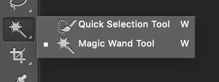
It’s up to you how you do this and there are many ways to select a subject. I personally use the Magic Wand Tool as well as the Quick Selection Tool.
Spend the time to cut the subject out properly as rushing this or cutting corners here will ruin the effect extremely quickly. Once I’ve got my basic selection of the subject then I often pop into the ‘Refine Edge…’ menu to make any minor adjustments to the styling or hair. This menu can be found in a variety of places dependant on your version of Photoshop but my preferred version of Refine Edge is found at the top of the screen when you have a selection tool active.
Note: I use an older version of Photoshop (even though I have access to the newest version via CC) mainly because of the power of this refine edge menu. Subsequent versions were a major step backwards in my opinion… but that’s a topic for another day.
Step 2 - Using our Mask
The hard part is now done. With our mask still active, create a new layer: Layer -> New Layer … (Shift+Command+N).
With the new layer simply create a Mask on it with the selection you’ve made. Layer -> Layer Mask.. -> Reveal Selection … (Or simply click the ‘Add Layer Mask’ button at the bottom of the layers palette.
If done correctly, your selection should disappear and your new blank layer should not have a black silhouette of your subject in the mask next to it.
Step 3 - Adding a base coat
Even though we may have an even background already, I like to add a base coat to this layer so that we don’t highlight any marks back there when we lighten it up later on.
First select the Gradient tool. This can be found in the tools palette or simply hit the G key.
With the base layer selected, hit the gradient palette at the top of the screen so that the Gradient Editor opens up. Now make a gradient by selecting one point at the top of your background and one at the bottom of your background. Mine here is almost identical from top to bottom, but yours might not be. Once you’ve done that hit ok.
With our new gradient we can now paint it across our new layer. Select the new layer, make sure you have the Linear Gradient selected at the top, then simply click and drag a new gradient from the top to bottom of your empty layer.
Step 4 - Keep it real!
At present, we have a pure pixel gradient that will likely have some amount of colour banding within it. We do not want that anywhere near our shot and although it might not be very visible now, it will be very noticeable once we lighten it later.
First we need to add some noise to eliminate that banding. With the new layer selected, go to Filter -> Noise -> Add Noise…
Once in here, select a noise amount of around 2-5 dependant on your shot.
Next we need to soften that noise as it’s looking too digital at the moment.
With the new layer selected, go to Filter -> Blur -> Gaussian Blur…
Once in the Gaussian Blur menu, select a low blur that will just take the sharp edges off of the noise.
Usually an amount of 1 - 2 is enough.
Lastly, I often choose to knock back the background a little to bed it into the original background. I will lower the opacity to around 50 -70% to help achieve this.
Step 5 - Lighten up
Next we need to brighten up that background so as to give us that separation we’re after. With your mask layer selected, add a curves adjustment layer. Layer -> New Adjustment Layer -> Curves… Or simply hit the little Curves icon on the Adjustments Palette.
With our new curves layer selected, simply double click it and then drag a point up from the centre of the curve to lighten up the whole image.
Clearly this is not the look we’re after and we need to isolate the effect to the background only.
With the Curves layer selected, go to Layer -> Create Clipping Mask (Option+Command+G). If done correctly, you should now see an arrow pointing down from your curves layer to the mask layer.
Step 6 - Vignette it
We are nearly there and now that we have a brighter background, we just need to make it look a little more natural and less dominating over the subject.
With your curves layer selected, create another mask for it. Go to Layer -> Layer Mask -> Reveal All.
With our new mask selected, we are going to add a vignette. To do this, simply select the Gradient Tool (G) again. Make sure you have the ‘Radial Gradient’ checked in the top left, select a white-to-black gradient and then simply click and drag a large gradient from the centre of your shot.
If all of this is done correctly, your curves layer mask should now have a little vignette in the thumbnail. You can now reduce the opacity of this to your tastes, but otherwise you’re done.
Final Before & After
Before
After
Closing Comments
This is one of those techniques that is far from flashy or dramatic, but more about adding a subtle yet effective result. In fact, post-production is often about adding many, many subtle effects that all add up to a big impact and this technique is a good example of this.
Final tips
Masking: Take your time on the mask. Failing to do so, will result in you not being able to lighten the background as much as you may like. If you’ve rushed the portion around the hair for example, you may end up with an odd looking halo effect which will be distracting.
Keep it subtle: This is probably the most important factor out of everything. We are not adding this glow behind the subject to emulate a light back there. Remember, we are ONLY adding this to add separation between subject and background. When people view the image for the first time, they should NOT notice you’ve added this effect.
Lastly…
If you are interested in learning more about my creative process in post-pro, why not join us on December 14th for an entire day of post production. To learn more about what topics in Lightroom and Photoshop I’ll be covering, check out the link Jake Hicks Photography - Post-Pro Workshop
THANK YOU
Thank you as always for checking out my article and spending a little bit of your day with me here. If you have any questions about this one, then feel free to let me know in the comments below. I can’t promise to have all the answers, but I’ll certainly do my best to answer what I can. Thanks again for stopping by.
More Free Tips & Techniques
If you’re after more tips and tricks on studio lighting then don’t forget to check out my monthly newsletter and my free 10 page pdf on studio lighting techniques. If you’re interested then follow the link below and download it immediately.
Did you receive my FREE 10 page PDF on Studio Lighting Tips yet?
Sign up to my monthly newsletter and receive my free 10 page pdf of my all time ‘Top 10 Photography Tips & Techniques’.
Once a month I’ll send you a newsletter of at least four photo related tips and tricks (one for each week I post them on here if you miss them) plus I’ll also keep you apprised of my new workshop dates as well.


